North star · Let oversized, condensed black typography lead on a quiet grey canvas, while keeping interface controls restrained and imagery dimensional.
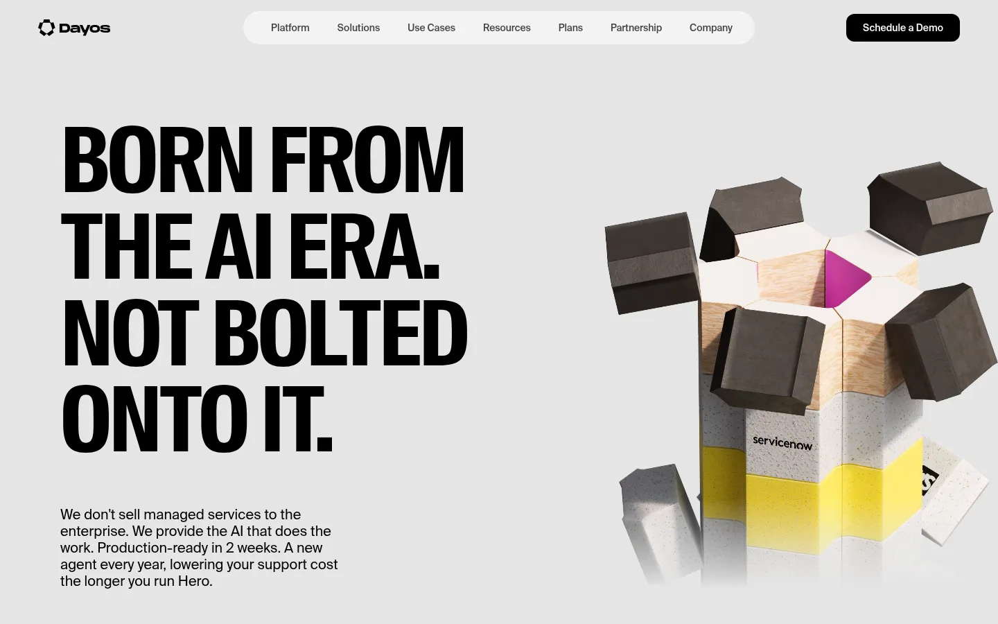
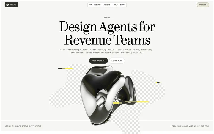
The homepage is anchored by a soft light-grey canvas (#e5e5e5), with black (#000000) doing the heavy lifting for the oversized, all-caps hero headline. White (#ffffff) appears in the pill-shaped navigation field and as a clean supporting surface; a lighter grey (#f3f3f3) provides subtle surface variation. The visual identity comes from typography and composition rather than a saturated brand accent. A large, tightly stacked headline occupies the left side of the hero, balanced by a rendered, dimensional object on the right. Its vivid yellow, magenta, and green details belong to the illustration, not the measured interface palette. Body copy is compact and readable beneath the headline. The header keeps the brand mark, centered navigation, and dark demo CTA distinct without adding visual clutter. Spacious margins and restrained interface styling let the headline and product imagery carry the page.
Body copy, navigation, captions, and supporting interface text.
Aa 设计
SuisseIntlCond
网络字体 · 字重 700 · 占比 6%
免费替代:Roboto Condensed
Display headlines, especially the stacked hero statement.
角色
示例
字号
字重
行高
字距
特大标题
Large uppercase, tightly stacked hero headline.
Dayos
130px
700
0.9
-0.03em
正文
Supporting hero paragraph beneath the main headline.
The quick brown fox 敏捷的狐狸
20px
400
1.2
0
辅助文字
Small supporting labels and compact secondary text.
The quick brown fox 敏捷的狐狸
14px
500
1.3
-0.01em
导航
Compact, medium-weight navigation links.
The quick brown fox 敏捷的狐狸
14px
500
1.3
-0.01em
间距与布局
基准单位 8px · 密度:宽松
96px版块间距
8px元素间距
—卡片内边距
—内容最大宽度
8px
16px
24px
Build the first viewport as a spacious two-part hero: oversized headline and supporting copy aligned left, dimensional product artwork to the right. Keep the brand mark at the left of a compact top navigation, with links centered in a white pill and the dark demo CTA at the far right. Preserve broad open areas around the content and clear separation between header and hero. Use a restrained, editorial rhythm rather than dense cards or boxed content; the measured spacing system is based on an 8px unit with a spacious section gap.
圆角与层次
导航 · 9999px
没有测到阴影:页面是扁平的,层次靠底色和描边区分。
The interface is mostly flat: the measured data reports no shadows and no border palette. Rely on contrast and surface changes rather than outlines. The rounded white navigation field and dark CTA provide the main layer separation; the hero render supplies depth through its own lighting, materials, and overlapping forms.
组件
下面的预览按实测的按钮、输入框、徽标、卡片样式重建(字体用替代字体)。
Header
Place the Dayos mark at the left, compact navigation links centrally in a white pill, and a black Schedule a Demo CTA at the right.
Navigation links
Use SuisseIntl medium at the measured 14px nav size, with muted charcoal text and restrained spacing.
Primary CTA
A dark, pill-like Schedule a Demo control with white label text; keep it visually distinct from the unboxed links.
Hero headline
Set the core statement in bold SuisseIntlCond, uppercase, with measured 130px display size, tight line-height, and negative tracking.
Hero supporting copy
Set a short paragraph under the headline in SuisseIntl regular at the measured 20px body size and compact line-height.
Hero product render
Use a prominent, dimensional 3D composition on the right; vivid colors belong to the artwork rather than interface controls.
Imagery · Use a large, polished 3D-rendered object as the hero counterweight to the headline. The composition is cropped close enough to feel substantial while remaining isolated against the grey canvas. Its bright yellow, magenta, and green elements are illustrative product details, not interface accents. Keep the render dimensional and tactile, with visible material contrast and no enclosing card.
该做与不该做
✓ 该做
Lead with one oversized uppercase headline.
Use the grey canvas as the dominant page background.
Keep the navigation compact and visually quiet.
Balance left-aligned copy with large right-side imagery.
Use black for the headline and primary CTA.
Preserve generous open space around the hero.
✕ 不该做
Do not turn the layout into a dense dashboard.
Do not introduce unmeasured interface accent colors.
Do not place the hero content inside a heavy card.
Do not use a wide, light-weight display headline.
Do not add decorative shadows or borders without evidence.
Do not mistake illustration colors for brand UI colors.
给 AI 的提示词
想快速出一个同风格的新页面,把这段话连同 DESIGN.md 一起发给 AI。
Build a new Dayos-style SaaS page with a restrained editorial composition. Use Soft Concrete (#e5e5e5) as the main canvas, Headline Ink (#000000) for high-impact text and primary actions, and Gallery White (#ffffff) for a quiet navigation surface. Set the display statement in a bold condensed sans, uppercase, tightly tracked, and visually dominant. Use a compact SuisseIntl-like sans for navigation and supporting copy. Arrange copy on the left and a substantial, dimensional product render on the right, leaving generous negative space between regions. Keep navigation links understated and make the demo action dark and clear. Treat vivid colors inside 3D artwork as illustrative details, not new interface accents. Avoid card-heavy layouts, ornamental borders, and unnecessary shadows.