North star · Keep the warm editorial canvas calm, then let vivid product color and real-life photography carry the story.
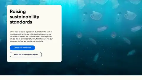
A warm off-white canvas (#fcfaf2) anchors the page, giving vivid product colors and full-bleed photography room to stand out. The palette alternates between electric blue, teal, soft lavender, pale blue, and yellow product fields; these are best treated as distinct collection or campaign blocks rather than a continuous gradient. Black and deep navy handle most text and outlines, while pale cream is used for contrast on colored cards and over photography. Typography combines Dopper’s rounded display face for prominent brand headlines with Gilroy for headings, body copy, and controls. A broad, responsive editorial grid alternates image-and-copy splits with compact horizontal product-card rows. Sections have generous visual breathing space against the warm canvas, while card content stays compact. Rounded media and buttons soften the geometry. Photography is candid and colorful, often showing bottles in use, with occasional graphic imagery inside campaign cards.
Display headlines and brand-forward hero lettering.
角色
示例
字号
字重
行高
字距
特大标题
Oversized brand-led display headlines.
Dopper
72px
400
1
0
一级标题
Main hero headline and top-level page title.
Dopper
58px
400
1
0
二级标题
Major section headings and collection introductions.
Dopper
48px
700
1.1
0
三级标题
Feature and content-card headings.
Dopper
43px
600
1.1
0
四级标题
Smaller product and editorial card titles.
The quick brown fox 敏捷的狐狸
27px
400
1.2
0
正文
Supporting copy, descriptions, and explanatory text.
The quick brown fox 敏捷的狐狸
18px
400
1.3
0
按钮
Primary and secondary action labels.
The quick brown fox 敏捷的狐狸
18px
600
1.3
0
间距与布局
基准单位 4px · 密度:紧凑
35px版块间距
8px元素间距
—卡片内边距
1324px内容最大宽度
8px
10px
12px
14px
19px
20px
24px
30px
35px
40px
48px
58px
60px
70px
113px
Use a centered, wide content frame with a measured maximum width of 1324px, while allowing hero and campaign media to bleed to the viewport edges. Sections mostly use two-column editorial splits, alternating image and copy placement; product and solution collections switch to compact five-card rows. Headings align to the start of their columns. Keep a compact underlying spacing rhythm, but preserve visible breathing room between large stories and card groups. The long page alternates content types over a consistent cream canvas.
圆角与层次
按钮 · 20px
卡片 · 20px
图片 · 20px
sm · other
md · other
The design is mostly flat: colored surfaces, photography, and spacing define the hierarchy rather than heavy shadows. Use rounded media and cards, with a measured 20px radius where applicable. Outlined buttons use a deep navy hairline; reserve subtle shadows for isolated floating controls or layered elements.
组件
下面的预览按实测的按钮、输入框、徽标、卡片样式重建(字体用替代字体)。
Hero
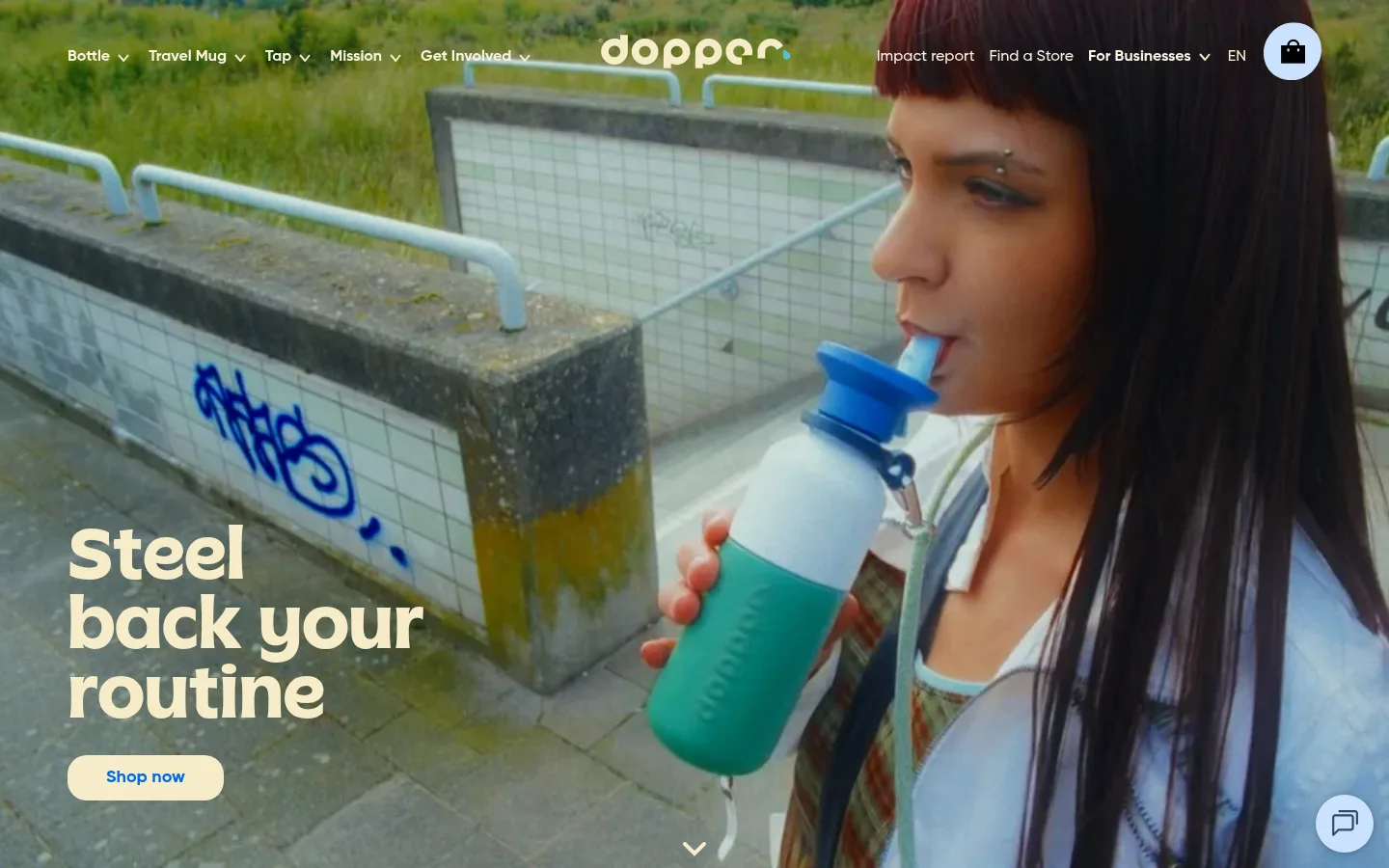
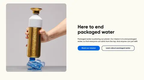
Full-bleed lifestyle image with overlaid cream display headline, compact pill-shaped blue action, transparent navigation, and a scroll cue.
Editorial split
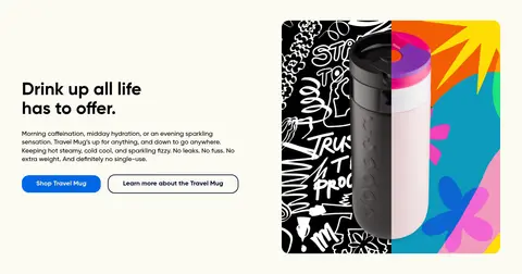
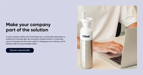
Two-column story block pairing a rounded image with a heading, concise supporting copy, and one or two actions.
Collection cards
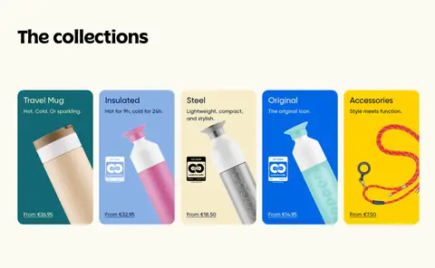
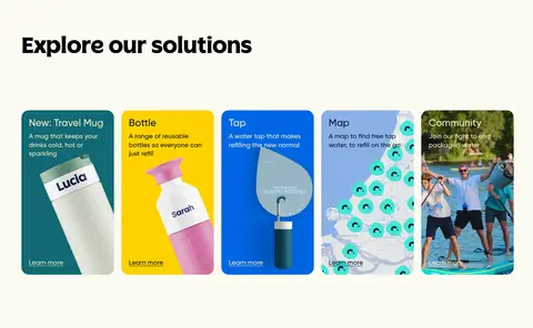
Five compact product tiles with individual bright surface colors, short product descriptions, bottle photography, and price links.
Action buttons
Rounded controls with 20px measured radius; use blue filled buttons, navy-filled dark actions, or navy-outlined secondary actions.
Impact calculator
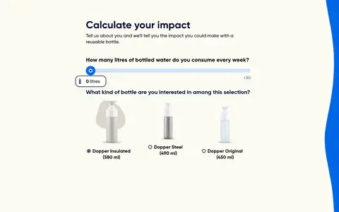
Light interactive section with explanatory copy, a weekly-liter slider, and a row of bottle choices.
Newsletter and footer
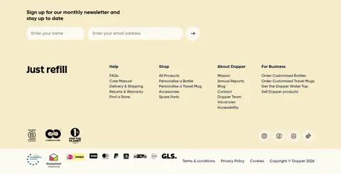
Warm pale-yellow signup band followed by a multi-column navigation footer, trust marks, and payment details.
Imagery · Prioritize candid lifestyle photography that shows bottles being carried, used, or placed in everyday settings. The hero is full-bleed video-like photography with a darkened image behind cream headline text. Product and editorial cards use colorful, varied product imagery, including graphic campaign art; keep this content within rounded frames rather than imposing a uniform studio treatment.
Let lifestyle photography occupy large, clear areas.
Reserve vivid color blocks for product and campaign cards.
Pair display headlines with readable geometric sans-serif copy.
Use navy outlines for secondary actions.
Keep section headings and copy aligned to column starts.
✕ 不该做
Do not turn every section into a colored block.
Do not use heavy shadows as the main hierarchy tool.
Do not crop product imagery so tightly that the bottle becomes unclear.
Do not replace the warm canvas with stark white.
Do not use blue gradients as a default section background.
Do not add decorative colors beyond the measured palette.
给 AI 的提示词
想快速出一个同风格的新页面,把这段话连同 DESIGN.md 一起发给 AI。
Build a new Dopper-style page using Refill Cream (#fcfaf2) as the calm canvas and True Ink (#000000) for primary text. Use Midnight Navy (#000f2e) for outlines and dark actions, Electric Blue (#0067e5) for selected primary actions and product blocks, and reserve Refill Teal (#116973), Soft Periwinkle (#d4d5e6), Soft Sky (#8ab1e6), Sunshine Yellow (#fed200), and Butter Cream (#f6ecc8) for deliberate product or campaign surfaces. Create a wide editorial layout with image-and-copy splits, generous visual separation, and compact horizontal card collections. Use rounded lifestyle photography, a distinctive rounded display face for hero headlines, and a geometric sans-serif for supporting text and controls. Favor flat surfaces and clear contrast over shadows; make every section feel human, optimistic, and focused on reusable drinkware.