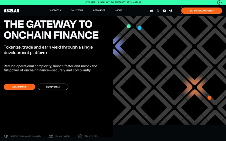
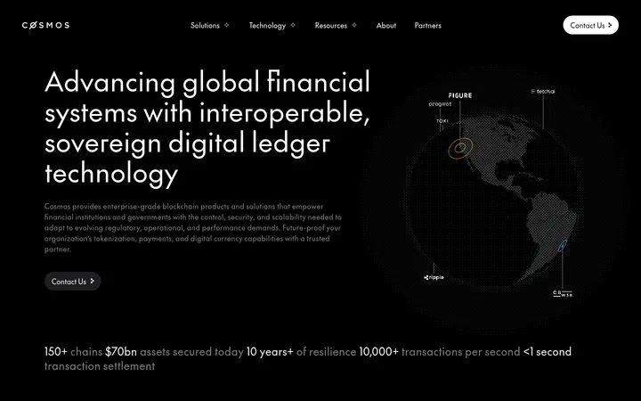
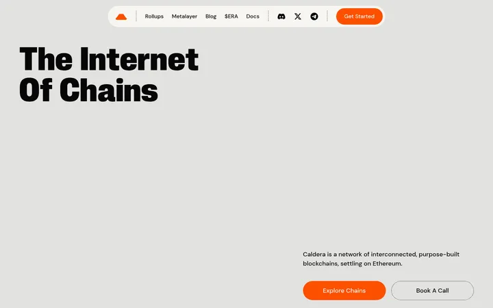
North star · Use stark black-and-white editorial structure, reserving vivid green for decisive emphasis and action.
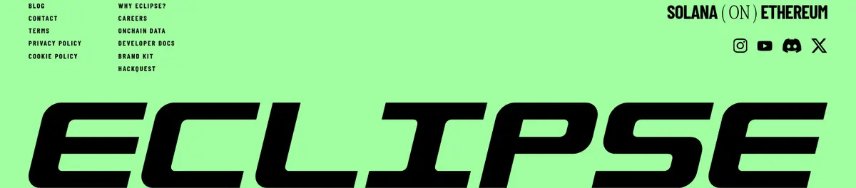
The visual strategy is built around a strict black-and-white foundation, punctuated by bright green panels and controls. Black carries the cinematic hero, dark video and news areas, and footer CTA; white provides breathing room for editorial headlines, partner names, and content cards. The measured green (#a1fea0) acts as the signature signal on feature splits, action buttons, and the full-width footer. Typography alternates between compressed, emphatic display faces and a typewriter-like utility face: headlines are large and often uppercase, while supporting text is compact and technical. The page moves between full-bleed animated or illustrated scenes and clean modular blocks, with repeated ticker-like bands linking the story. Broad section spacing and generous white fields counterbalance dense card grids. Thin black rules define cells and outlines; cards and buttons remain mostly flat, with rounded shapes reserved for controls and selected content surfaces. The dark green tones visible in screenshots belong largely to hero artwork and video, not the measured core palette.
配色
点色块复制色值。用途说明来自对页面的实测位置(背景、文字、描边、按钮)与截图判读。
强调色
表层色
中性色
页面底色 · Gallery White表层 · Deep Ink表层 2 · Carbon Gray主文字 · Deep Ink描边 · Deep Ink强调 · Signal Green
Utility copy, body text, captions, and some legal or text links.
Aa 设计
Gt Alpina Condensed
网络字体 · 字重 100 / 400 · 占比 18%
免费替代:Bodoni Moda
Editorial H1, H2, and H4 headlines.
Aa 设计
Barlow Condensed
网络字体 · 字重 700 / 500 · 占比 4%
免费替代:Barlow Condensed
Display lettering, H3s, navigation, eyebrows, buttons, and some card text.
角色
示例
字号
字重
行高
字距
特大标题
Oversized uppercase wordmarks and hero display lettering.
Eclipse
120px
700
0.9
-0.03em
一级标题
Main editorial hero headline and top-level section statement.
Eclipse
88px
100
1.1
0
二级标题
Large uppercase section headings.
Eclipse
61px
100
1.1
0
三级标题
Compact bold uppercase feature and CTA headings.
Eclipse
48px
700
1.2
-0.03em
四级标题
Elegant supporting headlines and card titles.
Eclipse
46px
100
normal
-0.01em
正文
Compact uppercase explanatory copy and feature descriptions.
The quick brown fox 敏捷的狐狸
16px
400
1.56
0
辅助文字
Small uppercase metadata and supporting labels.
The quick brown fox 敏捷的狐狸
12px
400
1.6
0
导航
Uppercase navigation labels with widely spaced letters.
The quick brown fox 敏捷的狐狸
12px
500
1.6
0.1em
链接
Bold utility links, legal links, and inline actions.
The quick brown fox 敏捷的狐狸
12px
700
1.7
0.02em
眉题
Small tracked uppercase section labels.
The quick brown fox 敏捷的狐狸
12px
700
1.6
0.13em
间距与布局
基准单位 8px · 密度:宽松
120px版块间距
10px元素间距
—卡片内边距
1368px内容最大宽度
1px
5px
10px
16px
18px
20px
24px
32px
40px
The measured page max width is 1368px, with a spacious rhythm and a 120px section gap. It alternates full-bleed dark media with white or green content sections, then uses split feature panels, centered metrics, and dense announcement cards. Feature and logo areas use strong rectangular divisions and fine rules rather than floating card shadows. Headlines align left in feature sections and center in investor and community moments. Keep the layout open at the section level while allowing the news feed to become visibly denser.
圆角与层次
按钮 · 9999px
卡片 · 24px
链接 · 25px
inset · button
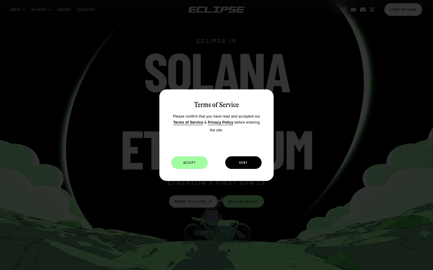
The interface is mostly flat: there are no measured visible drop shadows, and the sampled button shadow is transparent. Separate content with white space, hard section bands, and thin black outlines or rules. Use rounded pill shapes for buttons and selected links, with a rounded white consent dialog over the darkened hero as a temporary overlay.
组件
下面的预览按实测的按钮、输入框、徽标、卡片样式重建(字体用替代字体)。
Pill actions
Use fully rounded controls with uppercase Barlow Condensed labels. Primary actions use #a1fea0 with #000000 text; the alternate deny action uses #000000 with #ffffff text.
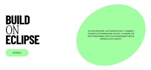
Split feature panels
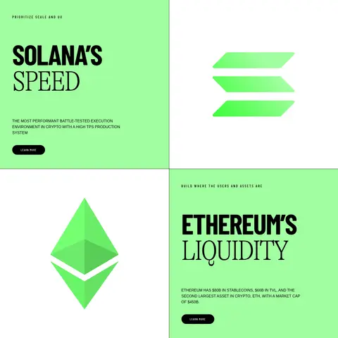
Pair a green text panel with a white symbol panel, then reverse the order for the next feature. Separate halves with a fine black rule and keep copy left-aligned.
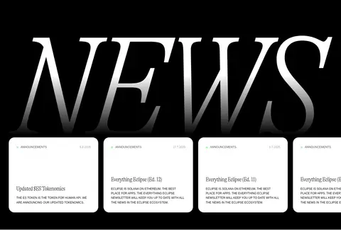
News cards
Show announcement cards as white, rounded link surfaces against a black section. Use compact metadata, clear title hierarchy, and short uppercase summaries.
Metric cells
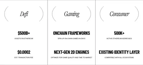
Present ecosystem figures and categories in a clean white grid with vertical rules, centered labels, and large condensed values.
Ticker band
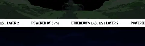
Repeat short Ethereum and SVM statements in a high-contrast horizontal strip to bridge cinematic media sections.
Investor capsules
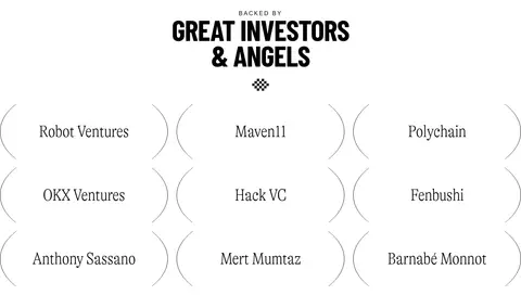
Arrange investor names in a three-column white grid; thin outlined capsule-like forms provide structure without heavy card fills.
Community CTA
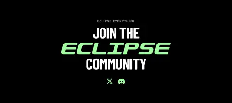
Center a stacked uppercase invitation on a black field, emphasizing the Eclipse wordmark in vivid green and placing social links beneath.
Imagery · The opening uses dark cinematic, illustrated scenery behind oversized hero lettering; later full-bleed video imagery carries the same dramatic contrast. Network and ecosystem marks appear as clean graphic symbols within white panels, alongside a vivid green abstract shape. Treat artwork as a large, deliberate visual field rather than a small decorative thumbnail. Deep green shades in the screenshots are primarily part of the media and illustration, not extra brand colours.
Keep the core palette to black, white, and measured Signal Green.
Use full-width dark bands for cinematic media and major CTA moments.
Set key headlines in highly condensed or editorial display typography.
Alternate open white sections with sharp green feature panels.
Use thin rules to define grids and split feature cells.
Reserve rounded pill treatments for actions and selected link surfaces.
✕ 不该做
Do not add unmeasured colors to the interface palette.
Do not apply gradients or decorative drop shadows.
Do not make every section a rounded floating card.
Do not use generic wide sans-serif headlines in place of the condensed display voice.
Do not let dense metadata compete with the primary headline.
Do not treat illustration-only dark greens as core interface colors.
给 AI 的提示词
想快速出一个同风格的新页面,把这段话连同 DESIGN.md 一起发给 AI。
Build a new Eclipse page using a strict black-and-white base with Signal Green (#a1fea0) reserved for actions, feature emphasis, and selected bands. Use Deep Ink (#000000) for text, rules, and dark cinematic sections; Gallery White (#ffffff) for the canvas and editorial content. Carbon Gray (#333333) may support secondary dark surfaces. Pair bold condensed uppercase display type with elegant editorial headlines and compact typewriter-style utility copy. Structure content in spacious full-width bands, alternating media-led dark scenes, clean white sections, and green-and-white split features. Favor thin rules and modular grids over shadows. Keep controls pill-shaped, labels concise, and major headlines visually dominant. Use graphic or cinematic artwork as a deliberate large-scale field, not as generic decorative clutter. Maintain clear contrast and preserve generous breathing room around section transitions.