Eindhoven Design District 以开阔克制的编辑式布局展示城市设计项目,并用醒目的粉、红、蓝色块突出重点。超大粗体字与纪实建筑摄影相结合,整体更像当代设计刊物,而非传统项目目录。
North star · Use oversized, tightly composed black typography and generous white space, then reserve saturated color blocks for distinct project stories.
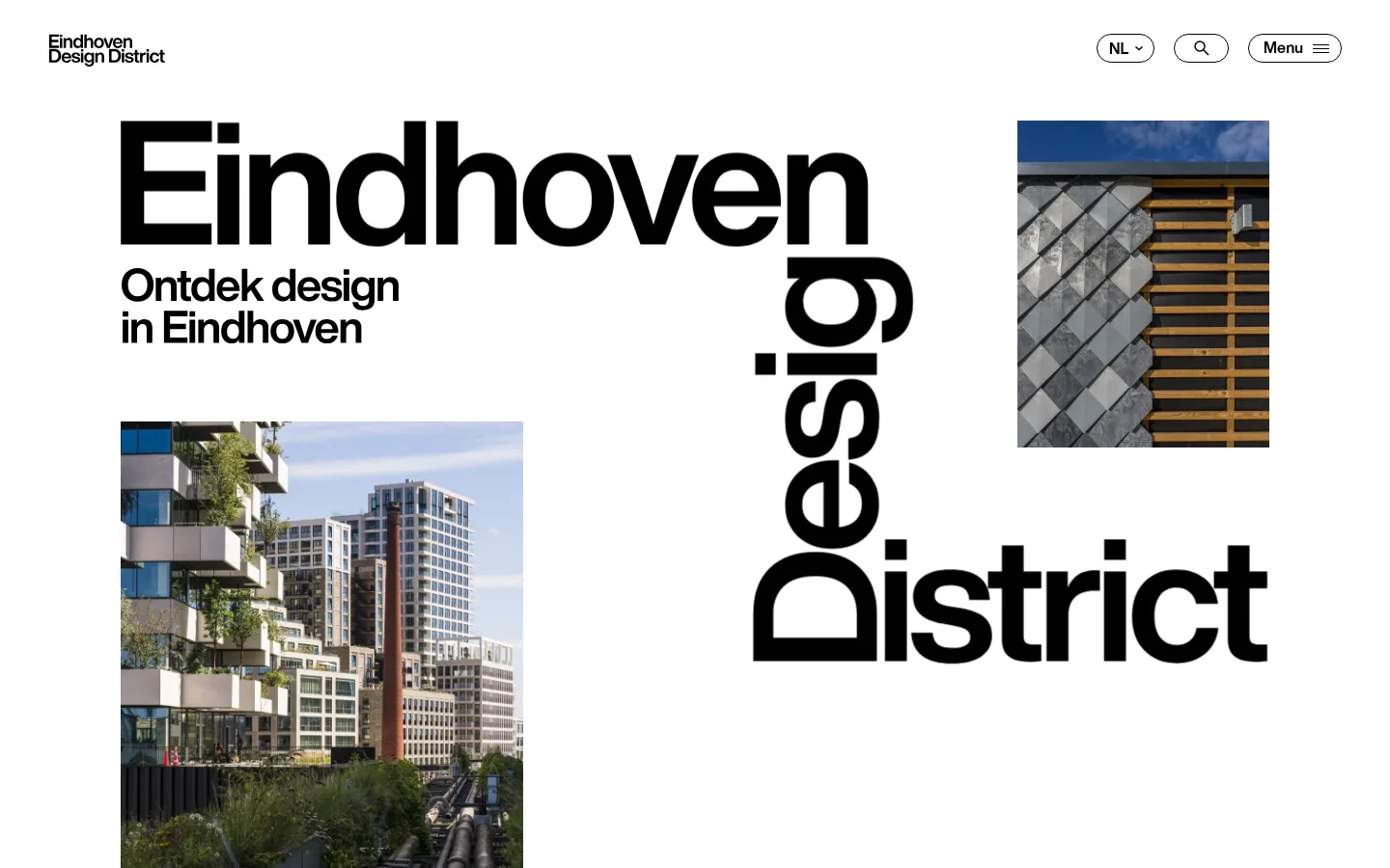
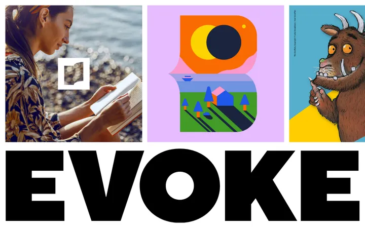
The visual identity is built on a white canvas, black typography, and a deliberately selective use of saturated project colors. Pale pink, vivid red, and electric blue mark individual feature bands, giving each project a distinct editorial chapter; they are not a continuous site-wide gradient or background treatment. Helvetica Now carries everything from compact navigation to oversized, tightly tracked display lettering, with weight and scale establishing hierarchy rather than decorative type. The hero uses unusually large, spatially arranged words alongside cropped photographs of buildings and materials. Below it, long white intervals separate the introduction, project features, articles, discovery links, and contact prompt. Project blocks pair strong color fields and black text with documentary photographs, often in an asymmetric split. Borders stay thin and black on rounded outline controls; the general page remains flat, with no visible shadow-driven card system.
配色
点色块复制色值。用途说明来自对页面的实测位置(背景、文字、描边、按钮)与截图判读。
品牌色
强调色
表层色
中性色
页面底色 · Gallery White表层 · Studio Pink表层 2 · Soft Concrete主文字 · District Ink次要文字 · Gallery White描边 · District Ink强调 · Studio Pink强调 2 · Signal Red强调 3 · Electric Blue
Site-wide display, heading, body, navigation, link, caption, and button type.
角色
示例
字号
字重
行高
字距
一级标题
Hero headline and primary page title.
Eindhoven Design District
50px
600
1
-0.02em
二级标题
Section headings and major project titles.
Eindhoven Design District
35px
600
1.2
-0.004em
三级标题
Article titles and smaller editorial headings.
The quick brown fox 敏捷的狐狸
23px
600
1
-0.017em
正文
Project descriptions, introductory copy, and supporting paragraphs.
The quick brown fox 敏捷的狐狸
16px
400
1.4
-0.017em
辅助文字
Compact labels and image or article metadata.
The quick brown fox 敏捷的狐狸
14px
600
1.31
0
按钮
Pill-shaped outlined actions and section controls.
The quick brown fox 敏捷的狐狸
16px
600
1
-0.024em
导航
Header navigation and prominent menu links.
Eindhoven Design District
35px
600
1
-0.03em
链接
Large editorial links and calls to explore related design content.
Eindhoven Design District
50px
600
1
-0.02em
间距与布局
基准单位 2px · 密度:宽松
50px版块间距
40px元素间距
—卡片内边距
1340px内容最大宽度
1px
2px
3px
10px
12px
15px
18px
19px
20px
21px
27px
30px
35px
40px
50px
100px
The page uses a spacious editorial canvas with measured maximum width of 1340px and predominantly left-aligned content. The hero is a loose, asymmetric composition of oversized typography and separate photographs. Project features alternate strong color panels with large photographs; article and discovery areas shift to multi-column layouts. Measured section rhythm is spacious, with a 50px section gap and a 40px element gap. Keep wide white intervals between major content groups; avoid making the page feel like a dense catalogue.
圆角与层次
按钮 · 9999px
导航 · 9999px
链接 · 9999px
没有测到阴影:页面是扁平的,层次靠底色和描边区分。
The page is primarily flat: no measured shadows are present, and broad color fields rather than elevated cards organize content. Use thin black outlines on pill-shaped navigation and action controls. Keep imagery and color bands flush to their section geometry; reserve layering for the hero’s overlapping visual composition rather than simulated depth.
组件
下面的预览按实测的按钮、输入框、徽标、卡片样式重建(字体用替代字体)。
Header navigation
Compact black brand mark at left; language selector, search, and Menu controls at right. Controls use thin black outlines and pill-shaped silhouettes.
Typographic hero
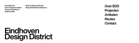
Oversized black Eindhoven Design District lettering arranged asymmetrically with smaller title text and cropped architecture photographs.
Project feature split
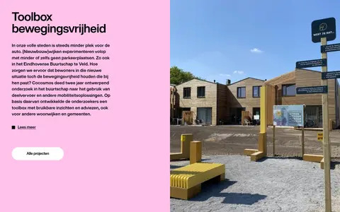
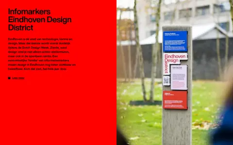
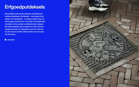
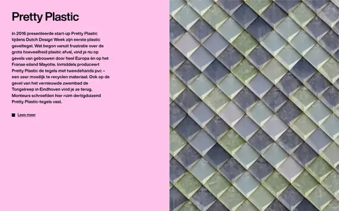
Large project story with a saturated pink, red, or blue text panel paired with documentary photography; include a compact Lees meer link.
Outline action
Text-led action such as Meer over Eindhoven Design District inside a white or transparent pill with a thin black border and black text.
Article feed
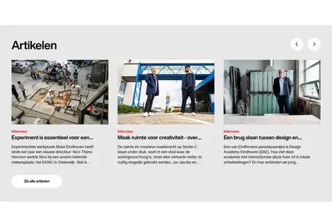
Light-gray editorial band with a section title, image-led article cards, compact red category labels, and carousel arrows.
Footer navigation
Spacious white closing area combining partner acknowledgements, a large brand wordmark, and a concise vertical set of site links.
Imagery · Use documentary photographs of Eindhoven’s architecture, streets, public-space interventions, and material details. Images appear as rectangular crops, often large enough to balance a colored text panel; the hero uses separate architectural crops around oversized lettering. Keep treatment observational and natural rather than adding illustration, 3D gloss, gradients, or heavy filters. Measured section counts show image-led article and discovery content as well as project photography.
Keep the canvas predominantly white and uncluttered.
Use Helvetica Now or a close substitute with strong weight contrast.
Compose the hero with oversized, tightly tracked black lettering.
Give project stories distinct pink, red, or blue color bands.
Pair project text panels with natural documentary photography.
Use thin black outlines and pill shapes for navigation controls.
✕ 不该做
Do not apply saturated color as a continuous page background.
Do not add gradients, drop shadows, or glossy card treatments.
Do not center every heading or regularize the asymmetric hero.
Do not place project imagery inside decorative frames.
Do not turn the spacious page into a dense grid of small cards.
Do not use colors outside the measured palette for brand UI.
给 AI 的提示词
想快速出一个同风格的新页面,把这段话连同 DESIGN.md 一起发给 AI。
Build a new editorial page in the Eindhoven Design District visual style. Use Gallery White (#ffffff) as the dominant canvas and District Ink (#000000) for confident, tightly tracked Helvetica Now–style typography. Create an asymmetric hero with oversized display lettering and a few natural architectural photo crops. Organize featured stories as split text-and-photo sections, using Studio Pink (#ffc2eb), Signal Red (#ff0000), or Electric Blue (#0f26ed) as distinct section fields rather than a continuous theme. Use Soft Concrete (#e8e8e8) only as a quiet supporting surface, such as an editorial feed band. Maintain generous white intervals, left-aligned copy, thin outlined pill controls, and a flat visual treatment without shadows. Keep photography documentary, material-focused, and rectangular; let scale, cropping, and typography provide visual energy.