North star · Use generous white space and bold editorial type to make colorful, image-led stories feel curated rather than crowded.
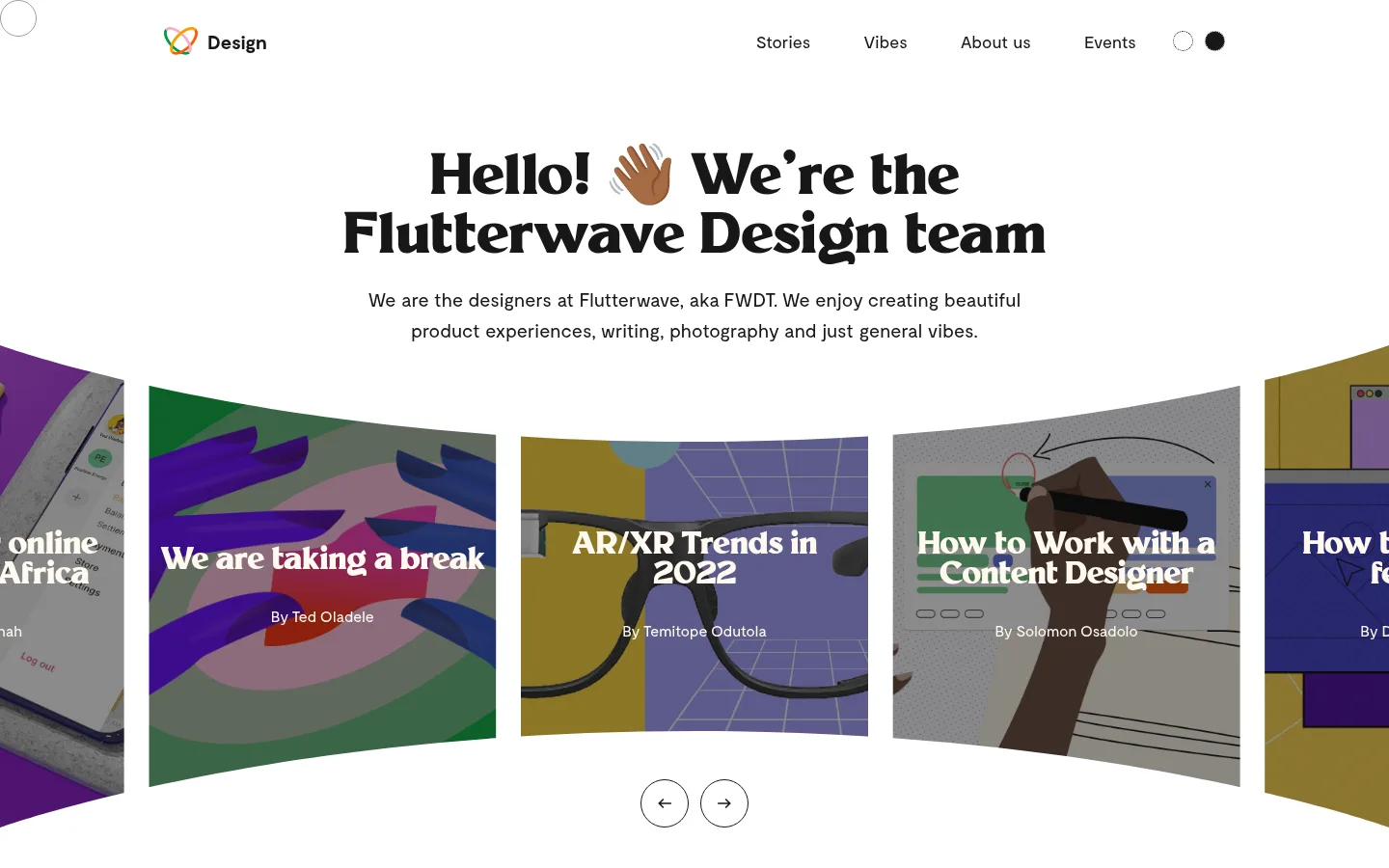
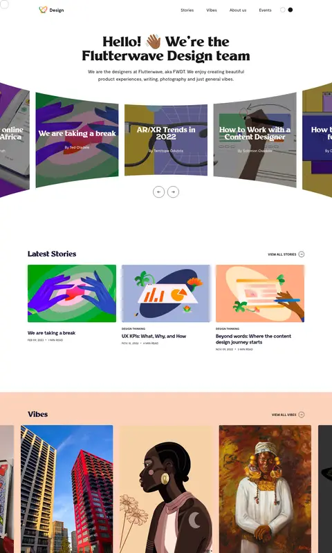
The page uses white as its dominant canvas, letting dark, high-contrast typography and image-led content carry the identity. A large, centered Millik display headline gives the hero an expressive editorial voice; Moderat handles navigation, supporting copy, and story details with a quieter, readable rhythm. The hero carousel presents colorful artwork in a shallow curved arrangement, while the latest stories return to a restrained white three-column feed. A broad peach section distinguishes Vibes without introducing a new visual system. Card artwork supplies much of the page’s vivid color, so those hues should stay inside the imagery rather than become interface colors. Small amber appears chiefly on the newsletter button. Layout is open and comfortable, with clear section breaks, centered hero content, and restrained outlines on controls. Keep surfaces mostly flat and let the artwork, rather than shadows or decoration, provide depth.
Navigation, body copy, story metadata, links, and supporting headings.
Aa 设计
Millik
网络字体 · 字重 700 / 800 · 占比 27%
免费替代:Fraunces
Hero display and primary editorial headings.
角色
示例
字号
字重
行高
字距
特大标题
Oversized hero statement and prominent display moments.
Flutterwave Design
60px
800
normal
-0.013em
一级标题
Primary editorial headings and page-level title.
Flutterwave Design
32px
700
normal
-0.025em
二级标题
Section titles and supporting prominent headings.
The quick brown fox 敏捷的狐狸
22px
600
1.18
-0.036em
三级标题
Secondary story or explanatory headings.
The quick brown fox 敏捷的狐狸
20px
400
1.6
0
正文
Introductory copy, descriptions, and newsletter support text.
The quick brown fox 敏捷的狐狸
16px
400
1.63
0
辅助文字
Compact story metadata and small supporting labels.
The quick brown fox 敏捷的狐狸
14px
500
normal
0
按钮
Newsletter subscribe action and compact controls.
The quick brown fox 敏捷的狐狸
16px
400
normal
0
导航
Top-level site navigation links.
The quick brown fox 敏捷的狐狸
18px
400
normal
0
链接
Story titles and inline navigational actions.
The quick brown fox 敏捷的狐狸
18px
500
normal
0
间距与布局
基准单位 2px · 密度:适中
82px版块间距
—元素间距
—卡片内边距
1200px内容最大宽度
1px
6px
10px
11px
12px
15px
18px
20px
30px
32px
40px
50px
60px
82px
117px
120px
A comfortable, centered page sits within a measured 1200px maximum content width. The header is a light horizontal navigation row; the hero centers its headline and short intro above a wide, curved carousel. Below, a three-column latest-stories feed gives way to a full-width peach Vibes band with horizontally presented artwork. The newsletter is centered on white, followed by a sparse footer. Sections have clear breathing room rather than dense stacking.
圆角与层次
按钮 · 50%
输入框 · 5px
卡片 · 5px
导航 · 50%
没有测到阴影:页面是扁平的,层次靠底色和描边区分。
The interface is predominantly flat: white and peach bands, artwork surfaces, and little emphasis on drop shadows. Story cards rely on their images and contrasting overlaid text for separation. Controls and the newsletter form use thin dark outlines; maintain crisp edges and avoid adding heavy elevation or layered effects.
组件
下面的预览按实测的按钮、输入框、徽标、卡片样式重建(字体用替代字体)。
Header navigation
A minimal horizontal header with the Design mark on the left, Moderat navigation links on the right, and small circular controls.
Intro hero
Centered, heavy Millik headline with a short Moderat introduction beneath it, surrounded by generous white canvas.
Curved story carousel
Large artwork cards form a shallow arc, with adjacent cards cropped at the viewport edges and outlined circular arrow controls below.
Latest stories feed
A white editorial section with a section heading, view-all link, and three image-led story cards with compact metadata.
Vibes gallery
A full-width #fcd2ba band holding a horizontally browsable row of large artworks and small attribution lines.
Newsletter form
Centered signup heading and supporting line above a thin outlined email input joined to an amber Subscribe button.
Footer
Sparse white footer with copyright and site link on the left and small social icons on the right.
Imagery · The page relies on colorful editorial artwork and illustrations, not product photography or 3D. Story images appear in large, edge-to-edge cards; the hero carousel bends the row into a shallow arc and crops cards at the viewport edges. Lower content uses a straightforward image grid and a horizontal Vibes strip. Artwork introduces vivid purples, greens, and ochres; treat these as image colors, not UI palette additions.
Keep the page canvas bright white and uncluttered.
Use Millik-style heavy display lettering for the hero statement.
Use Moderat-style sans-serif text for navigation and editorial details.
Let story artwork provide vivid color instead of adding extra interface hues.
Separate Vibes with the measured peach section band.
Reserve amber for the newsletter action.
Use thin outlines and flat surfaces for controls.
✕ 不该做
Don’t turn the interface into a dark theme.
Don’t use artwork colors as global buttons or navigation colors.
Don’t crowd the centered hero with extra controls or copy.
Don’t add heavy shadows or glossy card effects.
Don’t replace the editorial artwork with generic product photography.
Don’t use rounded, pill-like cards where the measured cards are square-edged.
给 AI 的提示词
想快速出一个同风格的新页面,把这段话连同 DESIGN.md 一起发给 AI。
Build a new editorial page in the Flutterwave Design visual style. Keep the main canvas Gallery White (#ffffff), with Soft Ink (#171717) navigation and outlines, and use a bold, expressive display face similar to Millik for the main heading. Set supporting copy and metadata in a clean Moderat-like sans serif. Give the hero centered alignment and generous breathing room, then feature large, colorful editorial artwork in a curated carousel or image-led feed. Use Peach Band (#fcd2ba) only for a distinct gallery section, and Signal Amber (#f5a623) sparingly for a primary newsletter-style action with Button Black (#000000) text. Keep cards flat, let imagery supply its own color, use restrained hairlines, and avoid heavy shadows or decorative gradients.