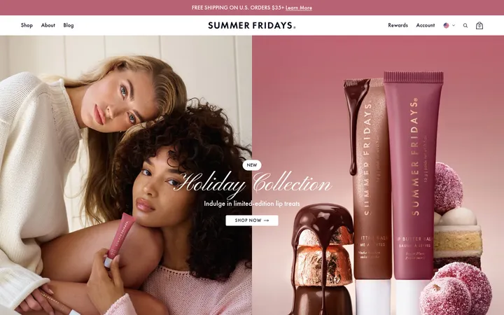
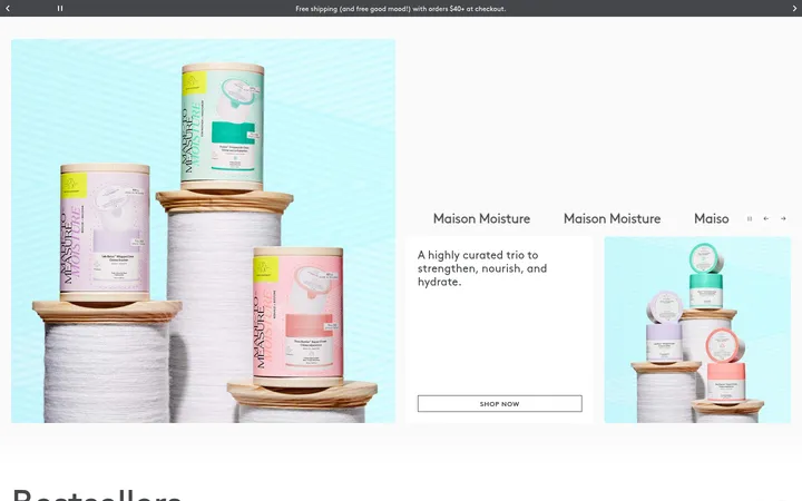
North star · Let generous white space and refined serif typography carry the luxury skincare identity; keep accents and interface chrome restrained.
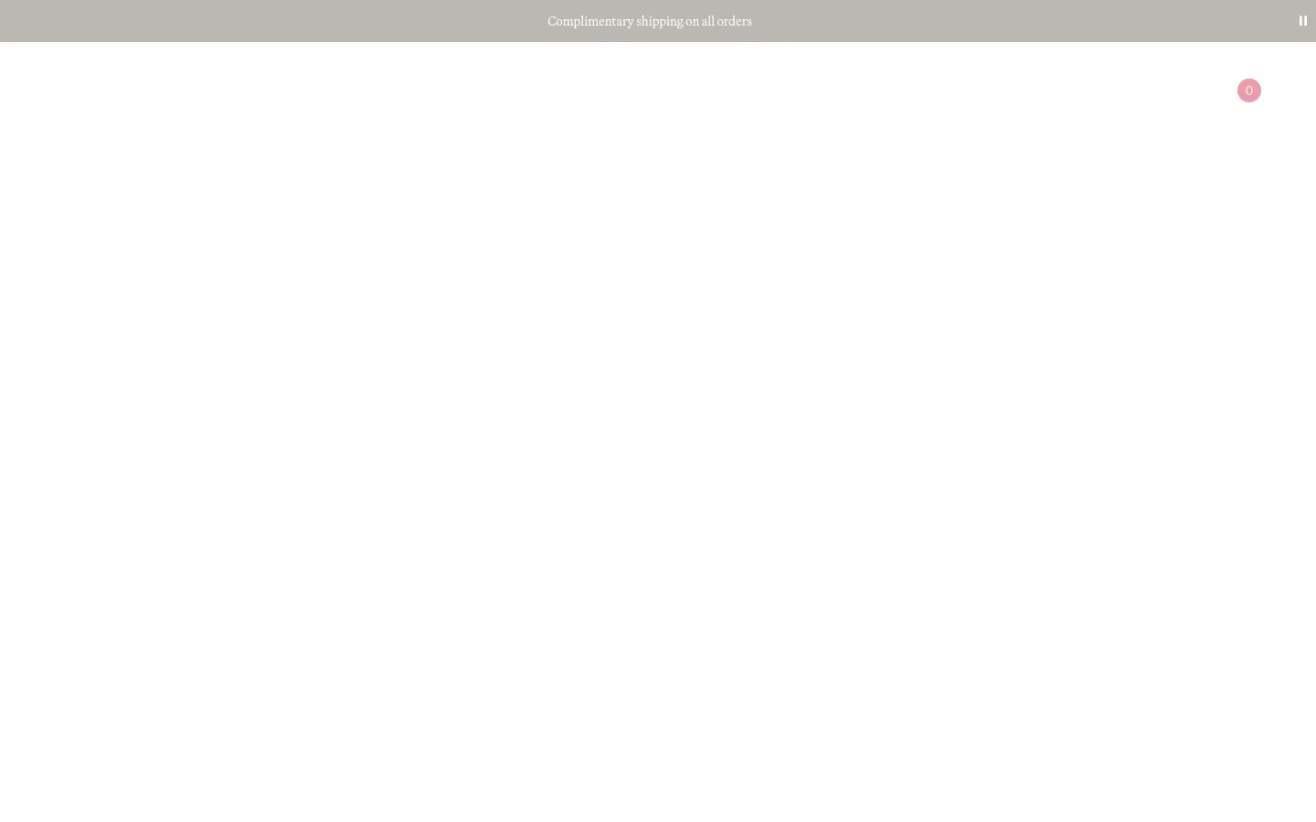
The visual strategy is defined by restraint: a white canvas dominates, while a muted warm-gray announcement band provides the only substantial contrasting area in the captured viewport. White text sits within that band, and the tiny pink cart marker is an incidental accent rather than a basis for the palette. Martina Plantijn supplies the measured text system, giving navigation and announcement copy a literary serif character; keep hierarchy clear through weight and scale rather than decorative effects. The layout places a slim shipping message above an exceptionally open field, with navigation content present but visually subdued in the screenshot. Generous negative space makes the page feel calm and premium instead of crowded. Product imagery is not visible in the supplied viewport, so preserve the quiet framing and avoid adding illustrative decoration. Treat surfaces as flat, with no prominent shadows or visible border system.
配色
点色块复制色值。用途说明来自对页面的实测位置(背景、文字、描边、按钮)与截图判读。
品牌色
表层色
中性色
页面底色 · Gallery White表层 · Warm Stone主文字 · Gallery White
Measured family for body copy, captions, buttons, and navigation.
角色
示例
字号
字重
行高
字距
正文
General storefront copy and supporting page text.
The quick brown fox 敏捷的狐狸
16px
400
1
0
辅助文字
Small supporting labels and compact explanatory text.
The quick brown fox 敏捷的狐狸
14px
400
1.86
0
按钮
Calls to action and functional button labels.
The quick brown fox 敏捷的狐狸
16px
700
1.38
0
导航
Primary navigation and the shipping announcement.
The quick brown fox 敏捷的狐狸
16px
400
1
0
间距与布局
基准单位 2px · 密度:适中
60px版块间距
8px元素间距
—卡片内边距
1320px内容最大宽度
2px
3px
4px
5px
6px
8px
10px
12px
14px
20px
60px
The captured page is exceptionally sparse: a narrow, full-width announcement strip sits at the top, followed by a large white field. Measured page max width is 1320px, with a comfortable density and a section gap of 60px. Navigation content is distributed across the header, while the announcement copy is centered. Preserve broad, uninterrupted negative space and use the measured spacing scale rather than introducing arbitrary gaps or a dense grid.
圆角与层次
导航 · 50%
没有测到阴影:页面是扁平的,层次靠底色和描边区分。
The captured interface is predominantly flat: no measured shadows or gradients define its appearance. The announcement strip is distinguished by its muted fill, not by a visible border or raised-card effect. Keep controls and surfaces visually integrated, using contrast and placement instead of layered elevation.
组件
下面的预览按实测的按钮、输入框、徽标、卡片样式重建(字体用替代字体)。
Shipping announcement
A slim full-width Warm Stone band with centered white serif copy announcing complimentary shipping.
Primary navigation
A restrained header containing shopping and brand destinations; measured navigation uses Martina Plantijn at regular weight.
Cart indicator
A small pink circular quantity marker appears near the upper-right area in the screenshot; treat it as a minor functional accent.
Skip-to-content control
Measured as a Charcoal Ink button with white bold Martina Plantijn text; accessibility utility rather than a prominent visual motif.
Imagery · No meaningful product photography or editorial imagery is visible in the supplied viewport; the page reads primarily as typography and open canvas. The full-page capture remains almost entirely white, so do not invent image treatments or decorative illustrations. Where imagery appears on other parts of the storefront, let product photography feel quiet and considered, with restrained framing that does not compete with the page's whitespace.
Keep the page canvas white and visually uninterrupted.
Use Warm Stone only for the announcement strip.
Set storefront copy in an elegant serif style.
Center the announcement message within its band.
Preserve generous negative space around navigation.
Keep utility accents small and subordinate.
✕ 不该做
Do not add saturated colors to the main interface.
Do not fill the open canvas with invented content.
Do not introduce heavy shadows or gradients.
Do not make navigation visually dense.
Do not treat illustration-only colors as core brand colors.
Do not use oversized decorative interface elements.
给 AI 的提示词
想快速出一个同风格的新页面,把这段话连同 DESIGN.md 一起发给 AI。
Build a new page in Emma Lewisham's restrained premium skincare style. Use Gallery White (#ffffff) as the dominant canvas and keep the layout open, with broad negative space. A narrow full-width Warm Stone (#bab7b2) announcement band can carry centered white serif shipping copy. Use Martina Plantijn, or a close literary serif substitute, for navigation, body text, captions, and buttons; rely on measured weight and hierarchy rather than tracking or decorative effects. Reserve Charcoal Ink (#333333) for a discreet utility control, not a large brand surface. Keep navigation quiet, functional accents small, and surfaces flat. Avoid introducing unmeasured colors, shadows, gradients, or dense content blocks. Use the measured comfortable spacing rhythm and keep the overall composition calm and editorial.