North star · Keep the page bright and editorial, using Saiga headlines and Employment Hero purple to focus attention amid practical, content-rich sections.
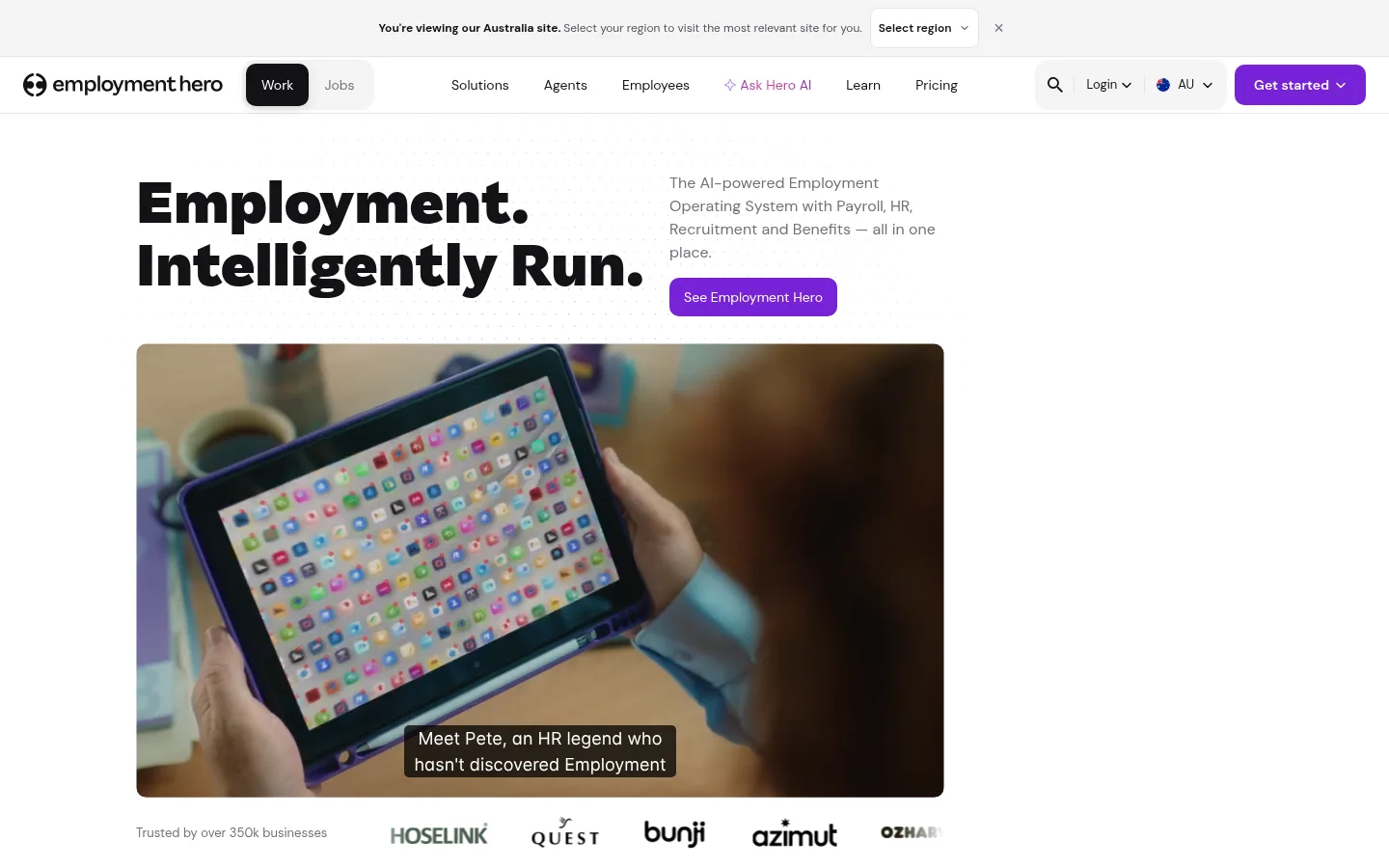
A crisp white foundation gives the page a bright, open feel, while near-black typography creates strong contrast and a confident tone. Purple is the unmistakable action colour: it marks the main buttons, selected brand surfaces, and the full-width closing banner. DM Sans handles navigation, body copy, and utility text; the heavier, distinctive Saiga display face gives the hero and key section headings their character. The hero pairs a large headline with a compact explanatory column, then anchors the opening with a broad, rounded video and a restrained customer-logo strip. Farther down, compact filters and a varied card feed create a more information-dense rhythm without abandoning white space. Fine neutral borders and soft-gray bands organize content instead of heavy shadows. The FAQ and statistics return to calm, structured layouts, before a vivid purple CTA and nearly black footer create a strong finish.
Navigation, body copy, labels, buttons, links, and captions
Aa 设计
Saiga
网络字体 · 字重 400 / 900 / 800 · 占比 16%
免费替代:Outfit
Display headings, especially the hero headline and prominent section titles
角色
示例
字号
字重
行高
字距
一级标题
Hero headline and primary display heading.
The quick brown fox 敏捷的狐狸
18px
400
1.2
0
正文
Paragraphs, resource descriptions, and supporting content.
The quick brown fox 敏捷的狐狸
14px
400
1.43
0
辅助文字
Small metadata and image or card captions.
The quick brown fox 敏捷的狐狸
12px
400
1.3
0
按钮
CTA labels and compact action controls.
The quick brown fox 敏捷的狐狸
12px
400
1.33
0
导航
Primary navigation and utility menu labels.
The quick brown fox 敏捷的狐狸
14px
400
1.43
0
链接
Text links and resource-card titles.
The quick brown fox 敏捷的狐狸
14px
400
1.43
0
眉题
Uppercase category labels and section overlines.
The quick brown fox 敏捷的狐狸
11px
700
1
0.073em
间距与布局
基准单位 2px · 密度:适中
60px版块间距
6px元素间距
26px卡片内边距
—内容最大宽度
4px
5px
6px
7px
8px
10px
11px
12px
14px
15px
16px
20px
24px
The desktop page uses a centered content region, with the hero and resource feed visibly narrower than the full viewport. A slim announcement strip sits above the full-width navigation. The hero aligns its large headline and short copy side by side, then places a broad video below. The resource area uses a dense, variable-width card grid with filters across its top. FAQ and statistics sections become simpler and more open, while the CTA and footer span the page width. Spacing moves from comfortable hero breathing room to compact card-feed rhythm.
圆角与层次
按钮 · 8px
卡片 · 16px
图片 · 50%
徽标 · 9999px
导航 · 14px
链接 · 8px
md · button
The visual system is mostly flat. Light neutral hairlines separate navigation and card content, with soft gray surfaces used for grouping. Rounded controls and media edges give the interface polish without making cards feel raised. The measured medium shadow appears on buttons, but the screenshot keeps elevation restrained; use dark overlays only on video captions and media.
组件
下面的预览按实测的按钮、输入框、徽标、卡片样式重建(字体用替代字体)。
Announcement strip
A narrow, light regional notice above the main navigation, with a region selector and dismiss control.
Primary navigation
Full-width white bar with logo, selected dark Work tab, navigation links, utility controls, and a violet Get started button.
Hero
Large bold Saiga headline beside compact supporting copy and a violet See Employment Hero action; wide rounded video follows.
Resource filters
Compact category tabs and a filter affordance above a search-style input with a thin neutral outline.
Resource feed
Dense, mixed-size card grid combining video thumbnails, article imagery, category badges, titles, and metadata.
FAQ and proof points
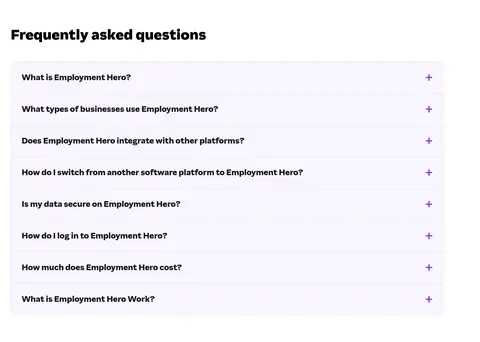
Accordion rows with fine dividers, followed by a centered heading and a row of prominent percentage metrics.
Closing banner and footer
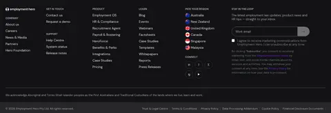
Full-width violet campaign CTA with character artwork transitions into a dark multi-column footer.
Imagery · The opening is led by a wide photographic video showing people using workplace technology, with a dark caption overlay at its base. Customer logos act as a quiet trust strip. Below, resource cards mix video thumbnails, workplace photography, and text-led stories in varied aspect ratios. The closing purple banner includes a playful illustrated character; treat it as a single campaign asset, not a general illustration system.
Reserve Hero Violet (#7622d7) for prominent actions and branded moments.
Set display headlines in Saiga and interface copy in DM Sans.
Give the hero video a broad, rounded frame.
Use thin neutral dividers to structure dense content.
Vary resource card widths while keeping their text legible.
✕ 不该做
Do not turn every section into a purple panel.
Do not use heavy shadows as the main card separator.
Do not apply display typography to long body copy.
Do not force the resource feed into uniform cards.
Do not treat badge colours as primary brand colours.
Do not crowd the opening hero with extra controls.
给 AI 的提示词
想快速出一个同风格的新页面,把这段话连同 DESIGN.md 一起发给 AI。
Build a new Employment Hero page that preserves the site's bright, practical SaaS identity. Use Gallery White (#ffffff) as the main canvas, Headline Black (#000000) for bold display copy, and Hero Violet (#7622d7) for key actions and selected brand moments. Set short headlines in Saiga, with DM Sans for navigation, body text, labels, and buttons. Keep the top navigation and announcement strip compact; give the hero a strong headline, concise support copy, and a prominent rounded media frame. Organize detailed material with fine Quiet Divider (#e4e4e7) borders and Cloud Surface (#f4f4f5) grouping. Let content cards vary in width and media ratio, then simplify lower sections into FAQ rows and proof-point statistics. Finish with a violet CTA and dark footer. Keep elevation restrained and preserve comfortable spacing around major sections.