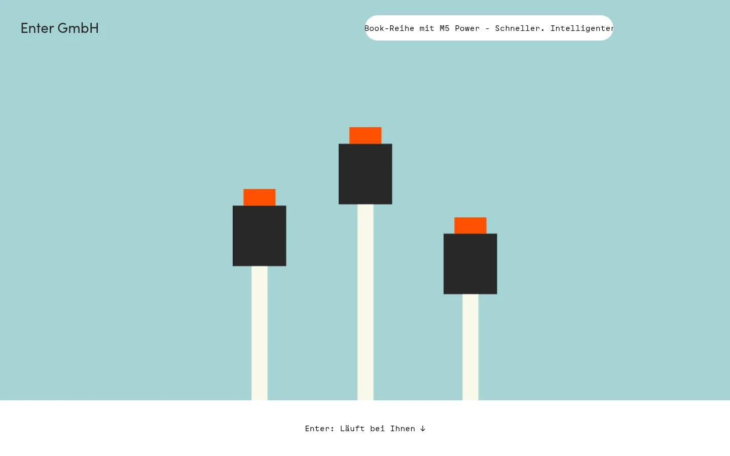
Enter GmbH以留白充足、文字为主的首页展示IT服务,并搭配简洁的几何插画。柔和的水绿色与暖米白色区块穿插亮橙色点缀,服务和客户信息则保持直白易读。
North star · Pair broad, quiet color fields and spacious content blocks with precise monospace typography and simple flat geometric illustrations.
The page uses a calm palette of aqua, white, warm off-white, charcoal, and a concentrated signal orange. White is the main reading canvas; broad, full-width color bands divide the homepage and carry oversized geometric illustrations. Orange is strongest in the server-like hero motif and the partner section, so it functions as an expressive accent rather than a routine button color. Body copy and links use Maax Mono, giving even ordinary service descriptions a technical, measured character; Sofia-Regular softens the prominent hero text. The layout alternates a centered visual statement with left-aligned informational content, service columns, client stories, partner marks, and a compact dark footer. Generous vertical pauses separate these blocks, while thin rules and small text details keep the content practical. Illustrations are flat, schematic, and built from simple shapes, not photographic imagery or layered effects.
Main body copy, links, navigation and compact details throughout the page.
Aa 设计
Sofia-Regular
网络字体 · 字重 400 · 占比 12%
免费替代:DM Sans
Prominent hero heading or brand statement.
角色
示例
字号
字重
行高
字距
一级标题
Prominent hero statement and primary page introduction.
Enter GmbH
28px
400
1.36
0
二级标题
Service and content-block headings.
The quick brown fox 敏捷的狐狸
20px
700
1.15
0
正文
Service descriptions, client stories, and footer information.
The quick brown fox 敏捷的狐狸
16px
400
1.6
0
链接
Inline actions, navigation, and client-story links.
The quick brown fox 敏捷的狐狸
16px
400
1.6
0
代码
Monospace utility text where a code-like role is needed.
const style = 1;
16px
400
1.6
0
间距与布局
基准单位 4px · 密度:宽松
100px版块间距
13px元素间距
—卡片内边距
785px内容最大宽度
6px
12px
13px
16px
20px
24px
28px
30px
48px
60px
80px
100px
120px
180px
Use broad, full-width horizontal bands and a measured content area capped at 785px. The first screen is a tall, centered hero, followed by a white introduction with text and a compact link list. Continue with illustration bands, a three-column service grid, then editorial client content and partner marks. Keep text left-aligned within content blocks, leaving generous vertical gaps between sections. Finish with a three-column charcoal footer. The overall density is spacious, with small typographic details balanced by substantial empty canvas.
圆角与层次
链接 · 9999px
没有测到阴影:页面是扁平的,层次靠底色和描边区分。
Keep the interface essentially flat: measurements report no shadows, gradients, or card treatments. Distinguish content through white space, full-width background bands, and occasional fine gray hairlines. The white announcement pill and links are simple exceptions, not cues for a layered card system.
组件
下面的预览按实测的按钮、输入框、徽标、卡片样式重建(字体用替代字体)。
Hero and announcement
Full-width aqua opening with brand text at upper left, a compact white rounded announcement near the top, and centered geometric artwork.
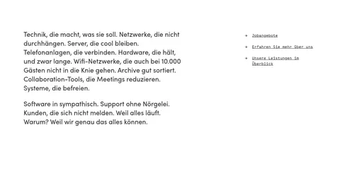
Intro and link list
White reading section pairing a descriptive copy block with a short list of black monospace links.
Illustration bands
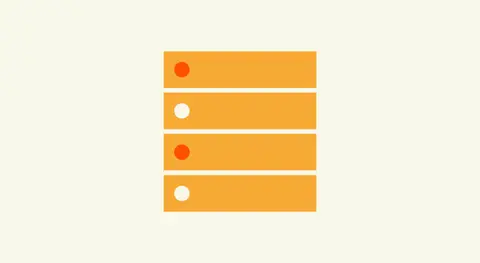
Full-width aqua, warm off-white, and orange fields, each carrying one centered, flat geometric motif.
Service grid
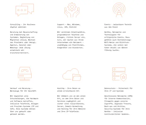
Six service descriptions in three columns, each led by a small outlined icon and followed by a concise heading and text.
Client stories
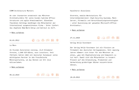
White editorial feed with client names, short descriptions, small linked actions, dates, and fine separators.
Partner marks
White section displaying partner logos in a loose three-column arrangement with ample breathing room.
Footer
Charcoal full-width footer split into three columns for navigation, contact details, and certification information.
Imagery · Use flat geometric vector-style illustrations rather than product photography. The hero uses three simple upright forms against aqua; later bands contain a stacked server motif, a signal/radio motif, and a repeated-dot composition. Keep shapes crisp, sparse, and centered within their colored fields. Small line icons support the six service entries, while client and partner areas use supplied-style logos and compact editorial details.
Use #a5d3d4 for the defining hero and illustration fields.
Reserve #ff5000 for a few strong visual accents or illustrated bands.
Set body copy and links in a restrained monospace style.
Separate content with generous vertical space and broad color bands.
Keep illustrations geometric, flat, and centered.
Use thin rules only where editorial content needs separation.
✕ 不该做
Do not add gradients, heavy shadows, or floating card stacks.
Do not turn every link or content heading orange.
Do not crowd the service grid or reduce the spacious section rhythm.
Do not substitute glossy photography for the schematic illustration style.
Do not overdecorate the typography with bold or uppercase styling.
Do not use charcoal as the dominant page canvas outside the footer.
给 AI 的提示词
想快速出一个同风格的新页面,把这段话连同 DESIGN.md 一起发给 AI。
Build a new Enter GmbH page with a spacious, editorial IT-services feel. Use #a5d3d4 Soft Aqua for the hero and selected full-width visual bands, #ffffff Gallery White as the main reading canvas, and #f9f8ea Warm Porcelain for a quiet illustration section. Keep #ff5000 Signal Orange concentrated in artwork or a single emphatic band; use #000000 Pure Ink for text and #282828 Charcoal for dark details and the footer. Set body copy and links in Maax Mono or a close monospace substitute, with a softer regular sans for the lead statement. Organize content into wide horizontal sections, left-aligned reading blocks, and simple columns. Favor crisp flat geometric vector art, restrained hairlines, and generous vertical pauses. Avoid shadows, gradients, dense cards, and decorative UI chrome.