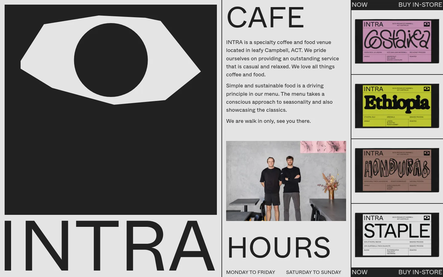
Intra 首页以克制的黑白灰配色、超大字体和紧凑的杂志式网格呈现咖啡馆形象。醒目的图形标志与彩色咖啡包装形成点睛对比,但整体仍保持冷静、实用的气质。
North star · Keep the interface monochrome and flat, letting oversized typography and the editorial grid do the visual work.
The page is built from a tight monochrome vocabulary: #e4e4e4 fills the canvas, while #212121 anchors text, graphic fields, outlines, and dividers. There is no measured accent colour, so the bright pink and yellow visible on the coffee packaging should be treated as image content, not as interface colour. Whyte supplies a single, consistent sans-serif voice. The display treatment is exceptionally large and uppercase, while body copy stays readable and conversational. A three-column composition creates distinct editorial zones: a dominant logo panel, a central cafe introduction and hours, and a narrow stack of product artwork. Hairline-like dark rules define the columns and product rows; the layout relies on boundaries and contrast rather than shadows or rounded cards. Generous canvas areas around the large marks balance the relatively dense text and image content.
Used throughout for the oversized display lettering, cafe description, hours, and compact labels.
角色
示例
字号
字重
行高
字距
特大标题
Oversized uppercase wordmarks and section labels, including CAFE and INTRA.
Intra
95px
400
1
0
正文
Cafe introduction and supporting descriptive paragraphs.
The quick brown fox 敏捷的狐狸
17.5px
400
1.5
0
辅助文字
Hours labels and compact uppercase utility text.
The quick brown fox 敏捷的狐狸
16px
400
1.5
0
间距与布局
基准单位 2px · 密度:适中
50px版块间距
—元素间距
—卡片内边距
—内容最大宽度
10px
15px
20px
40px
50px
A full-width editorial grid divides the page into three vertical zones: a broad brand panel, a central information column, and a slim product-art column. The central column stacks the cafe introduction, a staff photograph, and hours; the right column repeats framed product panels. Alignment is firm and mostly flush to column edges, with dark rules separating content. Preserve the measured comfortable density and open canvas; no maximum width was measured, so do not impose one.
圆角与层次
没有测到阴影:页面是扁平的,层次靠底色和描边区分。
The design is flat, with no measured shadows or rounded corners. Dark outlines and column boundaries provide separation, and the large dark logo panel creates contrast through colour blocking rather than elevation. Maintain crisp edges and avoid floating-card effects.
组件
下面的预览按实测的按钮、输入框、徽标、卡片样式重建(字体用替代字体)。
Brand panel
Large dark rectangular field containing a light graphic mark, paired with oversized INTRA lettering on the light canvas.
Cafe introduction
Central text block led by an oversized uppercase CAFE label, followed by short, left-aligned paragraphs.
Staff photograph
Rectangular documentary-style team image placed beneath the introduction in the central column.
Hours block
Large uppercase HOURS heading with compact weekday and weekend labels beneath it.
Coffee artwork rail
Stacked product images in the narrow right column, separated by crisp dark horizontal rules.
Utility strip
Compact dark top and bottom bars with light uppercase labels such as NOW and BUY IN-STORE.
Imagery · Photography is documentary and direct: a staff portrait appears within the central column, while the large left panel contains a stark eye-like graphic mark. Repeated coffee-package images form the right-hand strip; their pink, yellow, and muted colours belong to the packaging artwork rather than the interface palette. Keep image crops rectangular and treatments unembellished.
Do not treat packaging colours as brand UI colours.
Do not center all content into a single column.
Do not use multiple type families or heavy weights.
给 AI 的提示词
想快速出一个同风格的新页面,把这段话连同 DESIGN.md 一起发给 AI。
Build a new Intra-style page with the same restrained editorial character. Use Gallery Grey (#e4e4e4) for the canvas and Roast Ink (#212121) for text, graphic blocks, and dividers; do not add interface accent colours. Set type in Whyte or a close free alternative such as Manrope, using regular weight, very large uppercase display labels, and clear conversational body copy. Organize content in a strong asymmetrical multi-column grid, with a dominant visual panel, a central information area, and a narrower image or product rail where useful. Keep photography rectangular and documentary. Separate areas with crisp dark rules rather than shadows, rounded cards, or gradients. Allow breathing room around large graphics while keeping supporting information compact and legible.