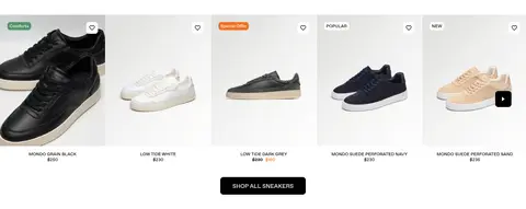
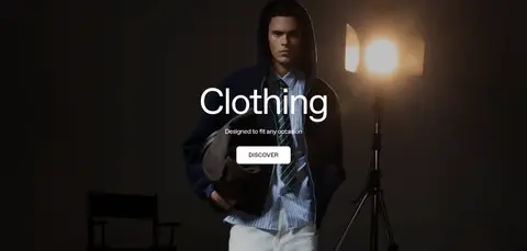
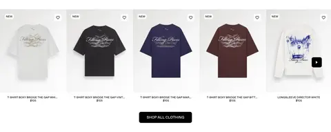
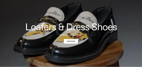
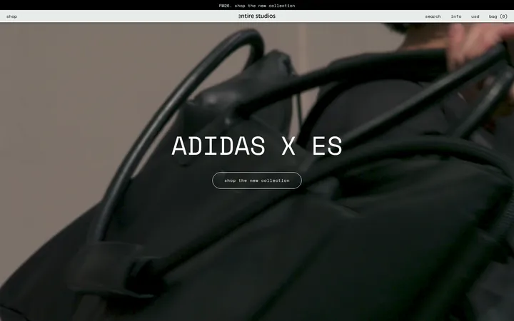
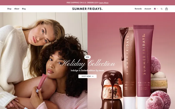
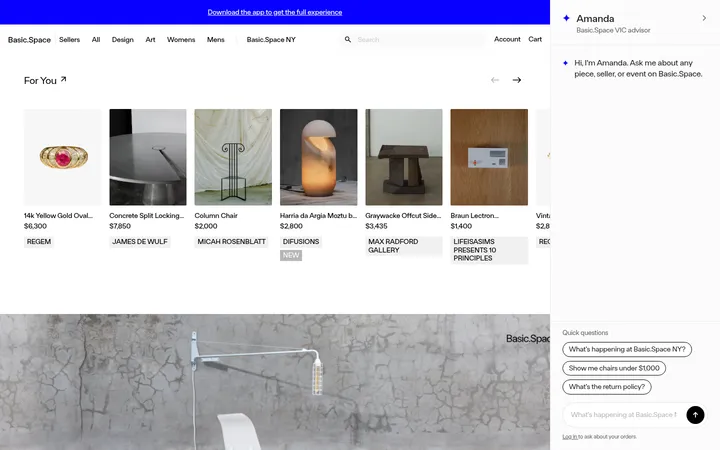
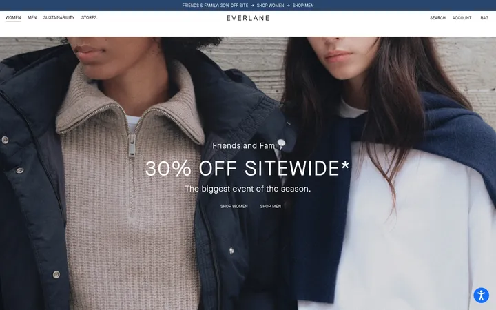
North star · Let monochrome interface structure recede so editorial fashion photography and shoppable product imagery lead every section.
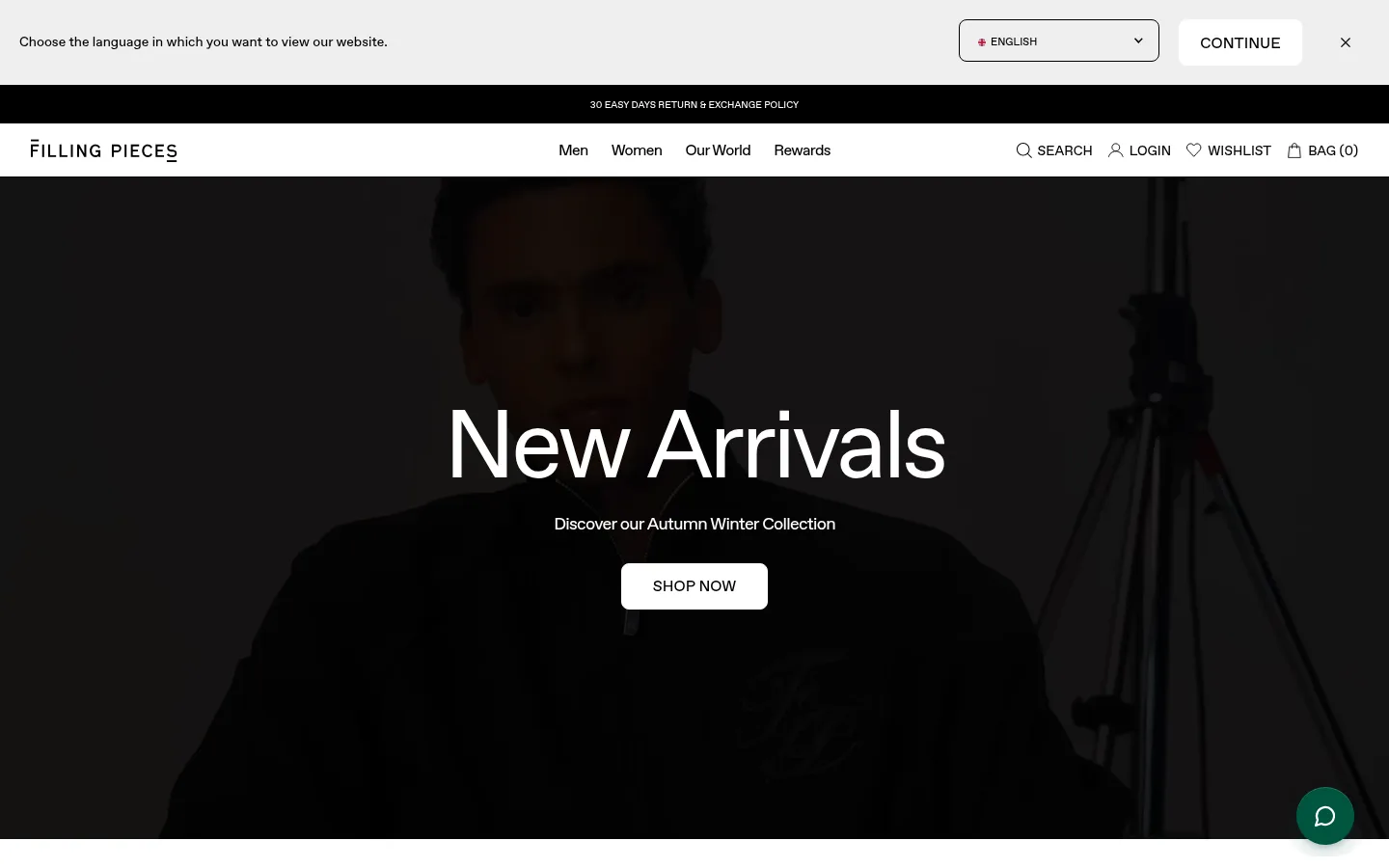
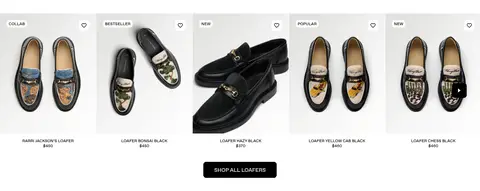
The page is grounded in white product sections, black navigation and promotional bands, and a pale gray language-selection strip. The measured palette is deliberately narrow; the teal chat control and colours inside garments or campaign footage are incidental rather than core interface colours. Favorit typography gives the page a clean, contemporary voice: oversized, light-feeling category headlines sit over imagery, while compact navigation, captions, and product labels stay quiet. The layout alternates cinematic full-width category panels with dense, five-item product rails and paired editorial tiles. Product photos are isolated against white, allowing silhouettes and material to carry colour. Generous image areas and clear section changes create an editorial rhythm without decorative framing. Buttons are simple, rounded rectangles with strong black-and-white contrast, while thin borders and restrained card chrome keep attention on footwear, apparel, and campaign photography.
配色
点色块复制色值。用途说明来自对页面的实测位置(背景、文字、描边、按钮)与截图判读。
品牌色
表层色
中性色
页面底色 · Soft Concrete表层 · Mist Grey表层 2 · Gallery White主文字 · Studio Ink次要文字 · Gallery White描边 · Gallery White
文字
背景
对比度
WCAG
#000000 Studio Ink
#efefef Soft Concrete
18.26:1
AAA
#000000 Studio Ink
#bfbfbf Mist Grey
11.42:1
AAA
#000000 Studio Ink
#ffffff Gallery White
21:1
AAA
#ffffff Gallery White
#efefef Soft Concrete
1.15:1
不达标
#ffffff Gallery White
#bfbfbf Mist Grey
1.84:1
不达标
字体
字号阶梯:Custom(比例约 2.5,正文 16px)。示例用免费替代字体渲染,数值为实测。
Aa 设计
favorit
网络字体 · 字重 400 / 600 / 700 · 占比 100%
免费替代:Inter
All page typography, including display headlines, navigation, product labels, and controls.
角色
示例
字号
字重
行高
字距
特大标题
Large campaign or category headline layered over full-bleed imagery.
Filling Pieces
100px
600
0.9
-0.04em
一级标题
Primary page or section headline, centered in editorial feature panels.
Filling Pieces
35px
400
0.9
-0.04em
正文
Supporting descriptions and short campaign or category copy.
The quick brown fox 敏捷的狐狸
16px
400
1.2
0
辅助文字
Product names, prices, badges, and small supporting labels.
The quick brown fox 敏捷的狐狸
12px
400
1.2
0
按钮
Compact uppercase action labels on shop and discovery controls.
The quick brown fox 敏捷的狐狸
12px
400
1.2
0
导航
Header navigation and utility links.
The quick brown fox 敏捷的狐狸
14px
400
1.2
0
间距与布局
基准单位 8px · 密度:适中
48px版块间距
4px元素间距
—卡片内边距
1400px内容最大宽度
4px
6px
8px
16px
20px
24px
32px
48px
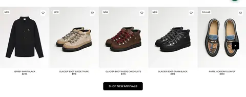
Use a full-width page canvas with a centered header system and broad image-led sections. Product rails form a dense five-column presentation, with each product image, small status label, name, and price aligned consistently. Alternate these rails with tall full-bleed category features and two-column editorial blocks. Keep headline and CTA groups centered over campaign media. The measured page max width is 1400px; section rhythm is comfortable, with clear transitions rather than boxed cards.
圆角与层次
按钮 · 8px
输入框 · 8px
图片 · 36px
没有测到阴影:页面是扁平的,层次靠底色和描边区分。
The interface is mostly flat, with white backgrounds and little card decoration. Use thin borders where controls or section divisions need definition, and avoid prominent shadows. Campaign media can sit behind overlaid text, with a restrained darkening treatment rather than elevated panels. Buttons are rounded, simple, and defined primarily by their black or white fill.
组件
下面的预览按实测的按钮、输入框、徽标、卡片样式重建(字体用替代字体)。
Utility and language bar
Pale gray top strip with language selection, a white CONTINUE button, and a close control; use a black hairline-like promotional band beneath it.
Primary navigation
White header with wordmark at left, centered category links, and search, account, wishlist, and bag utilities at right.
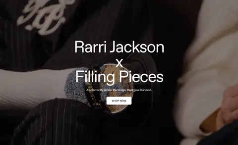
Campaign hero
Full-bleed darkened fashion image with a large centered headline, short supporting line, and compact white SHOP NOW control.
Product rail
Five evenly aligned product tiles on white, with large product imagery, small badges or wishlist icons, concise names, and prices.
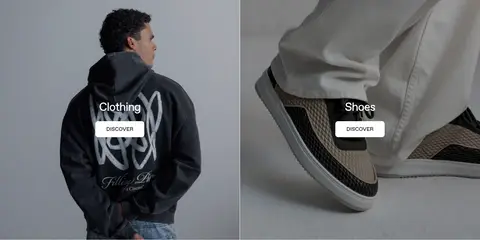
Category feature
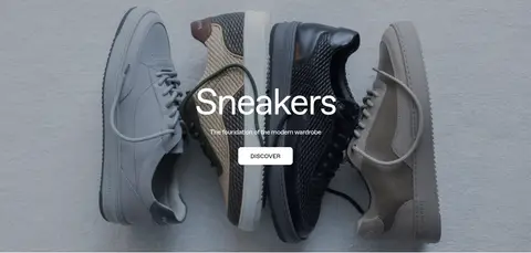
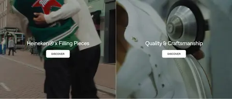
Full-width fashion image with centered category headline, brief descriptor, and a small white DISCOVER button.
Editorial split tiles
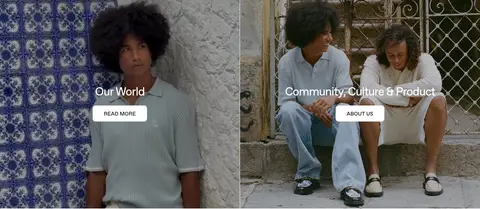
Two side-by-side image panels with centered title and white action button; imagery carries the story rather than added framing.
Footer and service strip
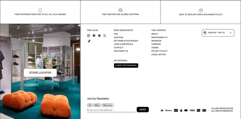
Service promises sit above a multi-column footer containing store imagery, links, locale controls, newsletter form, and payment marks.
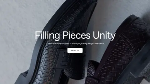
Imagery · Use fashion and product photography as the principal visual content: isolated shoes and apparel on bright neutral backgrounds, plus cinematic campaign footage or stills with models, craft, and lifestyle context. Full-bleed panels use centered white type and a subtle darkened image treatment for legibility. Product imagery stays crisp and evenly presented; colour in the photography should not expand the interface palette.
Use white product sections and black text as the default.
Reserve full-bleed media for campaign and category storytelling.
Center concise headlines and calls to action over feature imagery.
Keep product rails orderly, image-led, and easy to scan.
Use Favorit or a close neutral sans-serif substitute.
Make buttons visually simple with clear black-and-white contrast.
✕ 不该做
Do not introduce bright interface colours beyond the measured palette.
Do not add decorative gradients, heavy shadows, or card chrome.
Do not let campaign text overwhelm the photography.
Do not crowd product tiles with long descriptions.
Do not use playful display type or excessive uppercase styling.
Do not treat incidental photo colours as brand UI colours.
给 AI 的提示词
想快速出一个同风格的新页面,把这段话连同 DESIGN.md 一起发给 AI。
Build a new Filling Pieces page as a restrained fashion storefront. Use Gallery White (#ffffff) for the main shopping canvas, Studio Ink (#000000) for typography and strong actions, Soft Concrete (#efefef) for pale utility surfaces, and Mist Grey (#bfbfbf) only as a quiet secondary surface. Use Favorit or Inter, with compact navigation and labels contrasted against large, centered editorial headlines. Structure content as alternating full-width campaign imagery, clean product grids, and paired editorial tiles. Keep product presentation bright and consistent, with imagery, names, prices, and small status labels. Use simple rounded black or white buttons, minimal borders, and almost no elevation. Make media carry the mood; keep interface decoration subordinate and ensure overlaid text remains legible.