Fold 用浅灰白背景、深海军蓝文字和俏皮手绘插画,让个人财务管理显得轻松易懂。长页面在产品界面展示与简洁文案之间切换,并以一段深蓝色区块形成视觉对比。
North star · Keep the interface calm and spacious, letting deep-navy typography and playful product imagery make personal finance feel human.
Fold builds a distinctive fintech identity from a restrained palette and an unusually playful illustration style. White and cool pale gray-lavender establish the page canvas and broad section bands; deep navy carries the logo, large headings, and body text, while muted slate tones soften supporting copy. Blue is reserved for links and selective calls to action rather than spread across the interface. GT Walsheim Pro gives headlines a rounded, confident presence: oversized bold display text is tightly tracked, while body copy stays regular and readable. The layout is a long, centered editorial journey, combining two-column product stories with open, single-column pauses and broad white stretches around interface mockups. The opening illustration uses humorous everyday objects to set a human tone; later sections rely on layered app screens, transaction cards, and small explanatory illustrations. Rounded cards, fine borders, and restrained navy-tinted shadows make the product feel tactile without overpowering the airy page.
配色 点色块复制色值。用途说明来自对页面的实测位置(背景、文字、描边、按钮)与截图判读。
品牌色
Fold Navy
#20294c
Primary text, large headings, navigation, and the contrasting dark feature section.
强调色
Banking Blue
#0a2d67
Dark blue button and interface text accents, including the pale iOS app control.
Signal Blue
#459af8
Inline links and the single bright manifesto CTA; use sparingly for emphasis.
表层色
Gallery White
#ffffff
Main canvas and large white section bands; also appears in card details and on the blue manifesto CTA.
Cloud Lavender
#f0f1f5
Opening hero canvas, soft section backgrounds, and pale app cards and controls.
中性色
Muted Iris
#676b89
Secondary text and navigation details, providing softer contrast than primary navy.
Mist Border
#c7cbdb
Fine outlines on buttons, cards, and framed product media.
Hushed Lilac
#979db5
Low-emphasis text and minor interface details, not a primary text color.
Powder Slate
#bbc6dc
Subtle borders and interface details, mostly within app mockups.
Soft Ash
#dddfe9
Occasional faint card, text, and decorative details against the white canvas.
功能色
Slate Periwinkle
#788dba
Occasional button outline and minor interface detail; not a dominant page color.
Deep Teal
#042939
Measured mainly inside product media; treat as mockup detail rather than a core page color.
文字 背景 对比度 WCAG #20294c Fold Navy#ffffff Gallery White14.16:1 AAA #20294c Fold Navy#f0f1f5 Cloud Lavender12.55:1 AAA #676b89 Muted Iris#ffffff Gallery White5.2:1 AA #676b89 Muted Iris#f0f1f5 Cloud Lavender4.6:1 AA #676b89 Muted Iris#20294c Fold Navy2.72:1 不达标 #ffffff Gallery White#f0f1f5 Cloud Lavender1.13:1 不达标
字体 字号阶梯:Perfect Fifth(比例约 1.557,正文 17px)。示例用免费替代字体渲染,数值为实测。
Aa 设计
GT Walsheim Pro 网络字体 · 字重 400 / 600 / 700 · 占比 100%
免费替代:Nunito Sans
Site-wide type for headings, body copy, navigation, links, and controls.
角色 示例 字号 字重 行高 字距 特大标题 Oversized hero and expressive statement headlines.
Fold
100px 700 0.85 -0.03em 一级标题 Primary hero and major feature headlines.
Fold
64px 700 0.91 -0.03em 二级标题 Secondary section headings and feature titles.
The quick brown fox 敏捷的狐狸
26px 400 1.19 0 三级标题 Supporting feature headings and explanatory blocks.
The quick brown fox 敏捷的狐狸
24px 400 1.5 0 正文 Paragraphs describing the app and its finance features.
The quick brown fox 敏捷的狐狸
17px 400 1.41 0 辅助文字 Small explanatory labels and supporting interface copy.
The quick brown fox 敏捷的狐狸
16px 400 1.5 0 按钮 App download and prominent action controls.
The quick brown fox 敏捷的狐狸
18px 600 1.33 0 链接 Inline text links and emphasized feature references.
The quick brown fox 敏捷的狐狸
24px 400 1.5 0 眉题 Compact uppercase labels introducing content sections.
The quick brown fox 敏捷的狐狸
17px 600 1.18 0.04em
间距与布局 基准单位 8px · 密度:适中
48px 版块间距
8px 元素间距
12px 卡片内边距
1400px 内容最大宽度
6px
7px
8px
12px
16px
24px
32px
48px
100px
Use a centered long-form page with a measured maximum content width of 1400px and a comfortable density. The hero is centered, while product stories switch between two-column layouts and broader media-led presentations. Feature content can use four-column groupings, but keep each item visually light. Maintain generous section pauses and measured section rhythm; some sections transition from pale lavender to white, while the later financial-dashboard section uses a full-width navy band. Align headlines and copy to each section’s story rather than forcing a uniform grid.
圆角与层次 lg · card, other, media
sm · button
md · media, text
md · card, other
The page is mostly flat, with fine cool-gray outlines around controls and selective soft shadows beneath cards and product mockups. Use navy-tinted shadows to lift media gently from the white canvas. Large rounded product cards supply depth through layering rather than heavy borders or dramatic effects.
组件 下面的预览按实测的按钮、输入框、徽标、卡片样式重建(字体用替代字体)。
App download control Pale gray-lavender button with navy text, a fine border, an 8px radius, and a restrained shadow.
Manifesto CTA Single bright blue, pill-shaped action with white semibold type; reserve this treatment for a key editorial action.
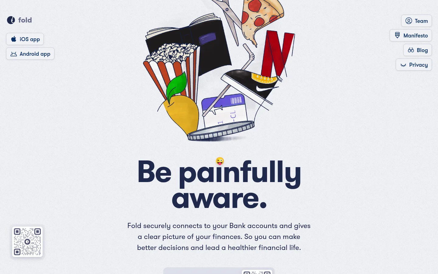
Hero illustration Playful hand-drawn collage centered above the headline, with small everyday objects suggesting spending and money.
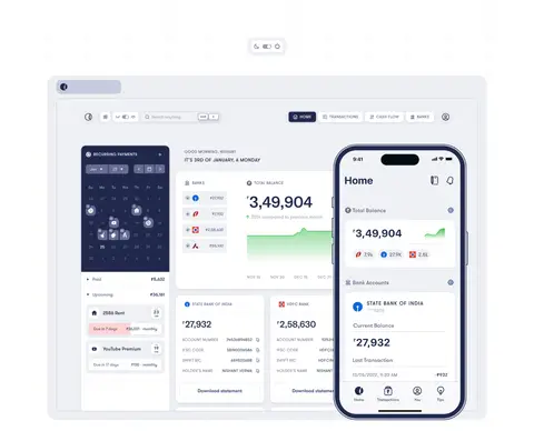
App showcase card Large layered desktop and phone interface mockups on pale surfaces, using softly rounded media frames and a subtle shadow.
Feature split Pair product imagery with a bold navy heading and compact explanatory copy; alternate which side carries the visual.
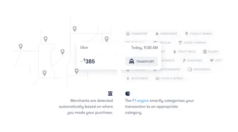
Transaction item Compact white transaction rows with merchant, date, amount, and category details, presented as a tidy app interface.
Imagery · Lead with a humorous hand-drawn collage of everyday spending objects, then show realistic app and web-dashboard mockups. Mix isolated phone screens, transaction lists, and explanatory interface illustrations with ample surrounding white space. Keep imagery crisp and lightly framed; colorful illustration details belong inside the artwork, not the core brand palette.
页面版块 共 8 个版块,按页面从上到下排列,每个都标了类型、布局和交互套路。
该做与不该做 ✓ 该做 Use the measured palette hex values exactly. Give large headings a bold, tightly tracked navy treatment. Keep broad sections white or pale lavender. Use bright blue links and calls to action sparingly. Pair product UI with concise, human explanatory copy. Allow illustration details to add humor and color. ✕ 不该做 Do not add unmeasured colors to the page UI. Do not crowd the hero or product mockups. Do not make every section a card grid. Do not use bright blue for large background areas. Do not treat mockup-only colors as core brand colors. Do not add heavy borders or dramatic shadows. 给 AI 的提示词 想快速出一个同风格的新页面,把这段话连同 DESIGN.md 一起发给 AI。
复制 Build a new Fold-style fintech page as a spacious editorial experience, not a dense dashboard. Use Gallery White (#ffffff) and Cloud Lavender (#f0f1f5) for broad backgrounds, Fold Navy (#20294c) for headings and primary text, Muted Iris (#676b89) for supporting copy, and Signal Blue (#459af8) only for selective links or a key CTA. Set type in GT Walsheim Pro or a close rounded sans-serif substitute, with bold, tightly tracked display headings. Alternate centered statements with two-column product stories and layered app mockups. Use playful hand-drawn illustration alongside credible finance interfaces. Keep controls and cards softly rounded, outlines fine, and shadows restrained and navy-tinted. Preserve generous whitespace and use a single dark navy section for contrast.
DESIGN.md Tailwind v4 CSS 变量 Design Tokens
---
title: "Fold design system"
variant: extended
source: https://fold.money/
captured_at: 2026-10-12
theme: light
industry: fintech
generator: Design DNA (https://four.wiralomi.com/style/fold-money)
ai_generated: true
ai_label: "本文件由 AI 辅助生成:数值取自公开网页的实测样式,命名、用途说明与建议为模型解读。商标归原所有者。 / AI-assisted content"
---
# Fold · Design System
> Clear-minded finance with a playful edge
**Theme:** light · **Industry:** fintech · **Source:** https://fold.money/ · **Captured:** 2026-10-12 (1440×900 desktop)
_AI-assisted content: values are measured from the public page at capture time; names, roles and guidance are model-written interpretations. Trademarks belong to their owners._
Fold pairs a calm, pale canvas with deep navy typography and playful hand-drawn imagery to make personal finance feel approachable. The long-form homepage alternates product demonstrations and concise editorial copy, with a single dark navy section providing contrast.
## North star
Keep the interface calm and spacious, letting deep-navy typography and playful product imagery make personal finance feel human.
## Overview
Fold builds a distinctive fintech identity from a restrained palette and an unusually playful illustration style. White and cool pale gray-lavender establish the page canvas and broad section bands; deep navy carries the logo, large headings, and body text, while muted slate tones soften supporting copy. Blue is reserved for links and selective calls to action rather than spread across the interface. GT Walsheim Pro gives headlines a rounded, confident presence: oversized bold display text is tightly tracked, while body copy stays regular and readable. The layout is a long, centered editorial journey, combining two-column product stories with open, single-column pauses and broad white stretches around interface mockups. The opening illustration uses humorous everyday objects to set a human tone; later sections rely on layered app screens, transaction cards, and small explanatory illustrations. Rounded cards, fine borders, and restrained navy-tinted shadows make the product feel tactile without overpowering the airy page.
## Colors
| Name | Hex | Token | Group | Role |
|---|---|---|---|---|
| Gallery White | ` | `--color-gallery-white` | surface | Main canvas and large white section bands; also appears in card details and on the blue manifesto CTA. |
| Fold Navy | ` | `--color-fold-navy` | brand | Primary text, large headings, navigation, and the contrasting dark feature section. |
| Cloud Lavender | ` | `--color-cloud-lavender` | surface | Opening hero canvas, soft section backgrounds, and pale app cards and controls. |
| Banking Blue | ` | `--color-banking-blue` | accent | Dark blue button and interface text accents, including the pale iOS app control. |
| Slate Periwinkle | ` | `--color-slate-periwinkle` | semantic | Occasional button outline and minor interface detail; not a dominant page color. |
| Muted Iris | ` | `--color-muted-iris` | neutral | Secondary text and navigation details, providing softer contrast than primary navy. |
| Signal Blue | ` | `--color-signal-blue` | accent | Inline links and the single bright manifesto CTA; use sparingly for emphasis. |
| Mist Border | ` | `--color-mist-border` | neutral | Fine outlines on buttons, cards, and framed product media. |
| Deep Teal | ` | `--color-deep-teal` | semantic | Measured mainly inside product media; treat as mockup detail rather than a core page color. |
| Hushed Lilac | ` | `--color-hushed-lilac` | neutral | Low-emphasis text and minor interface details, not a primary text color. |
| Powder Slate | ` | `--color-powder-slate` | neutral | Subtle borders and interface details, mostly within app mockups. |
| Soft Ash | ` | `--color-soft-ash` | neutral | Occasional faint card, text, and decorative details against the white canvas. |
### Semantic aliases
`--color-canvas` → ` (Gallery White) · `--color-surface` → ` (Cloud Lavender) · `--color-surface-2` → ` (Fold Navy) · `--color-text` → ` (Fold Navy) · `--color-text-muted` → ` (Muted Iris) · `--color-text-subtle` → ` (Gallery White) · `--color-border` → ` (Mist Border) · `--color-accent` → ` (Banking Blue) · `--color-accent-2` → ` (Signal Blue)
### Contrast (WCAG 2.x)
| Text | Background | Ratio | Level |
|---|---|---|---|
| ` | ` | 14.16:1 | AAA |
| ` | ` | 12.55:1 | AAA |
| ` | ` | 5.2:1 | AA |
| ` | ` | 4.6:1 | AA |
| ` | ` | 2.72:1 | fail |
| ` | ` | 1.13:1 | fail |
| ` | ` | 14.16:1 | AAA |
| ` | ` | 13.26:1 | AAA |
| ` | ` | 11.75:1 | AAA |
| ` | ` | 1.07:1 | fail |
### Gradients
- `radial-gradient(35% 30% at 50% 100%, rgb(240, 241, 245) 0%, rgba(0, 0, 0, 0) 100%)`
- `linear-gradient(rgb(240, 241, 245), rgba(240, 241, 245, 0))`
- `linear-gradient(to top, rgb(240, 241, 245), rgba(240, 241, 245, 0))`
- `linear-gradient(to top, rgb(255, 255, 255), rgba(255, 255, 255, 0.95), rgba(255, 255, 255, 0))`
## Typography
| Family | Token | Source | Weights | Role | Free substitute |
|---|---|---|---|---|---|
| GT Walsheim Pro | `--font-body` | webfont | 400, 600, 700 | Site-wide type for headings, body copy, navigation, links, and controls. | Nunito Sans |
- **GT Walsheim Pro:** Use regular for copy and 600–700 for emphasis; display headings are bold, tightly tracked, and often centered.
### Type scale — Perfect Fifth (ratio ≈ 1.557, base 17px)
| Role | Size | Weight | Line height | Letter spacing | Case | Family | Used for |
|---|---|---|---|---|---|---|---|
| display | 100px | 700 | 0.85 | -0.03em | — | GT Walsheim Pro | Oversized hero and expressive statement headlines. |
| h1 | 64px | 700 | 0.91 | -0.03em | — | GT Walsheim Pro | Primary hero and major feature headlines. |
| h2 | 26px | 400 | 1.19 | 0 | — | GT Walsheim Pro | Secondary section headings and feature titles. |
| h3 | 24px | 400 | 1.5 | 0 | — | GT Walsheim Pro | Supporting feature headings and explanatory blocks. |
| body | 17px | 400 | 1.41 | 0 | — | GT Walsheim Pro | Paragraphs describing the app and its finance features. |
| caption | 16px | 400 | 1.5 | 0 | — | GT Walsheim Pro | Small explanatory labels and supporting interface copy. |
| button | 18px | 600 | 1.33 | 0 | — | GT Walsheim Pro | App download and prominent action controls. |
| link | 24px | 400 | 1.5 | 0 | — | GT Walsheim Pro | Inline text links and emphasized feature references. |
| eyebrow | 17px | 600 | 1.18 | 0.04em | uppercase | GT Walsheim Pro | Compact uppercase labels introducing content sections. |
## Spacing & layout
- Base unit **8px**, density **comfortable**.
- Scale (most used values): 6, 7, 8, 12, 16, 24, 32, 48, 100 px.
- Section rhythm 48px · element gap 8px · card padding 12px · max content width 1400px.
Use a centered long-form page with a measured maximum content width of 1400px and a comfortable density. The hero is centered, while product stories switch between two-column layouts and broader media-led presentations. Feature content can use four-column groupings, but keep each item visually light. Maintain generous section pauses and measured section rhythm; some sections transition from pale lavender to white, while the later financial-dashboard section uses a full-width navy band. Align headlines and copy to each section’s story rather than forcing a uniform grid.
## Shape & elevation
- Radius: button `8px` · card `24px` · media `12px` · xs `8px` · sm `12px` · md `16px` · lg `20px` · xl `24px` · pill `9999px`
- Shadow `lg` (card, other, media): `rgba(0, 0, 0, 0) 0px 0px 0px 0px, rgba(0, 0, 0, 0) 0px 0px 0px 0px, rgba(32, 41, 76, 0.12) 0px 9px 25px 0px`
- Shadow `sm` (button): `rgba(0, 0, 0, 0) 0px 0px 0px 0px, rgba(0, 0, 0, 0) 0px 0px 0px 0px, rgba(32, 41, 76, 0.1) 0px 1px 4px 0px`
- Shadow `md` (media, text): `rgba(0, 0, 0, 0) 0px 0px 0px 0px, rgba(0, 0, 0, 0) 0px 0px 0px 0px, rgba(32, 41, 76, 0.12) 0px 6px 16px 0px, rgba(32, 41, 76, 0.09) 0px 1px 5px 0px`
- Shadow `md-2` (card, other): `rgba(0, 0, 0, 0) 0px 0px 0px 0px, rgba(0, 0, 0, 0) 0px 0px 0px 0px, rgba(32, 41, 76, 0.07) 0px 4px 11px 0px, rgba(32, 41, 76, 0.12) 0px 1px 3px 0px`
- Shadow `hairline` (card): `rgba(0, 0, 0, 0) 0px 0px 0px 0px, rgba(0, 0, 0, 0) 0px 0px 0px 0px, rgba(255, 255, 255, 0.53) 0px 1px 0px 0px`
- Shadow `inset` (other): `rgba(0, 0, 0, 0) 0px 0px 0px 0px, rgba(0, 0, 0, 0) 0px 0px 0px 0px, rgba(0, 0, 0, 0.03) 0px 0px 4px 0px inset`
- Motion: standard transition `0.15s cubic-bezier(0.4, 0, 0.2, 1)` on interactive elements.
The page is mostly flat, with fine cool-gray outlines around controls and selective soft shadows beneath cards and product mockups. Use navy-tinted shadows to lift media gently from the white canvas. Large rounded product cards supply depth through layering rather than heavy borders or dramatic effects.
## Imagery
Lead with a humorous hand-drawn collage of everyday spending objects, then show realistic app and web-dashboard mockups. Mix isolated phone screens, transaction lists, and explanatory interface illustrations with ample surrounding white space. Keep imagery crisp and lightly framed; colorful illustration details belong inside the artwork, not the core brand palette.
## Components
### App download control
Pale gray-lavender button with navy text, a fine border, an 8px radius, and a restrained shadow.
### Manifesto CTA
Single bright blue, pill-shaped action with white semibold type; reserve this treatment for a key editorial action.
### Hero illustration
Playful hand-drawn collage centered above the headline, with small everyday objects suggesting spending and money.
### App showcase card
Large layered desktop and phone interface mockups on pale surfaces, using softly rounded media frames and a subtle shadow.
### Feature split
Pair product imagery with a bold navy heading and compact explanatory copy; alternate which side carries the visual.
### Transaction item
Compact white transaction rows with merchant, date, amount, and category details, presented as a tidy app interface.
### Measured component styles
- **Primary button** (“iOS app”): background ## Do
- Use the measured palette hex values exactly.
- Give large headings a bold, tightly tracked navy treatment.
- Keep broad sections white or pale lavender.
- Use bright blue links and calls to action sparingly.
- Pair product UI with concise, human explanatory copy.
- Allow illustration details to add humor and color.
## Don't
- Do not add unmeasured colors to the page UI.
- Do not crowd the hero or product mockups.
- Do not make every section a card grid.
- Do not use bright blue for large background areas.
- Do not treat mockup-only colors as core brand colors.
- Do not add heavy borders or dramatic shadows.
## Agent prompt
Build a new Fold-style fintech page as a spacious editorial experience, not a dense dashboard. Use Gallery White (## Page sections (top to bottom)
| # | Type | Layout | UX patterns | UI patterns |
|---|---|---|---|---|
| 1 | hero | Centered headline and supporting copy beneath a playful illustration; navigation is distributed across the upper corners. | App download entry points, QR-code app access | Pale canvas, Large navy headline, Hand-drawn hero art, Compact outlined app buttons |
| 2 | feature-split | Single-column reassurance copy paired with a bank-account connection illustration. | Bank support link, OTP connection reassurance | Pale section band, Account-card illustration, Small inline blue link |
| 3 | product-showcase | Wide, centered product mockup followed by a split feature story. | Theme toggle, Desktop and phone preview | White canvas, Layered dashboards, Rounded media frames, Soft shadows |
| 4 | feature-split | Centered statement with an icon, headline, and short subtitle. | Editorial pause | White space, Centered navy heading, Small product icon |
| 5 | feature-grid | Four-column product details and illustrations with generous gaps. | Transaction categorization, Merchant recognition | Small UI cards, Light dividers, Inline feature links |
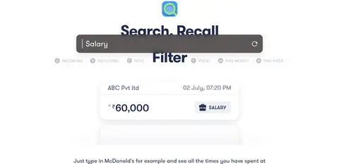
| 6 | feature-split | Two-column feature presentation with heading and search interface imagery. | Search transactions, Filter by tags and time | White canvas, Search bar mockup, Transaction result card |
| 7 | other | Centered paragraph beneath the search demonstration. | Illustrative search examples | Plain white background, Compact centered text |
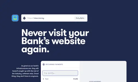
| 8 | feature-split | Dark full-width section with left-aligned heading and product preview. | Early-access product link | Fold Navy background, Light headline, Layered dashboard mockup |
---
本文件由 AI 辅助生成:数值取自公开网页的实测样式,命名、用途说明与建议为模型解读。商标归原所有者。
Generated by Design DNA · https://four.wiralomi.com/style/fold-money