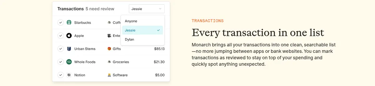
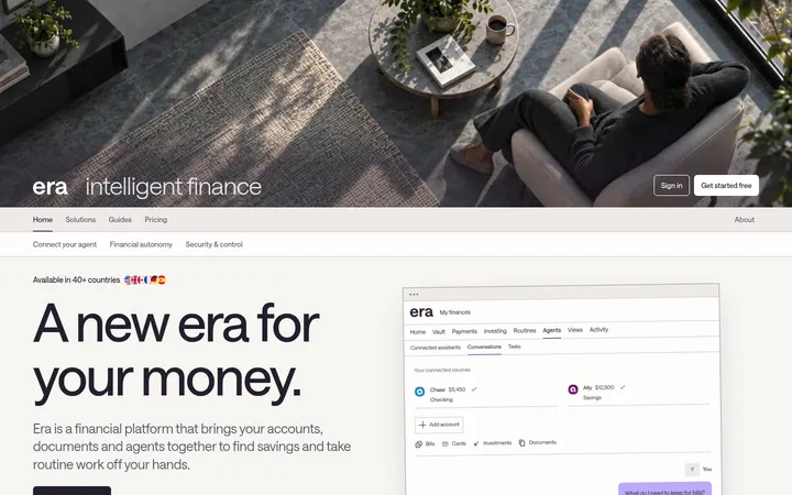
North star · Keep the page calm and human: use the cream canvas as the continuous backdrop, then let serif storytelling, real product UI, and orange CTAs create the hierarchy.
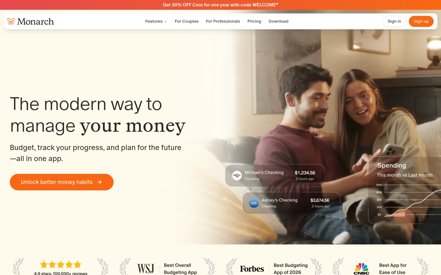
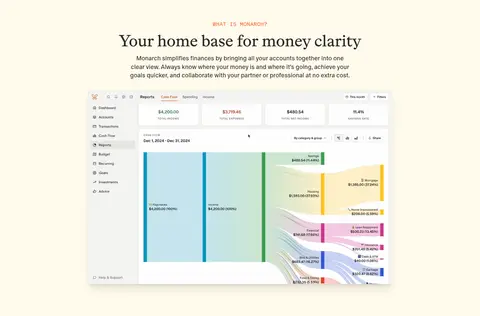
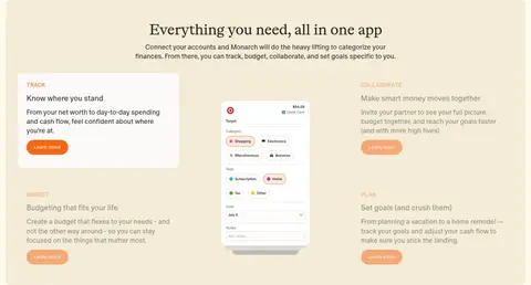
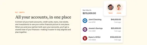
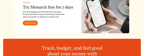
The page is built around a warm cream canvas (#fffaec), keeping long-form product storytelling soft rather than clinical. Dark charcoal text (#2a2926) provides confident contrast, while orange CTAs (#f86713) make the next step immediately visible. Large editorial serif headings alternate with restrained sans-serif body copy; small uppercase mono labels introduce feature sections without competing with the headlines. The layout moves from a split lifestyle hero into centered product demonstrations, alternating feature rows, testimonial cards, and a broad press quote panel. App screenshots and financial widgets are layered over the page as crisp, legible proof of functionality, while photography adds a human context. White cards and a pale beige band distinguish content groups without disrupting the overall cream field. Generous open space, rounded pill buttons, and subtle shadows keep the interface composed, warm, and accessible.
Navigation, body copy, captions, buttons, and supporting interface text.
Aa 设计
ABC Otto
网络字体 · 字重 350 / 400 · 占比 22%
免费替代:Newsreader
Primary page and section headlines, giving feature storytelling an editorial character.
Aa 设计
Beltram Mono
网络字体 · 字重 500 · 占比 1%
免费替代:Space Mono
Small feature eyebrows and uppercase section labels.
角色
示例
字号
字重
行高
字距
特大标题
Oversized hero headline treatment, set in a light sans-serif voice.
Monarch
59.5px
300
1.15
-0.02em
一级标题
Main editorial headline, including the hero and primary section introductions.
Monarch
48px
350
1.2
-0.02em
二级标题
Feature and content section headings.
Monarch
40px
350
1.2
-0.02em
三级标题
Subsection headings within feature and resource content.
Monarch
32px
350
1.2
-0.02em
四级标题
Compact card and supporting section titles.
The quick brown fox 敏捷的狐狸
24px
350
1.5
0
正文
Paragraphs explaining product value and feature behavior.
The quick brown fox 敏捷的狐狸
18px
350
1.4
0
辅助文字
Small review labels, UI annotations, and image or card supporting text.
The quick brown fox 敏捷的狐狸
14px
350
1.3
0
按钮
Pill CTA labels such as Sign up and Learn more.
The quick brown fox 敏捷的狐狸
14px
350
1.43
0
导航
Top navigation links and announcement-related navigation text.
The quick brown fox 敏捷的狐狸
14px
350
1.43
0
眉题
Uppercase feature identifiers such as NET WORTH, REPORTS, and PRICING.
The quick brown fox 敏捷的狐狸
14px
500
1.3
0.03em
代码
Short technical or product identifiers, styled consistently with mono labels.
const style = 1;
14px
500
1.3
0.03em
间距与布局
基准单位 8px · 密度:适中
32px版块间距
16px元素间距
24px卡片内边距
1408px内容最大宽度
4px
8px
12px
16px
20px
24px
32px
40px
64px
80px
A wide desktop composition uses a measured maximum content width of 1408px and a comfortable density. The hero splits left-aligned copy from full-height lifestyle imagery; subsequent sections alternate centered introductions, product showcases, and one-column feature rows with media and text shifting sides. A three-column app feature area and review grid introduce tighter groupings. The page keeps a continuous cream background, with occasional beige or white panels defining content bands. Section spacing is measured at 32px, with 16px element gaps and 24px card padding.
圆角与层次
按钮 · 9999px
卡片 · 8px
导航 · 9999px
hairline · button
md · nav, footer
md · card
lg · card
The page is mostly flat, using the cream canvas and restrained beige or white panels to organize content. White product and testimonial cards use soft, low-contrast shadows; the nav and select showcase elements gain more noticeable lift. Borders are sparse and pale, while screenshots and widgets create depth through careful overlap rather than heavy outlines.
组件
下面的预览按实测的按钮、输入框、徽标、卡片样式重建(字体用替代字体)。
Announcement strip
A narrow top promotion band uses the coral-to-orange gradient and centered white offer text.
Floating navigation
White rounded nav panel with dark links, a subtle shadow, and a compact orange Sign up pill.
Hero
Split cream-and-photo composition with a large headline, concise supporting copy, and orange pill CTA.
Feature showcase
Pale beige band, centered serif heading, short intro, and app UI arranged as a multi-column feature story.
Feature rows
Alternating product UI and copy, introduced by small uppercase mono labels and editorial serif headings.
Review cards
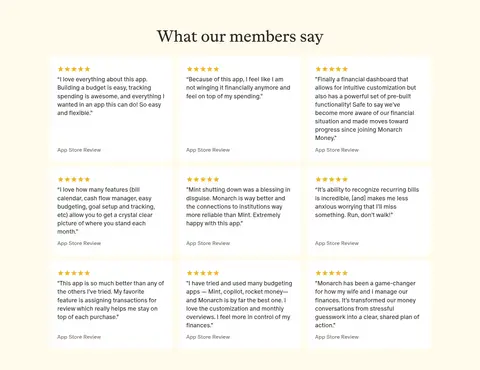
White rounded cards on cream with small gold stars, compact review text, and muted attribution.
Press quote panel
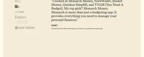
Large beige panel combines publication marks with a prominent serif testimonial and concise source label.
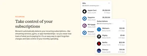
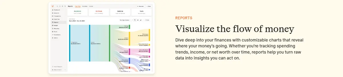
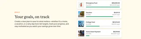
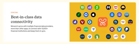
Imagery · Lifestyle photography gives the hero a relatable domestic setting and returns in the community and pricing areas. Most supporting media is product UI: account summaries, transaction lists, charts, goals, device screens, and provider marks. Screens are displayed cleanly and at useful scale, sometimes layered above the page with subtle shadows. The visual mix stays realistic and functional rather than relying on decorative illustration or 3D.
Keep the cream canvas continuous across most sections.
Use serif headlines to create an editorial hierarchy.
Reserve mono uppercase styling for short eyebrows.
Make primary actions orange, white-text pill buttons.
Show real product screens as clear feature evidence.
Alternate feature copy and product imagery for long-page rhythm.
✕ 不该做
Do not replace the warm canvas with stark white page backgrounds.
Do not use the orange accent for large areas of body copy.
Do not crowd serif headlines with decorative labels.
Do not add heavy borders around every card or section.
Do not let product screenshots become illegible decorative thumbnails.
Do not make the experience feel like a dense banking dashboard.
给 AI 的提示词
想快速出一个同风格的新页面,把这段话连同 DESIGN.md 一起发给 AI。
Build a new Monarch-style fintech page with a continuous Cream Canvas (#fffaec) and Warm Ink (#2a2926) text. Use Paper White (#ffffff) for product and review cards, and Oat Beige (#f3ecd7) for occasional feature bands. Make primary actions Signal Orange (#f86713), with white text and pill-shaped silhouettes. Pair a light editorial serif similar to ABC Otto with an open sans-serif like ABC Oracle; use a small tracked mono eyebrow for feature labels. Arrange a human lifestyle hero beside readable product imagery, then alternate feature copy and app screens in spacious rows. Keep sections comfortable and simple, use subtle shadows rather than heavy borders, and retain a clear content hierarchy from headline to supporting copy to CTA.