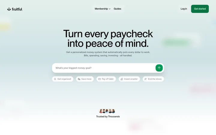
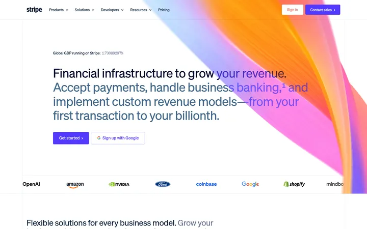
North star · Keep financial information approachable by pairing bold, concise messaging with calm surfaces and a vivid but softly treated app preview.
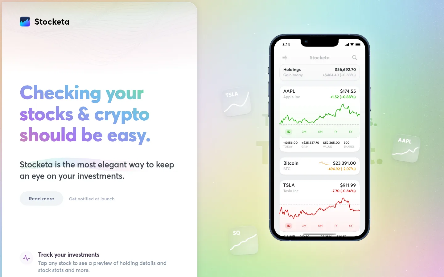
The visual strategy contrasts a calm, pale canvas with a vivid, softly blended hero backdrop. The measured canvas is #dfdfdf, while white and near-white panels create the impression of a bright product surface; the screenshot’s coloured fields belong mainly to the hero artwork and device mock-up, not a set of flat brand bands. Large, heavy Averta Standard headings use a multicolour gradient treatment in the hero, while supporting copy is compact, dark, and easy to scan. The composition gives the message and a rounded iPhone mock-up equal prominence: a tall white content panel anchors the left, and the phone floats over atmospheric colour on the right. A small pill-shaped “Read more” control and subdued launch link keep actions quiet. Below the hero, a vertically stacked feature list uses small purple line icons, concise labels, and muted explanatory copy. Generous whitespace and subtle inset shadows keep the presentation light rather than dashboard-dense.
All page typography, from oversized hero headlines to body copy, feature labels, and links.
角色
示例
字号
字重
行高
字距
特大标题
Oversized promotional headline treatment in hero artwork.
Stocketa
98px
800
1.2
-0.003em
一级标题
Primary hero heading about tracking stocks and crypto.
Stocketa
62.5px
800
1.1
-0.016em
二级标题
Major section headings if additional content sections are built.
Stocketa
52.5px
800
1.35
-0.006em
三级标题
Feature or product-story headings.
Stocketa
50.5px
800
1.35
-0.006em
四级标题
Individual feature names, such as “Track your investments.”
Stocketa
28px
700
1.15
0
正文
Hero supporting sentence and feature descriptions.
The quick brown fox 敏捷的狐狸
17px
500
1.35
-0.006em
辅助文字
Small secondary notes and supporting interface copy.
The quick brown fox 敏捷的狐狸
15px
400
1.4
0
链接
Compact CTA labels and navigation links.
The quick brown fox 敏捷的狐狸
14.5px
500
1
0
间距与布局
基准单位 8px · 密度:适中
58px版块间距
16px元素间距
37px卡片内边距
—内容最大宽度
5px
6px
8px
12px
16px
18px
20px
30px
32px
40px
44px
58px
The hero reads as a two-part composition: a tall, bright content panel on the left and a large app preview over soft colour on the right. Keep the left column text aligned to a consistent inset, with the headline, concise description, quiet CTA row, and vertically stacked feature list. The measured spacing uses a comfortable rhythm, with clear separation between hero content and feature items. No maximum page width was measured; preserve the broad, airy composition rather than forcing a narrow centered container.
圆角与层次
链接 · 9999px
inset · other
inset · card
inset · other
Surfaces rely on soft inset highlights and subtle, diffused shadows rather than visible borders. The app preview and white content area should feel gently lifted from the surrounding canvas, with rounded corners and delicate edge separation. Keep controls pill-shaped and light, avoiding heavy outlines or deep shadows.
组件
下面的预览按实测的按钮、输入框、徽标、卡片样式重建(字体用替代字体)。
Hero headline
Large, heavy sentence-case heading with a vivid purple-to-blue-to-teal gradient treatment, split across several short lines.
App preview
Tall, rounded iPhone mock-up showing investment holdings, small performance figures, and compact green and red line charts.
Primary text CTA
Pale-gray pill-shaped “Read more” link with medium-weight text and generous horizontal padding.
Secondary CTA
Quiet launch-notification link beside the main CTA, rendered in muted gray rather than as a filled button.
Feature list
Single-column stack of compact feature entries, each pairing a small purple line icon with a dark label and muted explanatory copy.
Hero backdrop
Soft, blurred pastel colour field behind the device, with faint floating market-symbol tiles and restrained decorative detail.
Imagery · Use a high-fidelity iPhone mock-up displaying a clean investment-tracking interface, with legible holding cards and simple green and red charts. Frame the device vertically and let it float against a softly coloured, atmospheric backdrop. Small translucent stock-symbol tiles can add depth. Avoid treating the mock-up’s market colours as the broader site palette; keep feature icons simple and purple.
Use soft gradients as atmosphere, not as flat section fills.
Set supporting text in restrained dark and muted neutrals.
Present features as a simple vertical list with small icons.
Use rounded, pale controls with low visual emphasis.
✕ 不该做
Do not turn the page into a dense financial dashboard.
Do not make market-chart greens and reds the main brand palette.
Do not add heavy borders or strong drop shadows.
Do not use multiple competing CTA buttons.
Do not use all-caps or widely tracked display headings.
Do not replace the soft backdrop with a loud, saturated gradient.
给 AI 的提示词
想快速出一个同风格的新页面,把这段话连同 DESIGN.md 一起发给 AI。
Build a new Stocketa page that feels like a calm, polished investment app introduction. Use #dfdfdf Soft Canvas around bright #ffffff Gallery White panels, with #8190a0 Slate Mist and #9aa1b1 Quiet Steel for secondary copy. Set headings in a heavy, friendly geometric sans similar to Averta Standard, and use #995bb9 Orchid Signal for restrained accents. Pair a concise, oversized headline with a clear app-device preview; place the primary message and a quiet pill-shaped CTA in a spacious content column. Use soft pastel gradient atmosphere behind product imagery, not as loud structural bands. Keep feature content in a single airy stack with small purple line icons, dark labels, and muted descriptions. Favor subtle inset highlights, gentle shadows, rounded surfaces, and an uncluttered hierarchy. Do not invent additional brand colours or measured dimensions.