Escape Coffee Company 将精品咖啡商品展示与“跳出常规”的品牌叙事结合,整体呈现鲜明的编辑式视觉风格。暖调米白底色、超大窄体标题与沉浸式摄影相互衬托,并搭配简洁的商品信息和直达购买入口。
North star · Let oversized, condensed typography and cinematic photography carry the story, while keeping commerce controls small, clear, and high contrast.
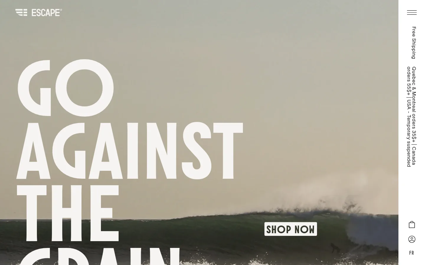
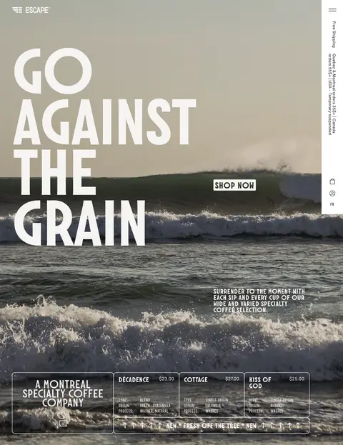
The page is built around a warm paper-like canvas (#f5f4f2), with near-black typography and crisp white surfaces used for contrast rather than decoration. The opening hero is dominated by full-bleed ocean footage or photography, overlaid with enormous uppercase condensed lettering and a small, sharply legible shopping control. Below it, quieter collection sections return to the pale canvas, using photographic cards and restrained text to create contrast with the cinematic opening. Typography does much of the branding: Molitor supplies compressed, assertive uppercase display and CTA lettering, while TWK Lausanne handles lighter navigation and explanatory copy. Garaje adds a supporting typographic voice. Layout alternates dense media-led panels with open, spacious bands; alignment is intentionally asymmetric, with large headline forms offset against compact copy and product data. Thin outlines and small-radius controls define interactive edges without adding heavy shadows. The dark footer reverses the page’s light palette and gathers navigation, email signup, address, and social links.
Body copy, navigation, captions, links, and lighter section headings.
Aa 设计
Molitor
网络字体 · 字重 700 / 300 · 占比 14%
免费替代:Oswald
Display headlines, uppercase section headings, eyebrows, and shopping buttons.
Aa 设计
Garaje
网络字体 · 字重 300 / 700 · 占比 11%
免费替代:Barlow Condensed
Supporting display or accent lettering within the page’s typographic mix.
角色
示例
字号
字重
行高
字距
特大标题
Oversized uppercase hero slogan lettering.
Escape Coffee Company
250px
700
0.85
-0.02em
一级标题
Large uppercase page and major section headlines.
Escape Coffee Company
75px
300
1
0.013em
二级标题
Secondary section titles and prominent editorial statements.
Escape Coffee Company
50px
200
1.06
-0.01em
三级标题
Uppercase collection and feature headings.
Escape Coffee Company
45px
300
0.85
0.021em
四级标题
Smaller supporting headings and card titles.
Escape Coffee Company
28px
300
1.05
0.034em
正文
Collection descriptions, subscription copy, and editorial text.
The quick brown fox 敏捷的狐狸
18px
300
1.35
0.053em
辅助文字
Compact product metadata and image-side notes.
The quick brown fox 敏捷的狐狸
16px
300
1
0.06em
按钮
Uppercase SHOP and other prominent action labels.
The quick brown fox 敏捷的狐狸
26px
700
1
0.037em
导航
Header, announcement rail, and footer navigation.
The quick brown fox 敏捷的狐狸
16px
300
1.05
0.06em
链接
Inline editorial and collection links.
The quick brown fox 敏捷的狐狸
16px
300
1.35
0.06em
眉题
Short uppercase labels introducing content sections.
The quick brown fox 敏捷的狐狸
26px
700
1
0.037em
间距与布局
基准单位 1px · 密度:适中
50px版块间距
20px元素间距
—卡片内边距
—内容最大宽度
5px
14px
15px
18px
20px
25px
40px
50px
52px
The page uses a comfortable, editorial rhythm rather than a uniform card grid. The hero stretches edge to edge and places oversized type to the left, with a compact shopping action and a narrow vertical announcement rail at the right. Collections combine a large image panel with a smaller product-and-copy column. Later sections alternate image-led storytelling with expansive headline-led space. Content aligns to the page edges with generous breathing room; no measured maximum content width is available. A full-width dark footer closes the page.
圆角与层次
按钮 · 3px
卡片 · 10px
链接 · 3px
hairline · card, other
The interface is mostly flat, with no prominent drop shadows. Product and editorial cards use fine outlines or a subtle measured canvas-colored hairline treatment rather than raised surfaces. Small-radius controls and compact outlined links keep interactive elements defined; contrast, imagery, and typography provide most of the layering.
组件
下面的预览按实测的按钮、输入框、徽标、卡片样式重建(字体用替代字体)。
Hero shopping action
A compact, high-contrast SHOP NOW control sits over the full-bleed hero; measured SHOP buttons use black, warm-paper lettering, uppercase Molitor, and a small radius.
Vertical announcement rail
A narrow white strip at the right edge holds a menu icon, vertically oriented shipping and order information, and small account and bag controls.
Collection feature card
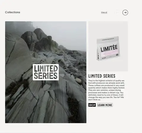
A large photographic card pairs with a smaller product image and copy block, followed by compact SHOP and outlined LEARN MORE links.
Product information strip
Product names, prices, blend or origin details, and process notes appear in a compact outlined overlay across the hero imagery.
Subscription story
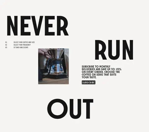
Oversized broken-line headline lettering frames concise subscription steps, supporting photography, and a direct subscribe action.
Dark footer
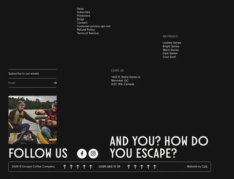
A dark closing panel organizes navigation, product categories, email signup, brand address, social links, and a slim bottom information bar.
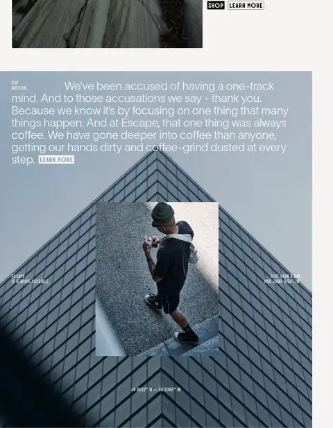
Imagery · Photography is central: ocean surf fills the hero, rocky landscapes introduce a collection, and architectural and lifestyle images carry the editorial story. Product packaging and brewing imagery appear as smaller supporting visuals. Images are generally rectangular and large, with minimal framing; the hero’s white type overlays moving or atmospheric imagery. The measured screenshot colors within photographs are image content, not additional brand palette colors.
Reserve #151515 and #000000 for strong readable contrast.
Let one oversized condensed headline dominate the hero.
Use photography as a full-bleed storytelling surface.
Keep product details compact and easy to scan.
Use thin outlines and restrained corner rounding for controls.
✕ 不该做
Do not add unmeasured brand colors to the core palette.
Do not make every section a uniform card grid.
Do not compete with the hero using multiple oversized focal elements.
Do not rely on heavy shadows or elevated card styling.
Do not crowd editorial copy with unnecessary interface chrome.
Do not treat colors sampled from photographs as brand colors.
给 AI 的提示词
想快速出一个同风格的新页面,把这段话连同 DESIGN.md 一起发给 AI。
Build a new coffee-commerce page in Escape Coffee Company’s editorial visual language. Use Warm Paper (#f5f4f2) for the main canvas, Roast Ink (#151515) for everyday text, Clean White (#ffffff) for crisp light surfaces, Deep Char (#000000) for strong actions and outlines, and Stone Tint (#ebe9e6) only as a quiet secondary neutral. Lead with immersive, edge-to-edge photography and one dominant uppercase, condensed Molitor-style headline. Use a lighter Lausanne-like sans for navigation, captions, and explanatory copy, with open tracking and generous line spacing. Alternate full-width image storytelling with spacious, asymmetric product and editorial layouts. Keep shopping links compact and obvious; use thin borders, small-radius controls, and almost no shadow. Finish with a dark, information-rich footer. Preserve the contrast between cinematic imagery and calm, readable commerce details.