North star · Use a near-black editorial canvas for coffee and brand stories, then let restrained serif typography and large, carefully framed photography carry the page.
The page alternates between stark black product and brand-story areas and broad white or warm off-white editorial sections. Black supplies the defining storefront canvas; white type and product imagery sit clearly against it, while olive-toned panels and small pale badges provide restrained supporting colour. A light, fine serif carries headlines, tasting notes and descriptive copy, contrasted with compact GT America sans-serif for navigation, labels and controls. The composition is deliberately uneven: product tiles have ample breathing room, the hero places a vertical list beside oversized campaign imagery, and later sections switch to side-by-side features, review cards, café photography and a compact story feed. Images do most of the expressive work, from coffee packaging and fruit-led campaign art to atmospheric interiors. Spacing stays generous between major stories, while cards and controls remain visually simple, with subtle borders or shadows rather than heavy decoration.
Navigation, compact labels, badges, buttons, captions and supporting sans-serif text.
Aa 设计
ID00 Serif
网络字体 · 字重 300 · 占比 31%
免费替代:Cormorant Garamond
Editorial headlines, product names, tasting notes and descriptive copy.
角色
示例
字号
字重
行高
字距
一级标题
Serif display heading for the principal campaign or brand statement.
Assembly Coffee
42px
300
1.25
0
二级标题
Serif section titles, including reviews and editorial features.
Assembly Coffee
36px
300
1.2
0
三级标题
Serif subheads and product or story titles.
Assembly Coffee
30px
300
1.2
0
正文
Light serif descriptions and narrative product copy.
The quick brown fox 敏捷的狐狸
18px
300
1
0
辅助文字
Sans-serif dates, small labels and supporting metadata.
The quick brown fox 敏捷的狐狸
14px
400
1.4
0
按钮
Compact medium-weight sans-serif control labels.
The quick brown fox 敏捷的狐狸
14px
500
1.25
0
导航
Small sans-serif primary and utility navigation.
The quick brown fox 敏捷的狐狸
14px
500
1.25
0
链接
Light serif links for product and editorial titles.
The quick brown fox 敏捷的狐狸
16px
300
1.5
0
间距与布局
基准单位 8px · 密度:适中
80px版块间距
8px元素间距
24px卡片内边距
1400px内容最大宽度
4px
5px
8px
9px
10px
12px
16px
20px
24px
32px
48px
80px
The measured page max width is 1400px, with full-bleed campaign media and several wide section bands. The top navigation is layered over or adjacent to a large dark hero; the product showcase continues as an open, asymmetric grid rather than a dense catalogue. Later sections switch between two-column image features, centered reviews, a horizontal café carousel, and a multi-card story feed. Major sections use a measured 80px rhythm, with comfortable element spacing and 24px card padding. Alignment varies intentionally between centered section headings and left-aligned editorial content.
圆角与层次
按钮 · 4px
输入框 · 2px
卡片 · 4px
图片 · 4px
徽标 · 4px
导航 · 4px
链接 · 4px
md · card
hairline · button
md · other
md · card
Most sections rely on flat colour fields and image contrast, not stacked interface chrome. Cards are generally white or dark, with measured subtle shadows on review cards and restrained hairline treatment on controls. Borders are dark grey where present, corners remain gently rounded, and product imagery should feel integrated into the canvas rather than floating in heavy boxes.
组件
下面的预览按实测的按钮、输入框、徽标、卡片样式重建(字体用替代字体)。
Utility and primary navigation
Stack a pale utility strip above a black main navigation bar, with compact GT America links, brand mark and thin divider.
Campaign hero
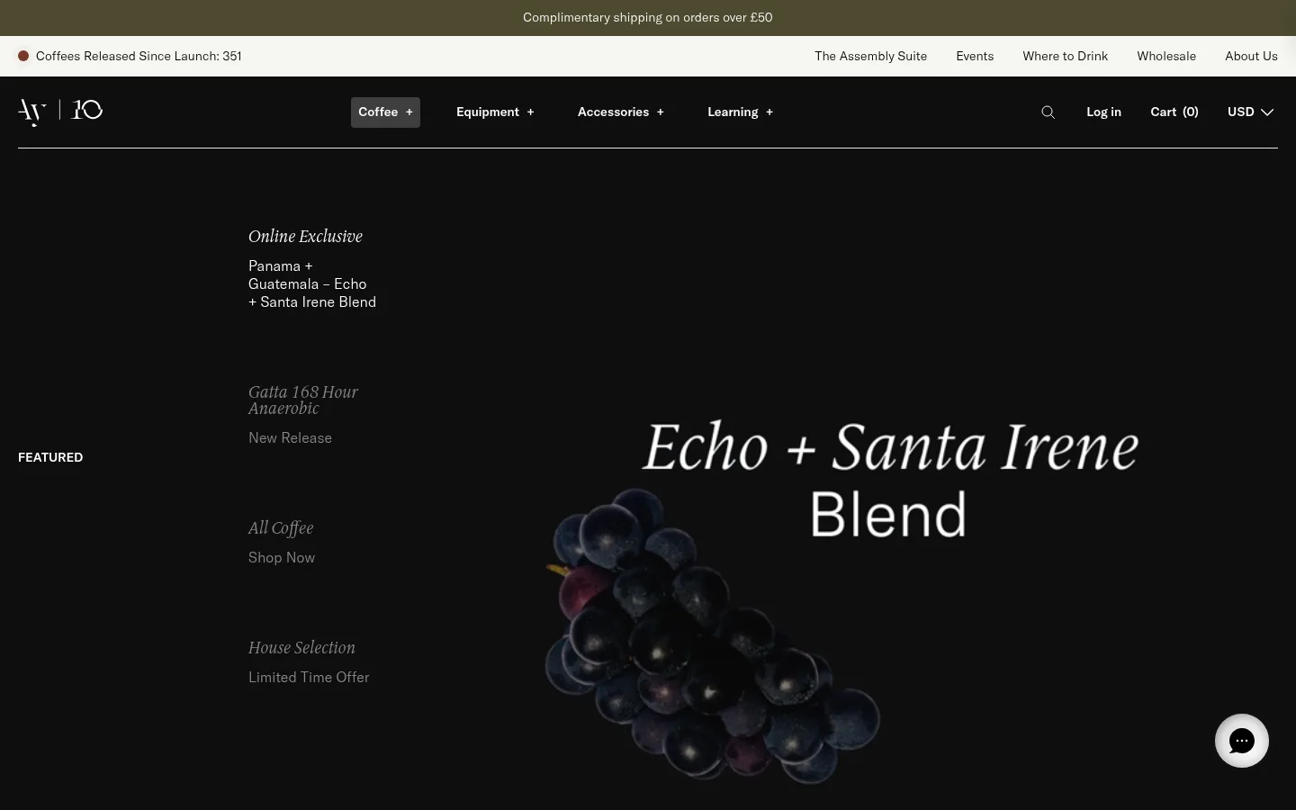
Full-bleed dark media stage with a small vertical campaign menu and oversized serif campaign title.
Coffee product showcase
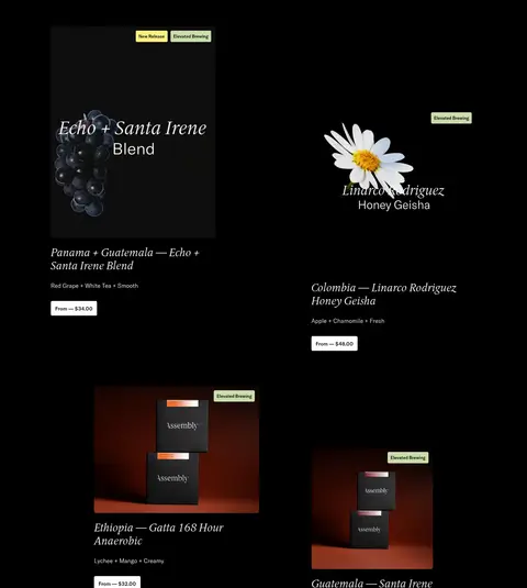
Open product grid on black, mixing packaging imagery, serif names, brief tasting notes, compact price buttons and small release badges.
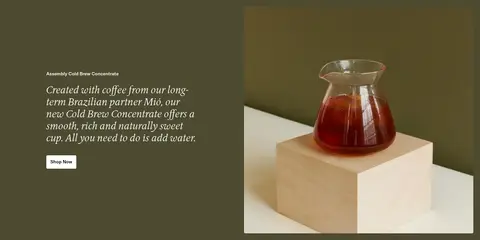
Split editorial feature
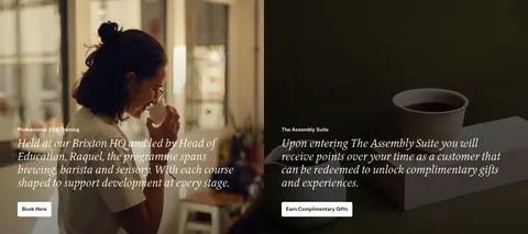
Two image-led panels place photography beside or behind serif copy and a small light CTA.
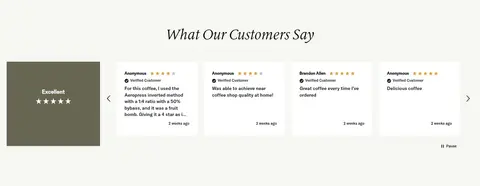
Review carousel
Warm off-white section with centered serif title, concise customer cards and visible carousel controls.
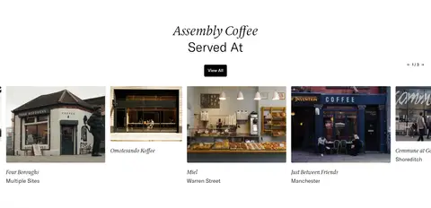
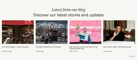
Cafe and story carousels
Horizontal image cards pair café or editorial photography with small serif titles and compact supporting metadata.
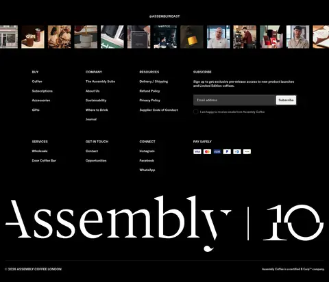
Dark footer
Black footer combines a social image strip, grouped link columns, newsletter form and oversized Assembly anniversary wordmark.
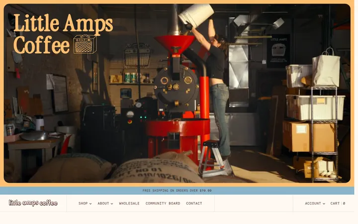
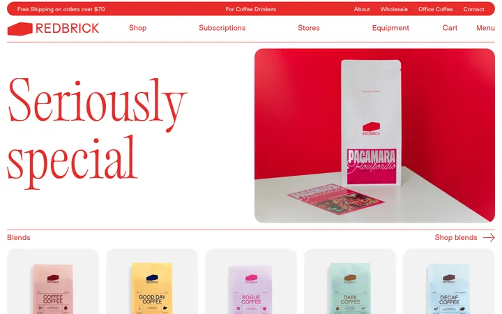
Imagery · Large, atmospheric imagery is central: campaign fruit, coffee packaging and brewing equipment are shown against dark or warm studio backdrops. Lifestyle and hospitality sections use photographic interiors, people and café storefronts, often placed edge-to-edge or in generous split panels. The homepage also includes video in the opening campaign. Keep image treatments natural and cinematic; measured green and yellow badges belong to product-image labels, not the overall photography palette.
Lead with a near-black campaign or product canvas.
Use light serif typography for editorial titles and coffee descriptions.
Contrast dark stretches with clean white or warm off-white sections.
Give campaign and hospitality photography room to breathe.
Keep product badges small and tied to their measured label colours.
Use compact sans-serif navigation and control text.
✕ 不该做
Do not make the entire page a uniform dark block.
Do not turn olive, yellow or sage into large brand surfaces.
Avoid dense, tightly packed product-card layouts.
Do not replace the serif editorial voice with heavy bold sans-serif headings.
Avoid loud gradients, decorative shadows or thick card borders.
Do not treat colours captured inside product images as page-wide tokens.
给 AI 的提示词
想快速出一个同风格的新页面,把这段话连同 DESIGN.md 一起发给 AI。
Build a new Assembly Coffee page as an editorial coffee storefront. Use Roast Black (#000000) for the main campaign, product and footer canvases, balanced by Roaster White (#ffffff) and Parchment Mist (#f5f6f1) section breaks. Set campaign titles, product names and tasting notes in a light editorial serif; use a restrained sans-serif for navigation, labels and buttons. Keep the layout spacious and intentionally asymmetric, mixing full-bleed campaign photography, open product tiles, split image-and-copy features, and horizontal café or story cards. Use Olive Brew (#4d4a31) only for a restrained feature panel, and Sage Badge (#cadcac) or Release Lemon (#faf080) only for small product labels. Keep elevation subtle, with fine boundaries and minimal shadows; let coffee photography provide colour and texture.