North star · Let bold, flat color fields and disciplined monospace typography frame tactile coffee imagery without adding visual clutter.
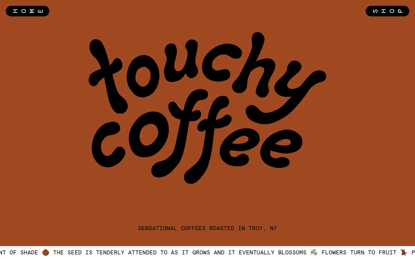
The page opens on an uninterrupted terracotta canvas (#9f4920), letting an oversized, hand-drawn black wordmark carry the hero while small pill-shaped navigation controls stay near the top corners. Apercu Mono supplies the contrasting system: uppercase, widely spaced labels and compact product information that feel precise without competing with the logo. Below, large flat-color bands define the shopping, brand-story, review, and footer zones: muted sage (#788c8c), lavender (#a697c6), pale blue (#d0eaf4), and vivid green (#5b9133). Product bags and candid coffee-making imagery add texture and real-world context; colorful review cards are accents within the imagery, not the core palette. Layouts shift from a compact multi-item shop grid to a broad text-led story and image-led testimonials. Generous section breaks, restrained black controls, thin outlines, and rounded capsules preserve a playful, tactile rhythm without relying on shadows.
Primary interface and content type: navigation, hero supporting line, labels, product details, and story copy.
Aa 设计
Apercu Mono Bold
网络字体 · 字重 700 · 占比 15%
免费替代:Space Mono
Emphasized product actions and quantity controls.
角色
示例
字号
字重
行高
字距
一级标题
Hero brand statement; the visible mark is hand-drawn artwork, not ordinary text.
Touchy Coffee
50px
400
1.5
0
二级标题
Section and supporting headings, including small tracked section labels.
The quick brown fox 敏捷的狐狸
24px
400
normal
0
正文
Uppercase story copy and descriptive supporting text.
The quick brown fox 敏捷的狐狸
20px
400
1.2
0
导航
Short top-level navigation links, often spaced out.
The quick brown fox 敏捷的狐狸
24px
400
normal
0
代码
Compact uppercase product and interface details; not code content.
const style = 1;
20px
400
1.2
0
间距与布局
基准单位 2px · 密度:适中
60px版块间距
20px元素间距
—卡片内边距
1280px内容最大宽度
5px
7px
10px
15px
20px
25px
30px
40px
60px
80px
100px
A wide, centered page uses a measured 1280px maximum content width, with color bands spanning the viewport. The hero is a spacious single-column composition; the shop becomes a seven-column measured grid with product cards, while the story returns to a single text-led column. The reviews section uses an eleven-column measured layout for cards and imagery. Section breaks are generous, with a measured 60px section gap and comfortable rather than dense content spacing. Footer information is arranged in three columns.
圆角与层次
按钮 · 9999px
图片 · 20px
没有测到阴影:页面是扁平的,层次靠底色和描边区分。
The interface reads as flat and color-blocked, with no measured shadows. Black pill controls provide contrast through solid fills, while the story and footer imagery uses fine outlined shapes. Preserve clear section boundaries using the full-width background bands; avoid adding layered card shadows or unnecessary borders.
组件
下面的预览按实测的按钮、输入框、徽标、卡片样式重建(字体用替代字体)。
Corner navigation pills
Small black capsules sit at opposite top corners of the terracotta hero, with white monospace labels and generous letter spacing.
Hero wordmark
Large hand-drawn black Touchy Coffee lettering dominates the open hero; a compact uppercase roast-location line sits below.
Product cards
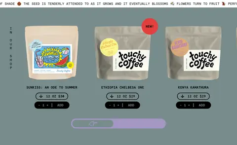
Coffee bag photography sits on the sage shop band, followed by uppercase product names, capsule price controls, and simple quantity/add actions.
Purchase controls
Black rounded capsules group quantity and add actions; measured ADD labels use bold 20px Apercu Mono Bold in sage.
Brand story block
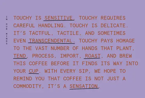
A broad lavender field carries large uppercase monospace prose with selected words underlined for emphasis.
Review carousel
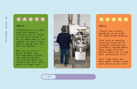
The pale-blue band combines review cards and coffee-work imagery, with a simple rounded slider indicator beneath.
Information footer
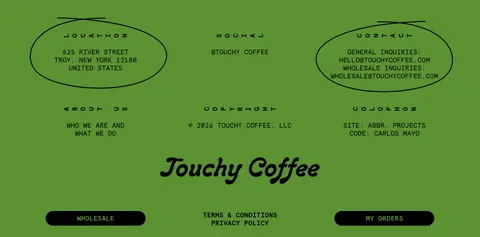
A green footer arranges location, social, and contact details in three columns, with restrained outlined oval treatments.
Imagery · The hero is led by a large, black hand-drawn brand wordmark on a plain terracotta field. The shop features photographed coffee bags, with packaging labels and small promotional badges providing varied color. Later, candid equipment and people imagery sits alongside vivid testimonial cards. Keep photography rectangular or gently rounded, with the measured 20px media radius; do not mistake illustration or packaging colors for the page’s underlying brand palette.
Keep interface copy monospace and mostly uppercase.
Use solid, full-width color bands to distinguish content sections.
Show coffee packaging and real coffee-making imagery.
Keep buttons simple, black, and capsule-shaped.
✕ 不该做
Do not replace the hand-drawn hero mark with generic display type.
Do not add gradients or drop shadows.
Do not use extra palette colors for page backgrounds.
Do not flatten every section into one continuous background.
Do not make product actions visually ornate.
Do not treat colors inside packaging or review cards as core brand colors.
给 AI 的提示词
想快速出一个同风格的新页面,把这段话连同 DESIGN.md 一起发给 AI。
Build a new Touchy Coffee page with the same tactile, playful, editorial character. Use Roasted Terracotta (#9f4920) as the hero canvas, Roast Ink (#000000) for the wordmark and controls, and Apercu Mono or a close Space Mono substitute for uppercase interface copy. Create clear full-width bands in Quiet Sage (#788c8c), Soft Lavender (#a697c6), Powder Blue (#d0eaf4), and Coffee Leaf (#5b9133), assigning each to a distinct content block. Keep navigation and purchase actions compact, high-contrast, and capsule-shaped. Favor product photography, honest coffee-making imagery, generous open space, and flat surfaces over decorative effects. Keep typography precise and labels legible, using occasional letter spacing and restrained underlines. Do not introduce gradients, shadows, or unmeasured colors.