North star · Keep the interface spacious and editorial, using purple for clear actions and vivid Ethereum artwork for moments of explanation.
The page uses a predominantly white canvas, with soft gray bands reserved for selected content areas and the footer. Near-black Inter headings create a strong editorial hierarchy; compact uppercase eyebrows label sections, while body copy stays subdued and readable. Ethereum purple is the main interactive signal for links, buttons, small labels, and selected visual accents, with darker and brighter purples appearing in badges and gradient artwork. A full-bleed illustrated hero gives the otherwise restrained interface a distinctive, human scale; later illustrations and product demonstrations explain concepts rather than behaving like generic decoration. Content alternates between centered introductions, left-aligned feature storytelling, and multi-column card groupings, with generous whitespace separating the long page sections. Cards use fine gray outlines and rounded corners, while selected promotional and principle panels use darker or purple gradient treatments. Keep the interface calm and legible, letting illustrations carry the richer color.
All interface text, including headings, body copy, navigation, labels, links, and buttons.
角色
示例
字号
字重
行高
字距
特大标题
Large hero display and oversized promotional headlines.
Ethereum
64px
900
0.9
0
一级标题
Primary page headline and prominent section introductions.
Ethereum
60px
900
1.2
0
二级标题
Major section headings, including feature and update sections.
Ethereum
48px
900
1.2
0
三级标题
Feature titles and secondary card headings.
Ethereum
36px
900
1.11
0
四级标题
Smaller card titles and subordinate content headings.
Ethereum
30px
900
1.3
0
正文
Default paragraphs, explanatory copy, and supporting text.
The quick brown fox 敏捷的狐狸
14px
400
1.6
0
辅助文字
Compact uppercase metadata and small supporting labels.
The quick brown fox 敏捷的狐狸
12px
400
1.6
0
按钮
Primary and secondary action labels.
The quick brown fox 敏捷的狐狸
16px
400
1.6
0
导航
Top-level navigation and search control text.
The quick brown fox 敏捷的狐狸
16px
400
1.6
0
链接
Prominent inline and standalone content links.
The quick brown fox 敏捷的狐狸
24px
400
1.63
0
眉题
Uppercase section labels above major headlines.
The quick brown fox 敏捷的狐狸
14px
600
1.6
0.05em
间距与布局
基准单位 8px · 密度:适中
48px版块间距
8px元素间距
20px卡片内边距
1248px内容最大宽度
2px
4px
8px
12px
14px
16px
20px
24px
32px
40px
48px
64px
Use a centered content frame capped at the measured 1248px maximum, opening with full-bleed hero artwork. The page alternates centered introductions with left-aligned feature narratives and multi-column card groups. Keep the measured comfortable density and 48px section rhythm, with 8px element gaps and generous whitespace between major blocks. The principles band and footer provide the main light-gray interruptions to the white canvas. Align text to the story: centered for onboarding and updates, start-aligned for feature explanations and link-heavy navigation.
圆角与层次
按钮 · 4px
卡片 · 24px
徽标 · 9999px
导航 · 3px
链接 · 32px
hairline · button, text, link
md · card
hairline · link
lg · card
The interface is mostly flat, relying on whitespace and fine #cfcfcf outlines instead of strong shadow. Rounded cards separate content from the page without heavy framing; a few cards use measured soft shadows for lift. Reserve layered gradients and darker backdrops for featured visual panels, not routine controls.
组件
下面的预览按实测的按钮、输入框、徽标、卡片样式重建(字体用替代字体)。
Primary action
Purple #6c24e0 fill with white label, compact rounded corners, and generous horizontal padding; use for onboarding and key section actions.
Text link
Purple inline link for contextual navigation; prominent standalone links remain simple and lightly framed.
Outlined information card
White or transparent card with a 1px #cfcfcf border, rounded corners, and calm black text.
Purple badge
Small uppercase pill using a pale lavender background and deep amethyst text.
Principle feature card
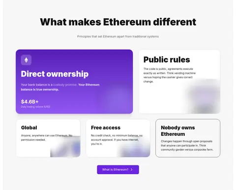
Large rounded card within the light-gray principles band; use vivid purple treatment for the highlighted principle among quieter cards.
Top navigation
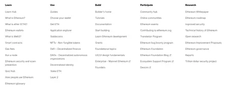
White horizontal bar with Ethereum mark, dark navigation labels, and a bordered search control whose icon or active state uses purple.
Announcement banner
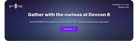
Full-width dark purple event strip with white event details, strong centered promotional text, and a bright purple action.
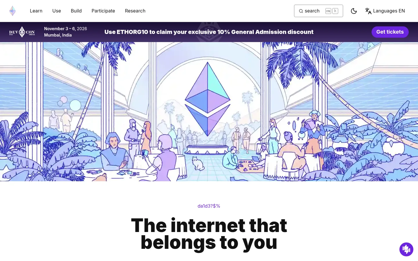
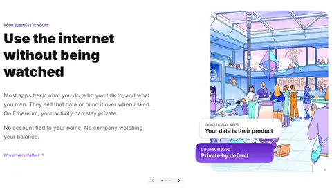
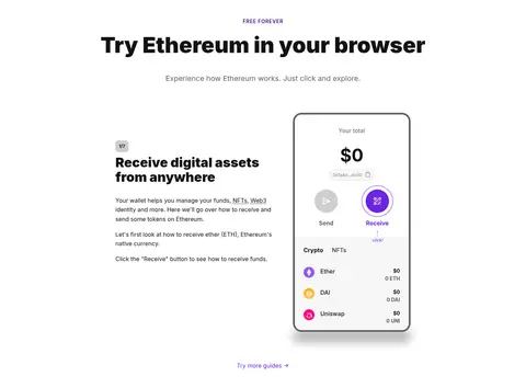
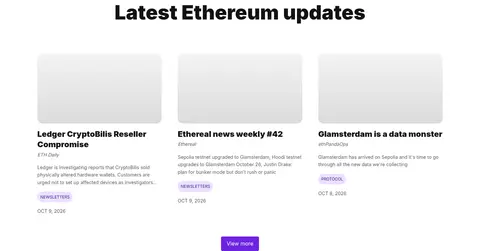
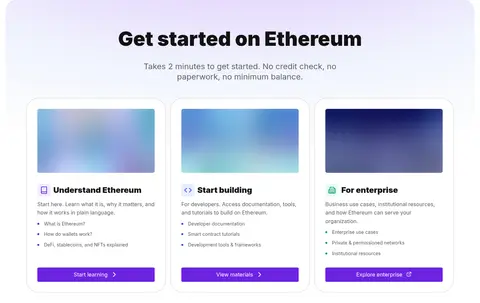
Imagery · Use detailed, colorful Ethereum-themed illustration rather than conventional photography: the opening scene depicts a lively architectural environment with the Ethereum symbol, while later illustrations and wallet screens clarify use cases. Frame hero art broadly and allow it to span the page width; keep explanatory artwork beside text in feature sections. Card imagery can use soft gradient or blurred visual treatments, but preserve a clean, legible foreground.
Reserve Ethereum purple for actions, links, and selected emphasis.
Set headings in heavy Inter with clear size hierarchy.
Give long sections generous whitespace.
Use illustrations to explain Ethereum concepts.
Use hairline borders to define cards without visual heaviness.
✕ 不该做
Do not turn every section into a colored panel.
Do not use purple for long body paragraphs.
Do not replace the illustrative identity with generic stock imagery.
Do not crowd the layout with dense UI chrome.
Do not add heavy shadows to ordinary cards.
Do not invent additional palette colors.
给 AI 的提示词
想快速出一个同风格的新页面,把这段话连同 DESIGN.md 一起发给 AI。
Build a new Ethereum.org-style page with a white Gallery White (#ffffff) canvas and a centered content frame capped at the measured 1248px maximum. Use Inter throughout: heavy near-black Ink Black (#121212) headings, readable Slate Reading Gray (#616161) body copy, and compact uppercase section labels. Apply Ethereum Violet (#6c24e0) to primary actions, active links, and selected accents; use Deep Amethyst (#41128c) sparingly for badge details. Organize content into spacious editorial sections, alternating centered introductions, text-and-illustration splits, and modular rounded cards. Use Soft Section Gray (#f7f7f7) for occasional bands and the footer, with Quiet Border Gray (#cfcfcf) hairlines instead of heavy framing. Favor detailed Ethereum-themed illustration and purposeful wallet or interface demonstrations. Keep gradients confined to featured visual treatments.