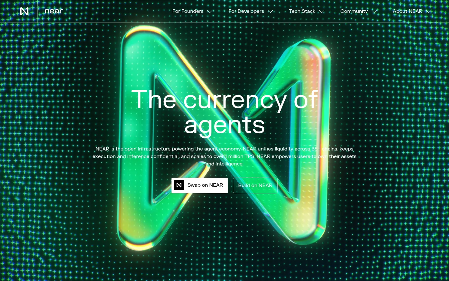
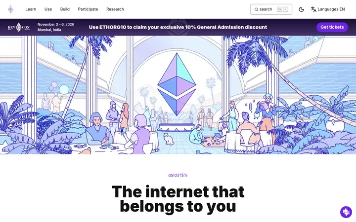
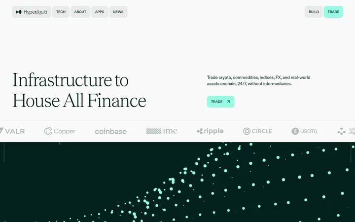
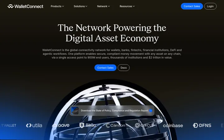
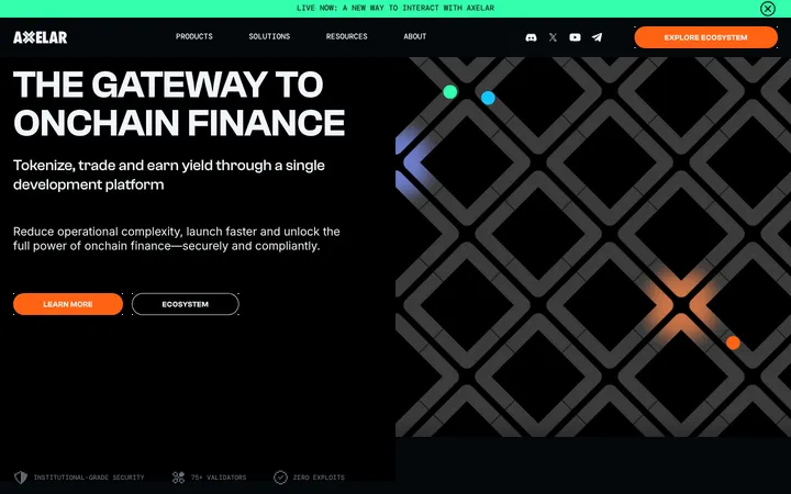
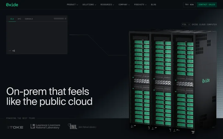
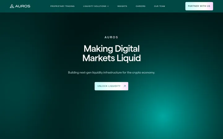
North star · Let cinematic green media command attention while keeping interface chrome minimal, high-contrast, and editorial.
The page alternates between a cinematic, media-led opening and a long black feature-story band, then returns to white for partner logos, editorial updates, and signup. Use Gallery White (#ffffff) and Carbon (#000000) as the defining surfaces; the bright green and turquoise tones visible in the hero and feature art belong primarily to media, not a general-purpose UI palette. Typography is FKGrotesk: large, centered hero copy contrasts with compact body text and left-aligned feature headings. Mona Sans appears only for small caption-style text. Keep content within a broad centered frame, with generous vertical pauses between major stories and simple two-column feature rows. Thin borders and squared-off, lightly rounded controls provide structure without shadows. Preserve the shift from immersive motion to quiet, legible editorial content rather than adding decorative UI.
配色
点色块复制色值。用途说明来自对页面的实测位置(背景、文字、描边、按钮)与截图判读。
品牌色
强调色
表层色
中性色
功能色
页面底色 · Gallery White表层 · Carbon表层 2 · Mint Wash表层 3 · Soft Alloy主文字 · Carbon次要文字 · Quiet Gray弱文字 · Gallery White描边 · Graphite Line强调 · Electric Turquoise强调 2 · Signal Green
文字
背景
对比度
WCAG
#000000 Carbon
#ffffff Gallery White
21:1
AAA
#000000 Carbon
#c7f5d8 Mint Wash
17.48:1
AAA
#000000 Carbon
#e5e5e5 Soft Alloy
16.67:1
AAA
#757575 Quiet Gray
#ffffff Gallery White
4.61:1
AA
#757575 Quiet Gray
#000000 Carbon
4.56:1
AA
#757575 Quiet Gray
#c7f5d8 Mint Wash
3.84:1
AA-large
字体
字号阶梯:Custom(比例约 1.71,正文 16px)。示例用免费替代字体渲染,数值为实测。
Aa 设计
FKGrotesk
网络字体 · 字重 400 / 500 / 700 · 占比 100%
免费替代:Space Grotesk
Primary typeface for display, headings, body copy, navigation, and links.
角色
示例
字号
字重
行高
字距
特大标题
Oversized hero headline over full-bleed opening media.
NEAR
80px
400
1
0
一级标题
Primary page or section headings, including feature-led titles.
NEAR
44px
500
1.09
0
二级标题
Secondary section headings and feature titles.
The quick brown fox 敏捷的狐狸
24px
500
1.25
0
正文
Descriptive copy, explanatory paragraphs, and card text.
The quick brown fox 敏捷的狐狸
16px
400
1.5
0
辅助文字
Small, emphasized labels and compact captions.
The quick brown fox 敏捷的狐狸
12px
600
1.17
0
导航
Header navigation and footer link groups.
The quick brown fox 敏捷的狐狸
16px
400
1.5
0
链接
Inline calls to action and editorial links.
The quick brown fox 敏捷的狐狸
16px
400
1.5
0
间距与布局
基准单位 8px · 密度:宽松
128px版块间距
8px元素间距
32px卡片内边距
1280px内容最大宽度
4px
8px
16px
20px
24px
32px
36px
40px
56px
64px
96px
112px
128px
Use a broad centered content frame, measured at a 1280px maximum width, and alternate full-bleed media with contained editorial sections. The hero centers its headline and supporting copy; later feature stories use spacious two-column rows with alternating image and text placement. Follow the measured 128px section rhythm and an 8px-based spacing system, allowing large pauses between content bands. White partner, blog, and signup sections contrast with a long black infrastructure band. Keep the overall density spacious, not card-heavy.
圆角与层次
按钮 · 4px
输入框 · 4px
卡片 · 4px
链接 · 4px
没有测到阴影:页面是扁平的,层次靠底色和描边区分。
The visual system is predominantly flat, with no measured shadow treatments. Separate content using black and white section bands, hairline borders, and card outlines rather than raised surfaces. Cards and controls use lightly rounded corners; artwork supplies most of the depth through rendered 3D lighting.
组件
下面的预览按实测的按钮、输入框、徽标、卡片样式重建(字体用替代字体)。
Header navigation
A compact, horizontal navigation row with black text on white in measured styles; the hero screenshot shows the navigation over dark media in white.
Hero
Centered display headline and supporting copy layered over a full-bleed video background, with restrained primary actions.
Feature story row
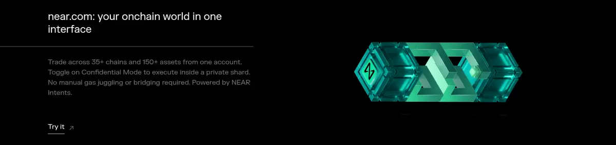
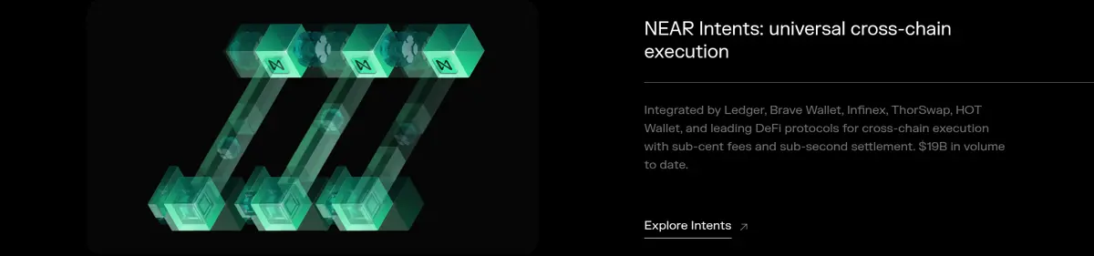
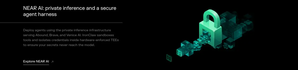
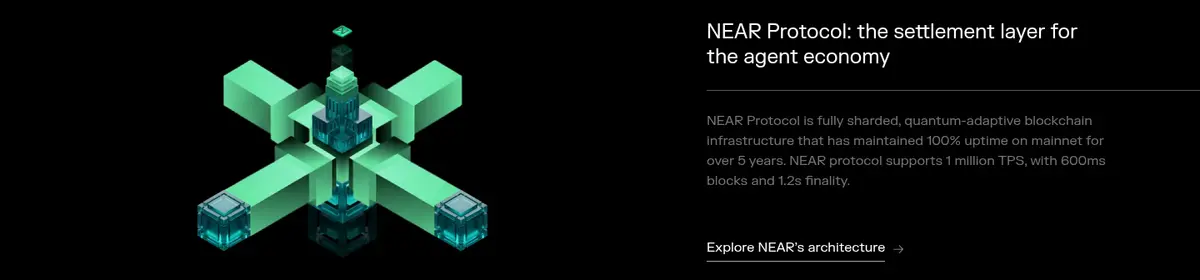
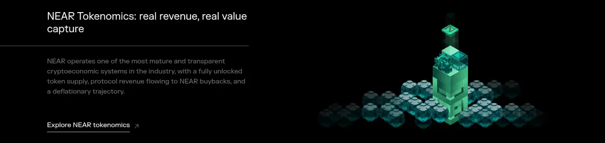
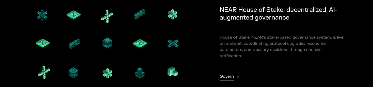
Black-band feature content arranged as alternating two-column rows, pairing explanatory text and a 3D illustration.
Partner tile
White-background logo tile with a fine outline, partner identity, supporting copy, and a muted Learn more link.
Editorial card
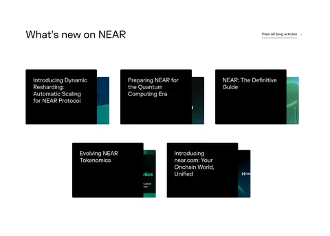
Dark card with a thin #e5e5e5 border and #000000 fill, used for news items within the white editorial section.
Newsletter form
White section with an email input using a #f2f1e9 border and a black Subscribe button with white text.
Footer
Black multi-column link area with muted secondary text, a bright-green join treatment, and separated legal links.
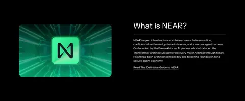
Imagery · Lead with full-bleed video and a luminous, dimensional NEAR mark against a dark field. Feature sections use isolated 3D infrastructure illustrations with vivid teal and green highlights on black. Partner marks and editorial cards are quieter and more contained. Treat these strong greens as media colors, preserving legible text and clean layouts around the artwork.
Use black and white section bands as the page's structural backbone.
Reserve vivid green and turquoise for prominent media and selective accents.
Keep hero copy centered and feature headings editorial and left-aligned.
Alternate feature imagery and text to create a steady story rhythm.
Use generous whitespace around partner and news content.
Prefer thin borders and flat surfaces over shadowed cards.
✕ 不该做
Do not make green the default background for every section.
Do not add gradients or shadows unsupported by the measured system.
Do not crowd feature copy against its illustrations.
Do not use decorative rounded cards throughout the page.
Do not make secondary links louder than primary content.
Do not treat colors inside 3D artwork as universal UI tokens.
给 AI 的提示词
想快速出一个同风格的新页面,把这段话连同 DESIGN.md 一起发给 AI。
Build a new NEAR-style page using a clean, spacious editorial structure. Anchor the palette in Gallery White (#ffffff) and Carbon (#000000); use Quiet Gray (#757575) for secondary text and Graphite Line (#595959) for subtle separators. Keep Signal Green (#00ec97), Electric Turquoise (#17d9d4), and Mint Wash (#c7f5d8) selective, primarily for media or small accents. Set type in FKGrotesk or a close sans-serif substitute, with a large centered opening headline, clear left-aligned section headings, and readable body copy. Use full-bleed cinematic media for the hero, then alternate black feature bands with spacious two-column text and 3D artwork. Return to white for partners, editorial cards, and the newsletter. Avoid shadows, excessive rounding, and busy decoration.