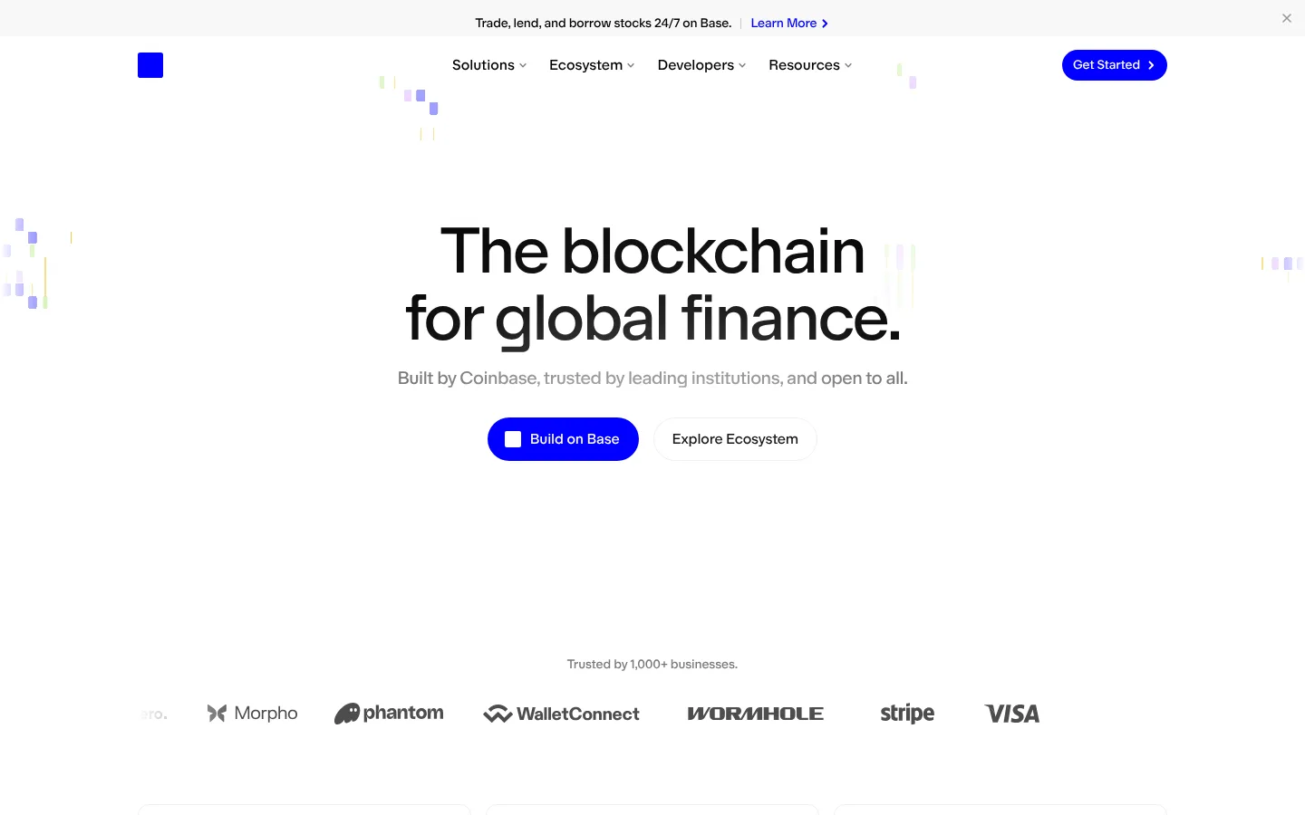
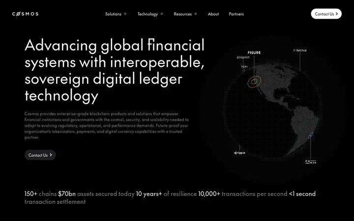
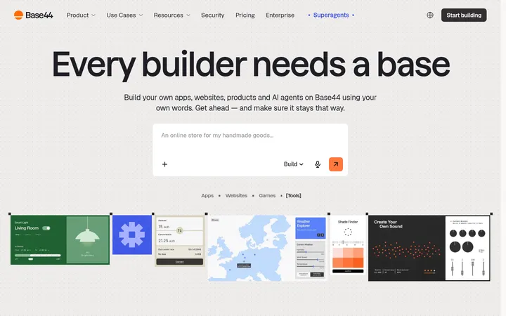
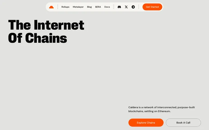
Base 以明亮克制的首页呈现其区块链产品,用清晰主标题、简洁数据和醒目的蓝色按钮传达核心价值。充裕留白与几何插画相结合,让技术主题显得直观、亲和且专业。
North star · Use an open white canvas and restrained typography, letting precise electric-blue accents organize the journey rather than decorate every surface.
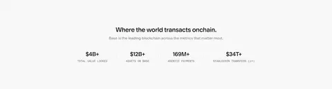
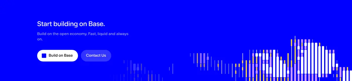
The visual system is anchored by a white canvas (#ffffff), with pale gray surfaces such as #f8f8f8 reserved for selected cards and a full-width metrics band. Saturated blue (#0000ff) provides the strongest brand signal: it marks primary buttons, small decorative accents, and the large lower-page CTA band. Typography is clean, rounded sans serif, set mostly at regular weight; the display headline is large and tightly tracked, while supporting copy and captions use muted grays for hierarchy without heavy contrast. The page alternates broad, open sections with compact, modular content: centered hero, partner logos, feature cards, metrics, illustrated explanations, release cards, CTA, and a multi-column footer. Illustrations use fine geometric lines and small bursts of blue, while release thumbnails add localized color rather than redefining the brand palette. Borders are subtle and corners rounded; the overall treatment stays flat and spacious.
Display headings, navigation, buttons, and captions
Aa 设计
baseSansMono
网络字体 · 字重 400 · 占比 3%
免费替代:IBM Plex Mono
Code and technical labels
角色
示例
字号
字重
行高
字距
特大标题
Oversized centered hero headline.
Base
72px
400
1.03
-0.04em
一级标题
Primary section headings and major content titles.
Base
32px
400
1.25
-0.04em
二级标题
Subsection titles, including feature and release areas.
Base
28px
400
1.29
-0.025em
三级标题
Feature-card and smaller content headings.
The quick brown fox 敏捷的狐狸
20px
400
1.4
-0.025em
正文
Paragraphs, descriptions, and supporting statements.
The quick brown fox 敏捷的狐狸
16px
400
1.4
0
辅助文字
Small labels, footnotes, and subdued metadata.
The quick brown fox 敏捷的狐狸
14px
400
1.43
-0.01em
按钮
Primary and secondary CTA labels.
The quick brown fox 敏捷的狐狸
16px
400
1.4
-0.01em
导航
Header navigation and footer link labels.
The quick brown fox 敏捷的狐狸
16px
400
1.4
0
代码
Compact uppercase technical or metric labels.
const style = 1;
12px
400
1.67
0
间距与布局
基准单位 4px · 密度:适中
64px版块间距
4px元素间距
—卡片内边距
1136px内容最大宽度
1px
2px
4px
6px
8px
10px
12px
16px
20px
24px
32px
40px
48px
80px
Use a centered content frame with a measured maximum width of 1136px and comfortable density. The hero is centered and surrounded by generous white space; logo marks sit in a horizontal strip, while feature and release content shifts into multi-column grids. A pale full-width statistics band and blue CTA band create clear section breaks. Keep alignment disciplined, allow large vertical pauses between major blocks, and use compact gaps within cards and navigation. Responsive layouts should stack grids while preserving the same open rhythm.
圆角与层次
按钮 · 9999px
卡片 · 12px
导航 · 3px
链接 · 12px
没有测到阴影:页面是扁平的,层次靠底色和描边区分。
The interface is mostly flat, with no measured shadows. Use subtle #efefef hairlines to define selected cards and controls, and pale #f8f8f8 fills for gentle separation. Rounded cards and pill-shaped buttons provide shape without relying on layered effects or heavy outlines.
组件
下面的预览按实测的按钮、输入框、徽标、卡片样式重建(字体用替代字体)。
Top announcement
A slim, light announcement strip with concise text, a blue Learn More link, and a close control.
Primary navigation
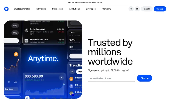
Logo mark at the left, grouped navigation links through the center, and a blue pill-shaped Get Started action.
Hero
Centered, large tightly tracked headline, muted supporting sentence, and paired primary and secondary actions.
Trust strip
Short trust statement above a horizontal row of partner logos, mostly rendered in subdued monochrome.
Feature and release cards
Modular feature content and release previews use restrained surfaces, rounded corners, concise labels, and subtle borders.
CTA band
Full-width #0000ff section with white headline and copy, contrasting pill buttons, and decorative geometric artwork.
Footer
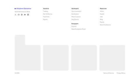
White multi-column link layout with operational status, grouped navigation, and subdued secondary details.
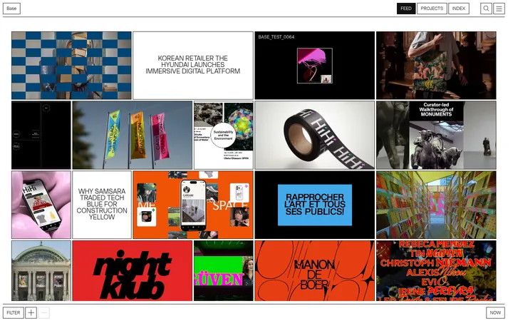
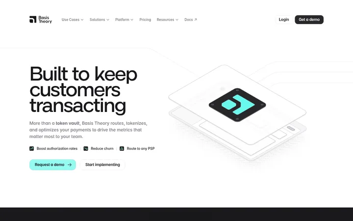
Imagery · The page favors diagrammatic geometric illustrations over photography: thin lines, modular shapes, and small blue or pale-colored accents explain infrastructure and product concepts. The hero remains typographic, with restrained abstract marks near the edges. Partner logos form a grayscale trust strip. Release thumbnails are more colorful and belong to their individual cards, rather than defining the site-wide palette.
Reserve saturated blue for primary actions and deliberate emphasis.
Use large, centered display type for the hero.
Separate major content blocks with generous whitespace.
Use pale surfaces and hairlines instead of heavy card treatments.
Treat illustration colors as local accents, not global brand colors.
✕ 不该做
Do not fill every section with blue or gray.
Avoid dense layouts and tightly packed navigation.
Do not use heavy shadows or thick card outlines.
Avoid bold, all-caps display typography.
Do not let colorful thumbnails overpower the restrained page palette.
Avoid adding gradients where the measured sections use flat color.
给 AI 的提示词
想快速出一个同风格的新页面,把这段话连同 DESIGN.md 一起发给 AI。
Build a new page in Base’s restrained blockchain style. Use Gallery White (#ffffff) as the dominant canvas, Near Ink (#171717) or True Black (#000000) for strong text, and Quiet Gray (#787878) or Slate Copy (#6f6f6f) for secondary copy. Apply Base Electric (#0000ff) to primary actions and selected emphasis; use Cloud Surface (#f8f8f8) and Soft Divider (#efefef) for gentle section separation and hairlines. Set clean regular-weight sans-serif typography, with a large centered, tightly tracked headline and concise supporting text. Use a centered content frame, broad section spacing, modular grids, rounded cards, and pill-shaped buttons. Favor geometric explanatory illustrations and restrained partner marks over decorative photography. Keep surfaces flat, shadows absent, and the overall page airy and legible.