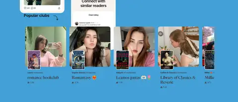
North star · Build a literary, community-first experience by pairing expressive serif headlines and vivid section colour with approachable product imagery.
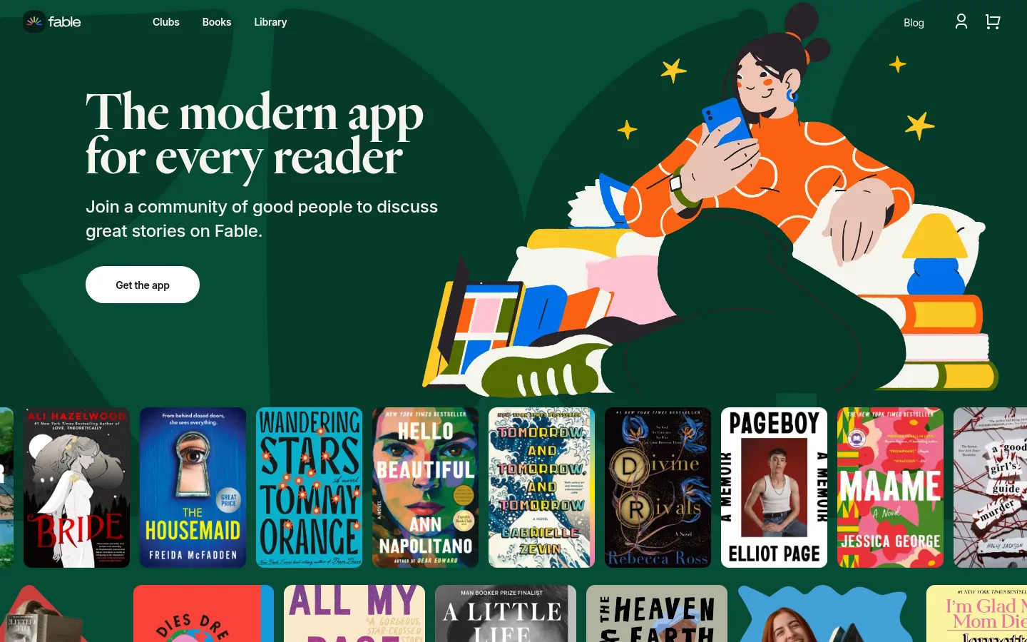
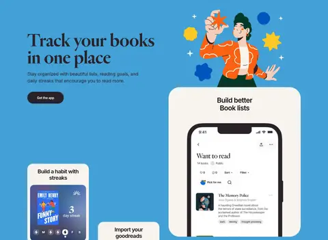
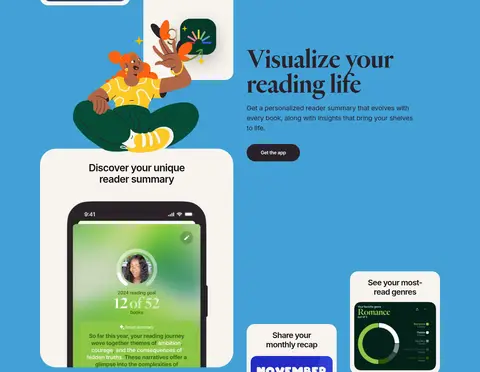
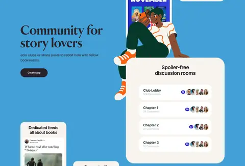
Fable’s visual strategy combines the intimacy of a reading journal with the energy of a social app. Deep forest green (#064c37) anchors the opening and frames rows of colourful book covers, while vivid blue (#43a1d7) carries the product-story sections. Warm paper (#f7f4ee) panels hold app screens and feature cards, creating contrast against the saturated canvas without adding visual clutter. Heldane Display gives major headlines a literary, high-contrast character; Inter handles navigation, explanatory copy, buttons, and compact interface text. The layout alternates broad, spacious two-column feature sections with dense image-led book and club galleries. Hand-drawn people, app mockups, and real community imagery keep the page personable and product-specific. Rounded pill CTAs and softly rounded cards support the friendly tone; most surfaces stay flat, with only subtle navigation shadows.
配色
点色块复制色值。用途说明来自对页面的实测位置(背景、文字、描边、按钮)与截图判读。
品牌色
表层色
中性色
功能色
页面底色 · Reader Blue表层 · Clean Page表层 2 · Night Black表层 3 · Library Green表层 4 · Book Paper主文字 · Story Ink次要文字 · Soft Charcoal弱文字 · Plum Ink描边 · Clean Page强调 · Reader Blue强调 2 · Library Green
Navigation, body copy, buttons, card labels, and compact interface text.
Aa 设计
Heldane Display
网络字体 · 字重 500 · 占比 24%
免费替代:DM Serif Display
Large editorial headlines and selected display-scale feature titles.
角色
示例
字号
字重
行高
字距
特大标题
Oversized editorial hero or campaign headline.
Fable
80px
500
0.94
0
一级标题
Primary hero headline introducing the reading app.
Fable
72px
500
0.86
0
二级标题
Major feature and testimonial headlines.
Fable
48px
500
0.88
0
三级标题
Feature-card headings and compact section labels.
Fable
30px
600
1.13
-0.033em
四级标题
Smaller serif titles within feature content.
The quick brown fox 敏捷的狐狸
26px
500
1.08
0
正文
Explanatory feature copy and supporting descriptions.
The quick brown fox 敏捷的狐狸
20px
400
1.5
-0.015em
辅助文字
Compact metadata and small supporting labels.
The quick brown fox 敏捷的狐狸
12px
400
1.33
-0.017em
按钮
Get the app calls to action.
The quick brown fox 敏捷的狐狸
14px
600
1.5
-0.018em
导航
Header navigation links.
The quick brown fox 敏捷的狐狸
14px
600
1
-0.018em
间距与布局
基准单位 4px · 密度:宽松
80px版块间距
40px元素间距
12px卡片内边距
1200px内容最大宽度
4px
8px
12px
14px
16px
17px
20px
24px
28px
32px
33px
34px
40px
50px
64px
80px
The page uses a spacious, wide composition with a measured maximum content width of 1200px. The hero is full-bleed, with copy aligned left and a large illustration occupying the right; book-cover rows span the canvas beneath it. Product sections use alternating two-column arrangements, balancing text against app mockups and feature cards. Large section gaps keep the feature narrative unhurried, while gallery rows intentionally become denser. A centered testimonial sits above a multi-column footer.
圆角与层次
按钮 · 9999px
卡片 · 24px
导航 · 12px
sm · nav
md · nav
Surfaces are mostly flat: saturated section backgrounds and pale cards provide the main separation. Cards use soft, generous rounding, while primary calls to action are pill-shaped. Borders are sparse; white is also used as a hairline colour. Navigation receives subtle layered shadows, but feature cards and galleries should not feel heavily elevated.
组件
下面的预览按实测的按钮、输入框、徽标、卡片样式重建(字体用替代字体)。
Primary app CTA
A compact pill button labeled Get the app, shown as white with dark text or dark plum with white text depending on its background.
Editorial hero
Left-aligned Heldane Display headline and supporting Inter copy on Library Green, balanced by a large reader illustration.
Book-cover gallery
Dense horizontal rows of colourful covers placed directly on the green hero canvas, creating a lively reader-community showcase.
Feature card
Warm Book Paper card with rounded corners, a short Inter heading, and an app screen or feature illustration.
Feature split
Two-column blue section pairing editorial text and a CTA with layered phone mockups, illustrations, or cards.
Club preview
Community feed and club previews combine member photos, book imagery, compact labels, and low-emphasis metadata.
Footer navigation
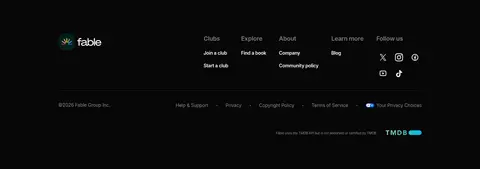
Multi-column links and social icons on Night Black, separated from the legal row with a fine dark hairline.
Imagery · The opening pairs a large, playful reader illustration with rows of book covers treated as colourful, edge-to-edge media. Blue feature sections mix illustrated characters, phone mockups, and warm card panels that show app screens. Community imagery includes club member portraits and book-related posts. Keep illustrations vivid and friendly, and let media retain its own colours rather than recolouring it to match the interface.
Use Library Green for the opening hero and book-cover showcase.
Reserve Reader Blue for the long product-feature narrative.
Pair Heldane Display headlines with practical Inter interface copy.
Use Book Paper panels to set app screens apart from saturated backgrounds.
Keep the hero full-bleed and feature content spacious.
Show book, app, and community imagery as distinct content.
✕ 不该做
Do not replace the strong section colour fields with gradients.
Do not use the serif display face for dense interface text.
Do not add heavy shadows to cards or gallery media.
Do not crowd the feature sections with extra decorative borders.
Do not flatten the book covers or community portraits into generic placeholders.
Do not make all calls to action the same colour regardless of background.
给 AI 的提示词
想快速出一个同风格的新页面,把这段话连同 DESIGN.md 一起发给 AI。
Build a new Fable-style page as a warm, literary social-reading experience. Use Library Green (#064c37) for a full-bleed opening or community gallery and Reader Blue (#43a1d7) for major product-story sections. Set display headlines in a high-contrast serif similar to Heldane Display, with Inter for navigation, body copy, labels, and CTAs. Compose broad two-column feature blocks with generous breathing room, alternating copy and app imagery. Use Book Paper (#f7f4ee) for rounded app-preview cards, Clean Page (#ffffff) for light pill CTAs, and Plum Ink (#292229) for dark CTAs. Keep the imagery colourful and reader-focused: book covers, friendly illustrations, phone screens, and club portraits. Finish with a Night Black (#070607) social-proof or footer band; keep elevation subtle and borders sparse.