North star · Let oversized black type and vivid cyan brand fields lead, while keeping product information modular, legible, and mostly flat.
The page builds its identity around a vivid cyan hero and closing footer, balanced by broad white content sections and a near-black enterprise band. Black display text stays exceptionally prominent against these fields; the Focal sans face uses tight tracking and heavy visual scale for the headline, while body copy remains compact and readable. Purple, lime, and other bright hues appear mainly in generative-art motifs and product-card illustrations, rather than as a competing interface palette. Content alternates between spacious editorial introductions and denser card groups, with a centered product showcase and testimonial layout breaking up the long scroll. Thin pale-gray borders and subtle neutral card surfaces define structure without pronounced shadows. Repeated dark buttons provide clear conversion anchors, while small monospace typography gives technical details a restrained developer-tool cue.
配色
点色块复制色值。用途说明来自对页面的实测位置(背景、文字、描边、按钮)与截图判读。
品牌色
强调色
表层色
中性色
功能色
页面底色 · Gallery White表层 · Electric Cyan表层 2 · Night Charcoal表层 3 · Cloud Gray表层 4 · Lilac Mist主文字 · Ink Black次要文字 · Slate Teal弱文字 · Deep Slate描边 · Mist Hairline强调 · Electric Cyan强调 2 · Vivid Violet强调 3 · Leaf Green
Primary display, headings, body copy, navigation, and links.
Aa 设计
chivoMono
网络字体 · 字重 400 · 占比 5%
免费替代:IBM Plex Mono
Code samples and developer-oriented technical details.
Aa 设计
publicSansRounded
网络字体 · 字重 600 · 占比 3%
免费替代:Nunito Sans
Prominent CTA button labels.
角色
示例
字号
字重
行高
字距
特大标题
Oversized hero display lettering and high-impact promotional headings.
fal
120px
500
0.83
-0.04em
一级标题
Primary hero headline and major page-level titles.
fal
80px
500
0.9
-0.05em
二级标题
Section titles across product, enterprise, and testimonials.
fal
60px
500
1
0
三级标题
Feature-card and product-group headings.
fal
48px
500
1
0
四级标题
Smaller feature and supporting panel headings.
fal
40px
500
0.9
-0.04em
正文
Introductory copy, product explanations, and testimonials.
The quick brown fox 敏捷的狐狸
16px
400
1.5
0
辅助文字
Compact labels and small supporting annotations.
The quick brown fox 敏捷的狐狸
14px
400
1.4
-0.143em
按钮
Primary and secondary CTA labels.
The quick brown fox 敏捷的狐狸
16px
600
1.5
-0.01em
导航
Compact top-level navigation links.
The quick brown fox 敏捷的狐狸
13px
500
1
0
链接
Inline product and documentation links.
The quick brown fox 敏捷的狐狸
16px
500
1.6
-0.025em
代码
Code samples and API-focused snippets.
const style = 1;
14px
400
1.5
0
间距与布局
基准单位 8px · 密度:紧凑
40px版块间距
8px元素间距
32px卡片内边距
1280px内容最大宽度
4px
6px
8px
12px
16px
20px
24px
26px
32px
40px
112px
A long, vertically sequenced landing page uses a measured 1280px maximum content width and an 8px-based spacing system. The hero is a full-bleed cyan canvas with left-aligned headline and copy; later sections return to white, pairing editorial text with four-column model cards or feature grids. The enterprise band reverses to charcoal, followed by centered testimonials and conversion panels. Footer links form multiple compact columns. Overall density is compact within cards but generous between major storytelling blocks.
圆角与层次
按钮 · 4px
卡片 · 6px
图片 · 6px
导航 · 4px
链接 · 6px
没有测到阴影:页面是扁平的,层次靠底色和描边区分。
The interface is mostly flat: rely on strong color fields, pale card fills, and thin measured hairlines rather than drop shadows. Product and testimonial cards use simple rounded corners and restrained borders. Dark enterprise cards sit directly on the charcoal section, while illustrations can overlap section edges to add depth without implying elevated UI.
组件
下面的预览按实测的按钮、输入框、徽标、卡片样式重建(字体用替代字体)。
Navigation bar
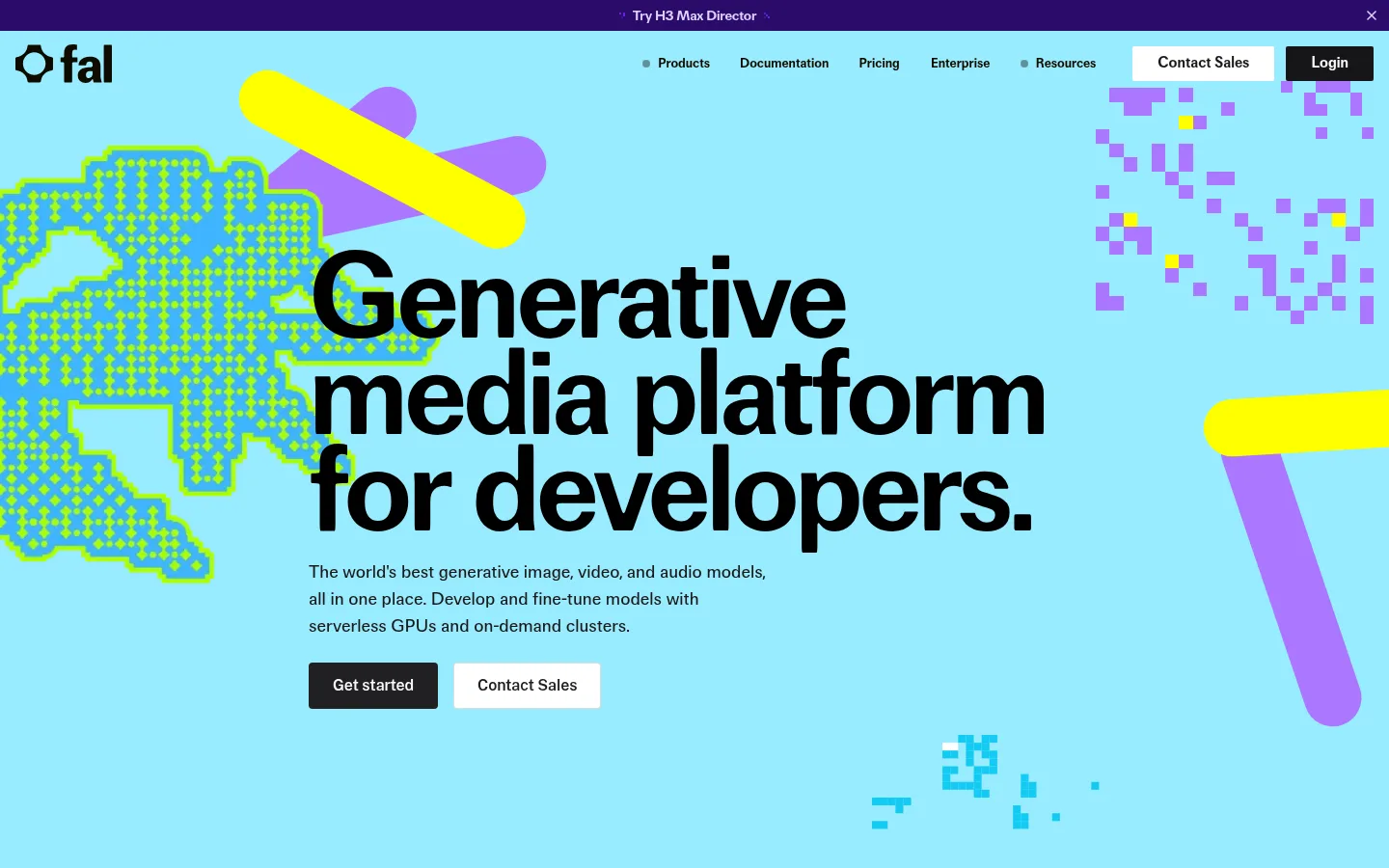
Compact links across the top, with a light Contact Sales action and dark Login button over the cyan hero.
Hero
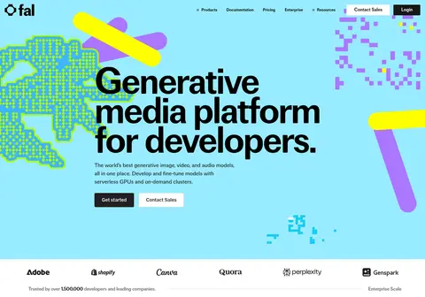
Full-bleed cyan field, oversized black multiline headline, concise supporting copy, and paired dark and light CTAs.
Model gallery cards
Four-column preview cards pair generative-media thumbnails with bold white overlay titles.
Product feature panels
Pale gray, lavender, cyan, and lime surfaces organize platform, serverless, and compute information.
Enterprise band
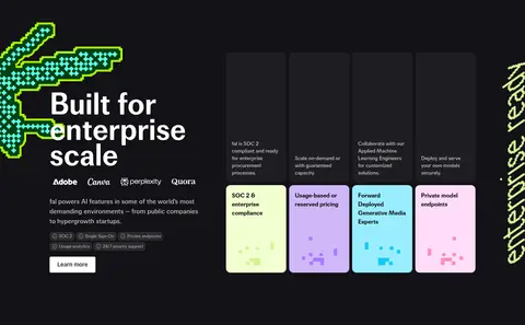
Near-black full-width section combines a large heading, customer marks, and bright pastel capability cards.
Testimonial blocks
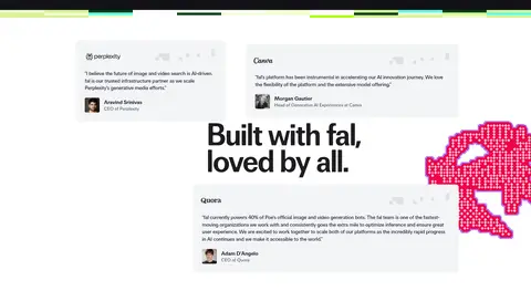
Light neutral quote cards and customer attribution sit around a centered, prominent heading.
Footer
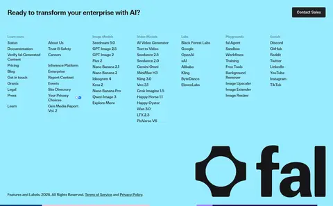
Cyan closing area combines a compact sales CTA, dense link columns, and a large black fal wordmark.
Imagery · Generative-media thumbnails and abstract pixel, geometric, and ribbon-like illustrations establish the visual character. Media appears as small card previews, oversized edge-cropped decorative motifs, and product-panel graphics; it is not uniformly photographic. Keep the hero artwork colorful and graphic, preserve clear headline contrast, and treat the measured violet, lime, and green hues as illustration accents rather than a general UI palette.
Use Electric Cyan #99ecff as a defining full-width brand field.
Keep major headlines black, large, and visually dominant.
Use white space to separate the page's editorial story blocks.
Reserve Night Charcoal #121216 for a deliberate contrast section.
Group product details in compact, plainly structured cards.
Keep vivid violet and lime accents tied to media or product illustrations.
✕ 不该做
Do not turn the page into a uniform dark interface.
Do not use saturated illustration colors as the main text palette.
Do not add decorative shadows to otherwise flat cards.
Do not compress the hero headline into small conventional SaaS typography.
Do not make every section a centered card grid.
Do not use all-caps labels as the primary typographic voice.
给 AI 的提示词
想快速出一个同风格的新页面,把这段话连同 DESIGN.md 一起发给 AI。
Build a new developer-facing page in fal's visual style. Use Electric Cyan #99ecff for a prominent brand field, Gallery White #ffffff for open content, and Ink Black #000000 for bold, high-contrast headlines. Organize the page as an editorial sequence: an expressive hero, concise product explanation, modular feature cards, an optional Night Charcoal #121216 contrast band, and a clear closing CTA. Use a Focal-like sans such as DM Sans for headings and body, with large tightly tracked display type and compact, readable supporting copy. Keep cards mostly flat with Cloud Gray #f4f4f5 surfaces and Mist Hairline #e5e7eb borders. Use Vivid Violet #4a17b0 and Lime Tint #f1ffd2 as restrained illustration accents. Favor generative-media imagery, crisp CTAs, and clean responsive grouping over ornamental effects.