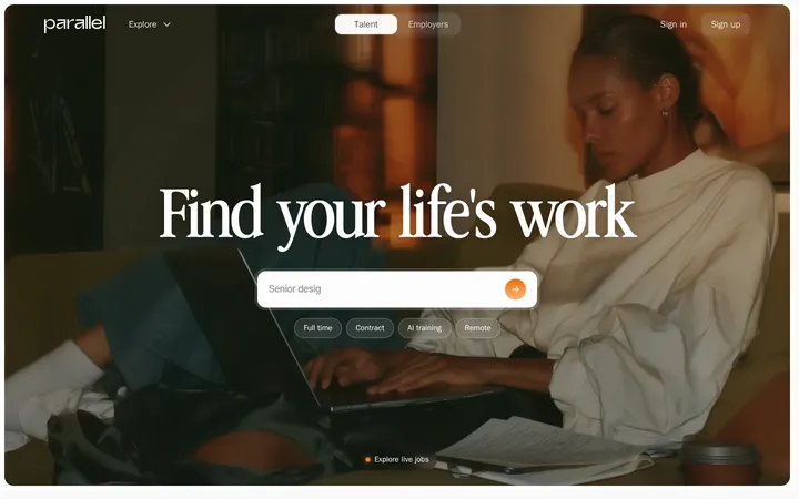
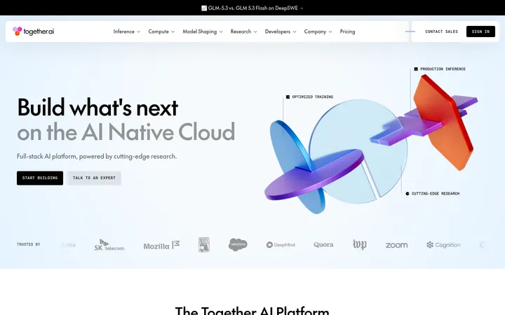
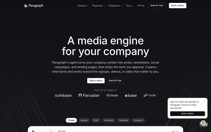
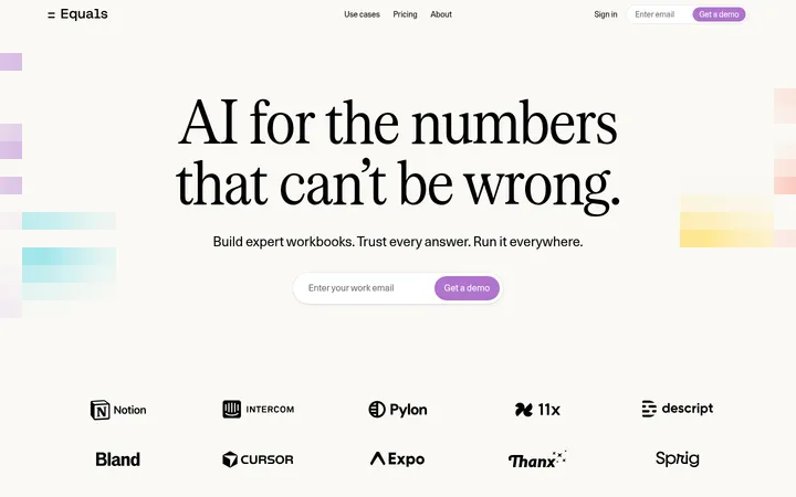
Parallel 以克制的白色画布和紧凑的技术字体,搭配醒目的大幅产品视觉。长页面交替呈现清晰的产品说明、界面演示、客户案例与信任信息。
North star · Keep the page quiet and spacious, then use vivid product media and orange actions to make the important moments unmistakable.
The page is built on a near-continuous white canvas, with dark near-black headings and muted gray supporting copy creating a calm, technical hierarchy. Signal Orange (#fb631b) marks the primary action and small points of emphasis; the blue hero media and warm gray product-demo panels supply most of the larger color fields. Gerstner Programm gives headings and body copy a compact, modern sans-serif voice, while FT System Mono is reserved for navigation, labels, code-like details, and uppercase controls. A narrow announcement bar and restrained header lead into a large headline and broad video demonstration. Below, alternating two-column feature sections and card grids use generous white space rather than colored section bands. Customer logos and testimonials add credibility, while thin gray rules, softly tinted cards, and restrained shadows separate content without making the page feel heavy.
配色 点色块复制色值。用途说明来自对页面的实测位置(背景、文字、描边、按钮)与截图判读。
品牌色
Signal Orange
#fb631b
Primary build CTA, login button, and small emphasis marks.
强调色
Ember Orange
#f4793f
Secondary orange within product cards, links, and illustrated interface details.
Link Blue
#0d6ea5
Occasional inline link or technical text accent.
Sky Blue
#6fa2e8
Large blue hero-demo imagery; an expressive media color, not a base UI surface.
表层色
Gallery White
#ffffff
Dominant page canvas, open section backgrounds, and light interface cards.
Peach Wash
#fcddcf
Measured flat gradient tone; treat as a subtle media or decorative tint, not a core page band.
Warm Stone
#ebe9e3
Warm neutral backing for product demonstrations and selected cards.
Porcelain Gray
#f5f4f1
Soft card and demo-panel fill, especially in the industry and product sections.
Mist Blue
#8fb6cc
Blue-toned media or card surface, mainly inside product visuals.
Weathered Taupe
#a8a497
Muted testimonial or illustration panel color rather than a general page background.
中性色
Soft Graphite
#858483
Muted supporting copy, secondary navigation, and subdued labels.
Rule Gray
#eeeeee
Card outlines, fine separators, and pale badge backgrounds.
Ink Black
#181818
Primary headings, body text, and dark interface details.
Button Charcoal
#434343
Secondary CTA backgrounds and dark control surfaces.
功能色
Status Green
#00ae4c
Small status or success badge detail; not a defining page color.
Mint Tint
#c5efd0
Pale badge accent in interface details; use only for status-like highlights.
文字 背景 对比度 WCAG #181818 Ink Black#ffffff Gallery White17.76:1 AAA #181818 Ink Black#ebe9e3 Warm Stone14.63:1 AAA #181818 Ink Black#f5f4f1 Porcelain Gray16.14:1 AAA #181818 Ink Black#8fb6cc Mist Blue8.23:1 AAA #858483 Soft Graphite#ffffff Gallery White3.73:1 AA-large #858483 Soft Graphite#ebe9e3 Warm Stone3.07:1 AA-large
字体 字号阶梯:Major Third(比例约 1.26,正文 16px)。示例用免费替代字体渲染,数值为实测。
Aa 设计
gerstnerProgramm 网络字体 · 字重 500 / 400 · 占比 91%
免费替代:Inter
Headings, body copy, feature descriptions, and most links and buttons.
Aa 设计
ftSystemMono 网络字体 · 字重 400 / 500 · 占比 8%
免费替代:IBM Plex Mono
Navigation, uppercase CTAs, technical labels, badges, and code-like content.
角色 示例 字号 字重 行高 字距 一级标题 Primary hero headline and major page-level statement.
Parallel
32px 500 1.13 0 二级标题 Section headings introducing product capabilities and proof.
The quick brown fox 敏捷的狐狸
26px 500 1.23 0 三级标题 Subsection titles and individual feature or FAQ prompts.
The quick brown fox 敏捷的狐狸
20px 500 1.4 0 正文 Explanatory copy across product, trust, and customer sections.
The quick brown fox 敏捷的狐狸
16px 500 1.5 0.009em 辅助文字 Compact card labels, supporting notes, and metadata.
The quick brown fox 敏捷的狐狸
13px 500 1.23 0.012em 按钮 CTA labels and interactive control text.
The quick brown fox 敏捷的狐狸
16px 500 1.5 0.009em 导航 Header navigation and compact menu labels.
The quick brown fox 敏捷的狐狸
13px 400 1.23 0.012em 链接 Inline actions and case-study links.
The quick brown fox 敏捷的狐狸
16px 500 1.5 0.009em 代码 Onboarding prompts, API examples, and technical snippets.
const style = 1;
13px 400 1.23 0.012em
间距与布局 基准单位 4px · 密度:适中
80px 版块间距
8px 元素间距
— 卡片内边距
1296px 内容最大宽度
2px
3px
4px
6px
7px
8px
9px
10px
12px
15px
16px
20px
24px
48px
80px
The page uses a centered, wide content frame with a measured maximum width of 1296px and a comfortable density. The header and announcement are compact, while the hero gives its headline and demo substantial breathing room. Content alternates between two-column feature splits, multi-column card groups, and full-width media. Section rhythm is generous, with measured 80px section gaps, and alignment is mostly left-led; customer proof and logo areas use centered groupings. Fine dividers structure the long scroll without introducing strong background bands.
圆角与层次 xl · card
hairline · card, other
sm · other
inset · other
Most sections sit flat on white, separated by whitespace and hairline gray borders. Cards use subtle fills, small corner radii, and occasional soft layered shadows rather than pronounced elevation. Product demos may appear inset into larger neutral panels, with the media itself providing depth and contrast.
组件 下面的预览按实测的按钮、输入框、徽标、卡片样式重建(字体用替代字体)。
Announcement and navigation A slim announcement strip sits above a minimal header. Navigation uses compact monospace labels; the dark contact control and orange login action stand apart.
Primary CTA Orange action button with white uppercase monospace text and a measured 4px radius; secondary actions use charcoal.
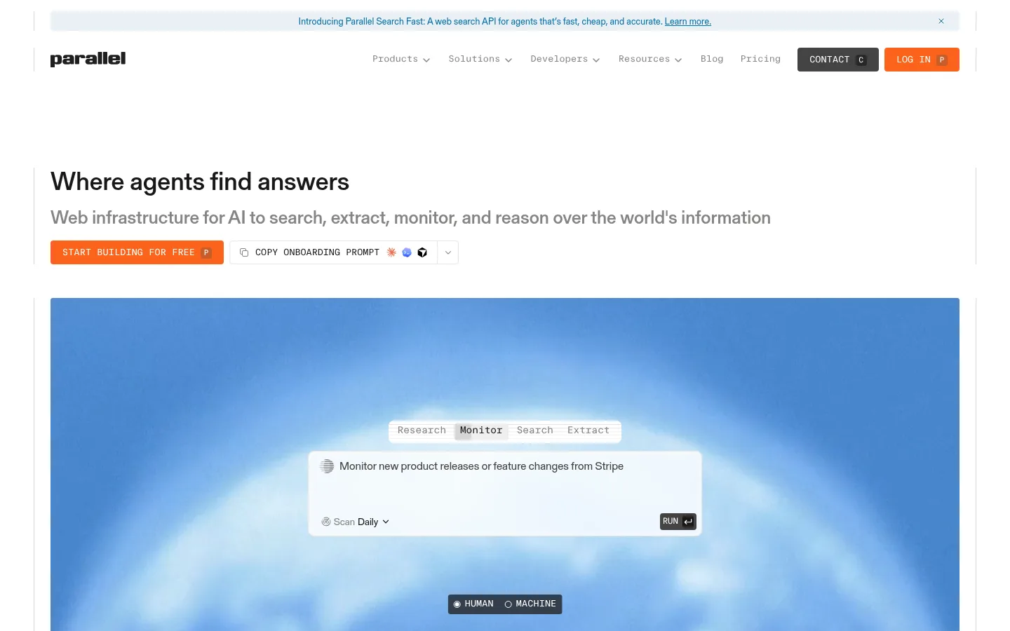
Hero product demo A broad media panel anchors the opening, with a floating light task interface, compact mode tabs, and a dark state control.
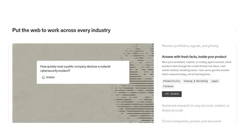
Feature split Alternating two-column text-and-demo sections pair concise explanations and links with framed interface visuals.
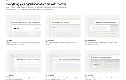
Product cards Product and use-case cards combine soft neutral fills, small labels, short descriptions, and screenshot-like media.
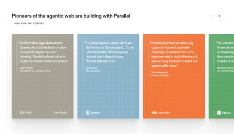
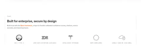
Trust and testimonial panels Customer proof uses logo groupings and colored quote cards; enterprise trust follows with concise credential details.
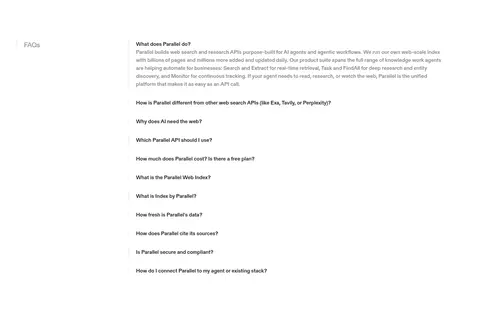
FAQ accordion A compact question list uses dark text, clear row separation, and simple expand controls on a white background.
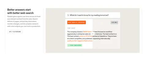
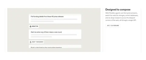
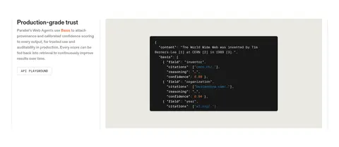
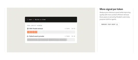
Imagery · Large product demos and interface mockups carry the visual storytelling. The hero uses a broad blue video-like scene with a floating white task interface; later sections show search, monitoring, extraction, and API output in framed UI panels. Most imagery is product illustration or screenshot-like media rather than lifestyle photography. Warm gray panels and occasional bright testimonial cards frame these visuals, while logos remain small and unobtrusive.
页面版块 共 22 个版块,按页面从上到下排列,每个都标了类型、布局和交互套路。
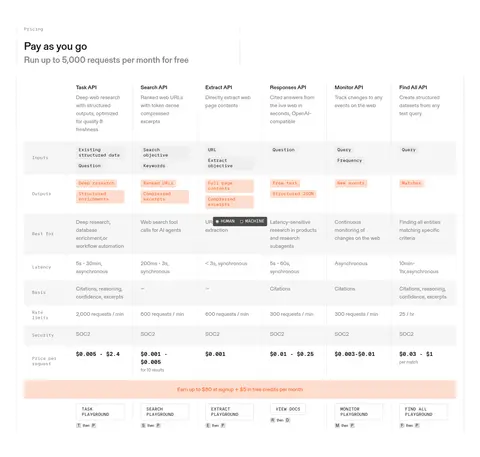
对比表 API定价对比
A six-column API comparison table beneath a pricing heading, with rows for inputs, outputs, use cases, latency, limits, security, and per-request prices.
功能网格 企业方案
A compact, single-row enterprise offer with heading and demo link on the left and a two-column feature list on the right.
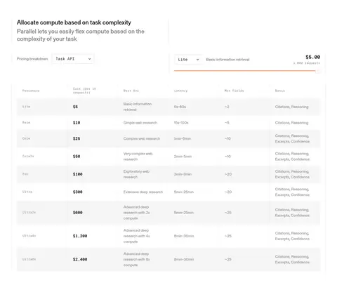
价格方案 任务定价明细
A pricing calculator and API selector sit above a wide, multi-column tier table.
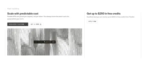
行动号召 开始构建
Two side-by-side promotional panels pair a cost-predictability message and media on the left with a free-credits offer on the right.
页脚 页脚导航
A multi-column footer places contact and email signup on the left, with grouped product, solution, developer, resource, and legal links alongside.
该做与不该做 ✓ 该做 Keep white as the default canvas. Use orange for primary actions, not broad decoration. Set technical labels in a compact monospace face. Alternate text-and-demo feature layouts down the page. Give product visuals room to read at a glance. Use neutral fills and fine rules to group content. ✕ 不该做 Do not turn every section into a colored band. Do not use large decorative gradients as the main brand treatment. Do not make secondary text compete with the headline. Do not apply heavy shadows to every card. Do not use orange for long passages of text. Do not crowd product screenshots with extra ornament. 给 AI 的提示词 想快速出一个同风格的新页面,把这段话连同 DESIGN.md 一起发给 AI。
复制 Build a new page in Parallel’s visual language: start with a clean Gallery White (#ffffff) canvas, dark Ink Black (#181818) headings, and Soft Graphite (#858483) supporting copy. Use Signal Orange (#fb631b) sparingly for the main CTA, with Button Charcoal (#434343) for secondary actions. Set editorial content in a modern sans-serif close to Inter and reserve a compact monospace like IBM Plex Mono for navigation, uppercase controls, and technical labels. Create a wide, centered layout with generous section spacing, alternating text-and-product-demo splits, and restrained card grids. Frame interface visuals with Porcelain Gray (#f5f4f1) or Warm Stone (#ebe9e3), fine Rule Gray (#eeeeee) borders, and subtle shadows. Keep the overall page calm; let one vivid blue product-media moment carry the strongest color.
DESIGN.md Tailwind v4 CSS 变量 Design Tokens
---
title: "Parallel design system"
variant: extended
source: https://parallel.ai/
captured_at: 2026-10-12
theme: light
industry: ai
generator: Design DNA (https://four.wiralomi.com/style/parallel-ai)
ai_generated: true
ai_label: "本文件由 AI 辅助生成:数值取自公开网页的实测样式,命名、用途说明与建议为模型解读。商标归原所有者。 / AI-assisted content"
---
# Parallel · Design System
> Quiet technical clarity with vivid product moments
**Theme:** light · **Industry:** ai · **Source:** https://parallel.ai/ · **Captured:** 2026-10-12 (1440×900 desktop)
_AI-assisted content: values are measured from the public page at capture time; names, roles and guidance are model-written interpretations. Trademarks belong to their owners._
Parallel pairs a restrained white canvas and compact technical typography with vivid, oversized product visuals. Its long-form homepage alternates clear editorial explanations, interface demonstrations, customer proof, and trust details.
## North star
Keep the page quiet and spacious, then use vivid product media and orange actions to make the important moments unmistakable.
## Overview
The page is built on a near-continuous white canvas, with dark near-black headings and muted gray supporting copy creating a calm, technical hierarchy. Signal Orange (## Colors
| Name | Hex | Token | Group | Role |
|---|---|---|---|---|
| Gallery White | ` | `--color-gallery-white` | surface | Dominant page canvas, open section backgrounds, and light interface cards. |
| Signal Orange | ` | `--color-signal-orange` | brand | Primary build CTA, login button, and small emphasis marks. |
| Soft Graphite | ` | `--color-soft-graphite` | neutral | Muted supporting copy, secondary navigation, and subdued labels. |
| Peach Wash | ` | `--color-peach-wash` | surface | Measured flat gradient tone; treat as a subtle media or decorative tint, not a core page band. |
| Rule Gray | ` | `--color-rule-gray` | neutral | Card outlines, fine separators, and pale badge backgrounds. |
| Ink Black | ` | `--color-ink-black` | neutral | Primary headings, body text, and dark interface details. |
| Warm Stone | ` | `--color-warm-stone` | surface | Warm neutral backing for product demonstrations and selected cards. |
| Status Green | ` | `--color-status-green` | semantic | Small status or success badge detail; not a defining page color. |
| Mint Tint | ` | `--color-mint-tint` | semantic | Pale badge accent in interface details; use only for status-like highlights. |
| Ember Orange | ` | `--color-ember-orange` | accent | Secondary orange within product cards, links, and illustrated interface details. |
| Porcelain Gray | ` | `--color-porcelain-gray` | surface | Soft card and demo-panel fill, especially in the industry and product sections. |
| Button Charcoal | ` | `--color-button-charcoal` | neutral | Secondary CTA backgrounds and dark control surfaces. |
| Link Blue | ` | `--color-link-blue` | accent | Occasional inline link or technical text accent. |
| Mist Blue | ` | `--color-mist-blue` | surface | Blue-toned media or card surface, mainly inside product visuals. |
| Weathered Taupe | ` | `--color-weathered-taupe` | surface | Muted testimonial or illustration panel color rather than a general page background. |
| Sky Blue | ` | `--color-sky-blue` | accent | Large blue hero-demo imagery; an expressive media color, not a base UI surface. |
### Semantic aliases
`--color-canvas` → ` (Gallery White) · `--color-surface` → ` (Warm Stone) · `--color-surface-2` → ` (Porcelain Gray) · `--color-surface-3` → ` (Mist Blue) · `--color-surface-4` → ` (Weathered Taupe) · `--color-text` → ` (Ink Black) · `--color-text-muted` → ` (Soft Graphite) · `--color-text-subtle` → ` (Gallery White) · `--color-border` → ` (Rule Gray) · `--color-accent` → ` (Signal Orange) · `--color-accent-2` → ` (Ember Orange) · `--color-accent-3` → ` (Link Blue) · `--color-on-accent` → ` (Gallery White)
### Contrast (WCAG 2.x)
| Text | Background | Ratio | Level |
|---|---|---|---|
| ` | ` | 17.76:1 | AAA |
| ` | ` | 14.63:1 | AAA |
| ` | ` | 16.14:1 | AAA |
| ` | ` | 8.23:1 | AAA |
| ` | ` | 3.73:1 | AA-large |
| ` | ` | 3.07:1 | AA-large |
| ` | ` | 3.39:1 | AA-large |
| ` | ` | 1.73:1 | fail |
| ` | ` | 1.21:1 | fail |
| ` | ` | 1.1:1 | fail |
### Gradients
- `linear-gradient(rgb(252, 221, 207), rgb(252, 221, 207))`
## Typography
| Family | Token | Source | Weights | Role | Free substitute |
|---|---|---|---|---|---|
| gerstnerProgramm | `--font-body` | webfont | 500, 400 | Headings, body copy, feature descriptions, and most links and buttons. | Inter |
| ftSystemMono | `--font-mono` | webfont | 400, 500 | Navigation, uppercase CTAs, technical labels, badges, and code-like content. | IBM Plex Mono |
- **gerstnerProgramm:** Measured weights 400 and 500; compact modern sans-serif with modest positive tracking on body and controls.
- **ftSystemMono:** Measured weights 400 and 500; small, precise monospace labels often use uppercase.
### Type scale — Major Third (ratio ≈ 1.26, base 16px)
| Role | Size | Weight | Line height | Letter spacing | Case | Family | Used for |
|---|---|---|---|---|---|---|---|
| h1 | 32px | 500 | 1.13 | 0 | — | gerstnerProgramm | Primary hero headline and major page-level statement. |
| h2 | 26px | 500 | 1.23 | 0 | — | gerstnerProgramm | Section headings introducing product capabilities and proof. |
| h3 | 20px | 500 | 1.4 | 0 | — | gerstnerProgramm | Subsection titles and individual feature or FAQ prompts. |
| body | 16px | 500 | 1.5 | 0.009em | — | gerstnerProgramm | Explanatory copy across product, trust, and customer sections. |
| caption | 13px | 500 | 1.23 | 0.012em | — | gerstnerProgramm | Compact card labels, supporting notes, and metadata. |
| button | 16px | 500 | 1.5 | 0.009em | — | gerstnerProgramm | CTA labels and interactive control text. |
| nav | 13px | 400 | 1.23 | 0.012em | — | ftSystemMono | Header navigation and compact menu labels. |
| link | 16px | 500 | 1.5 | 0.009em | — | gerstnerProgramm | Inline actions and case-study links. |
| code | 13px | 400 | 1.23 | 0.012em | — | ftSystemMono | Onboarding prompts, API examples, and technical snippets. |
## Spacing & layout
- Base unit **4px**, density **comfortable**.
- Scale (most used values): 2, 3, 4, 6, 7, 8, 9, 10, 12, 15, 16, 20, 24, 48, 80 px.
- Section rhythm 80px · element gap 8px · card padding — · max content width 1296px.
The page uses a centered, wide content frame with a measured maximum width of 1296px and a comfortable density. The header and announcement are compact, while the hero gives its headline and demo substantial breathing room. Content alternates between two-column feature splits, multi-column card groups, and full-width media. Section rhythm is generous, with measured 80px section gaps, and alignment is mostly left-led; customer proof and logo areas use centered groupings. Fine dividers structure the long scroll without introducing strong background bands.
## Shape & elevation
- Radius: button `4px` · card `4px` · media `4px` · badge `4px` · nav `4px` · link `4px` · xs `1px` · sm `2px` · md `3px` · lg `4px` · xl `5px` · 2xl `6px` · pill `9999px`
- Shadow `xl` (card): `rgba(0, 0, 0, 0.07) 0px 83.282px 66.626px 0px, rgba(0, 0, 0, 0.05) 0px 34.793px 27.835px 0px, rgba(0, 0, 0, 0.04) 0px 18.602px 14.882px 0px, rgba(0, 0, 0, 0.04) 0px 10.428px 8.343px 0px, rgba(0, 0, 0,`
- Shadow `hairline` (card, other): `rgba(0, 0, 0, 0.03) 0px 1.5px 0.75px 0px, rgba(0, 0, 0, 0.02) 0px 3px 0.5px 0px, rgba(0, 0, 0, 0.01) 0px 5px 0.5px 0px`
- Shadow `sm` (other): `rgba(0, 0, 0, 0.12) 0px 4px 4px 0px`
- Shadow `inset` (other): `rgba(31, 27, 12, 0.043) 0px 0px 18px 0px inset`
- Shadow `sm-2` (other): `rgba(0, 0, 0, 0.25) 0px 4px 4px 0px`
- Shadow `sm-3` (other): `rgba(0, 0, 0, 0.02) 0px 0px 0px 0.6px, rgba(0, 0, 0, 0.1) 0px 1.2px 1.2px 0px, rgba(0, 0, 0, 0.12) 0px 2.4px 3.6px -2.4px`
- Motion: standard transition `0.15s ease` on interactive elements.
Most sections sit flat on white, separated by whitespace and hairline gray borders. Cards use subtle fills, small corner radii, and occasional soft layered shadows rather than pronounced elevation. Product demos may appear inset into larger neutral panels, with the media itself providing depth and contrast.
## Imagery
Large product demos and interface mockups carry the visual storytelling. The hero uses a broad blue video-like scene with a floating white task interface; later sections show search, monitoring, extraction, and API output in framed UI panels. Most imagery is product illustration or screenshot-like media rather than lifestyle photography. Warm gray panels and occasional bright testimonial cards frame these visuals, while logos remain small and unobtrusive.
## Components
### Announcement and navigation
A slim announcement strip sits above a minimal header. Navigation uses compact monospace labels; the dark contact control and orange login action stand apart.
### Primary CTA
Orange action button with white uppercase monospace text and a measured 4px radius; secondary actions use charcoal.
### Hero product demo
A broad media panel anchors the opening, with a floating light task interface, compact mode tabs, and a dark state control.
### Feature split
Alternating two-column text-and-demo sections pair concise explanations and links with framed interface visuals.
### Product cards
Product and use-case cards combine soft neutral fills, small labels, short descriptions, and screenshot-like media.
### Trust and testimonial panels
Customer proof uses logo groupings and colored quote cards; enterprise trust follows with concise credential details.
### FAQ accordion
A compact question list uses dark text, clear row separation, and simple expand controls on a white background.
### Measured component styles
- **Primary button** (“LOG IN P”): background ## Do
- Keep white as the default canvas.
- Use orange for primary actions, not broad decoration.
- Set technical labels in a compact monospace face.
- Alternate text-and-demo feature layouts down the page.
- Give product visuals room to read at a glance.
- Use neutral fills and fine rules to group content.
## Don't
- Do not turn every section into a colored band.
- Do not use large decorative gradients as the main brand treatment.
- Do not make secondary text compete with the headline.
- Do not apply heavy shadows to every card.
- Do not use orange for long passages of text.
- Do not crowd product screenshots with extra ornament.
## Agent prompt
Build a new page in Parallel’s visual language: start with a clean Gallery White (## Page sections (top to bottom)
| # | Type | Layout | UX patterns | UI patterns |
|---|---|---|---|---|
| 1 | hero | Left-aligned headline and subheading above a broad product demo. | primary build CTA, copy prompt action | large headline, orange CTA, wide blue media |
| 2 | video | Full-width media panel with floating controls and task interface. | mode selection, run task | blue video scene, floating light card, dark toggle |
| 3 | logo-cloud | Centered heading above a multi-row customer logo grid. | customer proof, case-study links | centered title, logo grid, white canvas |
| 4 | feature-split | Two columns: demo visual on one side, explanatory content on the other. | industry examples, try search action | neutral demo panel, compact category chips |
| 5 | feature-split | Copy column beside a framed search-and-answer interface. | API playground link, answer preview | two-column split, warm neutral panel |
| 6 | feature-split | Workflow demo and supporting copy share a two-column row. | compose tasks, API playground link | stacked task cards, neutral media backing |
| 7 | feature-split | Copy and trust explanation paired with a structured output panel. | provenance explanation, auditability | code-like dark demo, light neutral frame |
| 8 | comparison | Cost comparison visual paired with concise explanatory text. | compare retrieval cost, onboard agent | bar comparison, dark task prompt |
| 9 | product-grid | Introductory copy followed by a three-column capability card grid. | browse product modules, open product details | image-led cards, short captions |
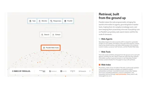
| 10 | feature-split | Large architecture visual beside explanatory product-family content. | explore product families, read capability details | diagram media, stacked text groups |
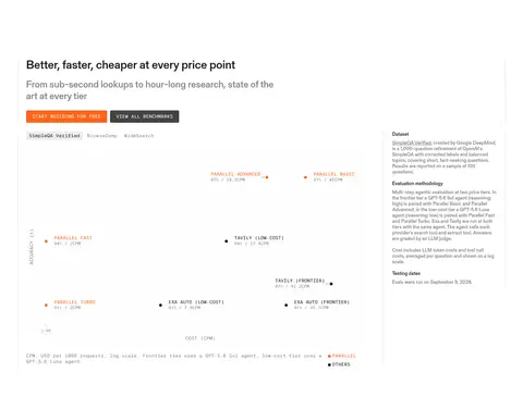
| 11 | stats | Wide benchmark area with intro and action controls above chart content. | view benchmarks, select benchmark | data chart, compact labels, orange emphasis |
| 12 | testimonials | Horizontal row of colored quote cards beneath an introductory heading. | carousel navigation, case-study links | colored quote cards, customer marks |
| 13 | other | Trust headline and copy paired with a row of security credentials. | review security claims, scan certifications | credential marks, compact trust labels |
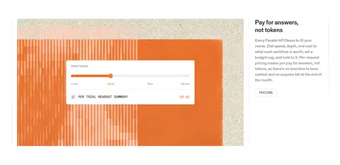
| 14 | pricing | Pricing illustration and explanatory copy arranged side by side. | review pricing model, inspect tier controls | orange-toned visual, pricing readout card |
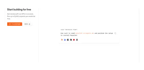
| 15 | cta | Introductory copy beside a spacious onboarding prompt panel. | open API playground, view docs | prompt panel, orange primary action |
| 16 | faq | Single-column FAQ list with questions and expandable answers. | expand answer, scan common questions | plain white rows, simple disclosure controls |
| 17 | cta | Closing headline and actions above a broad blue media panel. | start building, contact team | blue video backdrop, compact action links |
## Source CSS custom properties (selected)
```css
--color-stroke-primary: