North star · Make technical GIS feel editorial and approachable: warm neutral space, expressive serif headlines, crisp sans-serif controls, and purposeful map imagery.
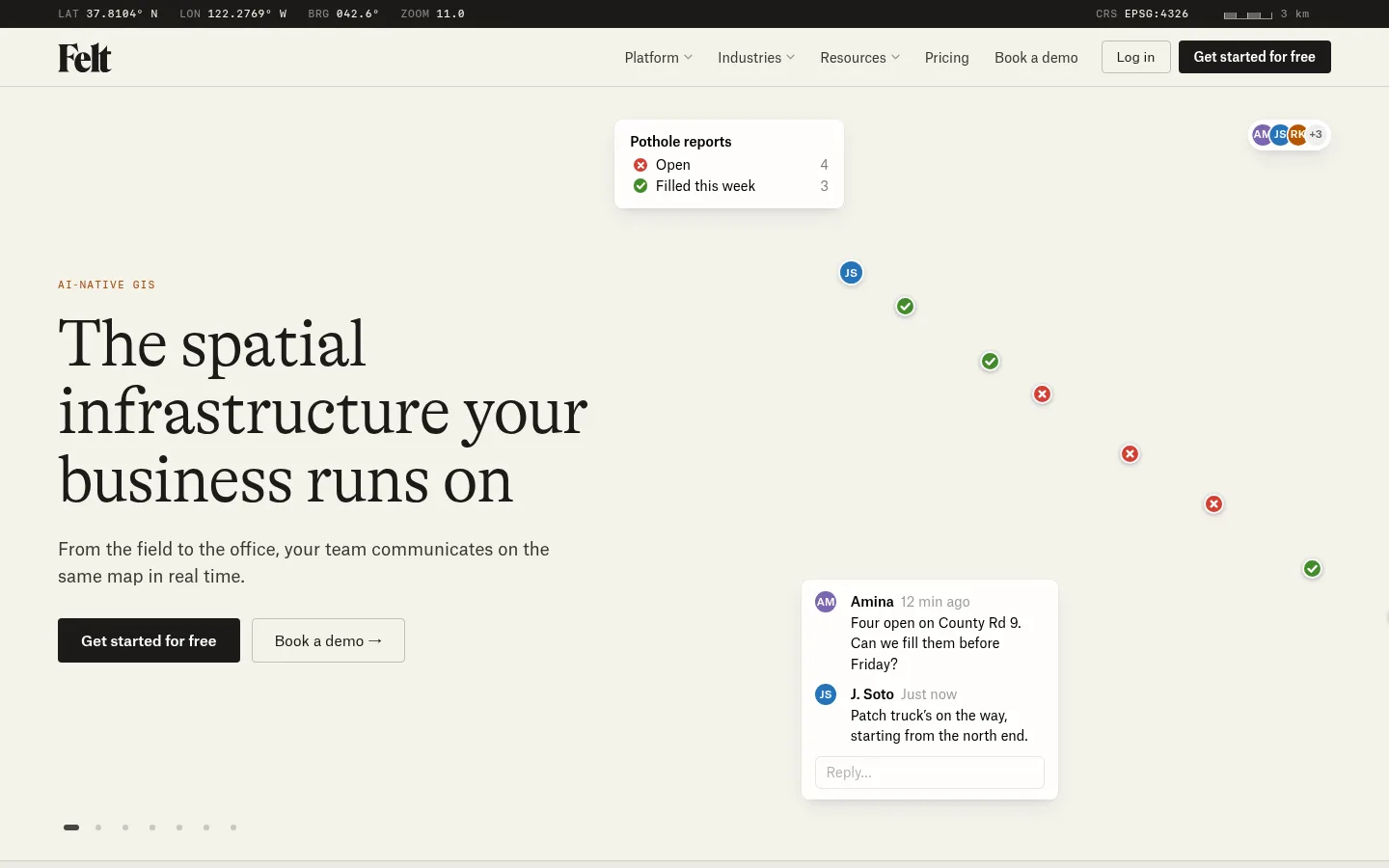
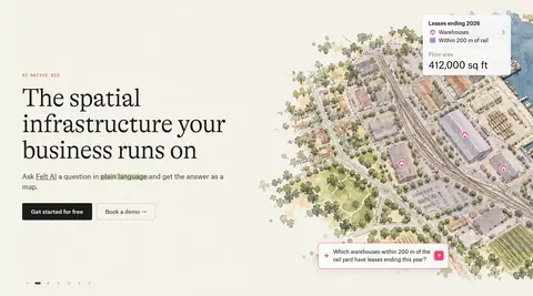
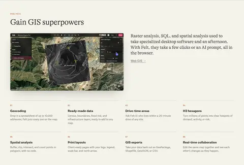
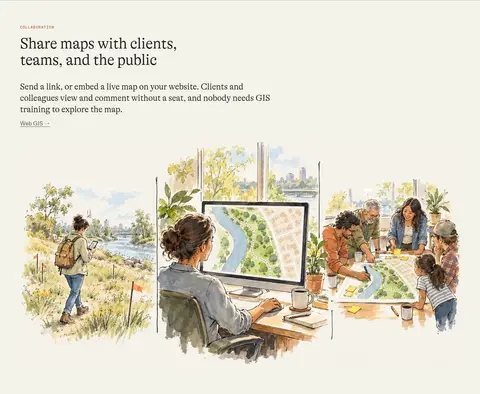
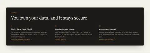
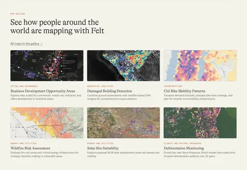
The page is grounded in a warm off-white canvas (#f4f2ea), with near-black text and occasional dark product or security panels providing strong contrast. Muted gray text and fine gray-beige rules keep the long homepage organized without heavy card framing. GT Alpina serif headlines create an editorial voice; Atlas Grotesk carries navigation, body copy, and controls, while small uppercase SF Mono labels lend a cartographic, technical accent. The layout alternates broad media-led showcases with compact multi-column content, keeping most section backgrounds continuous and using alignment and hairlines to mark transitions. Map artwork is the defining visual asset: watercolor-like landscapes and colorful GIS screenshots illustrate real use cases rather than acting as generic decoration. Black calls to action stay prominent, with restrained orange link accents and tiny colored badges. Cards and floating map UI layers gain separation through subtle borders and selective shadows, not persistent elevation.
配色
点色块复制色值。用途说明来自对页面的实测位置(背景、文字、描边、按钮)与截图判读。
品牌色
强调色
表层色
中性色
功能色
页面底色 · Warm Cartography表层 · Map Ink表层 2 · Interface White表层 3 · Night Panel表层 4 · Pale Stone主文字 · Map Ink次要文字 · Muted Graphite弱文字 · Deep Taupe描边 · Field Rule强调 · Survey Amber强调 2 · Overlay Blue强调 3 · Overlay Green
Navigation, body copy, links, buttons, and compact interface text
Aa 设计
GT Alpina
网络字体 · 字重 400 · 占比 24%
免费替代:Cormorant Garamond
Display and section headlines
Aa 设计
Publico Text
网络字体 · 字重 400 · 占比 10%
免费替代:Source Serif 4
Supporting serif text in selected editorial or content areas
Aa 设计
SF Mono
网络字体 · 字重 400 · 占比 7%
免费替代:IBM Plex Mono
Eyebrows, coordinates, and compact technical labels
角色
示例
字号
字重
行高
字距
特大标题
Large editorial hero headline.
Felt
69px
400
1.02
-0.02em
一级标题
Primary page and section headlines.
Felt
46px
400
1.06
-0.015em
二级标题
Secondary section headings.
The quick brown fox 敏捷的狐狸
27px
400
1.26
0
三级标题
Feature and content-card headings.
The quick brown fox 敏捷的狐狸
26px
400
1.3
-0.01em
四级标题
Smaller subsections and supporting headings.
The quick brown fox 敏捷的狐狸
21px
400
1.2
0
正文
Main descriptive and explanatory copy.
The quick brown fox 敏捷的狐狸
14px
400
1.55
0
辅助文字
Compact captions and supporting annotations.
The quick brown fox 敏捷的狐狸
11.5px
400
1.35
0
导航
Top navigation links and menu items.
The quick brown fox 敏捷的狐狸
13.5px
500
1.3
0
链接
Inline text links and feature destinations.
The quick brown fox 敏捷的狐狸
16px
400
normal
0
眉题
Small uppercase section labels and metadata.
The quick brown fox 敏捷的狐狸
11px
400
normal
0.1em
代码
Compact uppercase technical or coordinate-style labels.
const style = 1;
11px
400
normal
0.1em
间距与布局
基准单位 2px · 密度:适中
72px版块间距
2px元素间距
9px卡片内边距
1320px内容最大宽度
2px
4px
5px
6px
7px
8px
12px
13px
14px
16px
22px
24px
26px
34px
40px
56px
Use a centered, roomy page frame with a measured maximum width of 1320px and comfortable content density. The hero is a wide split composition with text on the left and map media on the right; later sections alternate single-column showcases, two-column feature splits, and dense multi-column grids. Most content remains on the same warm canvas, with section boundaries expressed by hairlines. Keep headlines and copy left-aligned except for the final centered CTA. The measured section rhythm is generous, with a 72px section gap.
圆角与层次
按钮 · 4px
卡片 · 6px
徽标 · 50%
导航 · 4px
hairline · badge
inset · nav
xl · card, section
hairline · other
The page is mostly flat: hairline borders and section rules organize content without heavy card chrome. Reserve soft, wide shadows for floating product surfaces, map UI, and selected showcase cards. The hero’s map overlay and small interface panels create layered depth; dark panels remain solid and graphic.
组件
下面的预览按实测的按钮、输入框、徽标、卡片样式重建(字体用替代字体)。
Primary CTA
Near-black button with white Atlas Grotesk text, measured 4px radius, and compact, confident treatment.
Secondary CTA
Canvas-colored or transparent button with dark text, a thin #c1beb8 outline, and matching 4px radius.
Eyebrow label
Small uppercase SF Mono label with tracked lettering, often in muted amber or subdued neutral.
Feature row
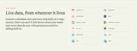
Text and media arranged in a split layout, with a serif heading, concise copy, and a restrained inline link.
Hairline card
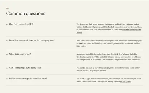
Flat content block separated by a thin gray-beige rule; avoid prominent filled containers.
Map showcase
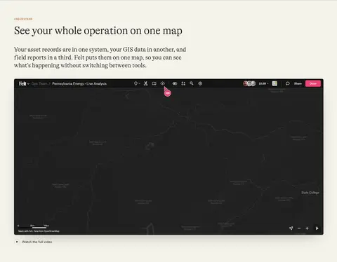
Large GIS screenshot or illustration with optional floating white product UI and subtle shadow.
Footer navigation
Dark inverse surface with a wordmark, coordinate-style metadata, and compact multi-column link groups.
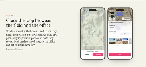
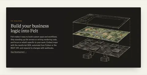
Imagery · Use map imagery as the primary visual language: detailed GIS screenshots, map-gallery tiles, and watercolor-like landscape illustrations. The hero uses broad, softly blended map art rather than a hard rectangular crop; product screenshots remain crisp and framed as software. Phone mockups and diagrams show the platform in context. Keep imagery colorful but earthy, and let data overlays provide brighter blue, green, and orange accents.
Use the warm canvas as the default page background.
Pair editorial serif headlines with practical sans-serif interface text.
Use maps and product views as meaningful evidence of the software.
Mark sections with subtle hairlines instead of heavy containers.
Keep primary actions dark, legible, and visually decisive.
Use mono uppercase labels sparingly for technical context.
✕ 不该做
Do not turn the page into a bright, saturated SaaS dashboard.
Do not use gradients as a dominant background treatment.
Do not surround every block with a raised card.
Do not use oversized all-caps headlines.
Do not make map artwork feel like generic stock photography.
Do not apply avatar or map-overlay colors as broad brand accents.
给 AI 的提示词
想快速出一个同风格的新页面,把这段话连同 DESIGN.md 一起发给 AI。
Build a polished SaaS page in Felt’s editorial GIS style. Use Warm Cartography (#f4f2ea) as the continuous canvas, Map Ink (#1c1b18) for text and primary actions, and restrained rules in Field Rule (#d6d4cc) or Soft Border (#c1beb8). Set large, sentence-case headlines in an expressive serif similar to GT Alpina, with clean sans-serif body and controls. Use small tracked mono eyebrows for section metadata. Favor spacious split layouts, wide product showcases, and purposeful map illustrations or GIS screenshots; keep most sections flat and separate them with hairlines. Use white floating UI sparingly, with subtle shadows only where layering clarifies the product. Reserve Survey Amber (#dc8c46) for small link accents and map colors for artwork. Keep navigation and CTA styling simple and precise.