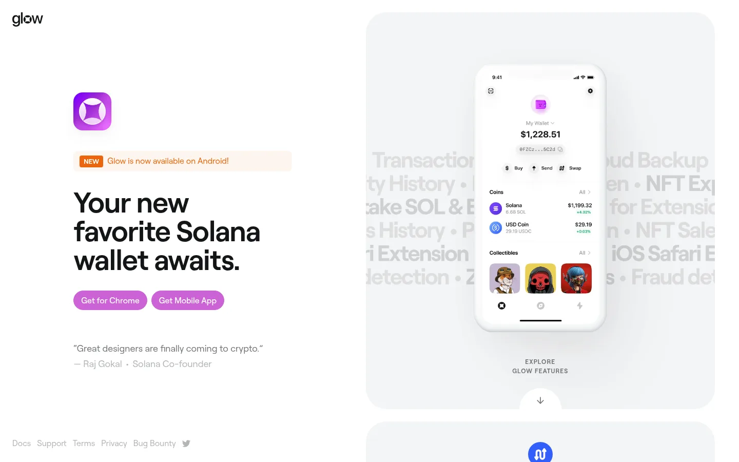
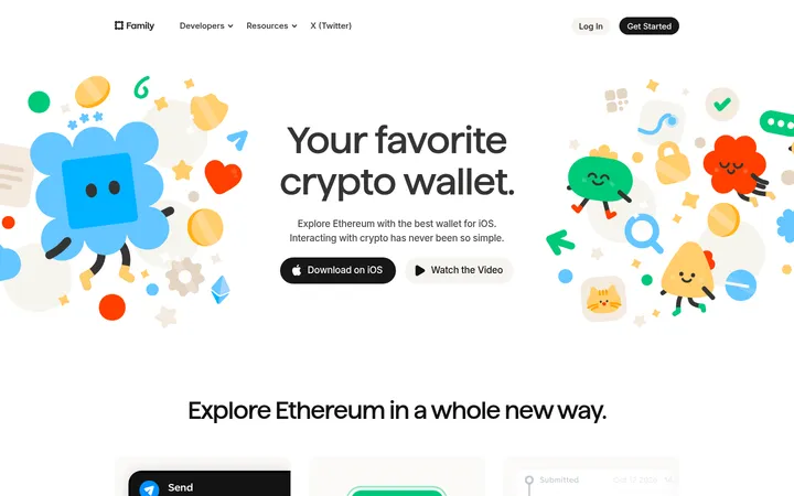
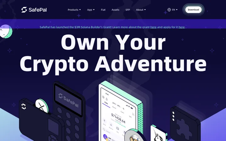
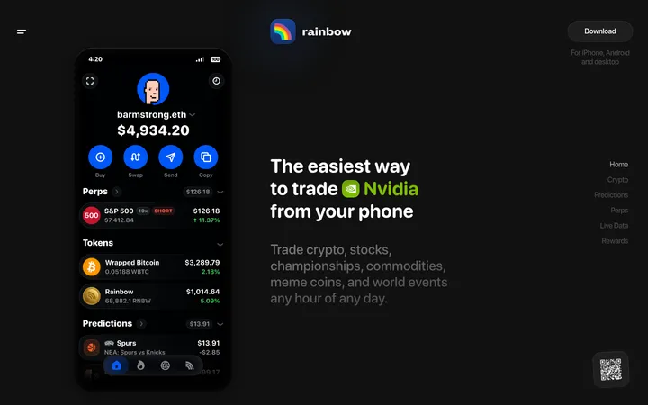
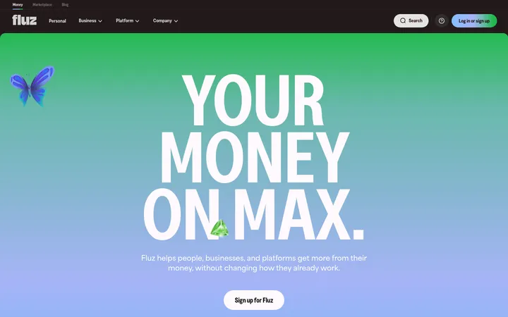
North star · Keep the page quiet and spacious so rounded, detailed wallet mockups—not decorative chrome—carry the story.
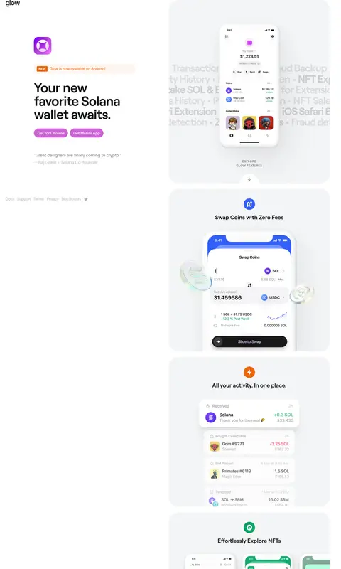
The page uses a white canvas and pale gray feature panels to create a calm frame for wallet screens. Near-black Roobert headings anchor the composition, while muted grays handle supporting copy and quiet footer links. Violet-pink marks the main browser CTA and selected links; orange, red, green, and purple accents appear mainly as feature indicators or within the wallet mockups, rather than as broad brand backgrounds. The hero places a compact text column beside a large, rounded product panel, then continues as a vertically ordered feature tour. Repeated, generous panels create rhythm without heavy dividers. Product imagery is the visual centerpiece: phones, interface cards, and app scenes sit against soft surfaces, with occasional vivid color contained inside the mockups. Rounded controls and panels soften the otherwise minimal, product-led layout.
All page text, from display headings and feature titles to buttons, captions, and links.
角色
示例
字号
字重
行高
字距
特大标题
Large hero or display statement, set tightly and confidently.
Glow
56px
600
1
-0.018em
一级标题
Main hero headline and primary page heading.
Glow
40px
700
1.1
0
二级标题
Feature-panel titles and secondary section headings.
The quick brown fox 敏捷的狐狸
24px
600
1.28
0
正文
Supporting descriptions, testimonials, and feature copy.
The quick brown fox 敏捷的狐狸
16px
400
1.5
0
辅助文字
Small uppercase labels such as feature-panel prompts.
The quick brown fox 敏捷的狐狸
12px
600
1.5
0.083em
链接
Navigation links and inline testimonial links.
The quick brown fox 敏捷的狐狸
16px
400
1.5
0
眉题
Short uppercase announcement or section-label text.
The quick brown fox 敏捷的狐狸
12px
600
1.5
0.083em
间距与布局
基准单位 8px · 密度:适中
48px版块间距
12px元素间距
—卡片内边距
—内容最大宽度
2px
4px
8px
10px
12px
14px
16px
24px
40px
48px
64px
The page has a sparse, asymmetrical hero: brand mark at the top, copy and CTAs on the left, and a large rounded product panel on the right. Below, the feature tour proceeds as a tall sequence of pale panels, with content centered inside each. The measured page uses a four-column structure, but the screenshot’s dominant impression is the split hero followed by a single vertical stack. Keep alignment deliberate, whitespace generous, and content density comfortable; no measured maximum width is available.
圆角与层次
按钮 · 9999px
卡片 · 40px
图片 · 18px
徽标 · 4px
没有测到阴影:页面是扁平的,层次靠底色和描边区分。
The visual system is mostly flat: pale surfaces distinguish feature panels from the white canvas, without measured shadows. Use rounded panels and controls instead of ornamental borders; button outlines match their fills. Keep mockups visually layered within panels, while avoiding extra card shadows or heavy separators.
组件
下面的预览按实测的按钮、输入框、徽标、卡片样式重建(字体用替代字体)。
Primary CTA
Pill-shaped browser button with white text on Glow Orchid (#cc62d5); measured CTA padding is 10px 14px.
Dark CTA
Matching pill control with white text on Graphite Button (#333537), used for mobile-related actions.
Feature panel
Large rounded Mist Panel (#f4f5f6) card, repeated to present individual wallet capabilities and UI mockups.
Announcement badge
Compact orange NEW badge using Signal Tangerine (#ec660d) with white text and a small rounded corner.
Hero product showcase
Split hero pairs a bold wallet promise and CTA group with a large panel containing a phone mockup and feature prompt.
Quiet navigation links
Small, low-emphasis footer links in Quiet Silver (#b3b5b7), kept visually secondary to the hero and product tour.
Imagery · Use polished wallet UI mockups in phone frames as the primary imagery, supported by app screens and feature-specific interface compositions. Place them inside pale rounded panels rather than as full-bleed backgrounds. Keep colorful scenes, tokens, and interface accents contained within the mockups; the hero device should remain the clearest focal point. The page includes video and image media, but the overall treatment is product-led rather than photographic.
Use white canvas space to make product panels stand out.
Keep feature content inside softly rounded pale gray panels.
Use Glow Orchid for the primary browser CTA and selected link emphasis.
Set headings in strong near-black Roobert or a close substitute.
Show wallet interfaces inside crisp device mockups.
Keep orange, red, and vivid purple accents localized to badges or visuals.
✕ 不该做
Do not turn the page into a dark-themed interface.
Do not use saturated color as a broad background band.
Do not crowd the hero with extra navigation or promotional blocks.
Do not add heavy card shadows or thick separators.
Do not let mockup artwork overwhelm the page’s restrained canvas.
Do not use uppercase styling for long headlines or body copy.
给 AI 的提示词
想快速出一个同风格的新页面,把这段话连同 DESIGN.md 一起发给 AI。
Build a new wallet-product page in Glow’s restrained visual style. Use Gallery White (#ffffff) as the canvas and Mist Panel (#f4f5f6) for large, softly rounded feature surfaces. Set headings in near-black Wallet Ink (#131517) and supporting copy in muted gray; use Roobert or Inter with clear weight contrast. Make the hero asymmetrical, pairing concise copy and a Glow Orchid (#cc62d5) pill CTA with a large wallet-device mockup. Continue with a vertical sequence of centered product-feature panels. Keep Signal Tangerine (#ec660d), Electric Violet (#8800ff), and Alert Coral (#e83b47) to small indicators or imagery, not full backgrounds. Favor crisp device UI, generous whitespace, flat surfaces, and quiet secondary links; avoid heavy borders, shadows, and clutter.