North star · Let a centered, readable content structure sit within bold, rounded color chapters, keeping decoration playful and controls unmistakably clear.
The page uses a pale, near-white canvas as a quiet stage for bold, full-width section bands: warm yellow for the getting-started pitch, vivid green for the stack, periwinkle for FAQs, and pink for testimonials. The opening hero is centered, black-on-light, and framed by floating rounded geometric shapes; treat these accents as decorative illustration rather than interface states. Geist carries headings and body copy with compact, confident line breaks, while Geist Mono marks small labels, code, and navigation details. The layout moves from a spacious hero into denser feature cards, then alternates color-led sections with a light gallery panel. Rounded pills, large soft-corner cards, and restrained shadows keep the vivid palette friendly rather than severe. Preserve clear contrast and allow each section color to define its own visual chapter; reserve black for high-contrast actions, text, and the closing footer.
Small labels, code samples, and compact navigation text
角色
示例
字号
字重
行高
字距
特大标题
Large centered hero statement.
FastHTML
72px
500
1.22
-0.015em
一级标题
Primary page or section headline.
FastHTML
60px
500
1.1
-0.015em
二级标题
Major feature and FAQ section headings.
FastHTML
32px
500
1.25
-0.015em
三级标题
Feature-card and supporting subsection titles.
The quick brown fox 敏捷的狐狸
24px
400
1.33
-0.01em
正文
Hero support copy and explanatory paragraphs.
The quick brown fox 敏捷的狐狸
20px
400
1.4
-0.01em
辅助文字
Small uppercase section labels and technical metadata.
The quick brown fox 敏捷的狐狸
16px
500
1.8
0
按钮
Pill-shaped navigation and primary action labels.
The quick brown fox 敏捷的狐狸
16px
400
1.5
-0.005em
链接
Inline philosophy, sample, and navigation links.
The quick brown fox 敏捷的狐狸
24px
400
1.33
-0.01em
代码
Code previews and developer-focused snippets.
const style = 1;
16px
500
1.8
0
间距与布局
基准单位 8px · 密度:适中
64px版块间距
8px元素间距
32px卡片内边距
800px内容最大宽度
8px
16px
20px
24px
32px
48px
64px
96px
The measured content max width is 800px, set within full-bleed section bands. The hero centers its heading, copy, and actions; later sections vary between a three-card feature row, stacked technology cards, a four-item gallery, split FAQ content, and testimonial cards. Section changes create the primary rhythm, with comfortable density and generous breathing room. Use the measured 8px spacing base and preserve the distinction between compact labels and larger content groupings.
圆角与层次
按钮 · 9999px
卡片 · 24px
图片 · 9999px
导航 · 9999px
sm · button, other
inset · other, button, card
sm · card
Most sections rely on flat, saturated color rather than deep elevation. Rounded cards separate from their backgrounds through pale contrasting fills; FAQ rows and pill controls use subtle shadowing for definition. Keep borders sparse, with thin dark navigation hairlines where needed, and use layering mainly for hero decorations and inset media.
组件
下面的预览按实测的按钮、输入框、徽标、卡片样式重建(字体用替代字体)。
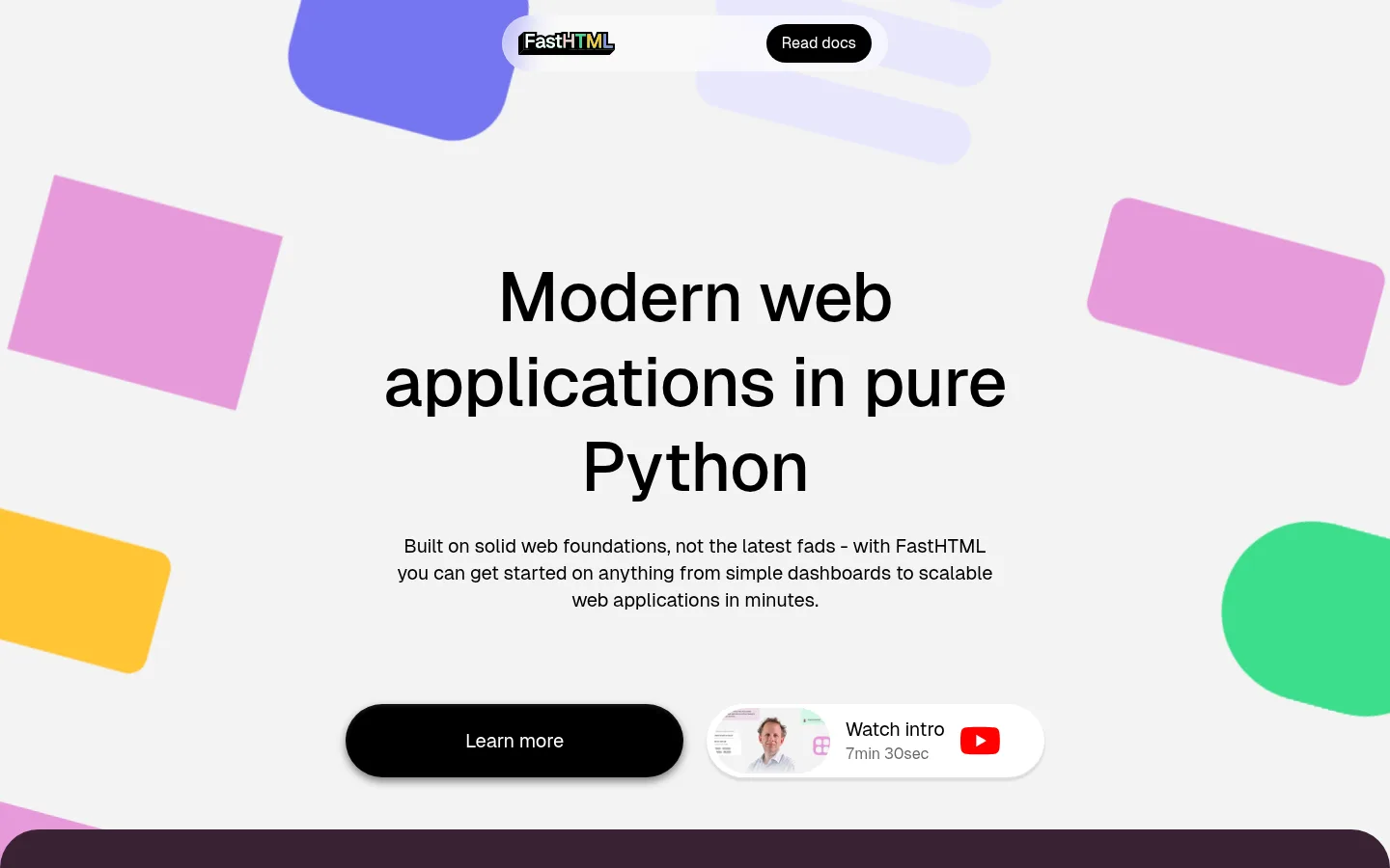
Centered hero
Large black multiline headline and concise support copy on a light canvas, with floating geometric accents and paired pill-shaped actions.
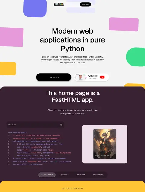
Dark demo panel
A plum showcase band with centered heading, code preview, sample media, and compact tab-like controls.
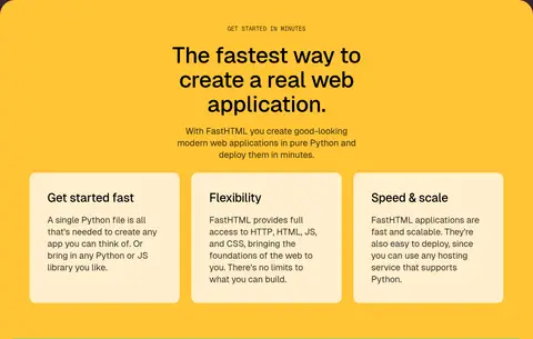
Feature cards
Three pale cards sit together on the marigold section, each with a concise heading and supporting copy.
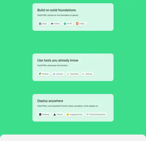
Stack cards
Pale mint cards organize foundations, familiar tools, and deployment options within the green section.
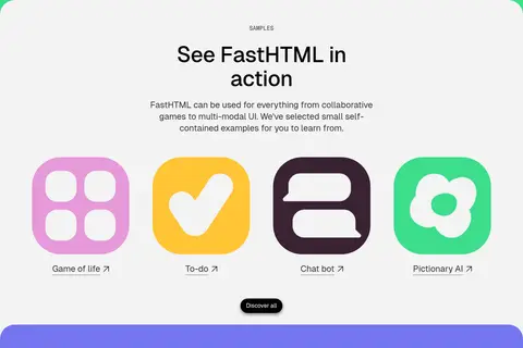
Sample gallery
A light rounded gallery panel presents four colorful app tiles with short linked labels.
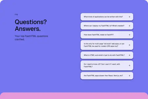
FAQ accordion
A split periwinkle section pairs a left-side title and description with a vertical stack of rounded question rows.
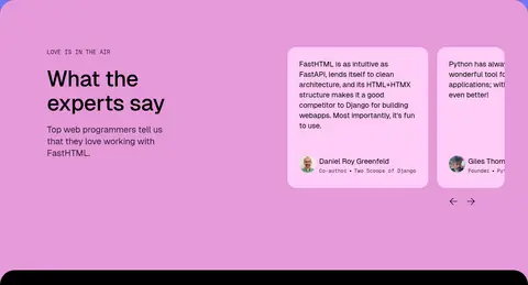
Testimonial cards
Pink section with introductory copy and a horizontal set of pale testimonial cards, including small author portraits.
Footer
Black closing band with compact monospace links and oversized FastHTML wordmark imagery.
Imagery · The page combines colorful abstract geometric shapes, product and sample previews, small technology logos, and testimonial portraits. The hero decorations are oversized, cropped rounded forms around the centered message. Sample artwork sits inside bright icon-like tiles, while cards contain compact previews or logos. Keep imagery crisp and secondary to the section colors; avoid introducing a photography-led visual direction.
Use full-width color bands to separate content chapters.
Set small technical labels in Geist Mono.
Use rounded cards and pill-shaped actions consistently.
Keep card copy concise and clearly hierarchical.
Treat floating geometric shapes as decoration.
✕ 不该做
Do not make the whole page dark.
Do not use gradients as a substitute for the solid section bands.
Do not let decoration obscure headings or controls.
Do not use dense, edge-to-edge text blocks.
Do not apply bright colors to every individual card.
Do not introduce heavy borders or dramatic shadows.
给 AI 的提示词
想快速出一个同风格的新页面,把这段话连同 DESIGN.md 一起发给 AI。
Build a new developer-tools page in the FastHTML visual style. Use a pale Gallery Porcelain (#f3f3f3) canvas, black Carbon Ink (#000000) typography, and generous centered space around the opening message. Organize content into full-width color chapters using Signal Marigold (#ffc435), Fast Green (#3cdd8c), Periwinkle Field (#7575f0), and Candy Orchid (#e699d9); keep each band distinct and readable. Use Geist or Inter for headings and body, with Geist Mono or Space Mono for labels and code. Favor rounded pale cards, black pill actions, compact technical labels, and restrained shadows. Add a few cropped geometric decorations and useful product previews, but keep them secondary to content. Vary section layouts while preserving clear hierarchy, comfortable spacing, and direct developer-focused copy.