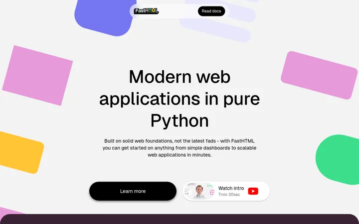
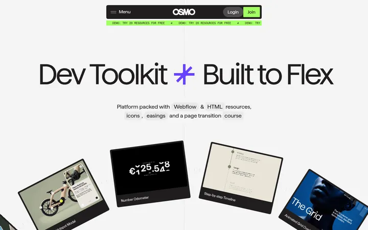
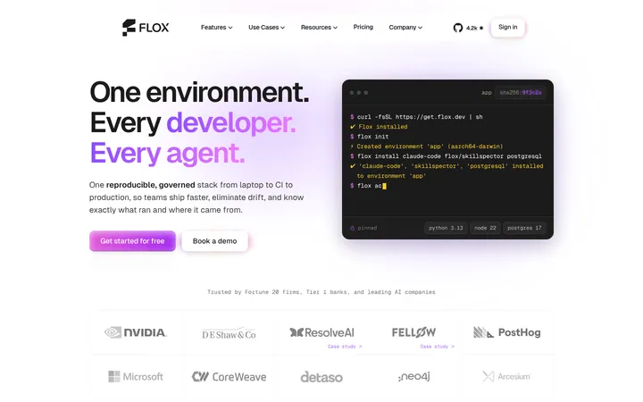
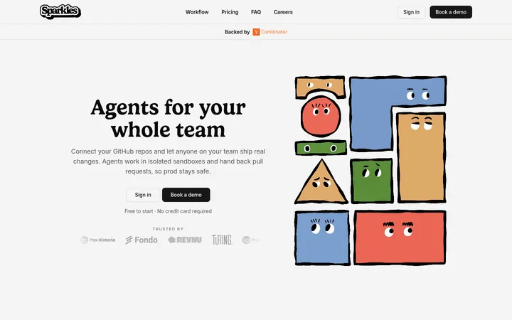
North star · Let editorial serif typography and generous white space frame technical content, using Svelte orange-red only as a precise navigational signal.
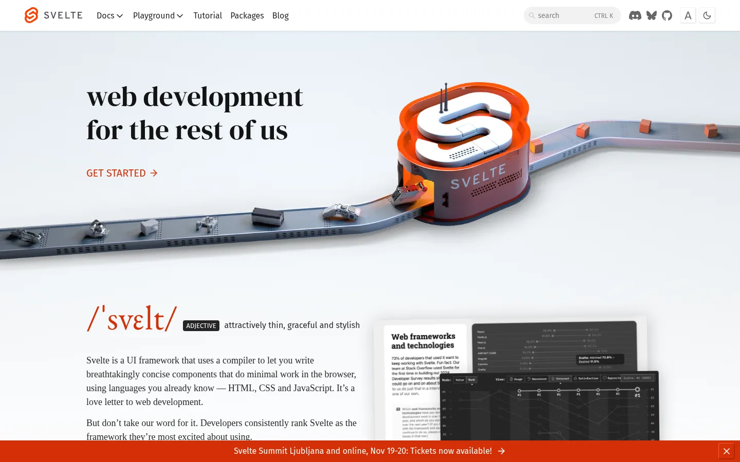
The page is built on a near-white canvas, with charcoal copy and a restrained orange-red accent reserved for the Svelte mark, links, calls to action, and the persistent announcement strip. The hero headline uses a large display serif, giving the framework a confident editorial voice; Georgia carries the longer explanatory text, while Fira Sans keeps navigation and controls compact and functional. The opening composition balances text on the left with a wide, cinematic 3D conveyor illustration on the right and across the hero. Below, content sections remain centered and sparse: a definition and product image, a muted company-logo row, a video, and a community collage. Broad vertical pauses separate these blocks. Borders are pale and thin, controls have restrained rounding, and the overall page stays mostly flat; depth comes primarily from layered media rather than interface shadows.
Long-form body copy, small captions, and small inline links.
Aa 设计
Fira Sans
网络字体 · 字重 400 · 占比 13%
免费替代:Roboto
Navigation and compact interface controls.
Aa 设计
DM Serif Display
网络字体 · 字重 500 · 占比 5%
免费替代:Bodoni Moda
Large hero headline and prominent editorial headings.
角色
示例
字号
字重
行高
字距
一级标题
Large two-line hero headline introducing Svelte.
Svelte
54px
500
1.2
0
正文
Explanatory framework copy and editorial section text.
The quick brown fox 敏捷的狐狸
18px
400
1.5
0
辅助文字
Compact image credits and supporting labels.
The quick brown fox 敏捷的狐狸
10px
400
1.5
0
导航
Top navigation items and interface navigation.
The quick brown fox 敏捷的狐狸
16px
400
1
0
链接
Small inline links, credits, and secondary calls to action.
The quick brown fox 敏捷的狐狸
10px
400
1.5
0
间距与布局
基准单位 2px · 密度:宽松
100px版块间距
10px元素间距
—卡片内边距
1104px内容最大宽度
1px
3px
5px
7px
8px
10px
14px
40px
48px
100px
A spacious, centered desktop composition uses a measured page maximum width of 1104px. The header forms a single compact horizontal row; the hero aligns its large headline and CTA to the left while full-bleed media expands across the page. Lower sections alternate centered text, media, logo strips, and collage imagery rather than a dense card grid. The measured section gap is 100px, with a spacious density and 10px element gap. Keep heading alignment predominantly start-aligned in the hero, with later community and proof sections centered.
圆角与层次
按钮 · 4px
输入框 · 9999px
图片 · 4px
导航 · 2px
链接 · 50%
没有测到阴影:页面是扁平的,层次靠底色和描边区分。
The interface is mostly flat, with no measured shadow system. Thin pale borders distinguish controls from the canvas, while small-radius buttons and media frames keep edges restrained. Let the hero artwork, video, and layered product imagery create depth; avoid adding floating cards or heavy drop shadows.
组件
下面的预览按实测的按钮、输入框、徽标、卡片样式重建(字体用替代字体)。
Header navigation
Compact white horizontal bar with the Svelte identity, Fira Sans navigation, search field, and small utility icons; labels use charcoal text.
Hero
Large DM Serif Display headline and orange-red GET STARTED link sit to the left of a wide Svelte 3D conveyor illustration.
Announcement strip
Bright orange-red banner spans the viewport near the lower edge, with centered event text, an arrow, and a close control.
Definition and product media
Georgia explanatory copy pairs with a Svelte wordmark-like phonetic heading and overlapping product-screen imagery.
Company proof
Centered serif heading is supported by a subdued horizontal row of recognizable company logos.
Community and video
Wide documentary video and a broad community photo collage provide human proof, separated by generous white space.
Imagery · The hero is defined by a wide 3D Svelte-branded conveyor scene, with cool pale surroundings and vivid orange-red hardware; these image colors are illustration content, not additional interface palette. Further down, a documentary video, product-screen imagery, company marks, and a community photo collage supply proof and personality. Keep media broad, carefully framed, and embedded in open white space.
Reserve Svelte Vermilion for links, identity, and key announcements.
Set prominent headings in a confident display serif.
Keep navigation and controls compact and sans-serif.
Give major content blocks generous vertical breathing room.
Use wide media to create visual impact instead of decorative cards.
✕ 不该做
Do not turn the page into a dense dashboard layout.
Do not use the accent red as a broad page background outside announcement-style emphasis.
Do not add heavy shadows or excessive card borders.
Do not replace the editorial serif voice with generic bold sans-serif headings.
Do not treat colors inside the 3D illustration as core interface colors.
Do not crowd the hero with extra labels or decorative UI.
给 AI 的提示词
想快速出一个同风格的新页面,把这段话连同 DESIGN.md 一起发给 AI。
Build a new Svelte-style developer page with a quiet white canvas (#ffffff), charcoal interface text (#262626), and carefully rationed Svelte Vermilion (#d43008) for links, calls to action, and brand moments. Lead with a large DM Serif Display-style headline, supported by Georgia-like readable prose; use Fira Sans-like typography for navigation and controls. Keep the header compact and horizontal. Give the hero an editorial text column beside a broad, distinctive technical illustration or product image, then separate subsequent content with generous whitespace. Use pale borders (#ebebeb), subtle control surfaces (#f2f2f2), and restrained corner rounding. Keep the page mostly flat and let imagery provide depth. Avoid dense cards, loud gradients, and decorative use of accent color.