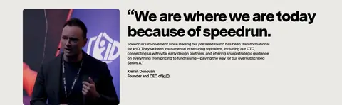
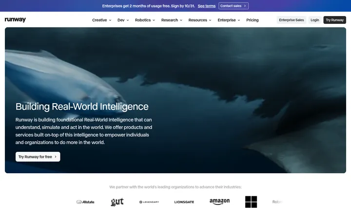
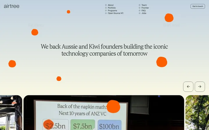
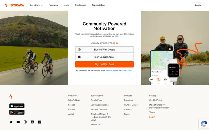
North star · Keep a warm, quiet canvas and let oversized black type and candid founder imagery carry the story, reserving saturated gradients for isolated accents.
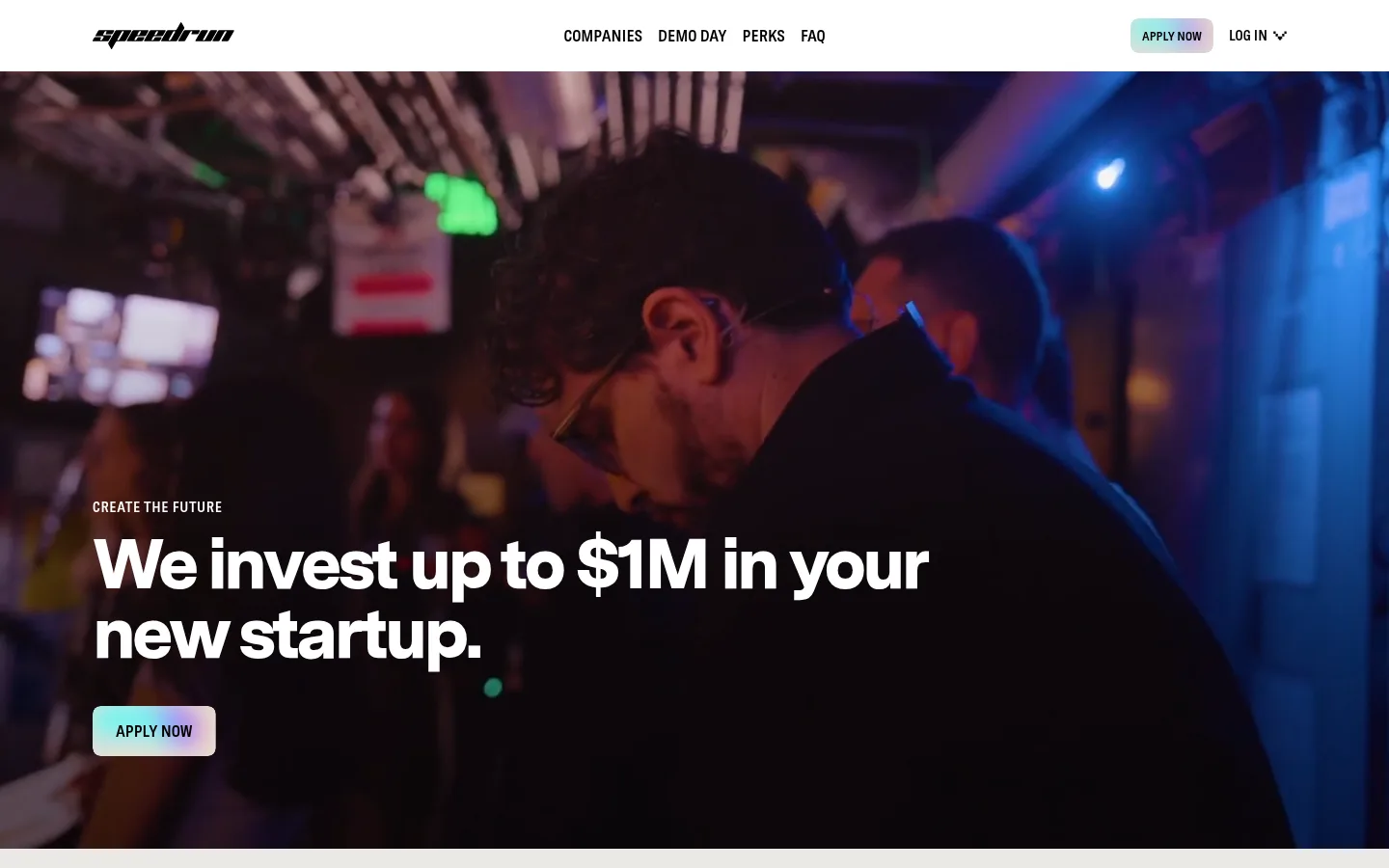
The visual system is anchored by a warm stone canvas (#ebe9e5), with black (#000000) headlines and white cards creating clear contrast. Most of the long page stays on the warm background; pure white is reserved for the closing event and FAQ areas. Pale gray rules separate content without adding visual weight. The accents—mint, cyan, and blue—appear sparingly in gradients, especially the newsletter panel and small CTA treatments; they are not the main page palette. Messina Sans carries nearly all the typography: heavy, tightly tracked display and heading styles make short statements feel direct, while compact uppercase labels introduce sections. A condensed Messina Sans face distinguishes uppercase navigation and buttons. The layout alternates wide text-led blocks with image cards, speaker portraits, and asymmetrical testimonial rows. Large section gaps keep this dense information page readable. Photography is candid and human, with simple rounded card edges and little reliance on shadows.
配色
点色块复制色值。用途说明来自对页面的实测位置(背景、文字、描边、按钮)与截图判读。
品牌色
强调色
表层色
中性色
页面底色 · Warm Stone表层 · Gallery White表层 2 · Oat Shadow主文字 · Pitch Black描边 · Soft Graphite强调 · Mint Signal强调 2 · Pool Cyan强调 3 · Electric Aqua
文字
背景
对比度
WCAG
#000000 Pitch Black
#ebe9e5 Warm Stone
17.32:1
AAA
#000000 Pitch Black
#ffffff Gallery White
21:1
AAA
#000000 Pitch Black
#e2dfd8 Oat Shadow
15.78:1
AAA
#a4d7bc Mint Signal
#ebe9e5 Warm Stone
1.33:1
不达标
#a4d7bc Mint Signal
#ffffff Gallery White
1.61:1
不达标
#a4d7bc Mint Signal
#e2dfd8 Oat Shadow
1.21:1
不达标
字体
字号阶梯:Custom(比例约 1.723,正文 16px)。示例用免费替代字体渲染,数值为实测。
Aa 设计
messinaSans
网络字体 · 字重 600 / 900 / 700 · 占比 94%
免费替代:DM Sans
Main display, headings, body copy, links, and most page text.
Aa 设计
messinaSansCondensed
网络字体 · 字重 600 · 占比 6%
免费替代:Barlow Condensed
Uppercase navigation, buttons, and eyebrow labels.
角色
示例
字号
字重
行高
字距
特大标题
Oversized event or campaign words used as visual anchors.
speedrun
243px
900
1
-0.074em
一级标题
Primary hero statement about startup investment.
speedrun
72px
900
1
-0.05em
二级标题
Major section headings and prominent testimonial quotations.
speedrun
64px
900
1
-0.05em
三级标题
Feature-card titles and secondary editorial headings.
speedrun
48px
900
1
-0.05em
四级标题
Smaller subheads within feature and content areas.
speedrun
32px
900
1
-0.05em
正文
Explanatory paragraphs, descriptions, and supporting copy.
The quick brown fox 敏捷的狐狸
16px
600
1.25
-0.03em
辅助文字
Compact speaker names, roles, and fine-print details.
A spacious, long-form page built around a measured 1248px maximum content width and a 4px-based spacing system. Navigation sits in a white top bar; the hero uses full-width photography with copy anchored low and left. Feature cards form a three-column row, while global-program and testimonial areas use looser split or multi-column arrangements. Large section gaps distinguish the editorial sequence. The denser speaker grid is balanced by broad margins, and the final event and FAQ blocks switch to white.
圆角与层次
按钮 · 8px
卡片 · 16px
图片 · 16px
导航 · 8px
链接 · 8px
没有测到阴影:页面是扁平的,层次靠底色和描边区分。
The page is largely flat: contrast comes from warm and white section bands rather than shadows. Cards use white surfaces on the stone canvas, with softly rounded corners and little visible elevation. Fine gray hairlines divide selected content rows. Hero media layers beneath copy, and gradients add color without creating a raised-card effect.
组件
下面的预览按实测的按钮、输入框、徽标、卡片样式重建(字体用替代字体)。
Top navigation
White horizontal bar with the black speedrun wordmark, compact links, and right-aligned Apply Now and Log In actions.
Hero
Full-bleed event image with dark treatment, uppercase eyebrow, large white investment headline, and a small gradient Apply Now control.
Feature cards
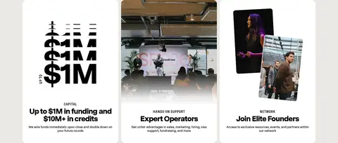
Three white, 16px-radius cards on the warm canvas; image-led content and centered capital, operator, and founder-network descriptions.
Perks CTA
Two bold perk statements separated by fine rules, followed by a black uppercase Learn More button.
Speaker gallery
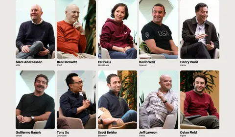
Compact multi-column portrait grid with names and affiliations set directly below each image.
Testimonial rows
Alternating image and large quotation layouts on the warm canvas, with compact founder attribution and supporting text.
Gradient newsletter panel
Wide blue-to-violet gradient field with a left-aligned bold heading and supporting subscription copy alongside a white form area.
Event and FAQ blocks
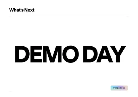
White closing sections use an oversized black Demo Day wordmark, then repeated question text, a founder image, and a compact FAQ CTA.
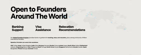
Imagery · Candid founder and operator photography is the primary image language: event moments, portraits, and speaker tiles are framed as clean rounded cards. Hero footage or photography fills the background, darkened enough for white overlay copy. Supporting cards mix event scenes and founder portraits. A faint world-map graphic supports the global-program section. The portfolio strip includes colorful company marks; treat their colors as image content, not brand palette.
Set headline hierarchy in bold black Messina Sans or a close substitute.
Keep navigation and button labels uppercase and condensed.
Use candid founder photography with restrained rounded framing.
Reserve vivid cyan and blue gradients for isolated panels or small CTA treatments.
Use white cards and fine gray rules to organize content without heavy shadows.
✕ 不该做
Do not turn the entire page into a saturated gradient.
Do not use colored body text where black is the measured default.
Do not add prominent drop shadows or glossy card effects.
Do not make every section a centered, identical card grid.
Do not use illustration colors as the site-wide brand palette.
Do not crowd the long-form page; preserve generous section separation.
给 AI 的提示词
想快速出一个同风格的新页面,把这段话连同 DESIGN.md 一起发给 AI。
Build a new page in the speedrun visual style. Use Warm Stone (#ebe9e5) as the primary canvas, Pitch Black (#000000) for typography and solid CTAs, Gallery White (#ffffff) for cards and selected section bands, and Soft Graphite (#d3d1ce) for quiet dividers. Keep Mint Signal (#a4d7bc), Pool Cyan (#00c6c6), and blue accents such as #398cff for restrained gradient moments rather than broad surfaces. Set bold, tightly tracked sans-serif headings against compact body copy; use a condensed uppercase face for navigation, buttons, and eyebrows. Arrange content in spacious editorial sections with a clear image-and-text rhythm, rounded photo cards, and occasional asymmetry. Choose authentic founder or team photography, keep shadows minimal, and make the CTA hierarchy obvious without adding ornamental UI.