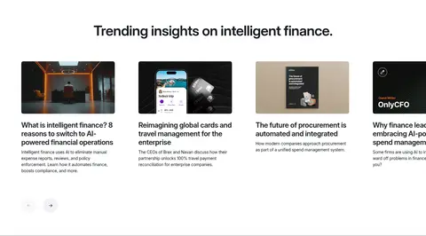
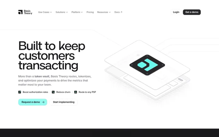
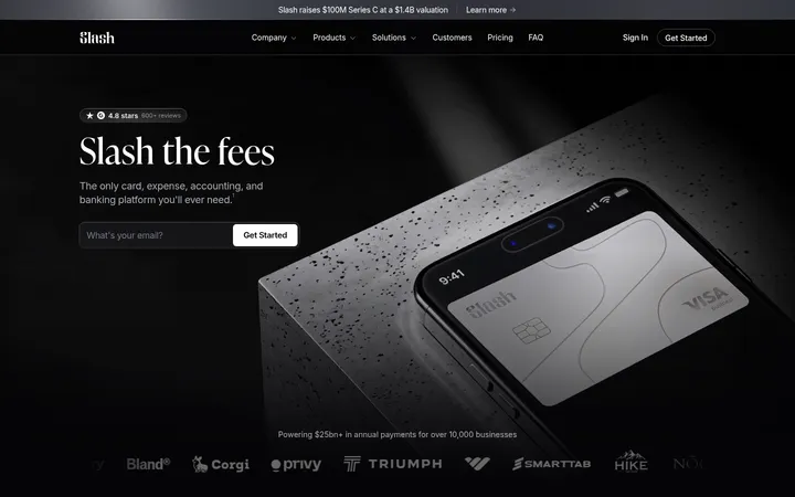
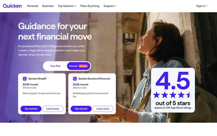
North star · Keep the canvas quiet and spacious, then use Brex orange only where the user should act or follow a link.
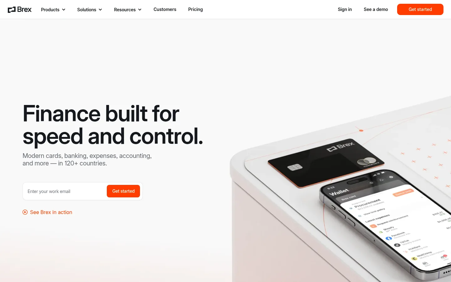
The page builds its identity from a near-white canvas, ink-dark headlines, muted gray supporting text, and a concentrated Brex orange accent. Orange is reserved for primary actions and occasional text links, keeping the interface calm while giving conversion points a clear visual signal. Inter carries nearly all of the typography: headlines are large, medium-weight, tightly tracked, and left-aligned in the hero, while centered headings organize many later sections. The layout alternates broad open white areas with pale lavender-gray bands, using centered trust and solution blocks to break up the long scroll. Product-interface visuals and card photography are set beside concise copy in alternating two-column feature rows; customer portraits and editorial imagery add human warmth. Cards and controls use modest corner rounding, light hairlines, and very restrained shadows rather than deep elevation. A near-black CTA and footer create a deliberate high-contrast finish.
Primary typeface for navigation, headlines, body text, links, buttons, and captions.
Aa 设计
flecha
网络字体 · 字重 500 · 占比 1%
免费替代:Literata
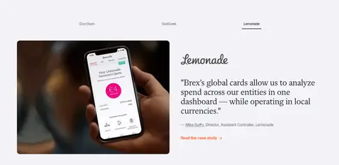
Small editorial serif accent, most visibly in customer-story quotation styling.
角色
示例
字号
字重
行高
字距
特大标题
Oversized hero or campaign headline.
Brex
72px
500
1
-0.02em
一级标题
Primary page or section headline.
Brex
48px
500
1
-0.02em
二级标题
Major section titles, often centered.
Brex
36px
500
1
-0.02em
三级标题
Feature titles and prominent card headings.
The quick brown fox 敏捷的狐狸
24px
500
1.21
-0.02em
四级标题
Smaller feature and subsection headings.
The quick brown fox 敏捷的狐狸
20px
500
1.2
-0.02em
正文
Supporting descriptions and standard explanatory copy.
The quick brown fox 敏捷的狐狸
16px
400
1.5
-0.02em
辅助文字
Fine print, image notes, and compact metadata.
The quick brown fox 敏捷的狐狸
12px
400
1.33
-0.02em
按钮
Primary action labels such as “Get started”.
The quick brown fox 敏捷的狐狸
14px
600
1.43
-0.01em
导航
Header and footer navigation links.
The quick brown fox 敏捷的狐狸
16px
400
1.5
0
链接
Inline actions such as “Learn more” and feature links.
The quick brown fox 敏捷的狐狸
16px
400
1.5
-0.02em
间距与布局
基准单位 8px · 密度:适中
48px版块间距
8px元素间距
—卡片内边距
1296px内容最大宽度
1px
4px
8px
16px
20px
24px
32px
48px
72px
80px
Use a centered content frame capped at the measured 1296px maximum, with broad page margins and comfortable density. The homepage alternates a two-column hero and feature splits with centered logo, product, and solution sections; several feature rows reverse image and text placement. The 8px-based spacing system creates generous separation between sections and compact relationships within controls. Preserve broad white intervals, align copy consistently within each grid cell, and use pale or dark full-width bands as occasional rhythm changes.
圆角与层次
按钮 · 10px
hairline · other
hairline · other
The interface is mostly flat: white and pale gray surfaces, subtle hairline borders, and only faint measured shadows. Use modest rounded corners on buttons and media cards, without floating-panel effects. Treat product imagery as its own visual layer, and reserve strong contrast for the dark CTA and footer rather than adding extra depth.
组件
下面的预览按实测的按钮、输入框、徽标、卡片样式重建(字体用替代字体)。
Header navigation
A white horizontal header with the Brex mark, grouped product navigation, utility links, and a right-aligned orange “Get started” action.
Hero email form
A two-column hero pairs a bold left-aligned headline and muted copy with a compact email field and orange submit button; a secondary video link sits below.
Primary CTA
Use #ff3d00 fill, light label text, and measured button corner variants of 8px or 10px; keep the treatment simple and flat.
Product feature row
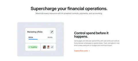
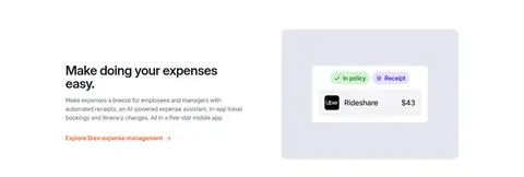
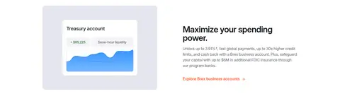
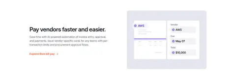
Alternate product or interface imagery and text in two columns, with a concise heading, subdued description, and orange inline link.
Solution cards
Three audience cards combine cropped people photography, compact headings, short copy, and small orange links on a pale section band.
Logo and proof band
Center a trust headline above a grid of subdued customer marks on a #f3f3f7 background.
Dark closing panel
Use a #000710 CTA and footer area with light text, muted footer links, and a product image beside the final action.
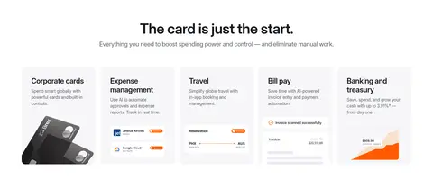
Imagery · Use crisp product photography and realistic device mockups for cards, phones, and finance interfaces. Place visuals large beside concise copy, or arrange interface previews in compact product tiles. Customer-story photography and editorial cards add human context; warm orange tones may appear inside imagery, but should not be mistaken for the interface palette. Avoid decorative gradients or busy illustration styles.
Keep headlines dark, prominent, and tightly tracked.
Reserve #ff3d00 for primary actions and selected links.
Alternate open white areas with occasional pale or dark section bands.
Pair feature copy with authentic product imagery.
Use muted gray for secondary information.
Keep shadows subtle and borders quiet.
✕ 不该做
Do not add unmeasured palette colors to the interface.
Do not use orange as a large page background.
Do not crowd the page with dense copy blocks.
Do not give every section a colored background.
Do not use heavy shadows or dramatic elevation.
Do not turn product photography into decorative illustration.
Do not apply serif typography to navigation or controls.
给 AI 的提示词
想快速出一个同风格的新页面,把这段话连同 DESIGN.md 一起发给 AI。
Build a new Brex-style fintech SaaS page using a quiet white canvas (#ffffff), Graphite Ink (#15191e) headlines, and Slate Gray (#60646c) supporting text. Reserve Brex Signal (#ff3d00) for the main CTA and selected links. Use Inter throughout the interface, with large medium-weight, tightly tracked headlines and readable body copy; use Flecha only as a restrained editorial accent. Create a spacious centered content frame with alternating two-column feature rows, centered proof or product sections, and occasional Lavender Mist (#f3f3f7) bands. Use realistic finance-product photography or interface mockups, not decorative illustrations. Keep controls softly rounded and mostly flat, with light borders and minimal shadow. End with a Midnight Ink (#000710) CTA or footer section, using muted light text for secondary details.