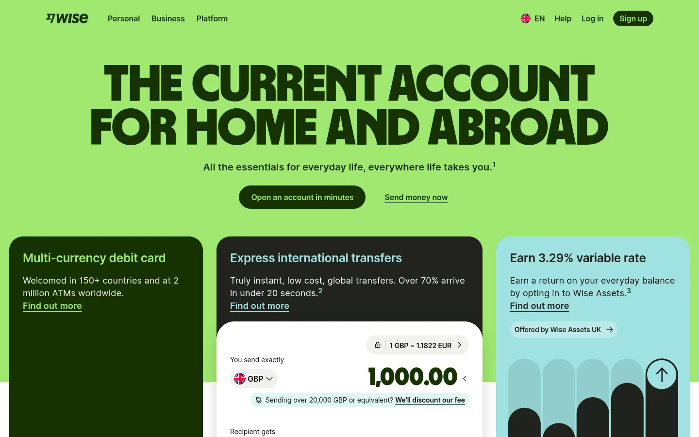
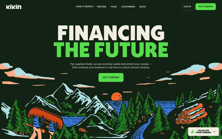
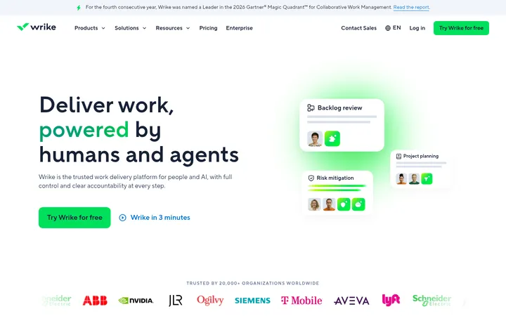
North star · Use oversized Wise Sans headlines and vivid lime-green panels to make practical international money features feel clear, confident, and human.
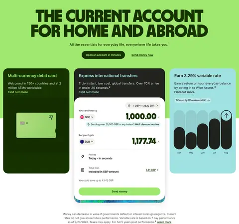
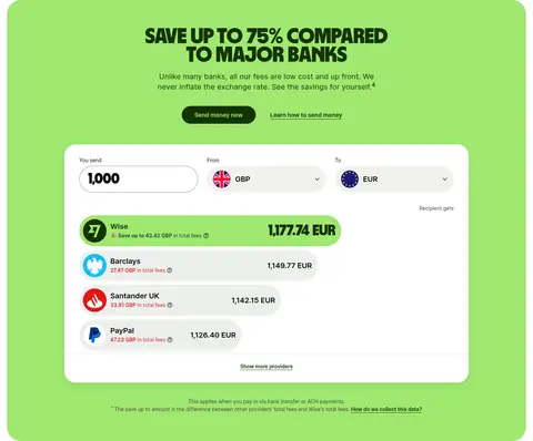
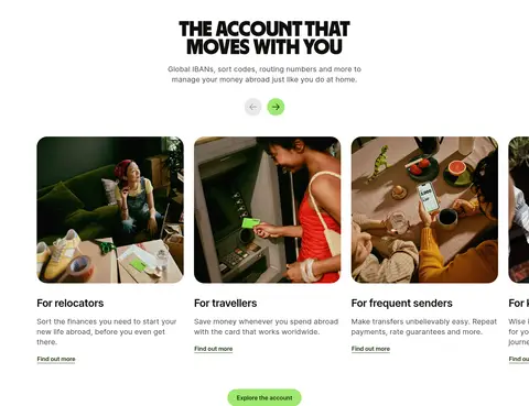
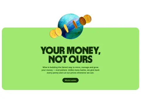
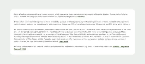
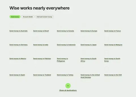
The page’s visual signature is a vivid lime-and-forest palette: bright green fills the opening hero and selected feature or mission panels, while deep green carries navigation, links, and pill-shaped primary actions. White remains the main canvas, so the long homepage feels open despite its many sections; pale gray-green marks the dense disclosures and destination directory near the footer. Wise Sans supplies the exceptionally heavy, compact display headlines, often centered and set in uppercase, while Inter handles navigation, body copy, buttons, and detailed interface labels. The layout alternates centered editorial moments with broad multi-column card rows and full-bleed video or photo bands. Rounded cards and pill controls soften the high-impact typography. Real product screenshots, money-transfer comparisons, customer photography, and testimonial cards make the brand promise tangible rather than abstract.
配色
点色块复制色值。用途说明来自对页面的实测位置(背景、文字、描边、按钮)与截图判读。
品牌色
强调色
表层色
中性色
功能色
页面底色 · Gallery White表层 · Mist Sage表层 2 · Forest Ink主文字 · Near Black次要文字 · Slate Olive描边 · Leaf Edge强调 · Wise Lime强调 2 · Pool Aqua
Navigation, body copy, buttons, links, captions, and much of the interface text.
Aa 设计
Wise Sans
网络字体 · 字重 900 / 400 · 占比 4%
免费替代:Inter
Display headlines, section headings, and large transfer amount inputs.
角色
示例
字号
字重
行高
字距
特大标题
Oversized hero headline setting the homepage’s bold editorial tone.
Wise
105.5px
900
0.85
0
一级标题
Primary hero heading and other prominent campaign-style headline treatment.
Wise
89px
900
0.85
0
二级标题
Major section headings for savings, security, reviews, and mission content.
Wise
58.5px
900
0.85
0
三级标题
Feature or content subheadings, including secondary editorial sections.
Wise
45.5px
600
1.25
-0.03em
四级标题
Smaller display-style headings used to establish section emphasis.
Wise
40px
900
0.85
0
正文
Introductory and supporting paragraphs beside features and calls to action.
The quick brown fox 敏捷的狐狸
20px
600
1.4
0.005em
辅助文字
Fine print, card details, product labels, and supporting interface copy.
The quick brown fox 敏捷的狐狸
16px
400
1.5
0.005em
按钮
Semibold text on pill-shaped primary and secondary actions.
The quick brown fox 敏捷的狐狸
16px
600
1.5
-0.011em
导航
Top-level navigation and utility menu labels.
The quick brown fox 敏捷的狐狸
16px
600
1.5
0.005em
链接
Inline content links and destination or resource links.
The quick brown fox 敏捷的狐狸
16px
600
1.5
0.005em
间距与布局
基准单位 4px · 密度:适中
56px版块间距
4px元素间距
28px卡片内边距
1240px内容最大宽度
2px
3px
4px
8px
9px
10px
11px
12px
16px
19px
24px
28px
32px
38px
48px
56px
A long, mostly white page uses centered, wide content areas and alternates between multi-column card rows, centered feature sections, and full-bleed media. The measured page maximum width is 1240px; measured spacing is based on a 4px unit, with a 56px section gap and 28px card padding. Keep headline blocks prominent and centered where shown, then use left-aligned directory and footer content. Density is comfortable: product evidence and cards are separated by generous white canvas.
圆角与层次
按钮 · 9999px
输入框 · 9999px
卡片 · 28px
图片 · 50%
导航 · 19px
链接 · 2px
hairline · media
hairline · media
xl · card
md · card
The page is primarily flat, relying on strong color blocks and white space rather than persistent shadows. Use measured rounded cards and pill buttons to define components. Product or comparison panels can sit above their surrounding surface with subtle measured shadow treatments; keep borders restrained and use hairlines for separation.
组件
下面的预览按实测的按钮、输入框、徽标、卡片样式重建(字体用替代字体)。
Primary pill button
Semibold Inter action in a 9999px pill. The dark version pairs Forest Ink #163300 with Wise Lime #9fe870; the light version reverses those colors.
Feature cards
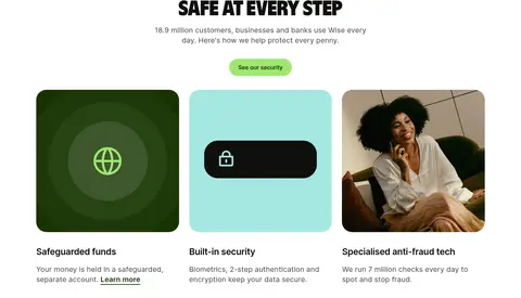
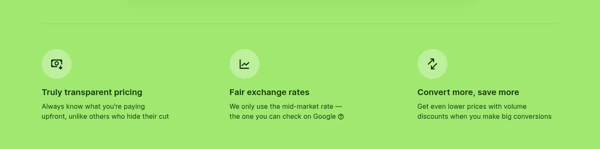
Rounded cards combine a concise heading, short supporting copy, and an underlined link; green, dark green, and aqua surfaces provide variation.
Transfer calculator
White product panel foregrounds large Wise Sans amounts, currency selection, fee details, recipient total, and a prominent send action.
Savings comparison
A green section presents a white, rounded comparison interface with provider rows and a highlighted Wise result.
Customer review cards
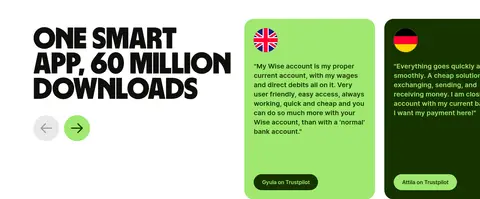
Rounded testimonial panels use contrasting lime or deep-green fills, readable quotation text, and compact source labels.
Destination directory
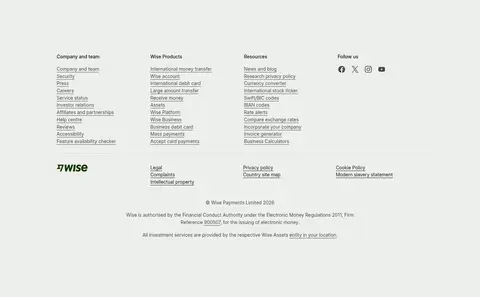
Muted sage background groups destination and resource links into a spacious multi-column list, with understated underlines.
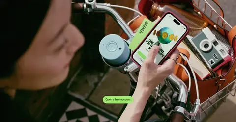
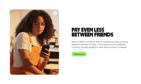
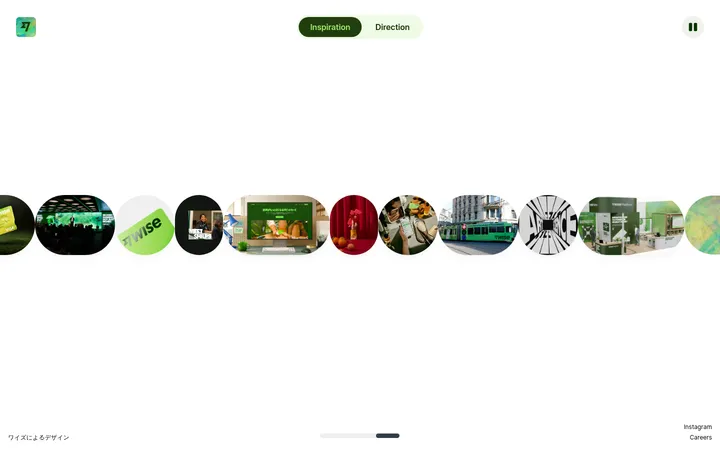
Imagery · Use real-life customer and travel photography in rounded feature cards and full-width video bands, with people interacting naturally with phones and money-related settings. Product-interface visuals should show transfer amounts, currency selectors, fees, and comparison rows clearly. The page also uses interface illustrations and decorative graphics; keep them secondary to product proof and photography. Avoid applying a uniform tint that obscures the imagery.
Use the measured Wise Lime and Forest Ink pairing.
Give product interfaces clear visual priority.
Alternate open white sections with distinctive color panels.
Keep primary actions in rounded pills.
Use aqua selectively for secondary highlights.
✕ 不该做
Do not replace the measured green palette with generic fintech blue.
Do not crowd the hero headline with competing elements.
Do not make every section a colored card.
Do not use heavy shadows as the main layout device.
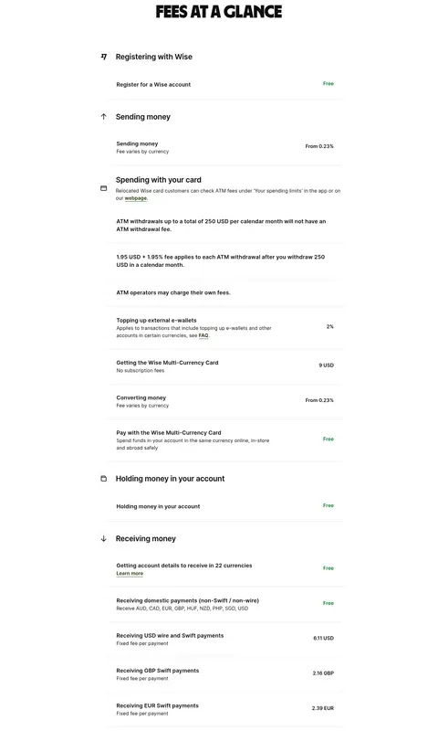
Do not bury fees or transfer amounts in decorative imagery.
Do not apply display typography to dense fine print.
给 AI 的提示词
想快速出一个同风格的新页面,把这段话连同 DESIGN.md 一起发给 AI。
Build a new page in Wise’s visual style using a white canvas, Wise Lime #9fe870 panels, and Forest Ink #163300 for navigation, links, and dark pill actions. Use oversized, heavy Wise Sans-style headlines with compact line spacing, then let Inter carry readable body copy and controls. Organize content into centered editorial sections, clear multi-column feature cards, and occasional full-bleed customer imagery. Show real product value through legible transfer interfaces, amounts, fees, and comparison rows. Keep cards generously rounded and the overall elevation restrained. Use Mist Sage #edefeb for dense informational areas and Pool Aqua #a0e1e1 sparingly as a secondary accent. Preserve generous white space, consistent section rhythm, and an approachable, practical tone.