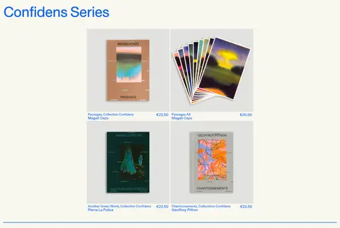
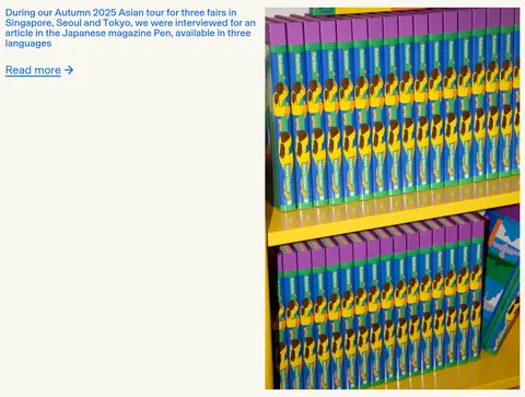
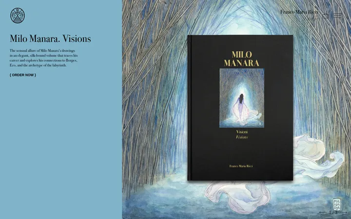
North star · Let vivid blue editorial text and tactile print imagery breathe against a quiet cream canvas, using rules—not boxes—to organize the page.
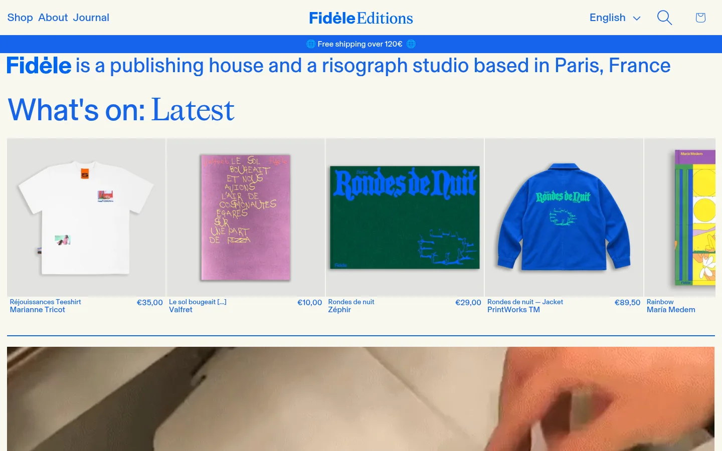
The page is built around a warm, nearly uniform cream canvas (#f8f7ef), which lets the saturated blue (#1664eb) carry nearly all interface text, headings, and navigational emphasis. A brighter blue (#006ce5) appears on selected links, while pale gray (#e2e2df) sits behind product photography in flat catalogue tiles. BaselGrotesk Book provides a consistent, clean editorial voice; larger headings create contrast without introducing a competing palette. The layout alternates wide product rows, asymmetrical image-and-copy features, short editorial columns, and full-bleed studio imagery. Thin blue rules mark section transitions rather than enclosing every block. Photographs remain tactile and varied—books, apparel, printmaking, and studio scenes—with no heavy decorative framing. Keep the spacing generous enough to separate editorial beats, while retaining a compact, information-rich catalogue feel.
配色
点色块复制色值。用途说明来自对页面的实测位置(背景、文字、描边、按钮)与截图判读。
品牌色
强调色
表层色
中性色
功能色
页面底色 · Paper Cream表层 · Catalogue Gray主文字 · Press Blue强调 · Press Blue强调 2 · Link Blue
Main interface and editorial font for navigation, body copy, links, and headings.
Aa 设计
BaselGrotesk Regular
网络字体 · 字重 400 · 占比 3%
免费替代:Inter
Secondary regular styling, including selected editorial links and product-card text.
Aa 设计
BaselGrotesk Bold
网络字体 · 字重 400 / 700 · 占比 1%
免费替代:Inter
Occasional stronger emphasis in the brand and editorial hierarchy.
角色
示例
字号
字重
行高
字距
特大标题
Oversized expressive Fidèle wordmark near the footer.
Fidèle Editions
62px
400
0.92
0
一级标题
Primary page and major editorial headings.
Fidèle Editions
41px
400
0.92
0
二级标题
Section titles such as catalogue and feature headings.
Fidèle Editions
37px
400
0.96
0
三级标题
Secondary editorial headings and product-group titles.
Fidèle Editions
32px
400
0.92
0
四级标题
Smaller feature and news subheadings.
Fidèle Editions
28px
400
0.96
0
正文
Compact descriptions, product details, and footer information.
The quick brown fox 敏捷的狐狸
14px
400
1
0
按钮
Prominent actions and larger call-to-action text.
The quick brown fox 敏捷的狐狸
24px
400
1.2
0.067em
导航
Large language selector and expanded navigation contexts.
The quick brown fox 敏捷的狐狸
22px
400
1.3
0
链接
Editorial links and contact or catalogue links.
The quick brown fox 敏捷的狐狸
22px
400
1
0
间距与布局
基准单位 1px · 密度:适中
42px版块间距
16px元素间距
—卡片内边距
1411px内容最大宽度
1px
2px
4px
5px
7px
10px
11px
12px
14px
15px
16px
19px
21px
24px
42px
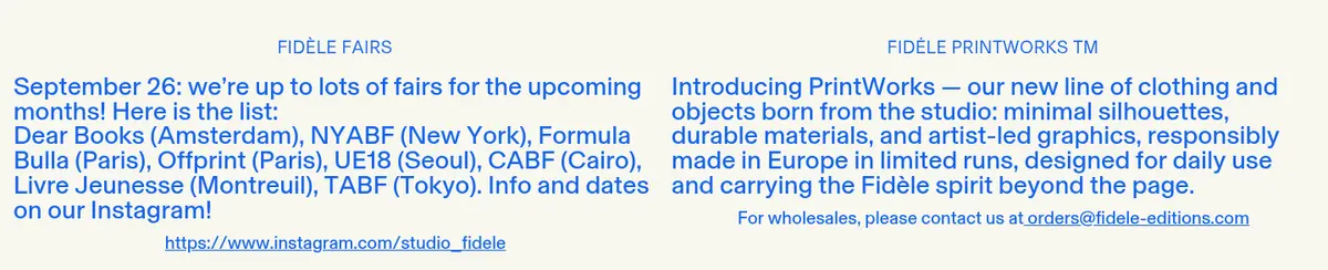
The measured page max width is 1411px, with content aligned to a consistent outer edge and several media sections running nearly full bleed. Product showcases use multi-column rows; editorial features switch between two-column image-and-copy compositions, while news updates form paired text columns. Heading alignment varies by block, with most content left aligned and the fairs section centered. Section rhythm is measured at a 42px gap, with comfortable density and compact catalogue captions. Thin horizontal blue rules punctuate major transitions without boxing in the content.
圆角与层次
没有测到阴影:页面是扁平的,层次靠底色和描边区分。
The interface is visually flat: measured shadows are absent and card corners are square. Product tiles use a pale gray surface behind their images, while thin blue hairlines separate selected blocks. Keep text and imagery on the page plane; use spacing and section rules for hierarchy rather than raised cards, gradients, or layered UI chrome.
组件
下面的预览按实测的按钮、输入框、徽标、卡片样式重建(字体用替代字体)。
Site header
Compact cream header with blue navigation at left, centered Fidèle wordmark, and language, search, and bag controls at right.
Shipping announcement
Full-width saturated blue strip with centered small white shipping message and globe symbols.
Product catalogue tile
Square-corner pale gray image surface with blue product title, maker, and price arranged as compact text below.
Editorial split feature
Two-column composition pairing a rectangular photograph with blue heading, brief copy, and a blue text link.
Section rule
Thin blue horizontal line spanning the content width to distinguish major page beats.
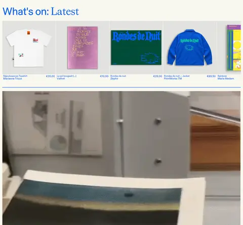
Studio image band
Wide documentary photograph displayed prominently with minimal framing and no surrounding card treatment.
Footer
Cream three-column information area with utility links, large blue branding, contact details, and compact subscription fields.
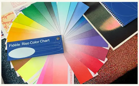
Imagery · Photography is central: apparel and books are shown as catalogue products, while wide process images document printing and studio work. Editorial photos pair a portrait or publication image with concise copy; later image-led blocks show print color samples and shelves. Preserve the natural, documentary character and varied color of the photographs. Product backdrops may use flat pale gray, but avoid turning photographic imagery into decorative mockups.
Let documentary print and product photos retain their natural color.
Separate major blocks with thin blue rules and open space.
✕ 不该做
Do not introduce gradients or prominent shadows.
Do not round product cards or place every section in a box.
Do not replace the cream canvas with stark white.
Do not use the measured illustration colors as extra brand colors.
Do not overuse bold weights or all-caps headings.
Do not make catalogue details larger than editorial headings.
给 AI 的提示词
想快速出一个同风格的新页面,把这段话连同 DESIGN.md 一起发给 AI。
Build a new editorial commerce page in the Fidèle Editions visual style. Use Paper Cream (#f8f7ef) as the broad canvas and Press Blue (#1664eb) for navigation, headings, and most interface text; reserve Link Blue (#006ce5) for occasional calls to action. Use Catalogue Gray (#e2e2df) only behind product images. Set a clean BaselGrotesk-like sans voice, with restrained expressive display lettering for brand moments. Compose the page from compact product grids, asymmetric photo-and-copy features, paired editorial text blocks, and occasional full-bleed documentary imagery. Keep corners square, shadows absent, and sections mostly unboxed. Use thin blue rules and generous gaps to mark transitions. Prioritize real-looking books, apparel, printmaking, and studio photography; keep captions concise and maintain a tactile, independent-publisher character.