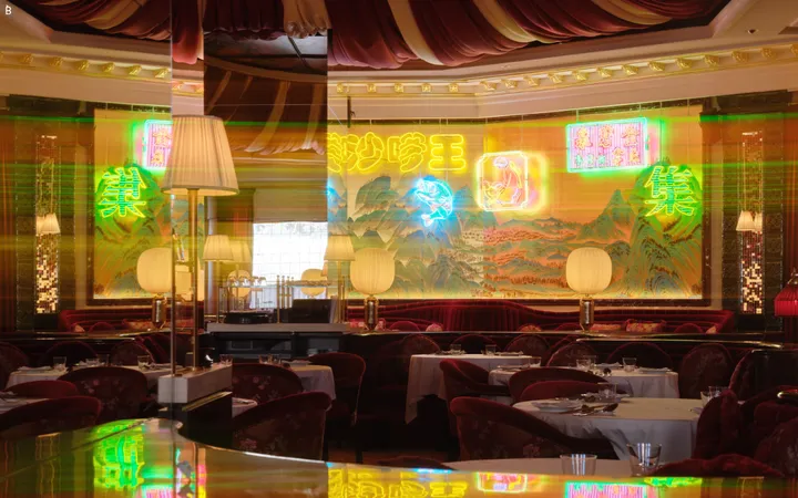
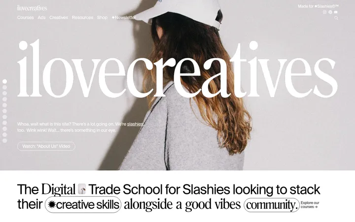
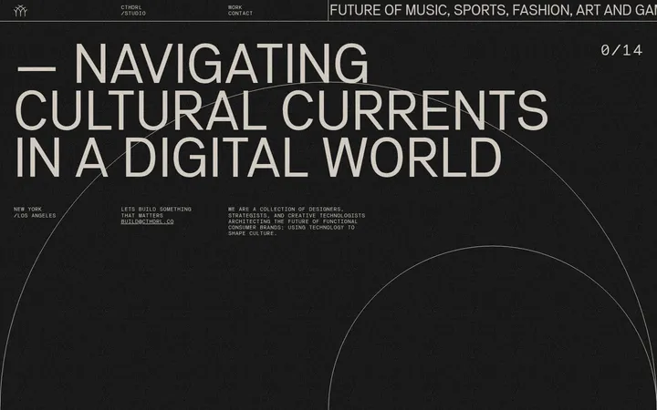
North star · Let oversized, expressive typography and a single documentary architectural image define the page, keeping interface details quiet.
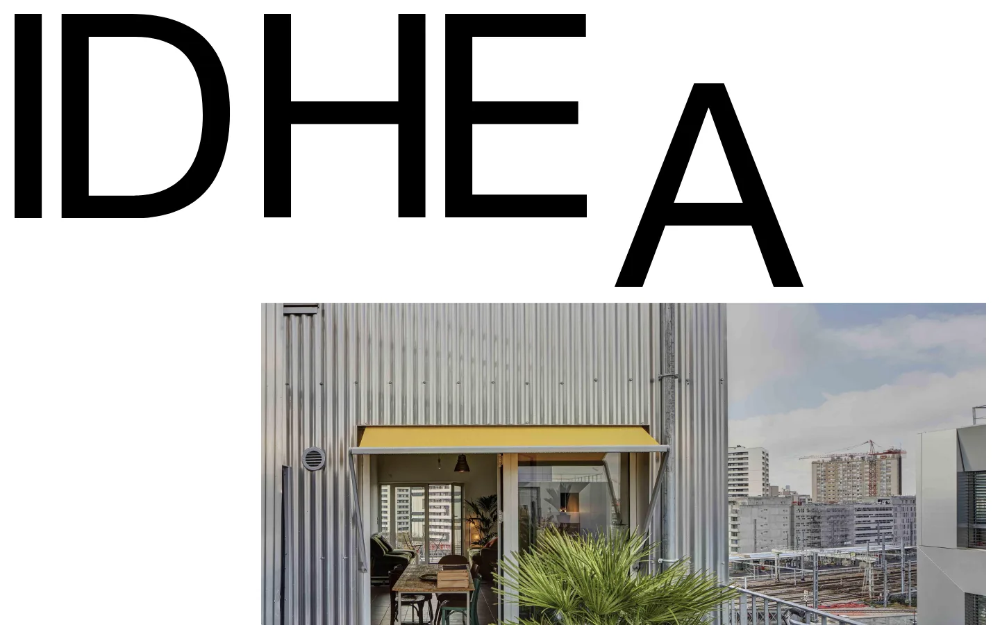
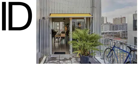
The page uses a stark white canvas and near-black text to establish an editorial, institutional tone. A huge IDHEAL wordmark dominates the opening view, treated as a graphic element rather than a conventional heading; its final letter drops toward the architectural photograph below. The image is a direct, documentary-style view of a home and its urban surroundings, offset to the right and framed by substantial white space. Navigation is minimal and visually subordinate to the wordmark, with simple text labels and rounded outlined controls. Measured sage green and muted red are tiny text accents rather than broad interface fills; the screenshot’s other muted tones belong largely to the photograph. Serif body and headline typography gives the content a literary quality, while Helvetica Neue supports compact utility text and controls. The composition feels spacious without decorative effects: flat surfaces, fine borders, and a deliberately uneven balance between type and image.
Oversized display wordmark and navigation display text
Aa 设计
HelveticaNeueLTPro-Bd
网络字体 · 字重 400 · 占比 2%
免费替代:Inter
Bold sans-serif emphasis
角色
示例
字号
字重
行高
字距
特大标题
Oversized IDHEAL wordmark and prominent display text.
IDHEAL
67px
400
1
0
一级标题
Editorial page headline or primary institutional statement.
IDHEAL
43px
400
1.08
0
二级标题
Large lowercase section headings.
IDHEAL
42px
400
1
0
三级标题
Sans-serif section or feature headings.
IDHEAL
39px
400
1.1
0
四级标题
Smaller lowercase editorial subheadings.
The quick brown fox 敏捷的狐狸
22.5px
400
1.1
0
正文
Primary editorial and explanatory copy.
The quick brown fox 敏捷的狐狸
16px
400
1.1
0
辅助文字
Compact captions and supporting metadata.
The quick brown fox 敏捷的狐狸
12px
400
1.2
0
按钮
Lowercase labels inside outlined controls.
The quick brown fox 敏捷的狐狸
20px
400
1
0
导航
Large display-style navigation labels.
IDHEAL
67px
400
1
0
间距与布局
基准单位 2px · 密度:适中
65px版块间距
—元素间距
108px卡片内边距
—内容最大宽度
2px
5px
6px
7px
8px
10px
11px
15px
16px
18px
20px
21px
23px
24px
30px
65px
The opening composition is a single, broad white field with no visible column dividers. The wordmark occupies the upper area and stretches across the page; its final letter descends toward an architectural photograph aligned to the right. Navigation remains small in the overall composition, while the image and large type create the page’s asymmetrical balance. Preserve generous open space around these elements and use a measured, comfortable rhythm between sections. Avoid imposing a fixed maximum width: none is available in the measurements.
圆角与层次
按钮 · 9999px
sm · button, other
The page is predominantly flat: no prominent shadows or layered cards define the first viewport. Controls rely on thin outlines, including black and pale gray borders, while card-like areas can use a neutral gray surface. Keep edges clean and let open white space, typography, and photography establish hierarchy rather than elevation effects.
组件
下面的预览按实测的按钮、输入框、徽标、卡片样式重建(字体用替代字体)。
Oversized wordmark
Treat IDHEAL as a monumental black typographic composition across the top of the page; allow the final letter to sit lower beside the image.
Architectural feature image
Use a large, unadorned photograph aligned to the right beneath the wordmark, showing a lived-in home and its city context.
Text navigation
Keep labels such as home, Institut, and logement plain and subordinate to the display typography.
Outlined text control
Use lowercase labels, black text, and a fine outline; measured examples have rounded corners.
Pale surface card
Where card surfaces appear, use the measured #e5e5e5 fill and dark text with square, unembellished edges.
Imagery · Use documentary architectural photography rather than illustration, 3D, or decorative graphics. The visible image depicts a home opening onto an urban rooftop, with materials and surroundings left natural rather than heavily stylized. Frame it as a large horizontal rectangle offset to the right beneath the wordmark. Keep image colors subdued and let the photograph read as evidence of the housing subject, not as a colorful interface background.
Use white space as an active part of the composition.
Make the institutional wordmark the dominant typographic gesture.
Pair the display typography with restrained editorial serif copy.
Use architectural photography with a documentary feel.
Keep navigation and controls visually secondary.
Reserve olive and brick accents for very small touches.
✕ 不该做
Do not introduce gradients or colorful section backgrounds.
Do not turn the wordmark into a small conventional logo.
Do not center every element into a symmetrical template.
Do not add decorative shadows to flat content areas.
Do not treat colors inside the photograph as interface palette colors.
Do not make the interface denser than the sparse reference.
给 AI 的提示词
想快速出一个同风格的新页面,把这段话连同 DESIGN.md 一起发给 AI。
Build a new institutional page in IDHEAL’s editorial style. Use Gallery White (#ffffff) as the canvas and Editorial Ink (#000000) for the wordmark, headings, and core navigation. Create a very large typographic opening gesture, then balance it with a right-aligned documentary architectural photograph; preserve the reference’s asymmetry and generous blank space. Use the measured serif face for editorial headlines and body copy, with a restrained sans-serif for navigation, captions, and lowercase outlined controls. Keep borders thin and surfaces flat; use Fine Ash (#ededed) only for subtle interface hairlines. Soft Concrete (#e5e5e5) may support secondary card surfaces. Olive Note (#51633c) and Brick Note (#bc5346) are rare text accents, not broad fills. Avoid gradients, ornamental effects, and dense card grids.