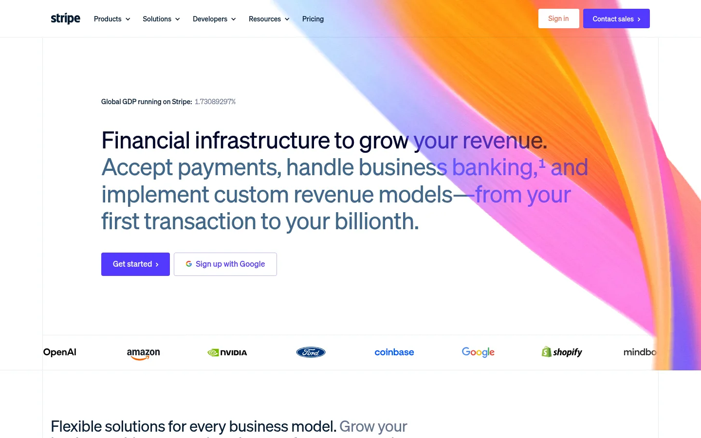
Stripe以克制的白色版面、精准的紫色强调和醒目的渐变视觉构建金融科技品牌形象。页面通过模块化长页,从支付产品与客户案例逐步延伸到平台能力和深色开发者内容。
North star · Keep the interface calm and typographic; reserve vivid colour for actions and expressive product media.
The page is built on a predominantly white canvas, with deep ink text and a vivid violet reserved for primary actions and links. Pale blue-gray lines and surfaces quietly separate content without making the page feel boxed in. A single near-black navy band creates a clear change of pace for developer infrastructure and technical proof. Typography is led by Sohne: light, generously sized headings with subtly tight tracking, balanced by restrained body copy and small monospaced code labels. The layout uses a wide centered content area, alternating broad editorial introductions with compact feature grids, story cards, and full-width media. Vivid pink, orange, and violet gradients appear mainly in hero and product artwork, adding energy without displacing the restrained interface palette. Customer logos, interface mockups, photography, and video give product claims concrete context. Generous whitespace, fine hairlines, modest radii, and soft card shadows keep the long page readable and composed.
配色 点色块复制色值。用途说明来自对页面的实测位置(背景、文字、描边、按钮)与截图判读。
品牌色
Stripe Violet
#533afd
Primary CTA fill and recurring link colour, including Get started and View services.
强调色
Lavender Tint
#b9b9f9
Subtle button-related tint; use only for secondary accent detail, not broad page surfaces.
Violet Shade
#362baa
Deep violet button-state detail measured in CTA styling.
Periwinkle Link
#7389ff
Secondary blue-violet link accent, used sparingly.
Electric Iris
#6b59fe
Minor violet variation found in small text and badge details.
Sky Lavender
#92adff
Occasional small highlight text or badge detail.
Muted Periwinkle
#839bc8
Secondary accent text; use as a restrained supporting highlight.
表层色
Mist Border
#e5edf5
Pale blue-gray surface and hairline border tone, especially around cards and section boundaries.
Midnight Panel
#0d1738
Large dark developer-infrastructure section background.
Night Card
#101d4e
Dark card and badge detail within the navy technical area.
Indigo Depth
#23356e
Minor badge tone within dark or illustrated UI details.
Cloud Surface
#f8fafd
Very light card and section surface, including subtle badge backgrounds.
中性色
Gallery White
#ffffff
Main page canvas and broad light sections; gives the long homepage its open, editorial base.
Deep Ink
#061b31
Main heading and interface text colour on the white canvas.
Slate Copy
#50617a
Muted body text on light backgrounds, including supporting copy.
Steel Muted
#64748d
Muted text and small labels or badges.
功能色
Signal Orange
#ff6118
Small badge or illustration detail; not a core interface colour.
文字 背景 对比度 WCAG #061b31 Deep Ink#ffffff Gallery White17.37:1 AAA #061b31 Deep Ink#e5edf5 Mist Border14.69:1 AAA #061b31 Deep Ink#0d1738 Midnight Panel1.01:1 不达标 #061b31 Deep Ink#101d4e Night Card1.08:1 不达标 #50617a Slate Copy#ffffff Gallery White6.3:1 AA #50617a Slate Copy#e5edf5 Mist Border5.33:1 AA
字体 字号阶梯:Perfect Fourth(比例约 1.316,正文 16px)。示例用免费替代字体渲染,数值为实测。
Aa 设计
sohne-var 网络字体 · 字重 300 / 400 / 500 · 占比 98%
免费替代:Inter
Primary interface type for navigation, headings, body copy, links, buttons, and captions.
Aa 设计
SourceCodePro 网络字体 · 字重 500 / 700 · 占比 2%
免费替代:Source Code Pro
Monospaced code labels and technical snippets in developer-facing content.
角色 示例 字号 字重 行高 字距 一级标题 Primary homepage headline and major hero statement.
Stripe
48px 300 1.15 -0.02em 二级标题 Large section headings introducing major product or audience areas.
Stripe
32px 300 1.1 -0.02em 三级标题 Feature, story, and content-card headings.
The quick brown fox 敏捷的狐狸
26px 300 1.12 -0.01em 四级标题 Smaller feature titles and supporting subsection headings.
The quick brown fox 敏捷的狐狸
22px 300 1.1 -0.01em 正文 Main explanatory copy, descriptions, and customer-story text.
The quick brown fox 敏捷的狐狸
16px 300 1.4 0 辅助文字 Compact metadata, labels, and supporting annotations.
The quick brown fox 敏捷的狐狸
11px 300 1.4 0 按钮 Primary and secondary CTA labels.
The quick brown fox 敏捷的狐狸
16px 400 1 0 链接 Inline actions and navigation links.
The quick brown fox 敏捷的狐狸
16px 400 normal 0 代码 Technical snippets and developer-oriented code examples.
const style = 1;
12px 500 2 0
间距与布局 基准单位 4px · 密度:适中
64px 版块间距
8px 元素间距
— 卡片内边距
1232px 内容最大宽度
2px
4px
6px
7px
8px
10px
11px
12px
14px
15px
16px
18px
20px
24px
32px
40px
A centered, wide content frame organizes a long scroll of alternating full-width media, editorial text, and multi-column cards. The measured page maximum is 1232px. Sections begin with clear text introductions, then open into split layouts, feature grids, logos, or story cards; the developer band spans the content with a strong dark background. Spacing feels comfortable, with substantial separation between major sections and tighter groupings within cards. Alignment is mostly left-led, with selective centered statistics and testimonial content.
圆角与层次 lg · text, other, card
lg · card
sm · card
lg · card
The design relies primarily on whitespace and pale hairlines rather than heavy borders. Cards use modest corner rounding and selective soft shadows to lift interface mockups and story panels. Gradient artwork and layered product imagery provide visual depth, while the developer section stays largely flat and dark for contrast.
组件 下面的预览按实测的按钮、输入框、徽标、卡片样式重建(字体用替代字体)。
Primary CTA Compact violet button with white Sohne text, a 4px radius, and no measured shadow; used for Get started and audience-specific actions.
Top navigation Brand mark and concise product, solution, developer, resource, and pricing links sit on the white header; sales contact is emphasized in violet.
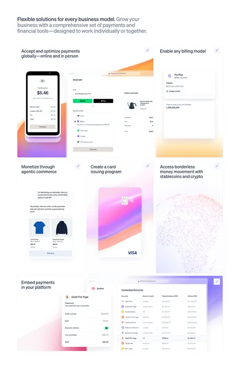
Product showcase Payment and billing features pair concise titles with checkout, card, and dashboard mockups framed by luminous gradient artwork.
Customer story A customer title and Read the story action lead into a broad image panel, followed by concise operating metrics.
Feature card Light or white card surfaces group short headings, supporting text, and a violet text link; subtle borders and soft elevation keep hierarchy quiet.
Developer band Full-width #0d1738 section uses light text, technical examples, integration choices, and vivid metric accents to distinguish developer content.
Imagery · Product UI mockups, checkout screens, dashboards, customer photography, and branded logos provide concrete proof. The hero and several product panels use large, luminous orange, pink, violet, and blue gradient artwork; these hues are imagery-led rather than the core UI palette. A wide conference video and photographic customer stories create moments of human scale. Artwork is generally framed within broad panels or cards rather than used as decorative page wallpaper.
页面版块 共 18 个版块,按页面从上到下排列,每个都标了类型、布局和交互套路。
首页
首屏 主视觉
Wide headline and actions over white, with large gradient media and a customer-logo strip.
功能网格 产品能力
Introductory copy followed by a multi-card grid of payment, billing, and commerce capabilities.
视频 AI主题视频
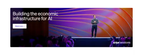
Two-column media-led feature with a conference video panel and short watch action.
数据亮点 平台规模
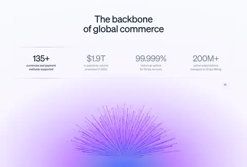
Centered heading, metrics row, and a large softly coloured abstract graphic.
图文交替 企业平台
Short enterprise introduction followed by a split heading and supporting proof statement.
图集 客户案例
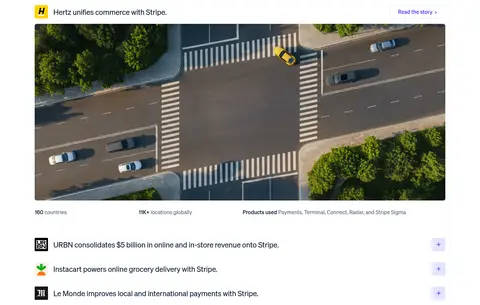
One large customer story image with title and metrics, followed by collapsed customer rows.
功能网格 专家服务
Three compact service columns with a short title, description, and text link.
商品网格 初创企业
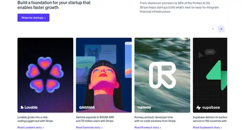
Startup introduction followed by a four-card customer and product story row.
图文交替 创业资源
Two side-by-side promotional cards for the startup program and company incorporation.
图文交替 平台业务
Audience introduction with heading, supporting copy, and a violet CTA.
产品展示 平台产品展示
Broad horizontal gradient media panel followed by a row of practical feature summaries.
功能网格 平台功能
Three concise text-led capability columns with links.
用户评价 客户评价
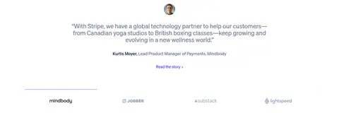
Centered testimonial and attribution above a row of customer logos.
图文交替 开发者基础
Dark section introduction with a heading, supporting statement, and two developer links.
集成生态 系统连接
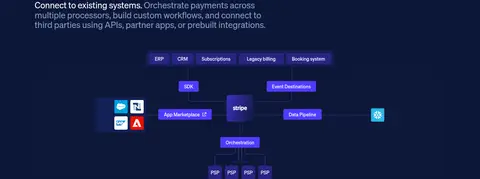
Left-aligned heading and explanatory copy within the dark technical band.
数据亮点 可靠性数据
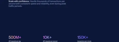
Technical reliability message followed by three large transaction metrics.
集成生态 集成方式
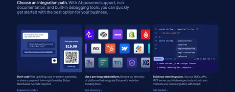
Introductory text above three horizontally arranged integration-path examples.
内容列表 Stripe动态
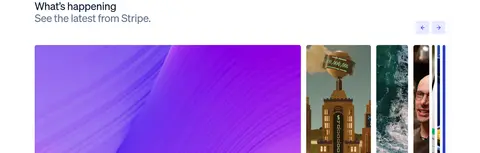
Editorial heading and latest-news introduction above a horizontal story-card feed.
该做与不该做 ✓ 该做 Use white space and dark ink as the default visual foundation. Apply #533afd consistently to primary actions and important links. Use gradients as expressive product or hero media, not as generic interface fills. Separate long-form sections with ample whitespace and fine pale borders. Use light, tightly tracked Sohne-style headings and restrained body copy. Give developer content a distinct deep navy section treatment. Pair product claims with interface mockups, customer proof, or real imagery. ✕ 不该做 Do not make the full page dark or rely on large coloured panels throughout. Do not use vivid gradient colours as the default text or button palette. Do not add heavy borders, pronounced shadows, or oversized card framing. Do not crowd the long page with uniformly dense grids. Do not use bold display typography where the measured heading style is light. Do not treat illustration-only orange and pink as core interface colours. 给 AI 的提示词 想快速出一个同风格的新页面,把这段话连同 DESIGN.md 一起发给 AI。
复制 Build a new fintech page in Stripe's visual language: a spacious white canvas (#ffffff), deep ink text (#061b31), muted slate copy (#50617a), and fine pale borders (#e5edf5). Use a Sohne-like sans serif with light, subtly tight-tracked headings and compact body copy. Keep the content within a centered wide frame; alternate editorial introductions, feature grids, proof points, and image-led story panels. Reserve Stripe Violet (#533afd) for primary CTAs and key links. Use gradient media for product artwork rather than interface backgrounds. Introduce a single deep navy (#0d1738) band for developer or technical content, with legible light text and selective violet highlights. Prefer whitespace, modest radii, understated borders, and selective soft card shadows. Support claims with product UI, logos, and customer photography.
DESIGN.md Tailwind v4 CSS 变量 Design Tokens
---
title: "Stripe design system"
variant: extended
source: https://stripe.com/
captured_at: 2026-10-12
theme: light
industry: fintech
generator: Design DNA (https://four.wiralomi.com/style/stripe-com)
ai_generated: true
ai_label: "本文件由 AI 辅助生成:数值取自公开网页的实测样式,命名、用途说明与建议为模型解读。商标归原所有者。 / AI-assisted content"
---
# Stripe · Design System
> Quiet financial clarity, punctuated by vivid gradients
**Theme:** light · **Industry:** fintech · **Source:** https://stripe.com/ · **Captured:** 2026-10-12 (1440×900 desktop)
_AI-assisted content: values are measured from the public page at capture time; names, roles and guidance are model-written interpretations. Trademarks belong to their owners._
Stripe pairs a restrained white editorial canvas with precise violet accents and expressive gradient media. A long, modular homepage moves from payments and customer proof into enterprise stories, platform tools, and a deep navy developer section.
## North star
Keep the interface calm and typographic; reserve vivid colour for actions and expressive product media.
## Overview
The page is built on a predominantly white canvas, with deep ink text and a vivid violet reserved for primary actions and links. Pale blue-gray lines and surfaces quietly separate content without making the page feel boxed in. A single near-black navy band creates a clear change of pace for developer infrastructure and technical proof. Typography is led by Sohne: light, generously sized headings with subtly tight tracking, balanced by restrained body copy and small monospaced code labels. The layout uses a wide centered content area, alternating broad editorial introductions with compact feature grids, story cards, and full-width media. Vivid pink, orange, and violet gradients appear mainly in hero and product artwork, adding energy without displacing the restrained interface palette. Customer logos, interface mockups, photography, and video give product claims concrete context. Generous whitespace, fine hairlines, modest radii, and soft card shadows keep the long page readable and composed.
## Colors
| Name | Hex | Token | Group | Role |
|---|---|---|---|---|
| Gallery White | ` | `--color-gallery-white` | neutral | Main page canvas and broad light sections; gives the long homepage its open, editorial base. |
| Stripe Violet | ` | `--color-stripe-violet` | brand | Primary CTA fill and recurring link colour, including Get started and View services. |
| Mist Border | ` | `--color-mist-border` | surface | Pale blue-gray surface and hairline border tone, especially around cards and section boundaries. |
| Deep Ink | ` | `--color-deep-ink` | neutral | Main heading and interface text colour on the white canvas. |
| Midnight Panel | ` | `--color-midnight-panel` | surface | Large dark developer-infrastructure section background. |
| Lavender Tint | ` | `--color-lavender-tint` | accent | Subtle button-related tint; use only for secondary accent detail, not broad page surfaces. |
| Violet Shade | ` | `--color-violet-shade` | accent | Deep violet button-state detail measured in CTA styling. |
| Slate Copy | ` | `--color-slate-copy` | neutral | Muted body text on light backgrounds, including supporting copy. |
| Periwinkle Link | ` | `--color-periwinkle-link` | accent | Secondary blue-violet link accent, used sparingly. |
| Steel Muted | ` | `--color-steel-muted` | neutral | Muted text and small labels or badges. |
| Night Card | ` | `--color-night-card` | surface | Dark card and badge detail within the navy technical area. |
| Signal Orange | ` | `--color-signal-orange` | semantic | Small badge or illustration detail; not a core interface colour. |
| Electric Iris | ` | `--color-electric-iris` | accent | Minor violet variation found in small text and badge details. |
| Sky Lavender | ` | `--color-sky-lavender` | accent | Occasional small highlight text or badge detail. |
| Indigo Depth | ` | `--color-indigo-depth` | surface | Minor badge tone within dark or illustrated UI details. |
| Cloud Surface | ` | `--color-cloud-surface` | surface | Very light card and section surface, including subtle badge backgrounds. |
| Muted Periwinkle | ` | `--color-muted-periwinkle` | accent | Secondary accent text; use as a restrained supporting highlight. |
### Semantic aliases
`--color-canvas` → ` (Gallery White) · `--color-surface` → ` (Mist Border) · `--color-surface-2` → ` (Midnight Panel) · `--color-surface-3` → ` (Night Card) · `--color-text` → ` (Deep Ink) · `--color-text-muted` → ` (Slate Copy) · `--color-text-subtle` → ` (Steel Muted) · `--color-border` → ` (Mist Border) · `--color-accent` → ` (Stripe Violet) · `--color-accent-2` → ` (Periwinkle Link) · `--color-accent-3` → ` (Muted Periwinkle) · `--color-on-accent` → ` (Gallery White)
### Contrast (WCAG 2.x)
| Text | Background | Ratio | Level |
|---|---|---|---|
| ` | ` | 17.37:1 | AAA |
| ` | ` | 14.69:1 | AAA |
| ` | ` | 1.01:1 | fail |
| ` | ` | 1.08:1 | fail |
| ` | ` | 6.3:1 | AA |
| ` | ` | 5.33:1 | AA |
| ` | ` | 2.78:1 | fail |
| ` | ` | 2.55:1 | fail |
| ` | ` | 4.75:1 | AA |
| ` | ` | 4.01:1 | AA-large |
### Gradients
- `radial-gradient(circle, rgb(127, 125, 252), rgb(244, 75, 204) 33%, rgb(229, 237, 245) 66%)`
- `radial-gradient(103.24% 102.63% at 50% 102.63%, rgb(72, 111, 253) 0px, rgb(127, 129, 243) 9.84%, rgb(196, 137, 255) 20.83%, rgb(218, 192, 255) 34.13%, rgb(234, 220, 255) 44.86%, rgb(249, 246, 255) 58.59%, rgb(248, 250, 2`
- `radial-gradient(50% 50%, rgb(255, 207, 94) 41.35%, rgba(255, 207, 94, 0) 100%)`
- `radial-gradient(50% 50%, rgba(83, 58, 253, 0.8) 62.5%, rgba(83, 58, 253, 0) 100%)`
## Typography
| Family | Token | Source | Weights | Role | Free substitute |
|---|---|---|---|---|---|
| sohne-var | `--font-body` | webfont | 300, 400, 500 | Primary interface type for navigation, headings, body copy, links, buttons, and captions. | Inter |
| SourceCodePro | `--font-mono` | webfont | 500, 700 | Monospaced code labels and technical snippets in developer-facing content. | Source Code Pro |
- **sohne-var:** Light weights dominate; headings use subtly negative tracking. Sentence case throughout, with compact, clear navigation and CTA labels.
- **SourceCodePro:** Used sparingly at medium weight for code-like material; preserve monospaced character and avoid applying it to general copy.
### Type scale — Perfect Fourth (ratio ≈ 1.316, base 16px)
| Role | Size | Weight | Line height | Letter spacing | Case | Family | Used for |
|---|---|---|---|---|---|---|---|
| h1 | 48px | 300 | 1.15 | -0.02em | — | sohne-var | Primary homepage headline and major hero statement. |
| h2 | 32px | 300 | 1.1 | -0.02em | — | sohne-var | Large section headings introducing major product or audience areas. |
| h3 | 26px | 300 | 1.12 | -0.01em | — | sohne-var | Feature, story, and content-card headings. |
| h4 | 22px | 300 | 1.1 | -0.01em | — | sohne-var | Smaller feature titles and supporting subsection headings. |
| body | 16px | 300 | 1.4 | 0 | — | sohne-var | Main explanatory copy, descriptions, and customer-story text. |
| caption | 11px | 300 | 1.4 | 0 | — | sohne-var | Compact metadata, labels, and supporting annotations. |
| button | 16px | 400 | 1 | 0 | — | sohne-var | Primary and secondary CTA labels. |
| link | 16px | 400 | normal | 0 | — | sohne-var | Inline actions and navigation links. |
| code | 12px | 500 | 2 | 0 | — | SourceCodePro | Technical snippets and developer-oriented code examples. |
OpenType features in use: `"ss01"` , `"tnum"` , `"sups"` .
## Spacing & layout
- Base unit **4px**, density **comfortable**.
- Scale (most used values): 2, 4, 6, 7, 8, 10, 11, 12, 14, 15, 16, 18, 20, 24, 32, 40 px.
- Section rhythm 64px · element gap 8px · card padding — · max content width 1232px.
A centered, wide content frame organizes a long scroll of alternating full-width media, editorial text, and multi-column cards. The measured page maximum is 1232px. Sections begin with clear text introductions, then open into split layouts, feature grids, logos, or story cards; the developer band spans the content with a strong dark background. Spacing feels comfortable, with substantial separation between major sections and tighter groupings within cards. Alignment is mostly left-led, with selective centered statistics and testimonial content.
## Shape & elevation
- Radius: button `4px` · card `6px` · media `6px` · badge `6px` · nav `6px` · link `4px` · xs `3px` · sm `4px` · md `5px` · lg `6px` · xl `8px` · pill `9999px`
- Shadow `lg` (text, other, card): `rgba(0, 0, 0, 0.1) 0px 20.187px 40.374px -20.187px`
- Shadow `lg-2` (card): `rgba(23, 23, 23, 0.08) 0px 15px 35px 0px`
- Shadow `sm` (card): `rgba(23, 23, 23, 0.06) 0px 3px 6px 0px`
- Shadow `lg-3` (card): `rgba(50, 50, 93, 0.12) 0px 16px 32px 0px`
- Shadow `lg-4` (card): `rgba(50, 50, 93, 0.12) 0px 15.931px 31.863px 0px`
- Shadow `lg-5` (badge): `rgba(50, 50, 93, 0.12) 0px 15.931px 31.863px -8px`
- Motion: standard transition `0.3s cubic-bezier(0.25, 1, 0.5, 1)` on interactive elements.
The design relies primarily on whitespace and pale hairlines rather than heavy borders. Cards use modest corner rounding and selective soft shadows to lift interface mockups and story panels. Gradient artwork and layered product imagery provide visual depth, while the developer section stays largely flat and dark for contrast.
## Imagery
Product UI mockups, checkout screens, dashboards, customer photography, and branded logos provide concrete proof. The hero and several product panels use large, luminous orange, pink, violet, and blue gradient artwork; these hues are imagery-led rather than the core UI palette. A wide conference video and photographic customer stories create moments of human scale. Artwork is generally framed within broad panels or cards rather than used as decorative page wallpaper.
## Components
### Primary CTA
Compact violet button with white Sohne text, a 4px radius, and no measured shadow; used for Get started and audience-specific actions.
### Top navigation
Brand mark and concise product, solution, developer, resource, and pricing links sit on the white header; sales contact is emphasized in violet.
### Product showcase
Payment and billing features pair concise titles with checkout, card, and dashboard mockups framed by luminous gradient artwork.
### Customer story
A customer title and Read the story action lead into a broad image panel, followed by concise operating metrics.
### Feature card
Light or white card surfaces group short headings, supporting text, and a violet text link; subtle borders and soft elevation keep hierarchy quiet.
### Developer band
Full-width ### Measured component styles
- **Primary button** (“Get started”): background ## Do
- Use white space and dark ink as the default visual foundation.
- Apply ## Don't
- Do not make the full page dark or rely on large coloured panels throughout.
- Do not use vivid gradient colours as the default text or button palette.
- Do not add heavy borders, pronounced shadows, or oversized card framing.
- Do not crowd the long page with uniformly dense grids.
- Do not use bold display typography where the measured heading style is light.
- Do not treat illustration-only orange and pink as core interface colours.
## Agent prompt
Build a new fintech page in Stripe's visual language: a spacious white canvas (## Page sections (top to bottom)
| # | Type | Layout | UX patterns | UI patterns |
|---|---|---|---|---|
| 1 | hero | Wide headline and actions over white, with large gradient media and a customer-logo strip. | primary signup CTA, secondary signup option, customer trust logos | oversized light headline, violet CTA, gradient artwork |
| 2 | feature-grid | Introductory copy followed by a multi-card grid of payment, billing, and commerce capabilities. | scan product capabilities, explore feature cards | light canvas, product mockups, gradient-backed panels |
| 3 | video | Two-column media-led feature with a conference video panel and short watch action. | watch featured video | wide video image, dark stage imagery, compact action |
| 4 | stats | Centered heading, metrics row, and a large softly coloured abstract graphic. | review platform metrics | large numerals, hairline separators, soft gradient illustration |
| 5 | feature-split | Short enterprise introduction followed by a split heading and supporting proof statement. | explore enterprise offering | left-aligned heading, muted supporting copy, violet action |
| 6 | gallery | One large customer story image with title and metrics, followed by collapsed customer rows. | read customer story, expand another story | wide photography, story title bar, plus controls |
| 7 | feature-grid | Three compact service columns with a short title, description, and text link. | compare service options, view service details | small line icons, three-column layout, violet text links |
| 8 | product-grid | Startup introduction followed by a four-card customer and product story row. | browse startup stories, open story links | portrait media cards, compact captions, story links |
| 9 | feature-split | Two side-by-side promotional cards for the startup program and company incorporation. | apply to program, start a company | paired text-and-art cards, bright gradient thumbnails |
| 10 | feature-split | Audience introduction with heading, supporting copy, and a violet CTA. | explore platform offering | split text alignment, light canvas, violet button |
| 11 | product-showcase | Broad horizontal gradient media panel followed by a row of practical feature summaries. | read related guides | full-width gradient media, three feature columns, small icons |
| 12 | feature-grid | Three concise text-led capability columns with links. | explore guides | small line icons, compact copy, violet links |
| 13 | testimonials | Centered testimonial and attribution above a row of customer logos. | read customer story | centered quote, small attribution, logo strip |
| 14 | feature-split | Dark section introduction with a heading, supporting statement, and two developer links. | open developer docs, visit GitHub | navy background, light text, violet CTA |
| 15 | integrations | Left-aligned heading and explanatory copy within the dark technical band. | understand integration options | dark flat surface, light heading, muted body copy |
| 16 | stats | Technical reliability message followed by three large transaction metrics. | review scale and reliability | navy background, large accent numerals, compact labels |
| 17 | integrations | Introductory text above three horizontally arranged integration-path examples. | choose an integration path, explore no-code, browse directory, get started | product screenshots, code example, integration logos |
| 18 | content-feed | Editorial heading and latest-news introduction above a horizontal story-card feed. | browse latest stories, move through feed | image-led cards, carousel controls, light canvas |
---
本文件由 AI 辅助生成:数值取自公开网页的实测样式,命名、用途说明与建议为模型解读。商标归原所有者。
Generated by Design DNA · https://four.wiralomi.com/style/stripe-com