North star · Keep the interface quiet and spacious so expressive font specimens—not decoration—command attention.
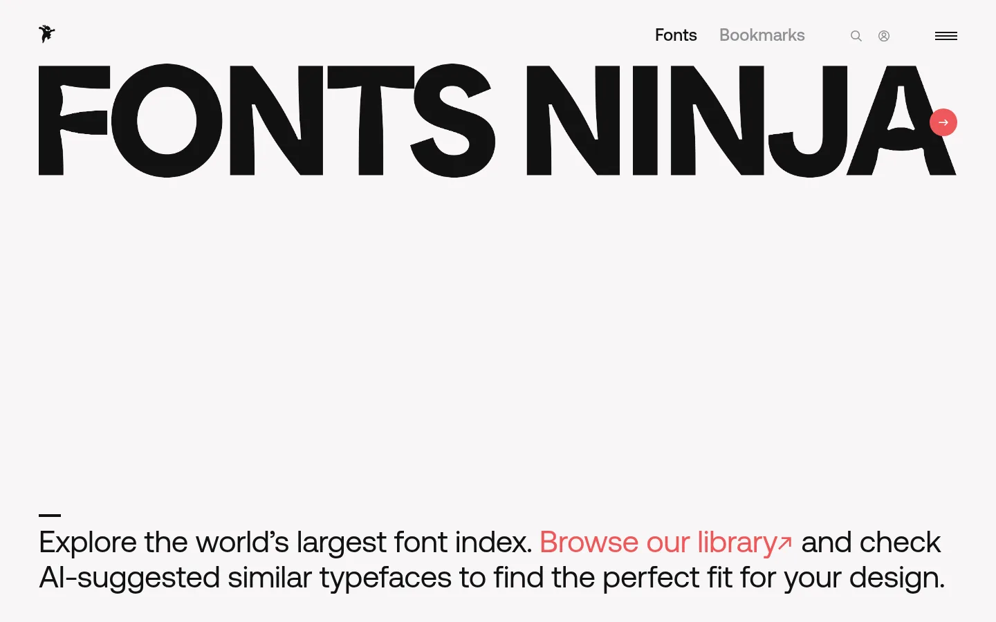
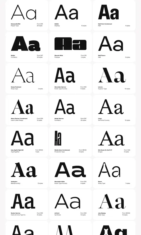
The page is built around a restrained palette: #f7f6f6 fills the main canvas, white cards create quiet islands for font specimens, and #121212 carries the headline, navigation, and most copy. #ee585a is a precise signal for the inline library link and primary actions; #8e8e93 recedes into secondary navigation and metadata. Aeonik provides a clean sans-serif framework, while the oversized masthead and the varied type specimens let typography itself become the visual content. The hero is unusually spacious: a compact navigation sits above a very large wordmark, followed by a substantial open interval before the explanatory copy. Below, the font catalog switches to a consistent multi-column card grid. Cards are generously padded and softly rounded, with specimen lettering dominant and compact family, foundry, price, and style details beneath. The overall effect is editorial and approachable rather than ornamental.
配色
点色块复制色值。用途说明来自对页面的实测位置(背景、文字、描边、按钮)与截图判读。
品牌色
强调色
表层色
中性色
功能色
页面底色 · Paper White表层 · Mist Canvas主文字 · Typeface Ink次要文字 · Paper White弱文字 · Soft Graphite强调 · Coral Signal
Navigation, explanatory copy, supporting labels, and interface text.
角色
示例
字号
字重
行高
字距
一级标题
Large introductory heading or wordmark treatment.
Fonts Ninja
44px
400
normal
-0.011em
二级标题
Uppercase section headings where present.
Fonts Ninja
32px
400
1
0
三级标题
Font family or featured content headings.
The quick brown fox 敏捷的狐狸
24px
500
normal
0
正文
Introductory copy and general interface text.
The quick brown fox 敏捷的狐狸
14px
400
1.14
0
辅助文字
Compact font details, foundry, pricing, and style counts.
The quick brown fox 敏捷的狐狸
12px
400
1.5
0
导航
Primary navigation labels and prominent navigation text.
The quick brown fox 敏捷的狐狸
24px
500
normal
0
链接
Large inline discovery link in the introductory copy.
Fonts Ninja
44px
400
normal
-0.011em
间距与布局
基准单位 8px · 密度:适中
56px版块间距
8px元素间距
52px卡片内边距
1328px内容最大宽度
2px
6px
16px
24px
32px
48px
56px
The page uses a broad centered content area, measured at a maximum width of 1328px, with a compact top navigation and a two-column introductory composition. A large typographic hero occupies the upper canvas; its copy sits low, leaving a pronounced open interval. The catalog follows as a multi-column grid of white cards on the same pale background. Spacing is comfortable, with a measured 56px section rhythm and 8px element gap; cards use generous measured padding.
圆角与层次
按钮 · 9999px
卡片 · 32px
链接 · 16px
lg · other
The interface is mostly flat, using contrast between the pale canvas and white cards to define catalog items. Cards have a measured 32px radius and generous padding; prominent buttons use pill-like rounding. Avoid pronounced borders and heavy shadows, which would compete with the type specimens.
组件
下面的预览按实测的按钮、输入框、徽标、卡片样式重建(字体用替代字体)。
Top navigation
Compact header with a small brand mark, primary links, utility icons, and menu control; measured navigation text uses #121212 with muted secondary items.
Typography hero
Oversized black wordmark above a large quiet gap, followed by an explanatory sentence and an inline #ee585a discovery link.
Font specimen card
White card with a 32px measured radius and generous padding; display a prominent font sample above compact family and pricing details.
Primary action
Coral fill with near-white label text; bookmark and filter actions appear as rounded buttons with measured 16px text.
Catalog grid
Repeated font cards form a multi-column browseable library, with consistent card sizing and clear gutters on the pale canvas.
Pagination
Small, muted page controls sit below the catalog; use a coral-filled current-page indicator and restrained neighboring numbers.
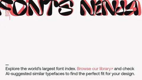
Imagery · The visual content is primarily typography rather than photography: the wordmark and font specimens display distinct typefaces as the product itself. In the hero, an oversized black wordmark dominates the viewport; catalog cards show large Aa-style previews above small metadata. The full-page image includes a red offset treatment in the wordmark, which reads as decorative brand artwork rather than a core interface color system. Avoid unrelated photography or illustration.
Use coral only to signal links and primary actions.
Preserve generous open space around the hero.
Keep card metadata compact and secondary.
✕ 不该做
Do not introduce gradients or decorative color fields.
Do not crowd the hero with extra copy or controls.
Do not make metadata compete with specimen lettering.
Do not add heavy borders or prominent shadows.
Do not use photography as the main visual content.
Do not apply coral broadly to large backgrounds.
给 AI 的提示词
想快速出一个同风格的新页面,把这段话连同 DESIGN.md 一起发给 AI。
Build a font-discovery page in the Fonts Ninja visual style. Use Mist Canvas (#f7f6f6) as the main surface, Paper White (#ffffff) for specimen cards, and Typeface Ink (#121212) for navigation, copy, and font previews. Reserve Coral Signal (#ee585a) for important inline links and primary actions; Soft Graphite (#8e8e93) is for secondary labels. Use a clean Aeonik-like sans-serif for interface text, while letting specimen lettering provide expressive variety. Place a compact header above a dramatic, oversized typographic hero with generous empty space, then add an explanatory line and a browsable multi-column font grid. Give cards measured generous padding and a 32px radius, with large samples and compact metadata. Keep the composition airy, flat, and focused on type.