North star · Use a warm, spacious editorial canvas to make violet-led enterprise messaging feel vivid, human, and easy to scan.
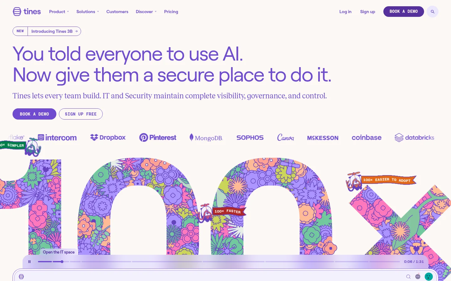
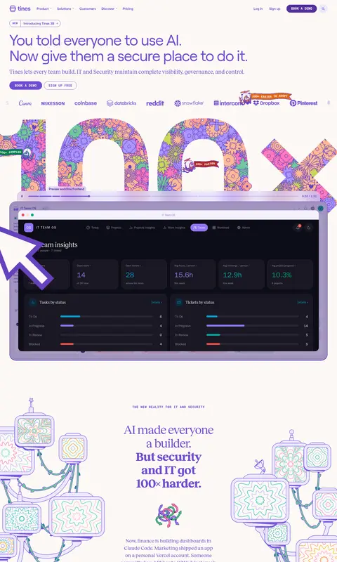
The page is built on a warm off-white canvas (#fcf9f5), allowing vivid violet (#714bd0) to carry the brand voice across navigation, headlines, links, and large feature panels. Green appears as a strong secondary accent in workflow content and product sections, while pale green tones and light borders soften interface modules. Roobert provides clean, compact sans-serif navigation and body copy; Reckless adds an editorial serif contrast to selected headings and supporting statements, with Roobert Mono reserved for uppercase labels and small utility text. The layout moves from a spacious, oversized hero into a customer logo row, large illustrated product media, narrative content, feature panels, and workflow cards. Colorful hand-drawn floral artwork and interface screenshots create contrast without replacing the product message. Rounded buttons, cards, and media frames keep the otherwise clean layout approachable and tactile.
Primary sans-serif for navigation, body copy, buttons, links, and large display headings.
Aa 设计
Reckless
网络字体 · 字重 400 / 500 / 700 · 占比 37%
免费替代:Newsreader
Editorial serif for supporting headings and selected narrative statements.
Aa 设计
Roobert Mono
网络字体 · 字重 700 / 600 · 占比 7%
免费替代:Space Mono
Uppercase eyebrow labels, captions, and compact utility or code-like text.
角色
示例
字号
字重
行高
字距
特大标题
Large hero or statement headlines with a light, clean sans-serif voice.
Tines
64px
400
1.05
-0.03em
一级标题
Primary page headline, set prominently in the hero.
Tines
56px
400
1.05
-0.03em
二级标题
Editorial section headline, often in a bold serif.
Tines
52px
700
1.1
-0.03em
三级标题
Supporting section or card heading in serif.
The quick brown fox 敏捷的狐狸
24px
400
1.25
-0.01em
四级标题
Smaller serif subheading for feature content.
The quick brown fox 敏捷的狐狸
22px
500
1.4
0
正文
Compact supporting paragraphs and product descriptions.
The quick brown fox 敏捷的狐狸
14px
500
1.2
0
辅助文字
Small uppercase labels and compact interface captions.
The quick brown fox 敏捷的狐狸
13px
700
1
0.05em
按钮
CTA labels and action controls.
The quick brown fox 敏捷的狐狸
14px
600
1.15
0
导航
Main navigation links and menu items.
The quick brown fox 敏捷的狐狸
14px
600
1.15
0
链接
Inline and standalone text links.
The quick brown fox 敏捷的狐狸
14px
600
1.15
0
眉题
Uppercase section markers above major headings.
The quick brown fox 敏捷的狐狸
13px
700
1
0.05em
代码
Compact mono labels and code-like interface text.
const style = 1;
13px
700
1
0.05em
间距与布局
基准单位 4px · 密度:紧凑
40px版块间距
4px元素间距
24px卡片内边距
1360px内容最大宽度
4px
5px
6px
8px
10px
12px
14px
18px
20px
24px
30px
40px
55px
The page uses a centered, wide desktop composition with a measured maximum width of 1360px. The hero is left-aligned, with a prominent headline, short supporting copy, paired CTAs, and a customer logo row before large media. Below, the long single-column page alternates centered editorial narratives, broad colored feature bands, product demonstrations, and multi-column cards. Section spacing is generous relative to compact body text; internal card padding and grid gaps create clear grouping without heavy dividers. Preserve the vertical sequence and keep each section visually distinct.
圆角与层次
按钮 · 9999px
卡片 · 14px
图片 · 19px
徽标 · 8px
导航 · 9999px
没有测到阴影:页面是扁平的,层次靠底色和描边区分。
The interface relies on flat color fields and crisp outlines rather than visible shadows. Pale green borders define selected controls and media, while rounded corners distinguish cards, buttons, and screenshot frames. Large product imagery and illustrations layer over section backgrounds to create depth; keep this layering controlled and let contrast and framing do the work.
组件
下面的预览按实测的按钮、输入框、徽标、卡片样式重建(字体用替代字体)。
Primary demo button
Use a deep violet (#542f9c) pill with warm off-white text, uppercase Roobert Mono styling, and a compact, high-contrast treatment.
Hero CTA pair
Place a filled violet action beside a light outlined secondary action beneath the hero copy.
Navigation
Keep the top navigation compact and text-led in violet, with a pill-shaped active item and a prominent demo button.
Feature panel
Use a broad violet panel with rounded corners, white text, a strong headline, concise feature copy, and decorative floral artwork.
Workflow cards
Organize workflow categories as adjacent colored cards, then show a large product interface preview beneath them.
Product media frame
Present screenshots in generously rounded frames with fine pale green outlines and visible interface detail.
Trust cards
Use violet cards with light text, concise proof points, and small illustrative accents anchored near the bottom.
Imagery · The first screen combines an oversized decorative typographic video graphic, customer logos, and a product interface preview. Across the page, hand-drawn floral motifs, whimsical connected-screen illustrations, and small illustrated card accents add personality. Product screenshots remain legible within rounded frames, while illustrations use lively violet, green, orange, and pink details. Treat artwork as colorful supporting content, not as a replacement for functional product UI.
Keep the warm off-white canvas as the dominant background.
Use Tines Violet for primary headlines, links, and navigation.
Pair clean sans-serif messaging with selective editorial serif headings.
Reserve mono uppercase styling for short labels and captions.
Use illustrations as lively accents around clear product content.
Give screenshots and cards rounded frames with restrained outlines.
✕ 不该做
Do not replace the warm canvas with stark pure white.
Do not use gradients or heavy shadows as defining effects.
Do not make every heading serif or every section violet.
Do not use decorative illustrations where product UI must be legible.
Do not overfill the page with dense copy or tight card layouts.
Do not treat isolated interface colors as core brand colors.
给 AI 的提示词
想快速出一个同风格的新页面,把这段话连同 DESIGN.md 一起发给 AI。
Build a new Tines-style SaaS page on a warm, spacious #fcf9f5 canvas. Use Tines Violet (#714bd0) for navigation, links, and major messaging, with Deep Violet (#542f9c) reserved for high-contrast demo actions. Introduce Workflow Green (#007f4a) in selected product or workflow sections and use Soft Mint (#cae4d4) and Mint Border (#aedac2) sparingly for surfaces and outlines. Set large clean sans-serif headlines in a Roobert-like face, contrast selected editorial statements with a Reckless-like serif, and use uppercase mono labels for section eyebrows. Compose clear, left-aligned hero messaging and CTAs, followed by product media, narrative sections, and colored feature cards. Use rounded frames, flat color fields, restrained borders, and lively hand-drawn illustration accents. Keep interface screenshots readable and the overall rhythm open.