North star · Keep the editorial canvas almost entirely white and let product imagery and isolated gradient workflow bands carry the visual emphasis.
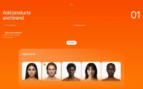
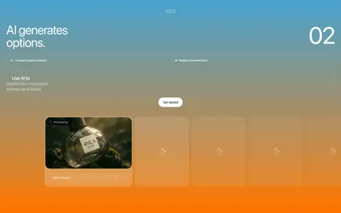
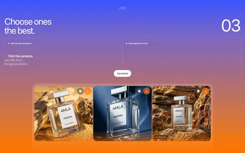
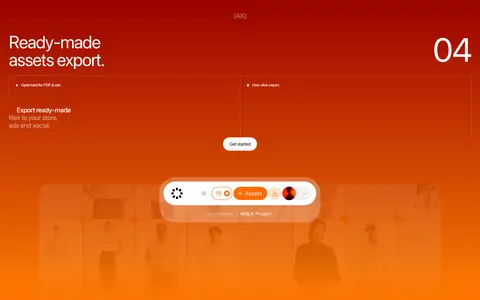
The page is predominantly a white canvas, with near-black typography and thin light-gray dividers defining its structure. Pale gray, softly rounded showcase panels distinguish product examples from the surrounding editorial content without introducing heavy card chrome. The accent palette is intentionally concentrated in four process bands: orange, blue-to-orange, violet-to-orange, and red-to-orange gradients. These saturated colors are demonstrative section treatments, not the default page background. Sf Pro Display carries the page with large, regular-weight headlines, tight negative tracking, and compact supporting copy; smaller labels stay understated. Layout alternates between left-aligned editorial headings and two-column feature or workflow arrangements, with generous vertical intervals. Product photography and interface previews sit inside rounded, softly composed media areas. Buttons remain small black capsules with white text. Keep the overall page quiet, and let imagery or the workflow bands provide the strongest color.
配色
点色块复制色值。用途说明来自对页面的实测位置(背景、文字、描边、按钮)与截图判读。
品牌色
强调色
表层色
中性色
功能色
页面底色 · Gallery White表层 · Soft Gallery主文字 · Near Ink次要文字 · Gallery White弱文字 · Slate Copy描边 · Quiet Divider强调 · Process Orange强调 2 · Vermilion强调 3 · Studio Blue
Site-wide display, headings, body copy, labels, and links.
角色
示例
字号
字重
行高
字距
特大标题
Oversized hero statement anchoring the opening viewport.
Fourmula.ai
100px
400
1
-0.03em
一级标题
Primary section and feature headlines.
Fourmula.ai
73px
400
0.94
-0.03em
二级标题
Large editorial headings for product capabilities and FAQs.
Fourmula.ai
53px
400
1
-0.03em
三级标题
Secondary feature headings and workflow titles.
Fourmula.ai
43.5px
500
1.05
-0.031em
四级标题
Compact subheads within the product narrative.
The quick brown fox 敏捷的狐狸
26.5px
400
0.63
0
正文
Supporting descriptions, navigation labels, and feature copy.
The quick brown fox 敏捷的狐狸
13.5px
400
1.25
0
辅助文字
Small interface labels, footnotes, and fine-print links.
The quick brown fox 敏捷的狐狸
11.5px
500
1.5
-0.015em
间距与布局
基准单位 1px · 密度:宽松
133px版块间距
7px元素间距
67px卡片内边距
1387px内容最大宽度
5px
7px
10px
12px
13px
20px
23px
27px
33px
40px
67px
133px
Use a spacious, centered page with the measured maximum width of 1387px and predominantly left-aligned editorial headings. The opening viewport gives the imagery and headline room to breathe; later content alternates between a single-column statement, broad product showcase, and two-column features. Four numbered process sections form a strong vertical sequence, each with a large media area. Long section gaps and generous card padding contrast with compact labels. Use thin rules to organize FAQs and content bands rather than dense grids.
圆角与层次
按钮 · 50%
卡片 · 7px
图片 · 27px
链接 · 9999px
没有测到阴影:页面是扁平的,层次靠底色和描边区分。
The design is mostly flat: no measured shadows, and the white canvas remains uninterrupted across most sections. Pale surfaces and thin gray hairlines provide separation. Rounded media and cards add softness, while the black capsule CTA supplies a compact focal point. Gradient bands create depth through color rather than shadow or layered chrome.
组件
下面的预览按实测的按钮、输入框、徽标、卡片样式重建(字体用替代字体)。
Primary CTA
Small black capsule with white Get started text; keep it visually distinct without turning it into a large block.
Editorial feature panel
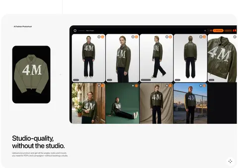
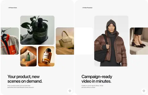
Pale gray, generously padded showcase surface with rounded corners, product imagery, and a prominent heading.
Workflow band
Full-width numbered process section using a vivid measured gradient, light copy, and a product-interface preview.
FAQ row
Large editorial heading beside a stacked list of questions, separated by fine horizontal rules and ending in plus affordances.
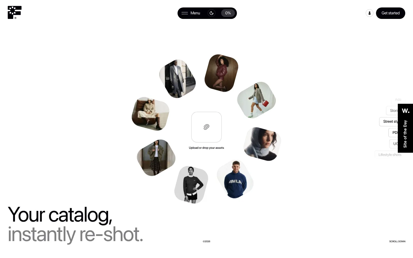
Hero collage
A central upload target surrounded by floating rounded fashion-image tiles, paired with a large two-tone headline.
Footer panel
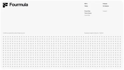
Large pale rounded region combining a bold brand mark, compact link columns, legal text, and a subtle patterned lower field.
Imagery · Lead with a floating collage of fashion imagery around a simple upload target. Product showcases mix catalog-like apparel and beauty photographs with screenshots of the generation interface. Images are cropped into rounded, soft-edged media shapes or contained in pale showcase panels. The numbered process bands use media previews over saturated gradients. Keep photography realistic and let product examples, not decorative illustration, explain the service.
Reserve saturated gradients for process demonstrations.
Give headlines generous breathing room and tight tracking.
Use pale surfaces and hairlines to separate content.
Let real product imagery explain each capability.
✕ 不该做
Do not spread accent gradients across ordinary content sections.
Do not add heavy shadows or layered card chrome.
Do not crowd the page with dense navigation or copy.
Do not use decorative imagery that competes with product examples.
Do not replace the editorial layout with uniform repeated tiles.
Do not make the CTA oversized or visually loud.
给 AI 的提示词
想快速出一个同风格的新页面,把这段话连同 DESIGN.md 一起发给 AI。
Build a new Fourmula.ai-style page as a spacious editorial canvas, not a generic dashboard. Use Gallery White (#ffffff) as the dominant background, Near Ink (#020108) for headlines, links, and compact pill CTAs, Soft Gallery (#f7f7f7) for showcase panels, and Quiet Divider (#d7d7d6) for restrained rules. Set headings in Sf Pro Display or Inter with regular weight and tight negative tracking; keep supporting copy compact and understated. Arrange content in broad left-aligned statements, selective two-column features, and generous vertical intervals. Use realistic product photography in softly rounded media frames. If demonstrating a workflow, reserve saturated gradients such as Process Orange (#fd7b03), Studio Blue (#48a3d1), or Electric Blue (#3a54ff) for those bands alone. Avoid shadows and heavy chrome.