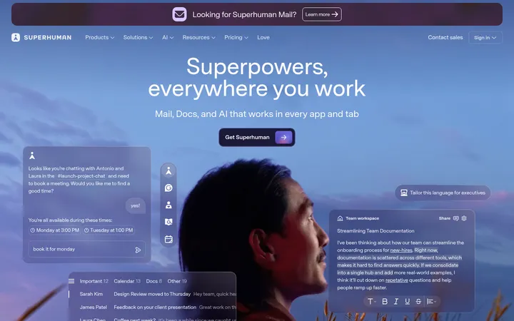
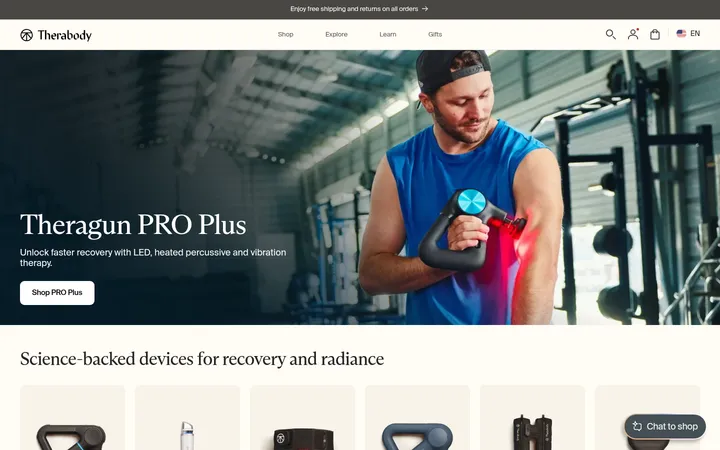
North star · Keep the interface quiet and editorial so clear health information and expressive human photography carry the story.
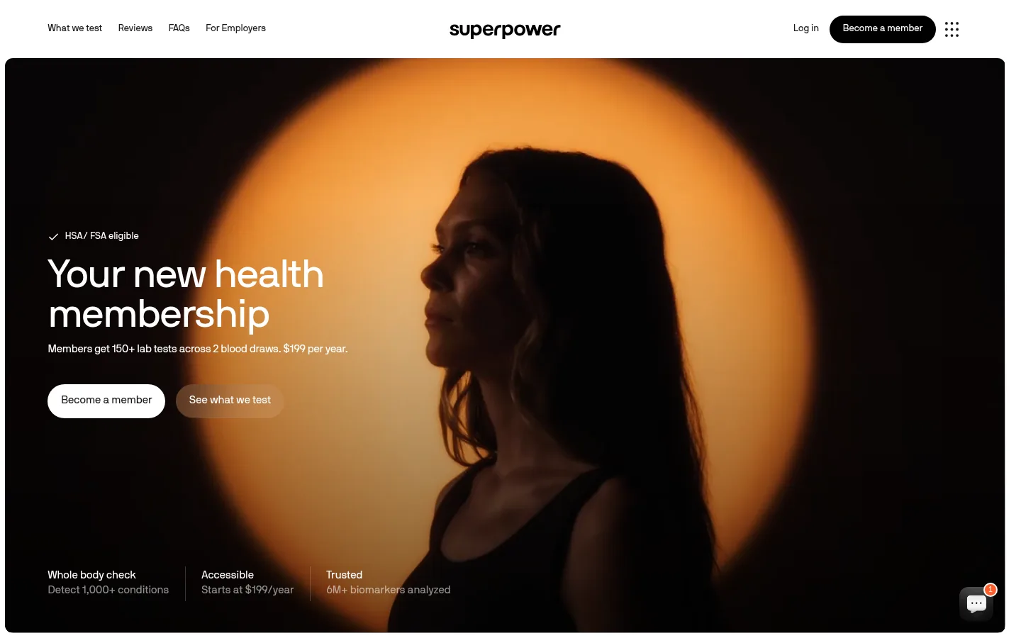
The page is built on a bright white canvas and a narrow grayscale palette, letting its large lifestyle photographs provide most of the visual warmth. The hero is a dark, cinematic image with an amber-lit portrait; white copy and pill-shaped calls to action sit over the image for strong contrast. Across the rest of the page, near-black headings and muted gray supporting text keep health information legible without making the interface feel clinical. A single sans-serif family is used throughout, with regular-weight headings, compact tracking, and a clear scale from display messaging to small navigation labels. Layouts alternate between centered explanatory sections and wide, media-led feature areas. Generous white space separates the process cards, biomarker content, doctor profiles, testimonials, and member-story gallery. Fine gray dividers and softly rounded cards provide structure, while color inside photography and product imagery remains illustrative rather than a general UI palette.
All page typography, from the hero and section headings to navigation, cards, buttons, and captions.
角色
示例
字号
字重
行高
字距
特大标题
Large hero or campaign statement.
Superpower
56px
400
1
-0.02em
一级标题
Primary hero headline and main page title.
Superpower
45px
400
1.2
-0.022em
二级标题
Major section headings, including process and member outcomes.
Superpower
34.5px
400
1.2
0
三级标题
Feature, step, and profile titles.
The quick brown fox 敏捷的狐狸
22.5px
400
1.4
-0.017em
正文
Explanatory paragraphs and membership details.
The quick brown fox 敏捷的狐狸
17px
400
1.44
-0.005em
辅助文字
Card descriptions, metadata, and supporting labels.
The quick brown fox 敏捷的狐狸
15px
400
1.5
-0.013em
按钮
Membership and other action labels.
The quick brown fox 敏捷的狐狸
13px
400
1.5
0
链接
Compact navigation and inline destination links.
The quick brown fox 敏捷的狐狸
13px
400
1.5
0
间距与布局
基准单位 1px · 密度:适中
60px版块间距
7px元素间距
—卡片内边距
—内容最大宽度
2px
4px
6px
7px
8px
11px
13px
14px
15px
19px
22px
30px
37px
40px
52px
60px
A wide, single-page flow sits on a white canvas, with a compact horizontal header above a nearly full-width hero. The hero uses left-aligned overlay copy, while the process section centers its heading over a four-card row. Later sections switch between full-bleed media, centered comparison content, and multi-column doctor or story layouts. Keep broad breathing room between sections and tighter grouping within cards. The measured page does not establish a reliable maximum width, so follow the screenshot's generous desktop framing without prescribing a fixed value.
圆角与层次
按钮 · 7px
卡片 · 11px
图片 · 8px
链接 · 11px
hairline · card
hairline · button
The interface is mostly flat, with whitespace and fine gray hairlines doing more work than shadows. Cards use softly rounded corners and only a very subtle shadow where measured. Dark gradients appear as image overlays for legibility; avoid raised panels or heavy borders.
组件
下面的预览按实测的按钮、输入框、徽标、卡片样式重建(字体用替代字体)。
Navigation header
Slim white horizontal bar with compact links at left, centered wordmark, and login, dark pill membership CTA, and icon control at right.
Hero media panel
Wide rounded photograph with darkened edges, left-aligned white headline and copy, two contrasting pill CTAs, and small proof points along the bottom.
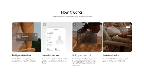
How-it-works cards
Four evenly aligned image-led steps with short titles and small supporting copy, introduced by a centered section heading.
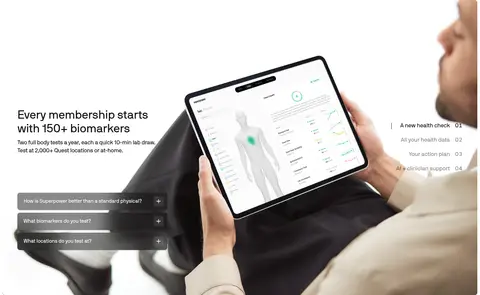
Feature media section
Large lifestyle or product image paired with explanatory copy and compact accordion-like questions or feature labels.
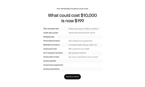
Membership comparison
Centered heading above a simple two-column list of included benefits and descriptions, ending in a dark membership CTA.
Doctor profile cards
A horizontal set of portrait-led clinician profiles with credentials, concise biography, and small institutional marks.
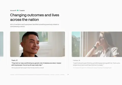
Member stories
Wide testimonial area with outcome heading, review context, and image-led story cards; a later gallery presents member and creator content.
Imagery · Photography is the main expressive device: the hero uses a shadowed portrait against a warm amber spotlight, while later imagery shows health dashboards, doctors, and members. Use human, candid-feeling images with rounded media framing and restrained overlays where text sits on top. Product screens and warm photographic colors belong to imagery, not the core interface palette.
Keep headings in Ink and supporting copy in measured muted grays.
Reserve black membership buttons for high-priority actions.
Use warm, human photography to add color and emotion.
Place white hero copy over a darkened portion of the image.
Keep cards softly rounded and visually quiet.
✕ 不该做
Don't introduce an unmeasured bright UI accent color.
Don't turn warm image tones into interface backgrounds.
Don't use heavy shadows or thick borders to define every card.
Don't center every section; preserve varied alignments.
Don't use bold, all-caps typography as the default.
Don't crowd the hero with dense copy or too many controls.
给 AI 的提示词
想快速出一个同风格的新页面,把这段话连同 DESIGN.md 一起发给 AI。
Build a new health-service page in Superpower's restrained editorial style. Use Gallery White (#ffffff) as the canvas, Ink (#18181b) for headings and primary text, Slate Text (#71717a) for supporting copy, and Quiet Divider (#e3e3e3) for subtle rules. Keep the single sans-serif voice close to Inter, with regular-weight type and compact, gently tight heading tracking. Start with a compact white navigation bar, then use a wide, rounded photographic hero with a dark overlay, clear left-aligned message, and contrasting pill actions. Let warm human photography supply atmosphere; do not use its amber tones as UI colors. Alternate centered explanatory blocks with wide image-led features and compact card groups. Favor open whitespace, fine borders, understated shadows, and clear health information over decorative effects.