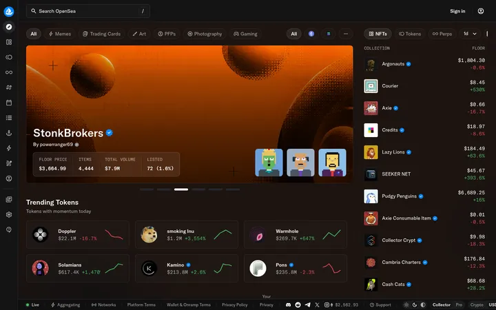
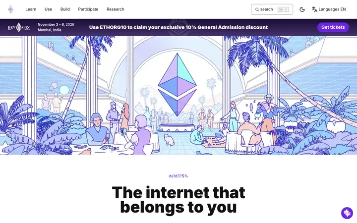
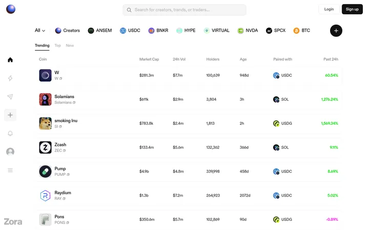
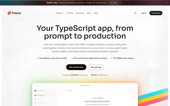
North star · Keep the marketplace chrome quiet and let vivid artwork, rather than interface colour, lead every discovery moment.
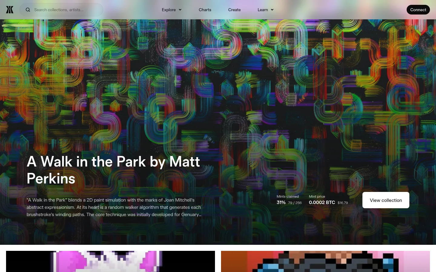
Gamma’s visual strategy gives the artwork the loudest voice: the marketplace sits on a white canvas, while vivid, often pixelated or painterly collection images carry saturated colour. Near-black text, quiet grey metadata and pale hairlines keep navigation, rankings and discovery tools legible without turning them into competing panels. Gamma Sans Display provides a consistent typographic voice, with large, confident headings, lighter supporting copy and restrained button labels. The page moves from a full-bleed artwork hero into a two-column feature collage, then returns to airy white discovery sections for prints, charts and ranked collections. A large, rounded charcoal brand panel interrupts that rhythm with pink-to-lilac gradient accents and cropped artwork motifs. Generous blank space around section headings contrasts with compact, information-dense collection rows. Rounded controls and image corners soften the otherwise spare, editorial marketplace presentation.
Page-wide display and interface type, from hero titles to metadata and controls.
角色
示例
字号
字重
行高
字距
特大标题
Large hero or brand-section headline.
Gamma
72px
600
1.15
-0.005em
一级标题
Primary page or feature headline.
Gamma
48px
600
1.17
0.02em
二级标题
Major section headings such as prints and charts.
Gamma
40px
600
1.2
0.02em
三级标题
Subsection titles and collection feature headings.
Gamma
32px
600
1.25
0.02em
四级标题
Compact card and feature headings.
The quick brown fox 敏捷的狐狸
24px
600
1.17
0.02em
正文
Descriptions, collection summaries and explanatory copy.
The quick brown fox 敏捷的狐狸
18px
300
1.5
0.02em
辅助文字
Small metadata, volume, floor-price and supporting labels.
The quick brown fox 敏捷的狐狸
14px
300
1.43
0.01em
按钮
Marketplace actions, including collection and discovery CTAs.
The quick brown fox 敏捷的狐狸
16px
400
1.5
0.02em
链接
Navigation, collection names and inline discovery links.
The quick brown fox 敏捷的狐狸
18px
300
1.5
0.02em
间距与布局
基准单位 4px · 密度:紧凑
40px版块间距
4px元素间距
131px卡片内边距
1360px内容最大宽度
4px
8px
12px
16px
20px
24px
32px
40px
52px
A centered marketplace shell uses a measured 1360px page max width, with a compact top navigation and broad, image-led hero. The content alternates between a two-column feature collage, open single-column promotional bands, a three-column chart row and a two-column ranked-list layout. A long, spacious white page rhythm culminates in a centered dark brand panel and a multi-column footer. Use the measured 4px-based spacing scale and compact overall density; preserve generous whitespace around section transitions.
圆角与层次
按钮 · 8px
输入框 · 9999px
卡片 · 9999px
图片 · 4px
链接 · 8px
没有测到阴影:页面是扁平的,层次靠底色和描边区分。
The page is mostly flat: white sections meet without prominent shadows, and subtle pale hairlines define inputs or separations. Artwork cards rely on image contrast and dark overlays rather than floating elevation. Use rounded corners for media and buttons, and reserve the large, pill-like silhouette for the dark brand feature panel.
组件
下面的预览按实测的按钮、输入框、徽标、卡片样式重建(字体用替代字体)。
Marketplace navigation
Place the Gamma mark and pill-shaped search input at left, destination links across the center, and a compact near-black Connect pill at right.
Artwork hero
Use a full-bleed featured artwork crop with a darkened lower area for a large white title, supporting description, mint and price metadata, and white View collection CTA.
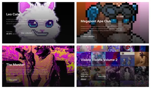
Collection feature cards
Arrange large artwork-led cards in two columns, with white text and compact collection details over darkened image areas.
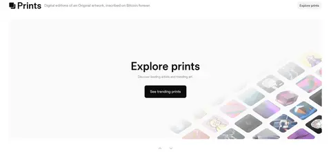
Prints promotion
Set a Prints heading and short descriptor above a light, spacious promotional panel with centered copy, a near-black CTA and artwork imagery fading into pink and lilac.
Chart cards
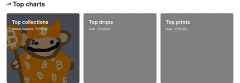
Show Top collections, Top drops and Top prints as three aligned cards with concise labels and image or surface treatment behind the ranking.
Ranked collection lists
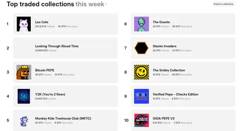
Present numbered collections in two columns of compact rows, pairing small artwork thumbnails with collection names and muted volume or floor-price metadata.
Brand feature panel and footer
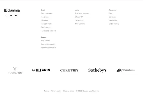
Use a tall, rounded charcoal panel for three editorial benefits, gradient-highlighted headings, artwork motifs, partner marks and a white CTA; follow with a light link-rich footer.
Imagery · Treat collection artwork as the page’s primary colour source: use large, edge-to-edge crops in hero and feature cards, with dark overlays where copy sits over busy images. Artwork ranges from pixel-art avatars to painterly prints and collaged collections. The prints promotion and dark brand panel use cropped, rounded image motifs and soft pink-to-lilac gradients. Keep artwork visually distinct from neutral UI chrome.
Keep the marketplace canvas white and the interface chrome restrained.
Let collection artwork provide most of the page’s saturated colour.
Use Carbon Ink #0c0c0d for primary text and dark CTAs.
Reserve Petal Rose #e0a6b5 and Orchid Haze #dc94d5 for selective gradient accents.
Use muted grey metadata to separate trading details from collection titles.
Build clear transitions between image-led discovery and spacious editorial sections.
✕ 不该做
Do not add bright interface colours that compete with the artwork.
Do not place long, low-contrast copy over busy images without a dark treatment.
Do not make every section a card or add heavy shadows.
Do not use the pink-lilac gradient as a general page background.
Do not give collection metadata the same emphasis as collection names.
Do not flatten the dark brand panel into the surrounding white canvas.
给 AI 的提示词
想快速出一个同风格的新页面,把这段话连同 DESIGN.md 一起发给 AI。
Build a new Bitcoin art marketplace page in Gamma’s restrained editorial style. Use Gallery White #ffffff as the main canvas, Carbon Ink #0c0c0d for text and primary actions, and Porcelain Grey #f3f3f3 or Mist Line #e9e9ec for quiet UI boundaries. Use Gamma Sans Display, or Inter as a free substitute, with light supporting copy and semibold headings. Make artwork the dominant colour source: use large, carefully cropped collection images, with dark overlays behind text where needed. Alternate image-led discovery with open white sections and compact ranked rows. Introduce a single dark feature panel in Gallery Charcoal #1d1d1e, accented selectively with Petal Rose #e0a6b5 and Orchid Haze #dc94d5. Keep shadows minimal, corners rounded and the hierarchy clear.