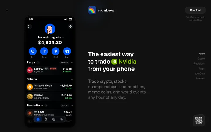
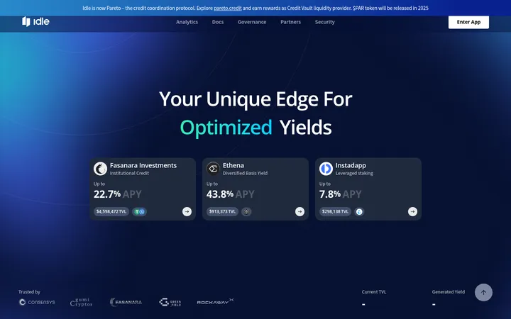
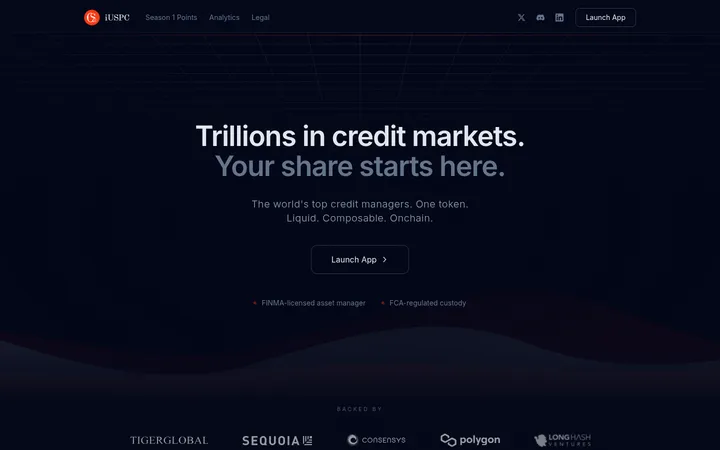
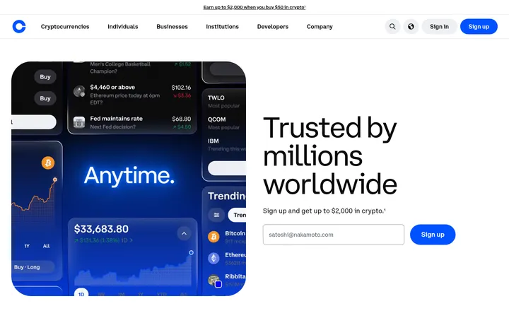
North star · Treat the dark interface as a quiet trading frame: let artwork attract attention and use restrained color to make market signals instantly legible.
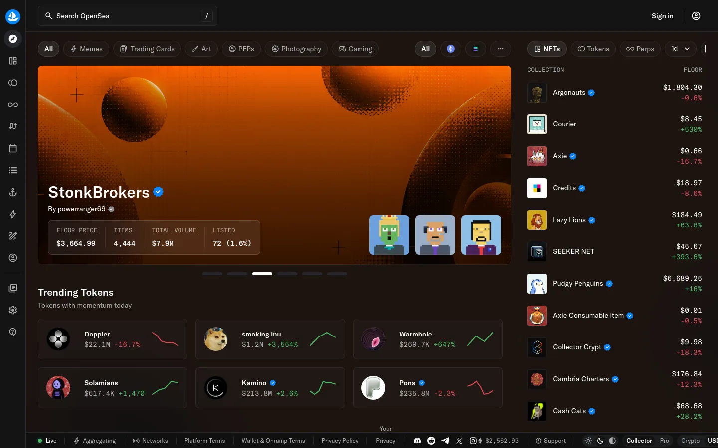
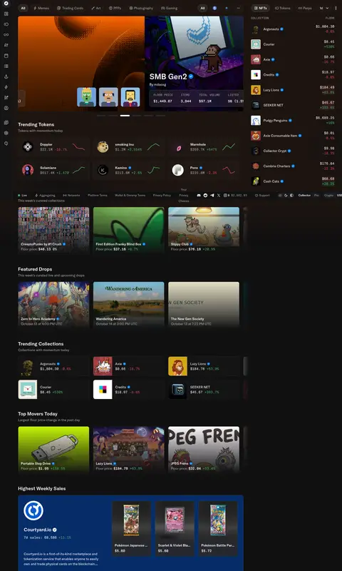
The page uses a near-black canvas as a quiet frame for a dense stream of market information and colorful collection artwork. White establishes the primary reading hierarchy, while muted gray handles secondary labels and supporting navigation. Green and red are reserved for market movement, status, and other high-signal details rather than broad decorative fills. GT America supplies the compact sans-serif interface; GT America Mono marks terse uppercase labels and data-like captions. The desktop composition pairs a narrow vertical icon rail with a wide discovery area and a market list at the right. Rounded pills group filters, while bordered cards organize token performance and collection previews. Large media panels provide visual contrast, often with dark gradients overlaying artwork so text remains legible. Consistent spacing, restrained borders, and small-radius cards keep the crowded marketplace scannable without making it feel like a conventional storefront.
Primary interface type for navigation, headings, body copy, buttons, collection names, and prices.
Aa 设计
gtAmericaMono
网络字体 · 字重 400 / 500 · 占比 27%
免费替代:IBM Plex Mono
Monospaced code and compact uppercase market or status captions.
角色
示例
字号
字重
行高
字距
一级标题
Primary page or feature heading, set in GT America medium.
OpenSea
32px
500
1.5
0
二级标题
Section titles such as Trending Tokens and Featured Drops.
The quick brown fox 敏捷的狐狸
20px
500
1.25
0
正文
Collection details, supporting descriptions, and interface copy.
The quick brown fox 敏捷的狐狸
14px
400
1.5
0
辅助文字
Compact uppercase labels for metrics and status information.
The quick brown fox 敏捷的狐狸
12px
400
1.25
0
按钮
Filter pills and action controls.
The quick brown fox 敏捷的狐狸
14px
400
1.5
0
导航
Main navigation labels and category links.
The quick brown fox 敏捷的狐狸
16px
400
1.5
0
代码
Monospaced data details where a technical readout is needed.
const style = 1;
14px
400
1.5
0
间距与布局
基准单位 4px · 密度:适中
48px版块间距
4px元素间距
4px卡片内边距
—内容最大宽度
2px
4px
6px
8px
12px
16px
20px
24px
The desktop page combines a slim icon rail, a broad discovery workspace, and a right-side market list. Within the workspace, a category-filter row precedes a large collection feature, followed by compact token cards and further discovery sections. Keep content aligned to a consistent left edge and use a multi-column card arrangement where the available width allows. Section changes are clear but economical; density comes from many visible listings, not oversized text or generous empty bands. No page maximum width was measured.
圆角与层次
按钮 · 9999px
卡片 · 8px
图片 · 4px
徽标 · 4px
导航 · 50%
链接 · 4px
inset · other, media, card
hairline · card
sm · card
The page relies on tonal surfaces and fine borders more than prominent shadows. Cards use restrained outlines and measured rounded corners; an inset light edge appears on some media and card surfaces. Keep layers legible through subtle background shifts, with artwork, overlays, and interface controls stacked clearly rather than separated by heavy elevation.
组件
下面的预览按实测的按钮、输入框、徽标、卡片样式重建(字体用替代字体)。
Icon rail
A slim, dark vertical navigation strip with stacked white or muted icons and an emphasized OpenSea mark.
Search and account bar
A compact top bar pairs a bordered search field on the left with sign-in and account controls on the right.
Filter pills
Rounded category and market filters use subtle dark fills or fine #232324 borders, with white active text and muted inactive text.
Featured collection
A wide artwork panel layers collection title, creator, metrics, and thumbnail previews over the image with a dark readability fade.
Market cards
Compact bordered cards combine token artwork, name, value, and a small green or red performance signal.
Collection market list
The right column lists collection thumbnails, names, floor prices, and movement in a tightly aligned, scannable format.
Status badge
A small uppercase monospaced label uses #47bb64 text and a matching fine border for minting status.
Imagery · Artwork is the visual centerpiece: collection banners, token thumbnails, and editorial NFT cards use varied, saturated imagery against the dark interface. The leading collection feature uses a wide framed image with overlaid title, creator, and market metrics; smaller cards crop imagery tightly. Some artwork includes illustrated or pixel-art subjects, but treat these colors as content, not brand palette. Dark gradients support text contrast over media.
Use #101011 and #1b1d1f as the main dark interface layers.
Keep artwork prominent and reserve negative space around its overlaid text.
Use #47bb64 for positive movement and #e24756 for negative movement.
Separate dense listings with fine #232324 borders.
Use GT America for interface text and GT America Mono for compact captions.
Keep filters pill-shaped and card surfaces subtly rounded.
✕ 不该做
Do not turn artwork colors into the interface palette.
Do not use bright accent colors for large background bands.
Do not replace market signals with decorative gradients.
Do not make every text label equally prominent.
Do not rely on heavy shadows to distinguish cards.
Do not make the dense marketplace feel like a sparse editorial landing page.
给 AI 的提示词
想快速出一个同风格的新页面,把这段话连同 DESIGN.md 一起发给 AI。
Build a new OpenSea-style marketplace page as a dark, information-dense discovery interface. Use Abyss Black (#101011) for the main application surface and Slate Canvas (#1b1d1f) for supporting regions. Set interface text in white (#ffffff), secondary copy in Quiet Silver (#acadae), and keep borders close to Divider Charcoal (#232324). Use Market Green (#47bb64) and Market Coral (#e24756) only for positive and negative market signals. Use GT America or a close sans-serif substitute for navigation and content, with a monospace face for compact uppercase metric labels. Arrange navigation, filters, a large artwork feature, compact market cards, and a collection list in aligned desktop columns. Let varied NFT imagery provide color; apply dark overlays where text sits on media. Prefer rounded pills, restrained card corners, fine borders, and minimal shadows.