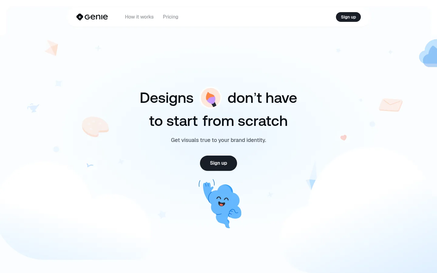
North star · Keep the interface mostly white and spacious, using soft pastel washes and playful artwork around crisp dark type and decisive pill-shaped actions.
The page uses white as its dominant canvas, punctuated by very pale lavender and blue section bands rather than strong blocks of brand colour. Soft gradients blur section boundaries and echo the airy, cloudlike artwork. Near-black headings provide the strongest contrast; muted gray supports explanatory copy, while the primary signup action is a compact dark pill. Aeonik shapes the display and heading hierarchy with a clean, rounded feel, and Geist handles body copy and controls. The composition is centered and deliberately sparse, with generous vertical pauses between product demonstrations and feature stories. Friendly cloud characters and floating objects appear as illustrative accents, not as a dense decorative pattern. Product mockups and sample generated visuals sit within the same pale atmosphere. Rounded media and cards, minimal hairlines, and restrained shadows preserve a soft, lightweight interface rather than a conventional dashboard aesthetic.
Body copy, navigation links, captions, and interface controls.
Aa 设计
Aeonik
网络字体 · 字重 500 · 占比 45%
免费替代:Manrope
Display text and main headings.
角色
示例
字号
字重
行高
字距
特大标题
Oversized hero display treatment and prominent short brand statements.
Geniestudio
148px
500
1.05
0
一级标题
Primary hero headline and major page headings.
Geniestudio
48px
500
1.17
0
二级标题
Section titles such as feature and gallery introductions.
Geniestudio
32px
500
1.25
0
正文
Explanatory copy, feature descriptions, and supporting product text.
The quick brown fox 敏捷的狐狸
18px
500
1.33
-0.01em
辅助文字
Small helper copy and supporting labels.
The quick brown fox 敏捷的狐狸
16px
500
1.5
-0.01em
链接
Navigation links and understated text actions.
The quick brown fox 敏捷的狐狸
16px
500
1.5
-0.01em
间距与布局
基准单位 8px · 密度:宽松
120px版块间距
8px元素间距
48px卡片内边距
878px内容最大宽度
6px
8px
12px
16px
18px
20px
24px
28px
30px
32px
40px
48px
56px
88px
120px
The page is a single-column, vertically paced landing page, with a measured 878px maximum content width and a spacious density. Navigation and hero content are centered within the canvas; later feature content introduces two-column arrangements and image-led blocks. Long white intervals separate major demonstrations, while brief pastel section bands signal changes of topic. Keep headlines and supporting copy centered where shown, then use aligned card content for feature details. The measured spacing system is based on an 8px unit, with a generous 120px section rhythm.
圆角与层次
按钮 · 9999px
卡片 · 32px
图片 · 16px
hairline · button, other
hairline · other
Most surfaces are flat, with separation created by whitespace, pale color fields, and subtle gradient transitions. Cards use large rounded corners and pastel fills instead of prominent outlines. Signup actions are dark pills; measured button treatment includes a crisp hairline shadow on one instance. Keep other shadows very restrained and avoid heavy layered panels.
组件
下面的预览按实测的按钮、输入框、徽标、卡片样式重建(字体用替代字体)。
Navigation
A quiet top bar with the Genie mark, muted text links, and a compact dark signup pill; keep the navigation visually subordinate to the hero.
Hero
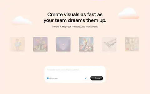
Centered, large Aeonik headline, short Geist support line, and dark rounded signup action over a pale blue-white atmospheric field.
Style selector
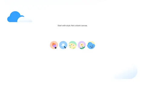
A sparse style introduction paired with a row of small, colorful illustrated style icons and scattered cloud motifs.
Prompt gallery
A soft pastel showcase with a centered heading, supporting line, sample visual thumbnails, and a rounded prompt-creation interface.
Feature cards
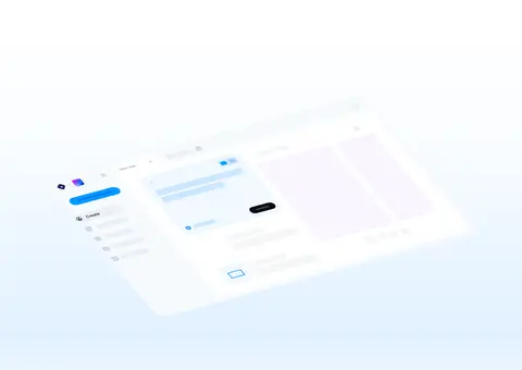
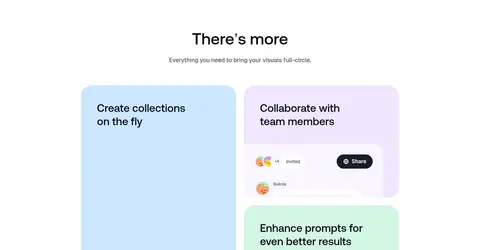
Large rounded feature panels with #cce7ff or #f1e6ff fills, muted copy, and product-interface imagery.
Signup button
Dark pill-shaped CTA with white Geist text; the larger measured variant has generous horizontal padding and a subtle hairline shadow.
Imagery · Use playful, polished illustrations rather than conventional photography: friendly cloud characters, floating icons, soft clouds, and small colorful style samples. Keep decorative elements airy and dispersed around the hero headline instead of crowding its text. Product screenshots and generated-image thumbnails should feel lightly embedded in the page, with pale surroundings and rounded media corners. Avoid treating illustration colors as core interface colors.
Reserve #0a0d12 for strong headings and high-contrast text.
Set display and heading text in Aeonik or a close substitute.
Use Geist or a close substitute for controls and supporting copy.
Give sections generous vertical breathing room.
Use playful illustrations as sparse accents around product content.
✕ 不该做
Do not turn the page into a dense dashboard.
Do not introduce saturated interface colors beyond the measured palette.
Do not rely on heavy borders or deep shadows to separate sections.
Do not crowd hero text with decorative illustrations.
Do not style every pastel in the mockups as a core brand color.
Do not replace the clean rounded controls with sharp, boxy buttons.
给 AI 的提示词
想快速出一个同风格的新页面,把这段话连同 DESIGN.md 一起发给 AI。
Build a new Geniestudio-style page as a spacious AI product landing experience. Use Gallery White (#ffffff) for the main canvas, with restrained Lilac Veil (#f9f5ff) and Cloud Blue (#ebf5ff) section washes; let Glacier Mist (#e1f1ff) appear in soft atmospheric transitions. Use Midnight Ink (#0a0d12) for clear headings, Slate Haze (#535862) for supporting copy, and Soft Graphite (#93979f) for quiet links. Set headlines in Aeonik or Manrope and interface text in Geist or Inter. Center the hero and its CTA, then alternate generous white pauses with pastel feature and product-showcase sections. Use rounded cards, pill-shaped dark actions, and friendly cloudlike illustrations as occasional accents. Keep visual hierarchy crisp, shadows minimal, and mockup colors subordinate to the measured interface palette.