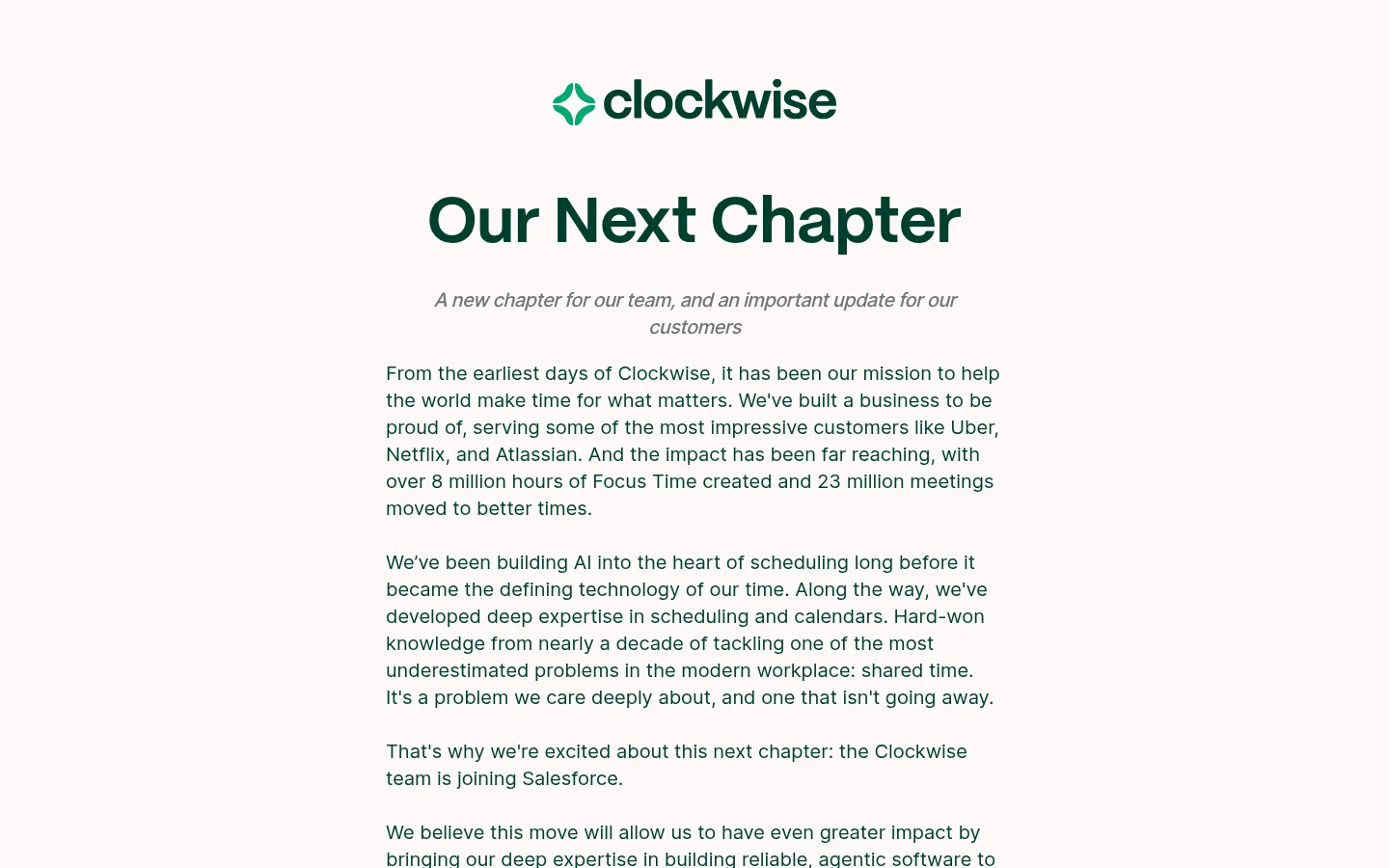
North star · Keep the page calm and editorial: a narrow reading column, deep-green typography, warm canvas, and clear section transitions.
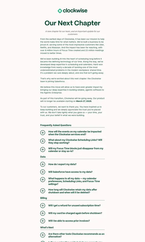
The page is defined by a warm off-white canvas (#fdf9f7) and deep green (#003f2e) typography, giving a sensitive company update a quiet, readable tone. A restrained brighter green (#039861) appears in the wordmark and selected navigation links rather than being used as a large promotional field. The opening is centered around the Clockwise mark and a large, bold headline; below it, a narrow left-aligned column carries the announcement in readable paragraphs. PP Mori gives headings a distinctive, rounded display character, while Inter handles body copy, navigation, and FAQ text. Spacing is generous around the introduction, then more compact through the grouped FAQ rows. A white lower section creates a clear change of pace and holds a centered customer logo cloud, impact figures, and a closing thank-you. Hairline rules and outlined plus icons structure the FAQ without cards or shadows.
Body paragraphs, navigation, FAQ questions, and supporting copy.
Aa 设计
PP Mori
网络字体 · 字重 700 / 600 · 占比 19%
免费替代:DM Sans
Display headline and prominent section or impact headings.
角色
示例
字号
字重
行高
字距
特大标题
Large display treatment for the prominent closing and brand statements.
Clockwise
66px
700
1.1
0
一级标题
Centered “Our Next Chapter” announcement headline.
Clockwise
64px
600
0.95
0
二级标题
Major section headings and prominent impact statements.
Clockwise
52px
700
1
0
三级标题
Supporting section and content headings.
The quick brown fox 敏捷的狐狸
24px
400
1.4
0
四级标题
FAQ group labels and smaller emphasized headings.
The quick brown fox 敏捷的狐狸
23px
700
1.2
0
正文
Announcement paragraphs, customer note, and explanatory copy.
The quick brown fox 敏捷的狐狸
18px
400
1.3
0
导航
Brand navigation and the small set of inline links.
The quick brown fox 敏捷的狐狸
18px
400
1.3
0
间距与布局
基准单位 4px · 密度:适中
72px版块间距
10px元素间距
8px卡片内边距
640px内容最大宽度
4px
7px
8px
9px
10px
14px
20px
30px
32px
40px
48px
64px
96px
Use a single centered reading column with a measured maximum content width of 640px. Center the logo and announcement headline; align paragraphs and FAQ content to the left within the column. Keep the main announcement on a continuous warm canvas, with generous vertical breathing room before the FAQ. Group questions into labeled categories with fine rules. Transition to a full-width white band for the customer logos and impact content, centered within the page. The overall density is comfortable, with tighter repeated FAQ rows.
圆角与层次
导航 · 9999px
没有测到阴影:页面是扁平的,层次靠底色和描边区分。
The design is essentially flat: measured shadows and gradients are absent. Use the warm-to-white section change, whitespace, and thin rules to establish hierarchy instead of floating cards. FAQ rows are separated through outlines and hairlines, with no heavy container treatment. Keep borders understated and avoid layered surfaces.
组件
下面的预览按实测的按钮、输入框、徽标、卡片样式重建(字体用替代字体)。
Brand header
A compact Clockwise wordmark centered above the announcement title on the warm canvas.
Announcement introduction
Centered PP Mori headline with a short muted italic subheading, followed by a narrow left-aligned Inter text column.
FAQ groups
Category labels and stacked questions separated by thin rules; use circular outlined plus icons for expandable rows.
Customer logo cloud
A centered multi-column collection of customer marks on the full-width white section; preserve their original colors.
Impact figures
Two large deep-green numeric highlights with short explanatory labels, arranged side by side within the white section.
Closing thanks
A centered, bold deep-green thank-you message closing the customer section.
Imagery · The page is primarily typographic rather than photographic or illustrative. Its main visual media is a customer-logo cloud in the lower white section, arranged in a compact multi-column grid; preserve each logo’s own brand colors instead of recoloring them. The Clockwise wordmark sits above the headline. Keep these assets crisp and restrained, without decorative image framing, gradients, or prominent mockups.
Use PP Mori for prominent headings and Inter for body copy.
Separate FAQ categories with restrained hairlines.
Reserve the white section for customer marks and impact content.
Use brighter green only as a small accent.
✕ 不该做
Don't turn the article into a multi-column layout.
Don't introduce large saturated color panels.
Don't add card shadows or gradients.
Don't recolor customer logos to match the palette.
Don't make FAQ rows look like raised cards.
Don't crowd the headline or article with decorative imagery.
给 AI 的提示词
想快速出一个同风格的新页面,把这段话连同 DESIGN.md 一起发给 AI。
Build a new Clockwise-style page as a calm, text-first editorial experience. Use Warm Paper (#fdf9f7) for the main canvas and Clockwise Forest (#003f2e) for primary text and headings. Set a compact centered brand mark above a clear PP Mori-style headline, then place Inter-style body copy in a narrow, left-aligned reading column. Use Fresh Clover (#039861) sparingly for small brand or link accents. Organize repeated information with simple FAQ rows, circular plus icons, and Soft Divider (#d9d9d9) hairlines rather than cards. If the page includes customer proof or metrics, transition into a full-width Gallery White (#ffffff) section, retain customer logos in their original colors, and present figures with restrained emphasis. Avoid shadows, gradients, dense ornament, and broad saturated backgrounds.