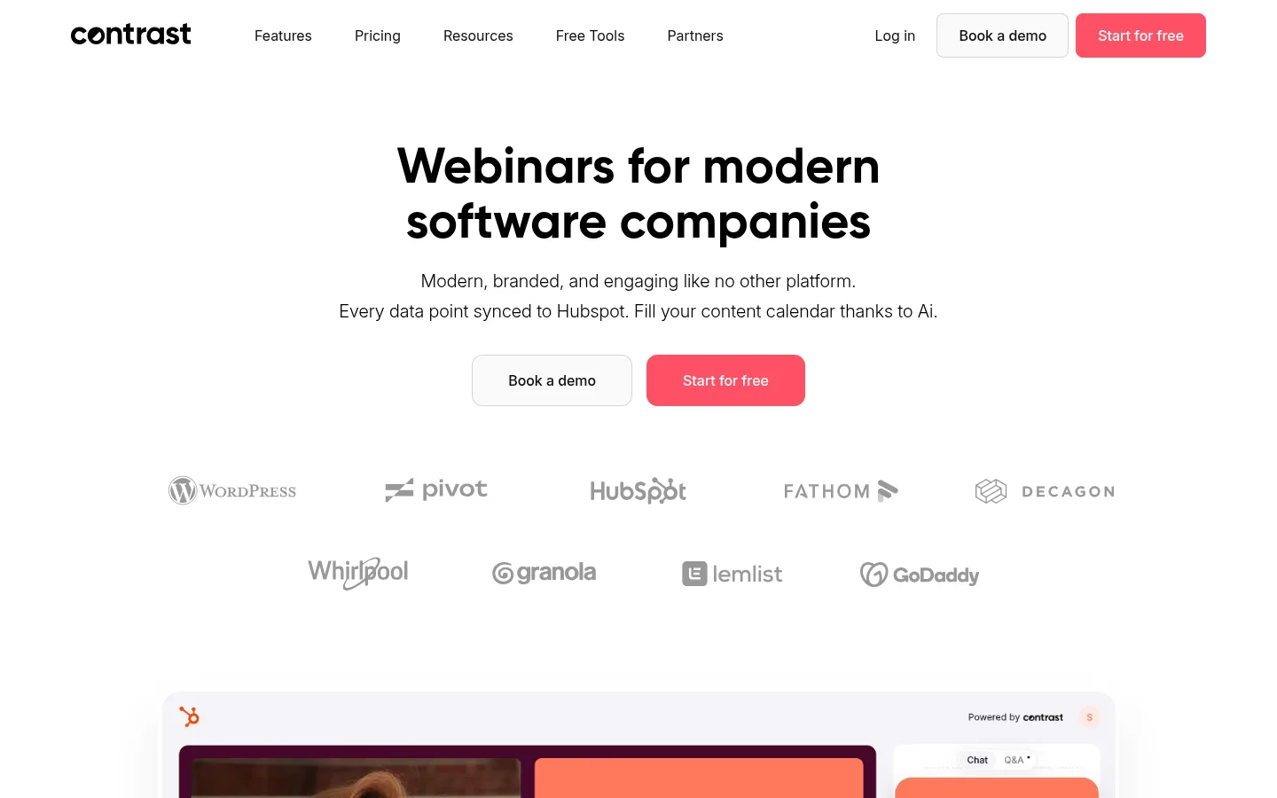
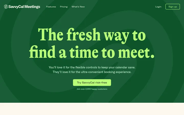
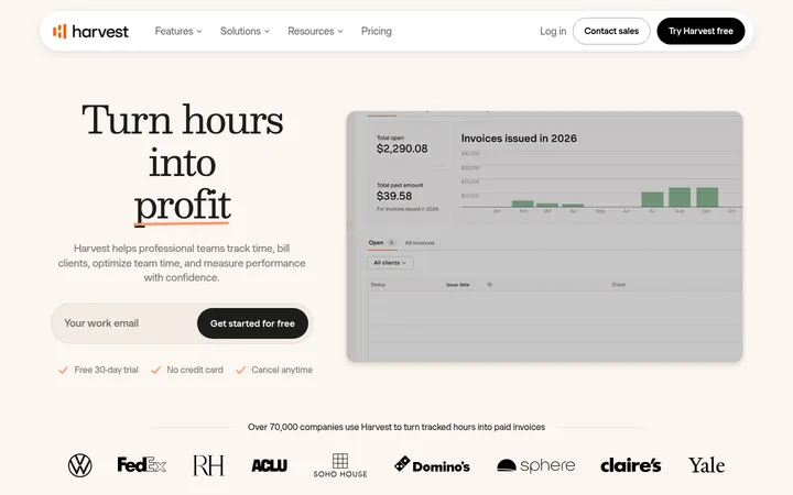
North star · Let generous white space and crisp black type carry the story, reserving coral for the next action and dark surfaces for editorial contrast.
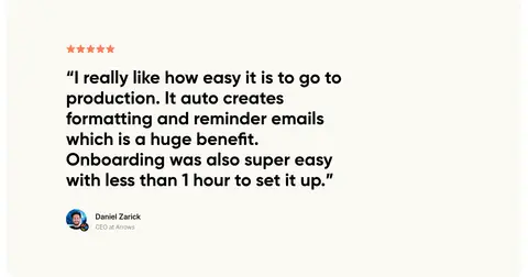
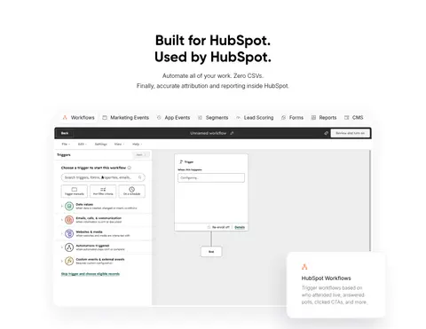
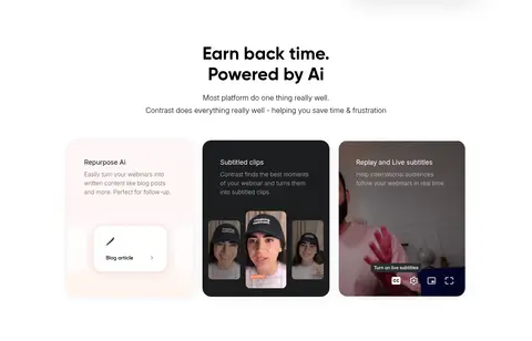
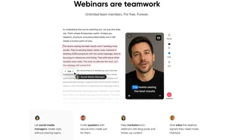
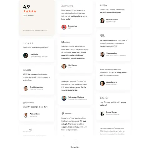
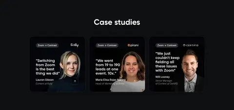
The page is defined by a white canvas, black typography, and restrained coral action color. The soft cream surface (#fbf9f3) appears in selected testimonial treatments, while the lower case-study and resource areas switch to a near-black band for a deliberate change of pace. Gilroy supplies the bold display and heading voice; Inter handles navigation, body copy, captions, and buttons with a light, open feel. Centered hero and section headings are paired with product demonstrations, customer logos, proof cards, and feature content, so the page alternates explanation with evidence. The layout is comfortable rather than dense: broad whitespace separates sections, with a measured maximum content width and multi-column arrangements used for cards and feature grids. Product screenshots and webinar video previews provide the main visual detail; keep them framed as supporting evidence rather than decorative backgrounds. Fine gray borders and subtle shadows distinguish cards without making the interface feel heavy.
Navigation, body copy, captions, buttons, and lighter feature text.
Aa 设计
__gilroy_9ec1f1
网络字体 · 字重 700 / 600 · 占比 10%
免费替代:Plus Jakarta Sans
Display and major section headings.
角色
示例
字号
字重
行高
字距
特大标题
Large hero or standout display headlines.
Contrast
56px
700
1.11
0
一级标题
Primary page headline and prominent section titles.
Contrast
48px
700
1.17
0
二级标题
Secondary section headings and card headings.
The quick brown fox 敏捷的狐狸
24px
600
1.08
0
三级标题
Feature titles and supporting subheads.
The quick brown fox 敏捷的狐狸
20px
300
1.7
0
正文
Descriptions, testimonial copy, and explanatory text.
The quick brown fox 敏捷的狐狸
16px
300
1.75
0
辅助文字
Small labels, attribution, and metadata.
The quick brown fox 敏捷的狐狸
14px
300
1.57
0
按钮
CTA labels and actionable controls.
The quick brown fox 敏捷的狐狸
16px
400
1.5
0
导航
Header navigation links.
The quick brown fox 敏捷的狐狸
16px
300
1.5
0
间距与布局
基准单位 8px · 密度:适中
80px版块间距
16px元素间距
40px卡片内边距
1280px内容最大宽度
1px
4px
5px
6px
8px
12px
16px
20px
24px
32px
40px
42px
80px
120px
Use a centered content frame with a measured maximum width of 1280px, generous section gaps, and comfortable internal spacing. The hero centers its headline, supporting copy, paired CTAs, logo cloud, and product preview. Most sections keep headings centered, then shift into three- or four-column evidence and feature arrangements; selected product explanations use split layouts. Keep the white sections visually open and let the dark case-study/resource bands read as a distinct closing chapter.
圆角与层次
按钮 · 14px
卡片 · 24px
图片 · 50%
徽标 · 9999px
导航 · 16px
链接 · 24px
lg · card, link
xl · card
lg · button
sm · button
Favor flat white sections, fine borders, and quiet card shadows. Cards use rounded surfaces with subtle separation rather than strong outlines or dramatic lift. Layer product previews and testimonial panels only where needed to establish hierarchy; the dark editorial bands rely on surface contrast, not extra elevation.
组件
下面的预览按实测的按钮、输入框、徽标、卡片样式重建(字体用替代字体)。
Primary CTA
Coral #ff5065 fill with white text, a compact rounded shape, and medium Inter weight; pair with an outlined or pale secondary action.
Hero
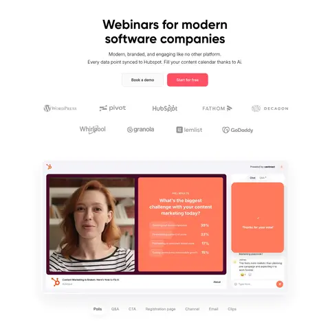
Centered bold Gilroy headline, two-line supporting copy, paired actions, a subdued logo cloud, and a large framed product demonstration.
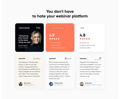
Proof cards
Rounded testimonial and review cards with fine gray borders, generous padding, customer details, and occasional soft shadow.
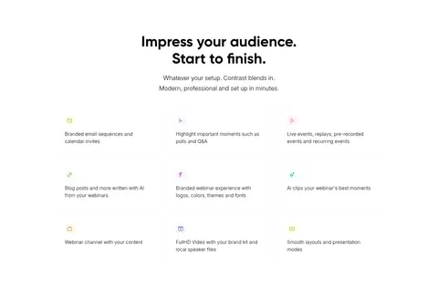
Feature grid
Short feature statements and simple icons arranged in open multi-column rows with ample separation.
Product preview
Screenshots and video stills framed as tangible product evidence; keep UI detail legible and surrounding layout uncluttered.
Dark editorial band
Near-black background with white headings, dark charcoal story cards, and fine dividers for case studies and learning links.
Badge
Small charcoal pill or compact label with white text, used for integrations or editorial status such as trending.
Imagery · Use authentic-looking product interface captures, webinar video stills, and customer-story portraits as the primary imagery. Keep screenshots in clear, polished frames with softly rounded corners and restrained shadow; avoid turning them into full-bleed backgrounds. Customer logos and small portraits act as supporting proof, while coral within product previews may be illustration-specific rather than a site-wide surface color.
Keep the main canvas bright white and uncluttered.
Use Signal Coral #ff5065 for primary actions, not broad decorative fills.
Set large headlines in bold Gilroy-style geometry.
Use Inter for navigation, supporting copy, and controls.
Alternate product evidence with concise benefit explanations.
Reserve dark bands for case studies and learning resources.
Separate cards with subtle borders and restrained shadows.
✕ 不该做
Do not make every section a colored panel.
Do not use coral as the default text or background color.
Do not crowd the centered hero with extra decorative elements.
Do not let product screenshots become full-bleed page backgrounds.
Do not use heavy shadows or harsh card outlines.
Do not replace the quiet page rhythm with dense dashboard-like grids.
给 AI 的提示词
想快速出一个同风格的新页面,把这段话连同 DESIGN.md 一起发给 AI。
Build a new SaaS page in Contrast’s visual style: use a white-first canvas, bold geometric headings, light supporting copy, and a comfortable centered content frame. Use Gallery White #ffffff for the main surface, True Ink #000000 for headline contrast, and Signal Coral #ff5065 only for the primary action. Use Warm Paper #fbf9f3 selectively for testimonial warmth and Midnight Charcoal #0e0f10 for a clear editorial closing band. Set headlines in a Gilroy-like face and interface copy in Inter. Give sections generous breathing room; center the hero and major headings, then use restrained multi-column cards and product-focused splits. Show product captures and customer proof in softly rounded, lightly bordered frames. Keep elevation subtle, hierarchy clear, and the page’s conversion path easy to scan.