North star · Let a warm, quiet canvas and centered oversized typography lead; use gold only to mark key actions.
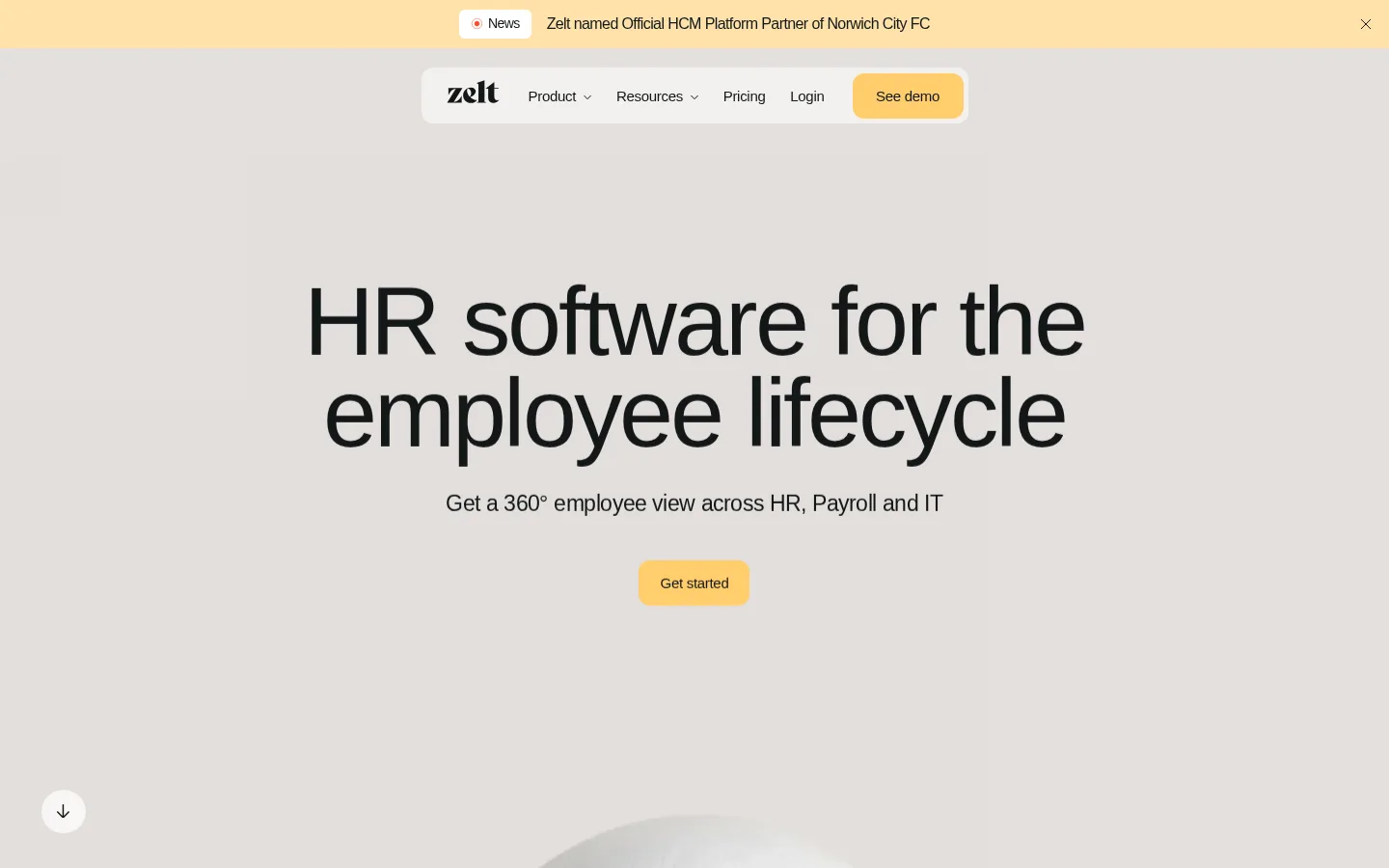
The page establishes a calm, warm-neutral identity: a broad muted gray-beige canvas supports near-black text, while cream navigation surfaces and a small golden CTA provide the main contrast. A narrow announcement band sits above a floating, pill-like navigation bar; both remain visually secondary to the centered hero. Typography is clean system sans-serif, with a very large, regular-weight headline, tight tracking, and a compact supporting line. The first viewport keeps generous open space around the message and CTA, creating an editorial rather than dashboard-like feel. The measured page uses a spacious grid and a 1181px maximum content width, but the hero reads as a centered, constrained text composition. Media is visible near the lower edge and elsewhere in the page, yet the opening identity is defined primarily by typography, muted surfaces, and restrained gold accents. Rounded controls soften the otherwise flat layout.
System sans-serif throughout; oversized hero headline, navigation, supporting copy, and captions.
角色
示例
字号
字重
行高
字距
特大标题
Oversized hero headline treatment in the first viewport.
Zelt
101px
400
0.95
-0.03em
一级标题
Compact section or content headings beneath the display title.
The quick brown fox 敏捷的狐狸
23px
400
1.4
-0.02em
正文
Supporting hero copy and descriptive page text.
The quick brown fox 敏捷的狐狸
15px
500
3.13
-0.02em
辅助文字
Small announcement and secondary interface labels.
The quick brown fox 敏捷的狐狸
14px
400
0.95
-0.043em
导航
Primary navigation and announcement-style navigation text.
Zelt
101px
400
0.95
-0.03em
间距与布局
基准单位 4px · 密度:宽松
173px版块间距
16px元素间距
—卡片内边距
1181px内容最大宽度
5px
6px
8px
12px
16px
29px
43px
54px
173px
Use a spacious, centered composition with the measured 1181px maximum page width and a 12-column underlying grid. The hero title and supporting copy align centrally, with a compact CTA beneath and substantial open space around the group. A slim announcement strip precedes the floating navigation surface. Keep the density low and let sections breathe; the measured section rhythm is spacious, with a large 173px section gap and a 16px element gap. Avoid adding extra framing around the hero.
圆角与层次
按钮 · 12px
导航 · 12px
没有测到阴影:页面是扁平的,层次靠底色和描边区分。
The interface is largely flat, with no measured shadows or gradient system. Separate regions through warm surface shifts rather than strong borders. The navigation sits as a light rounded capsule against the canvas, and the golden CTA is distinguished by color and rounded corners rather than depth effects.
组件
下面的预览按实测的按钮、输入框、徽标、卡片样式重建(字体用替代字体)。
Announcement strip
A shallow full-width warm apricot band above the navigation, with a compact news marker, announcement text, and a close affordance.
Floating navigation
A centered cream capsule containing the Zelt wordmark, Product and Resources menus, Pricing, Login, and a golden See demo CTA.
Hero headline
Large regular-weight, near-black sans-serif headline centered across two lines, with tight negative tracking.
Hero supporting copy
A short centered line beneath the headline describing the unified employee view across HR, Payroll, and IT.
Primary CTA
Golden rounded button with near-black label; used for See demo and the hero’s Get started action.
Scroll cue
Small circular light control near the lower-left edge of the opening viewport, showing a downward arrow.
Imagery · The opening viewport is led by typography rather than a prominent image; a soft, pale media form is only beginning to appear at the bottom edge. The full measured section contains many images and SVGs, so treat product media as supporting content rather than the brand’s primary signature. Keep imagery clean and integrated into the page, without introducing a new dominant palette.
Keep the hero message centered and visually dominant.
Use Warm Haze #e4e0dd as the broad canvas color.
Reserve Honey Gold #ffcd6d for primary actions.
Use Soft Ink #121718 for all prominent text.
Separate navigation with a light cream capsule.
Preserve generous empty space around the hero.
Keep typography regular-weight and clean.
✕ 不该做
Don’t introduce saturated colors outside the measured palette.
Don’t add heavy shadows or decorative gradients.
Don’t crowd the hero with extra panels or badges.
Don’t use bold display typography in place of the measured regular style.
Don’t turn the navigation into a full-width dense bar.
Don’t make illustrations more prominent than the headline.
给 AI 的提示词
想快速出一个同风格的新页面,把这段话连同 DESIGN.md 一起发给 AI。
Build a new page in Zelt’s warm, spacious SaaS style. Use Warm Haze #e4e0dd as the dominant canvas, Soft Ink #121718 for text, and Oat Cream #f6f3ef for quiet navigation or content surfaces. Use Honey Gold #ffcd6d sparingly for the primary action, with Apricot Glow #ffe2aa reserved for announcement-like emphasis. Set clean system sans-serif type with regular-weight, tightly tracked display text; center the main message and leave generous breathing room. Keep a narrow announcement strip above a compact rounded navigation capsule. Favor flat surfaces and soft color transitions over shadows, borders, or gradients. Use imagery as supporting material, not as the focal point, and keep the page’s overall density low.