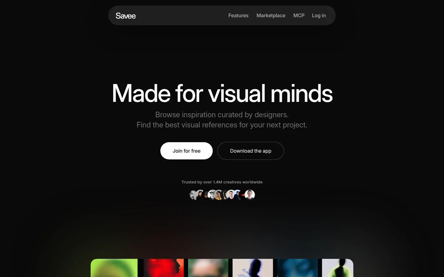
North star · Keep the interface nearly invisible so curated visual content and clear editorial type lead every section.
Savee’s visual strategy is built around a near-black canvas that recedes behind its visual references. The main background is #0a0a0a, with subtly lighter #151515 surfaces for navigation, cards, and selected content; restrained #1e1e1e outlines separate controls without adding visual weight. Bright near-white headings and primary actions create crisp contrast, while two levels of gray keep supporting copy and footer details quiet. A single clean sans-serif family carries the whole interface. Large, tightly tracked headlines establish editorial emphasis, while smaller body and caption styles stay understated. Layout alternates centered statements with broader image-led sections and split product showcases. Carefully curated photography, interface previews, and video provide color and texture inside the otherwise monochrome system. Rounded pill controls and gently rounded cards soften the geometry, while open spacing and mostly flat surfaces preserve a calm, gallery-like quality.
The single site-wide family for display headings, body copy, navigation, links, and captions.
角色
示例
字号
字重
行高
字距
特大标题
Large editorial statement or hero headline.
Savee
80px
500
1.05
-0.035em
一级标题
Primary page or section headline.
Savee
60px
500
1
-0.055em
二级标题
Major section heading, including feature and CTA titles.
Savee
48px
500
1
-0.035em
三级标题
Feature-card and supporting content headings.
Savee
36px
500
1.11
-0.02em
四级标题
Introductory or secondary statement copy.
The quick brown fox 敏捷的狐狸
24px
400
1.38
-0.007em
正文
Descriptions, paragraphs, and general interface text.
The quick brown fox 敏捷的狐狸
16px
400
1.38
-0.015em
辅助文字
Trust note, image labels, and fine-print metadata.
The quick brown fox 敏捷的狐狸
13px
500
1.46
0.01em
链接
Navigation items and prominent actionable text.
The quick brown fox 敏捷的狐狸
16px
550
1.38
-0.01em
间距与布局
基准单位 4px · 密度:适中
32px版块间距
16px元素间距
32px卡片内边距
1374px内容最大宽度
6px
8px
12px
14px
16px
20px
24px
32px
40px
64px
80px
Use a centered page frame with a measured maximum width of 1374px, while allowing media to feel broad and gallery-like. The hero is centered beneath a compact pill navigation; later sections alternate centered introductions, a two-column platform showcase, and a multi-column feature area. Keep the overall density comfortable, with a measured 32px section gap and 16px element gap as recurring rhythm. Preserve generous open space between content groups, and use left alignment for editorial copy and footer columns.
圆角与层次
按钮 · 9999px
卡片 · 16px
图片 · 50%
链接 · 9999px
xl · other
hairline · button
xl · card
The interface is predominantly flat, with contrast between the canvas and subtly raised charcoal surfaces doing most of the separation. Thin dark borders define selected controls and footer rules. Cards rely on rounded corners and image framing rather than visible shadows; reserve any deep shadow for isolated floating layers, not routine panels.
组件
下面的预览按实测的按钮、输入框、徽标、卡片样式重建(字体用替代字体)。
Pill navigation
A compact #151515 capsule centered near the top, with a wordmark and restrained navigation links in light and muted tones.
Primary CTA
A fully rounded light button with dark text; pair it with a dark, fine-outlined secondary action when needed.
App availability links
A vertical group of compact rounded dark controls with subdued labels and platform marks.
Reference collage
Layer curated imagery in a focused composition with surrounding negative space; let image colors provide the visual variation.
Feature cards
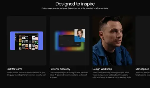
Dark rounded panels with image or interface previews above concise titles and muted explanatory text.
Footer columns
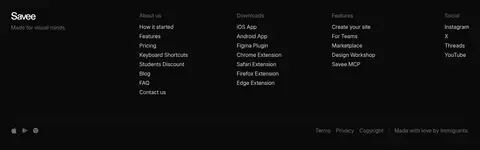
Organize many small links into clear columns, using brighter labels sparingly and quiet gray text for secondary details.
Imagery · Imagery is the page’s main source of color: curated reference images, overlapping visual samples, product-interface previews, and a workshop portrait sit against the dark canvas. The hero collage and broad image/video areas feel like selected inspiration rather than decorative wallpaper. Use crisp, varied image crops, keep artwork inside its own frame, and avoid adding gradients or effects that compete with the references.
Keep navigation and cards subtly distinct with #151515 surfaces.
Reserve bright near-white for headlines and primary actions.
Let curated imagery supply most of the page’s color.
Use generous negative space around hero and editorial blocks.
Favor rounded pill controls and softly rounded media cards.
✕ 不该做
Do not introduce vivid interface accents absent from the palette.
Do not crowd the hero with extra labels or decorative graphics.
Do not use heavy shadows on ordinary cards.
Do not make secondary copy as bright as primary headings.
Do not add large colored section bands behind the content.
Do not treat illustration-only colors as core brand colors.
给 AI 的提示词
想快速出一个同风格的新页面,把这段话连同 DESIGN.md 一起发给 AI。
Build a new Savee-style page as a quiet, image-led design gallery. Use Gallery Black (#0a0a0a) for the canvas, Soft Charcoal (#151515) for restrained panels, and Graphite Hairline (#1e1e1e) for subtle outlines. Set primary headings in Paper Light (#fafafa); use Quiet Silver (#a3a3a3) and Muted Ash (#737373) for secondary text. Use one clean sans-serif throughout, with tightly tracked medium-weight headlines and calm regular body copy. Center a compact capsule navigation, then balance an editorial hero with generous open space and a prominent curated image composition. Alternate centered statements with split showcases and image-led feature cards. Use rounded pills, restrained borders, and almost no shadow. Keep image colors inside their frames, avoid gradients, and ensure the interface remains quieter than the visual references.