North star · Keep the page calm and legible with generous white space, then use rounded, saturated colour and friendly imagery to make each next step feel inviting.
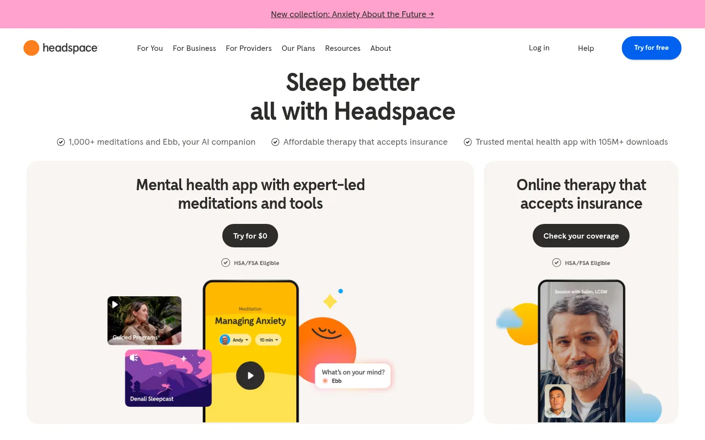
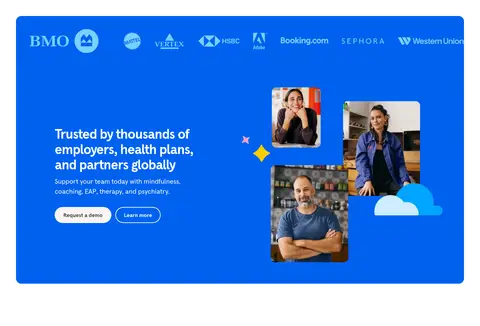
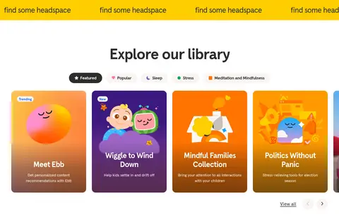
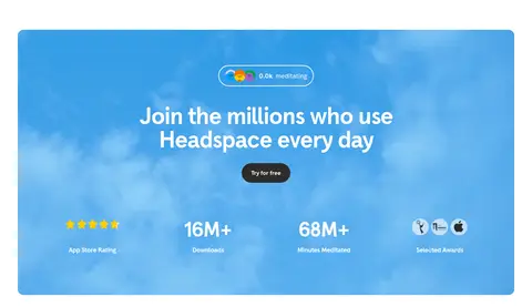
The page balances a predominantly white canvas with warm off-white panels, giving the content a calm foundation while making vivid blue and yellow section bands feel energetic rather than overwhelming. Headspace Apercu is used throughout: heavy, closely tracked headlines create clear focal points, while readable regular-weight text keeps benefits and navigation approachable. Large centered headings and generous whitespace distinguish the major sections, with compact horizontal navigation, pill-shaped topic controls, rounded cards, and a dense footer providing contrast in rhythm. The hero places concise proof points above two large service cards, where app imagery and therapy photography make the offerings tangible. Later sections alternate product-oriented content, logo and partner imagery, a bright library gallery, and a blue photographic statistics panel. Colourful character illustrations add personality; their colours are expressive content accents, not a replacement for the restrained white, ink, blue, and yellow interface palette.
All page typography, from display headlines and body copy to navigation, buttons, and footer links.
角色
示例
字号
字重
行高
字距
特大标题
Large campaign or section display headings.
Headspace
64px
700
1
-0.03em
一级标题
Primary page headline and major hero titles.
Headspace
52px
700
1.1
-0.03em
二级标题
Centered section headings and prominent feature titles.
Headspace
48px
700
1
-0.03em
三级标题
Subsection headings and content-card titles.
Headspace
40px
700
1.15
-0.03em
四级标题
Smaller feature and supporting panel headings.
Headspace
32px
700
1.2
-0.03em
正文
Explanatory copy, benefit descriptions, and introductory text.
The quick brown fox 敏捷的狐狸
20px
400
1.5
-0.01em
辅助文字
Badges, eligibility notes, and compact supporting labels.
The quick brown fox 敏捷的狐狸
16px
400
1.5
0
按钮
Primary and secondary call-to-action labels.
The quick brown fox 敏捷的狐狸
18px
700
1.2
-0.03em
导航
Header navigation and footer category links.
The quick brown fox 敏捷的狐狸
16px
400
1.15
0
链接
Inline informational links and text actions.
The quick brown fox 敏捷的狐狸
20px
400
1.5
-0.01em
间距与布局
基准单位 4px · 密度:适中
48px版块间距
8px元素间距
20px卡片内边距
1344px内容最大宽度
4px
6px
8px
10px
12px
14px
16px
19px
20px
24px
32px
48px
56px
64px
Use a centered, responsive content frame with a measured maximum width of 1344px. The header is a compact horizontal bar beneath a full-width announcement strip; the hero centers its headline and proof points above a two-card service layout. Follow with centered topic controls, product-feature panels, testimonials, partner content, library cards, statistics, FAQ, CTA, and footer. Preserve the measured 48px section rhythm and 8px element rhythm where applicable, with comfortable density, broad whitespace, and occasional full-bleed or wide colour bands.
圆角与层次
按钮 · 9999px
输入框 · 8px
卡片 · 24px
徽标 · 9999px
导航 · 50%
链接 · 16px
hairline · button
sm · link
The design is mostly flat, relying on whitespace, surface contrast, and rounded card shapes rather than layered shadows. Use the measured subtle button shadow for a slight pressed-control lift and a restrained shadow on selected links. Hairline borders remain quiet; avoid heavy outlines or dramatic depth.
组件
下面的预览按实测的按钮、输入框、徽标、卡片样式重建(字体用替代字体)。
Announcement bar
A narrow, full-width soft-pink strip above the header, with centered underlined announcement text.
Primary CTA
Blue #0061ef pill with white bold text and a subtle measured hairline shadow; use for actions such as “Try for free”.
Hero service cards
Warm Porcelain #f9f4f2 panels with 24px measured card radius, bold centered titles, dark pill actions, and app or therapy imagery.
Topic selector
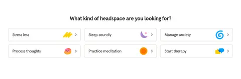
A centered heading followed by a compact grid of rounded category controls with simple icons and short labels.
Feature carousel
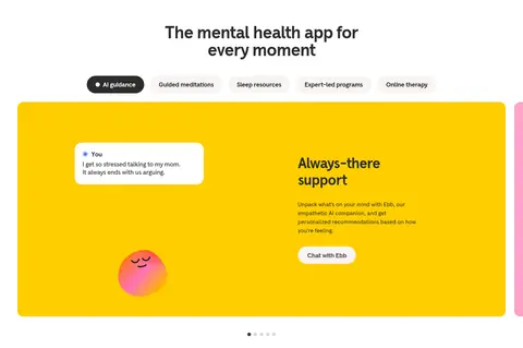
Wide, vividly coloured product panels pair a short feature explanation with a character illustration or app conversation preview.
Library cards
A horizontal gallery of colourful illustrated content cards with small badges, clear titles, and supporting descriptions.
FAQ rows
A restrained vertical question list with thin light dividers and a right-aligned expand affordance.
Footer signup
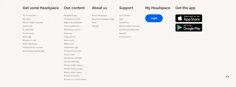
Warm light surface containing a short newsletter pitch, email field, dark subscribe button, and multi-column link groups.
Imagery · Mix app and phone mockups, candid therapy imagery, partner logos, and cheerful character illustrations. Keep photos framed within rounded cards or campaign panels; use bright illustrations as expressive accents around product content. Some imagery contributes its own vivid colours, so keep surrounding interface areas quiet and avoid treating artwork colours as global chrome.
Keep the white canvas dominant and section backgrounds calm.
Use #0061ef for prominent conversion actions.
Reserve #ffce00 for bold feature or CTA moments.
Set major headlines in bold, closely tracked sentence case.
Use rounded cards and pill-shaped action controls.
Pair product content with friendly, purposeful imagery.
✕ 不该做
Do not turn every section into a saturated colour block.
Do not use sharp, angular card treatments.
Do not replace warm ink text with pure black by default.
Do not crowd the hero with competing messages.
Do not apply illustration colours as the global interface palette.
Do not add heavy borders or dramatic shadows.
给 AI 的提示词
想快速出一个同风格的新页面,把这段话连同 DESIGN.md 一起发给 AI。
Build a responsive mental wellness homepage in the Headspace visual style. Use Gallery White (#ffffff) as the main canvas, Warm Ink (#2d2c2b) for primary text, and Warm Porcelain (#f9f4f2) for softly rounded service cards. Make #0061ef the clear primary-action colour, reserving Sunshine Yellow (#ffce00) and Clear Sky (#00a4ff) for distinct feature or campaign panels. Set all type in Headspace Apercu, or DM Sans if unavailable, with bold tightly tracked headlines and readable regular body text. Structure the page as a centered hero, service cards, topic selector, product features, social proof, partner content, library gallery, statistics, FAQ, CTA, and multi-column footer. Use generous whitespace, friendly illustrations, real-looking product and therapy imagery, pill buttons, subtle borders, and restrained shadows.