North star · Let atmospheric imagery and oversized, delicate type create the mood, while keeping interface details sparse and precise.
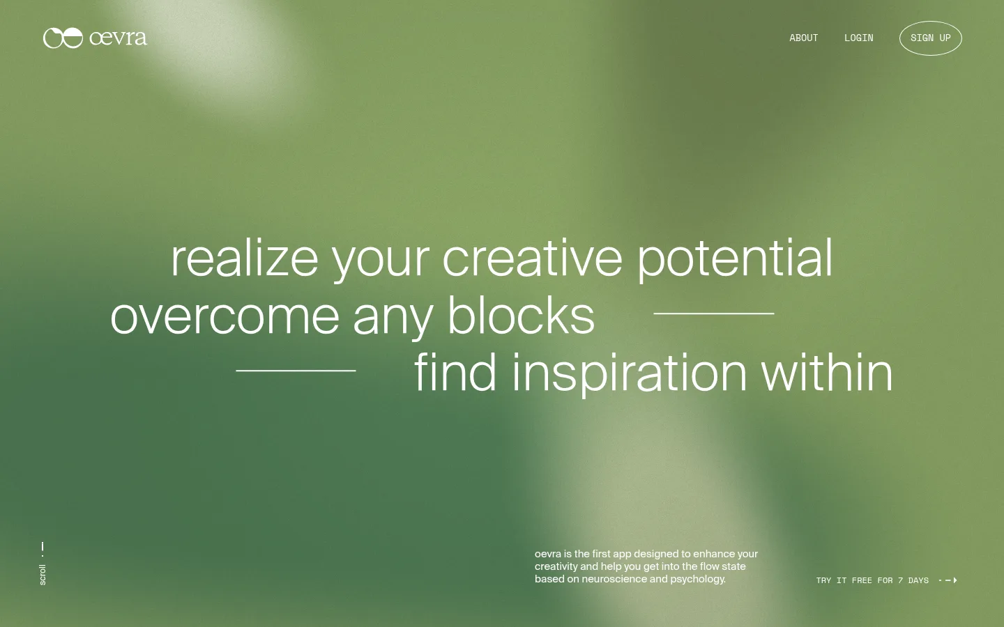
The visual identity hinges on contrast between a soft, organic green hero image and an understated neutral foundation. The screenshot’s green tones belong to the photographic background, not the measured brand palette; keep them confined to immersive imagery. On top, white typography and navigation remain crisp and legible. Below the hero, #efefef creates a quiet canvas, while #4e4e4e is the principal measured text color; white also appears as a hairline and outline color. Suisse Light gives the large headline a fine, airy editorial quality, balanced by Suisse Regular for compact explanatory copy. Space Regular supplies the uppercase, technical-feeling navigation and micro-labels. Layout is intentionally sparse: the hero statement occupies the center, with navigation at the top and small supporting details near the bottom. Generous vertical breathing room and the absence of prominent cards, shadows, or decorative UI preserve a meditative, image-led flow.
Oversized hero display statement and large section heading.
角色
示例
字号
字重
行高
字距
特大标题
Oversized hero statement and prominent editorial messaging.
Oevra
75px
400
1.1
0
一级标题
Large section headline introducing the app’s creative practice.
Oevra
45px
400
1
0
正文
Short explanatory copy beneath or alongside major statements.
The quick brown fox 敏捷的狐狸
15px
400
1.2
0
辅助文字
Compact uppercase section markers and small metadata.
The quick brown fox 敏捷的狐狸
12px
400
1.25
0
按钮
Uppercase signup and other concise action labels.
The quick brown fox 敏捷的狐狸
13.5px
400
1.3
0
导航
Uppercase top-level About, Login, and Sign Up links.
The quick brown fox 敏捷的狐狸
13.5px
400
1.3
0
间距与布局
基准单位 2px · 密度:宽松
120px版块间距
15px元素间距
—卡片内边距
1125px内容最大宽度
2px
4px
8px
11px
15px
30px
38px
60px
68px
75px
120px
Use a wide, centered composition with a measured page maximum of 1125px. Keep the hero statement visually centered and broken into deliberate, staggered lines, with navigation near the top edge and supporting copy and a trial link low in the frame. The following section returns to the #efefef canvas and uses a restrained split between a large headline and compact explanatory text. Preserve a spacious rhythm: the measured section gap is 120px, with an overall low-density presentation.
圆角与层次
按钮 · 9999px
没有测到阴影:页面是扁平的,层次靠底色和描边区分。
The page reads as flat and unboxed: measured data reports no shadows and no card components. Separate the hero photograph from the pale content canvas through the change in background, not through elevated panels. Use only the measured white hairline and thin signup outline as subtle boundaries.
组件
下面的预览按实测的按钮、输入框、徽标、卡片样式重建(字体用替代字体)。
Hero navigation
Place the white Oevra wordmark at the upper left; align compact uppercase About and Login links with an outlined, pill-shaped Sign Up action at the upper right.
Hero statement
Set the central message in Suisse Light with oversized, fine white letterforms, staggered line breaks, and short horizontal hairlines as pauses.
Hero microcopy
Keep the vertical scroll cue at the lower left and a small explanatory paragraph near the lower right, both white and visually secondary.
Trial link
Show a compact uppercase free-trial prompt near the hero’s lower edge, with a small directional arrow and no filled button background.
Intro section
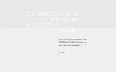
Continue on #efefef with a large, light-weight headline and a small block of supporting copy, maintaining generous open space.
Imagery · The hero is defined by a full-bleed, softly blurred green photograph with diffuse light and no sharply legible subject. Treat its green palette as imagery rather than a reusable UI color system. The next section appears mostly typographic on a pale neutral background; avoid adding decorative illustrations or product mockups that compete with the atmospheric opening.
Keep the hero image soft-focus and visually immersive.
Set major statements in a light, delicate sans serif.
Use compact uppercase labels for navigation and actions.
Preserve strong negative space around text groups.
Keep interface outlines thin and low emphasis.
✕ 不该做
Do not treat the hero’s greens as measured brand UI colors.
Do not introduce card grids or raised panels.
Do not use heavy bold typography for the main statement.
Do not crowd the hero with dense navigation or controls.
Do not add conspicuous shadows or gradients to UI elements.
Do not let small supporting copy compete with the headline.
给 AI 的提示词
想快速出一个同风格的新页面,把这段话连同 DESIGN.md 一起发给 AI。
Build a new Oevra-style page as a spacious editorial canvas. Use #efefef for the light content background and #4e4e4e for readable copy; reserve #ffffff for hero text, fine rules, navigation, and subtle outlines. Keep #000000 limited to occasional small text. If using a blurred green photograph, treat its greens as image content rather than interface palette. Use a light Suisse-like display face for oversized, carefully broken-up statements, a clean regular sans for body copy, and an uppercase mono-like face for navigation and labels. Align navigation along the top, center the primary message within the hero, and place small supporting copy near its lower edge. Continue into a quiet, open section with sparse text, no cards, no shadows, and generous vertical breathing room.