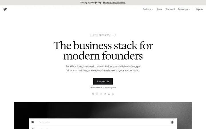
North star · Make the announcement feel like a readable, personal letter by keeping the page monochrome, centered, and free of decorative noise.
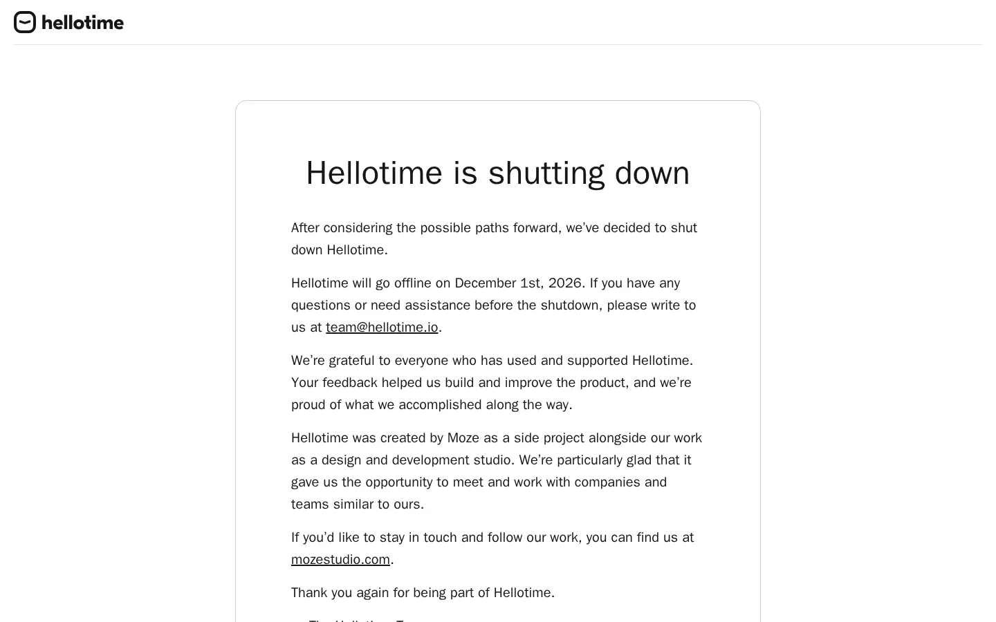
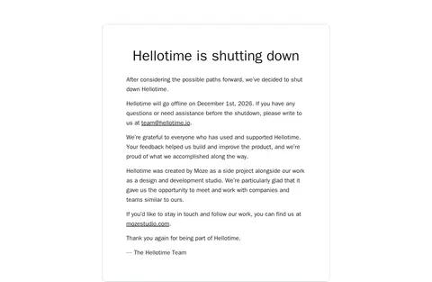
The page uses a bright white canvas and a deliberately narrow, centered reading area to give a shutdown announcement the tone of a personal letter. Near-black text carries the heading, body copy, and inline links; the links remain visually integrated with the text rather than styled as buttons. Fine neutral-gray rules separate the header and footer, while a light-gray outline defines the main rounded card without adding shadow or colored fill. Typography is system-led: a large, bold display heading introduces the message, followed by comfortably sized sans-serif paragraphs with open line spacing. A compact brand mark sits in the header and returns in the footer, where muted text and small legal links recede from the main announcement. The layout relies on generous whitespace and a single-column flow; there is no photography or decorative illustration competing with the content.
配色
点色块复制色值。用途说明来自对页面的实测位置(背景、文字、描边、按钮)与截图判读。
表层色
中性色
功能色
页面底色 · Paper White主文字 · Soft Ink次要文字 · Footer Gray描边 · Card Line
文字
背景
对比度
WCAG
#151619 Soft Ink
#ffffff Paper White
18.09:1
AAA
#7f8491 Footer Gray
#ffffff Paper White
3.74:1
AA-large
字体
字号阶梯:Custom(比例约 2.4,正文 20px)。示例用免费替代字体渲染,数值为实测。
Aa 设计
SF Pro Text
系统字体 · 字重 400 · 占比 97%
免费替代:Inter
Body paragraphs, links, navigation, caption-sized footer details, and card text.
Aa 设计
SF Pro Display
系统字体 · 字重 700 · 占比 3%
免费替代:Inter
Main announcement heading.
角色
示例
字号
字重
行高
字距
一级标题
Large centered title introducing the shutdown announcement.
Hellotime
48px
700
1
0
正文
Readable announcement paragraphs inside the main card.
The quick brown fox 敏捷的狐狸
20px
400
1.6
0
辅助文字
Small secondary footer and legal details.
The quick brown fox 敏捷的狐狸
14px
400
1.14
0
链接
Inline contact and related-site links within text.
The quick brown fox 敏捷的狐狸
20px
400
1.6
0
间距与布局
基准单位 8px · 密度:适中
80px版块间距
24px元素间距
80px卡片内边距
760px内容最大宽度
8px
16px
20px
24px
40px
64px
80px
160px
A compact header spans the page above a centered, single-column announcement card. The measured content max width is 760px, with generous card padding and a 16px corner radius; keep the text itself comfortably narrower than the card. The main content sits well apart from the header and footer, giving the notice a calm, letter-like rhythm. The footer returns to a simple, low-density arrangement with brand attribution and small legal links. Maintain ample whitespace rather than adding columns or decorative bands.
圆角与层次
卡片 · 16px
没有测到阴影:页面是扁平的,层次靠底色和描边区分。
The page is flat, with no shadows, gradients, or layered surfaces. A fine measured gray border outlines the announcement card, and subtle horizontal rules divide header and footer regions. Use the white canvas as the card interior; rely on spacing and the outline, not elevation, to establish hierarchy.
组件
下面的预览按实测的按钮、输入框、徽标、卡片样式重建(字体用替代字体)。
Brand header
Small Hellotime mark aligned at the top left, followed by a thin light-gray horizontal divider.
Announcement card
Single white card with a 1px #c8cad0 outline, 16px radius, and measured 80px padding; no shadow.
Notice heading
Centered, bold SF Pro Display heading at the measured 48px size and tight 1 line-height.
Announcement copy
Near-black SF Pro Text paragraphs at 20px with 1.6 line-height, left-aligned inside the card.
Inline links
Contact and related-site links use the same 20px text styling as body copy and sit within paragraphs.
Footer
Small brand attribution, muted details, and legal links separated from the page content by a fine rule.
Imagery · The page is essentially text-only. A small Hellotime logo appears in the header and footer, with no photography, video, 3D, or prominent illustration. Keep brand marks modest in scale and avoid introducing imagery that competes with the announcement or changes the quiet editorial tone.
Build a new page in Hellotime’s quiet, letter-like visual style. Use Paper White (#ffffff) as the canvas, Soft Ink (#151619) for primary text and inline links, Card Line (#c8cad0) for a fine card outline, Footer Gray (#7f8491) for secondary details, and Rule Gray (#e1e2e5) for subtle separators. Place a modest brand mark in a simple header, then a generously spaced, centered single-column content card. Use a bold, sentence-case display heading and readable system sans-serif body copy with relaxed line spacing. Keep links integrated with sentences, the card flat, and the footer restrained. Preserve broad whitespace and a calm reading rhythm. Avoid imagery, shadows, gradients, colored bands, and decorative controls; prioritize clear hierarchy and legibility.