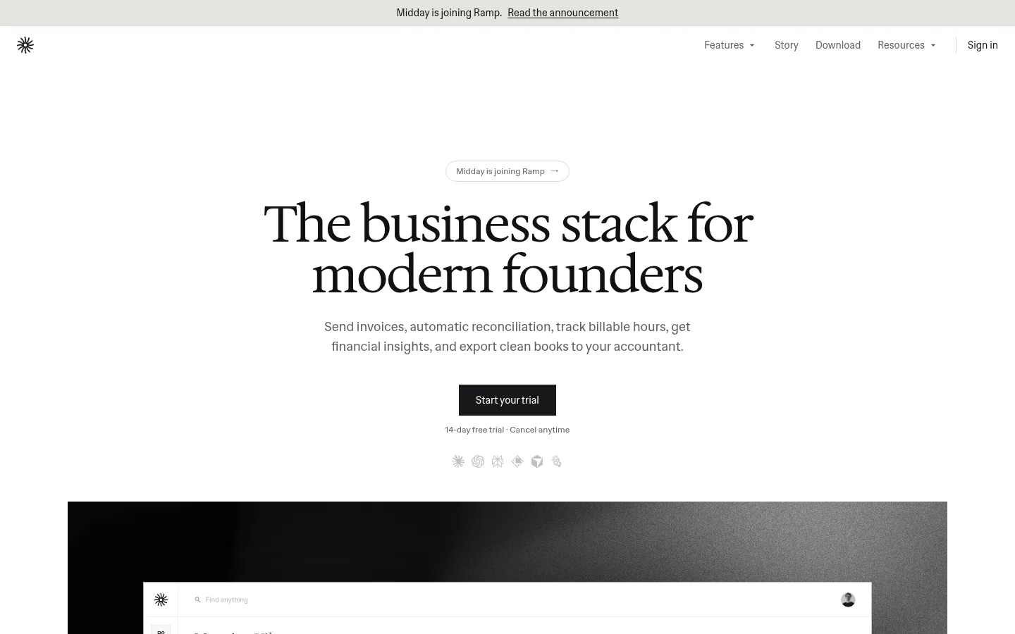
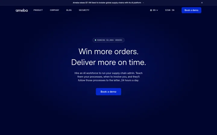
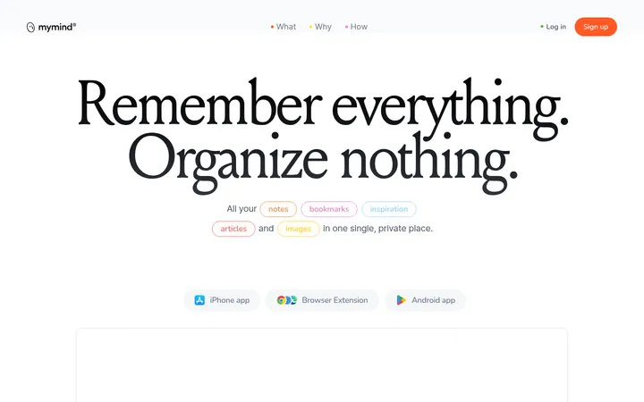
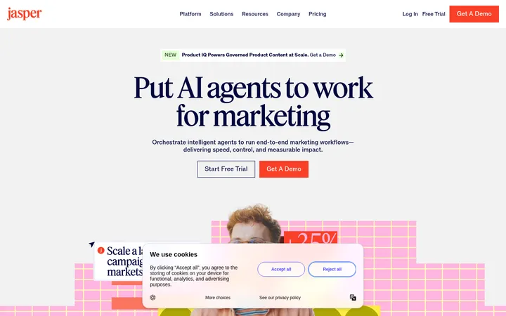
North star · Keep the product story calm and legible: white space first, precise type second, and interface evidence instead of decoration.
The page is built on a white canvas, with near-black headings and muted gray supporting copy. Soft warm-gray surfaces and hairline borders separate content without introducing strong color bands; green appears only as a small functional accent, not as a dominant brand fill. Hedvig Letters Serif gives the hero and selected feature headings an editorial voice, while Hedvig Letters Sans handles navigation, body copy, labels, and controls. The centered hero uses a compact announcement, a large two-line headline, concise supporting text, and a dark trial CTA. Below it, interface imagery is given room to breathe, followed by centered feature sections, orderly grids, restrained testimonial cards, and fine horizontal dividers. The overall rhythm is spacious and low-density: clear section transitions, simple geometry, and little decorative chrome keep attention on the product and its practical benefits.
配色
点色块复制色值。用途说明来自对页面的实测位置(背景、文字、描边、按钮)与截图判读。
品牌色
强调色
表层色
中性色
功能色
页面底色 · Gallery White表层 · Stone Surface主文字 · Editorial Ink次要文字 · Soft Graphite描边 · Warm Hairline强调 · Ledger Green
文字
背景
对比度
WCAG
#121212 Editorial Ink
#ffffff Gallery White
18.73:1
AAA
#121212 Editorial Ink
#e6e4e0 Stone Surface
14.75:1
AAA
#616161 Soft Graphite
#ffffff Gallery White
6.19:1
AA
#616161 Soft Graphite
#e6e4e0 Stone Surface
4.88:1
AA
#4caf50 Ledger Green
#ffffff Gallery White
2.78:1
不达标
#4caf50 Ledger Green
#e6e4e0 Stone Surface
2.19:1
不达标
字体
字号阶梯:Custom(比例约 2.051,正文 14px)。示例用免费替代字体渲染,数值为实测。
Aa 设计
Hedvig Letters Sans
网络字体 · 字重 400 / 500 · 占比 96%
免费替代:Inter
Navigation, body copy, controls, labels, and most headings.
Aa 设计
Hedvig Letters Serif
网络字体 · 字重 400 · 占比 4%
免费替代:DM Serif Display
Hero headline and selected editorial-style section headings.
角色
示例
字号
字重
行高
字距
特大标题
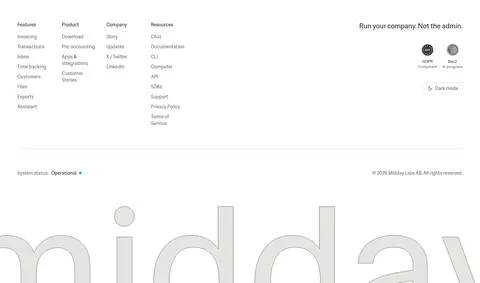
Oversized brand wordmark treatment in the footer.
Midday
508px
400
1
0
一级标题
Centered hero headline, set in the serif face.
Midday
72px
400
1
-0.025em
二级标题
Major section headings and feature-group titles.
Midday
48px
400
1
0
三级标题
Editorial subheadings and selected feature titles.
The quick brown fox 敏捷的狐狸
24px
400
1.33
0
四级标题
Smaller feature and supporting section headings.
The quick brown fox 敏捷的狐狸
20px
400
1.4
0
正文
Descriptions, explanatory paragraphs, and card copy.
The quick brown fox 敏捷的狐狸
14px
400
1.43
0
辅助文字
Trial reassurance, metadata, and small interface labels.
The quick brown fox 敏捷的狐狸
11px
400
1.5
0
按钮
Primary trial action and compact control labels.
The quick brown fox 敏捷的狐狸
14px
400
1.43
0
导航
Header navigation and footer navigation links.
The quick brown fox 敏捷的狐狸
14px
400
1.43
0
链接
Inline calls to action and contextual text links.
The quick brown fox 敏捷的狐狸
14px
400
1.43
0
眉题
Uppercase micro-labels and small section identifiers.
The quick brown fox 敏捷的狐狸
10px
400
1.5
0.05em
间距与布局
基准单位 4px · 密度:宽松
96px版块间距
8px元素间距
24px卡片内边距
1248px内容最大宽度
1px
6px
8px
10px
12px
16px
24px
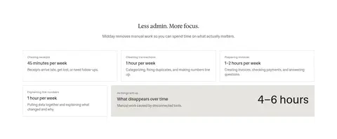
The page uses a centered, spacious composition with a measured maximum content width of 1248px. The hero is center-aligned, while later sections alternate between centered feature introductions, two-column product demonstrations, and compact multi-column grids. Keep section gaps generous and element spacing restrained; cards have measured 24px padding, and the overall density is spacious. Thin horizontal rules mark transitions without heavy color bands. Align content to a consistent central frame, allowing product imagery to feel broad while text remains easy to scan.
圆角与层次
按钮 · 9999px
图片 · 50%
hairline · footer
The interface is mostly flat: no prominent card shadows or layered floating panels. Cards and controls rely on measured #dbdad7 hairline borders, while pale #e6e4e0 areas provide occasional surface contrast. Preserve the clean separation and square card treatment; pill-shaped outlines are reserved for compact announcement and integration controls.
组件
下面的预览按实测的按钮、输入框、徽标、卡片样式重建(字体用替代字体)。
Announcement pill
A centered, compact announcement link with muted text, a fine #dbdad7 outline, and fully rounded pill geometry.
Primary trial CTA
A compact #18181b button with a light label, set beneath the hero copy and followed by small trial reassurance.
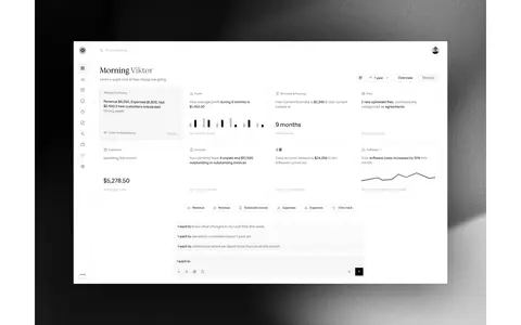
Product preview
Large dashboard imagery presented as evidence of the product; preserve its clean interface details and generous surrounding whitespace.
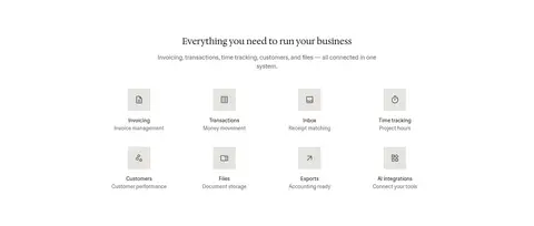
Feature navigation grid
A centered set of business-tool categories using small icons, concise titles, and muted one-line descriptors.
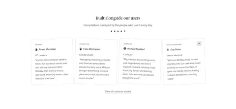
Testimonial card
Square-cornered quote cards with a #dbdad7 outline, measured 24px padding, and restrained customer metadata.
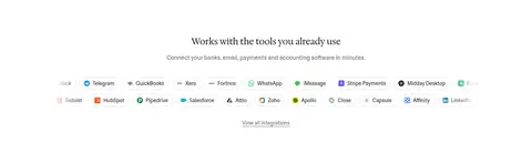
Integration row
A compact collection of partner logos and names on white, with subtle separators and restrained neutral styling.
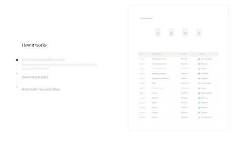
Imagery · Product imagery is primarily interface-focused: large screenshots and video previews show the business dashboard, transaction lists, and connected tools. Frame previews cleanly against the white canvas; the hero product demonstration sits over a dark, textured backdrop visible within the media rather than defining the page palette. Small partner logos and icons appear in compact integration rows. Keep imagery documentary and functional, with no invented decorative photography.
Do not use decorative imagery that competes with the interface.
Do not round square content cards into pills.
给 AI 的提示词
想快速出一个同风格的新页面,把这段话连同 DESIGN.md 一起发给 AI。
Build a new Midday-style SaaS page with a calm editorial character. Use Gallery White (#ffffff) as the dominant canvas, Editorial Ink (#121212) for primary text, and Soft Graphite (#616161) for supporting copy. Apply Warm Hairline (#dbdad7) to subtle dividers and card outlines, with Stone Surface (#e6e4e0) only for quiet contrast. Keep Ledger Green (#4caf50) sparse and functional; use Trial Charcoal (#18181b) for the main CTA. Set headlines in a restrained serif and navigation, body, and controls in a clean sans. Center the hero, give it ample whitespace, and follow with product-interface evidence, clearly separated feature sections, and compact grids. Favor flat surfaces, square content cards, and precise alignment over decoration. Make the product itself the visual focus.