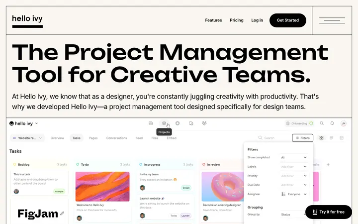
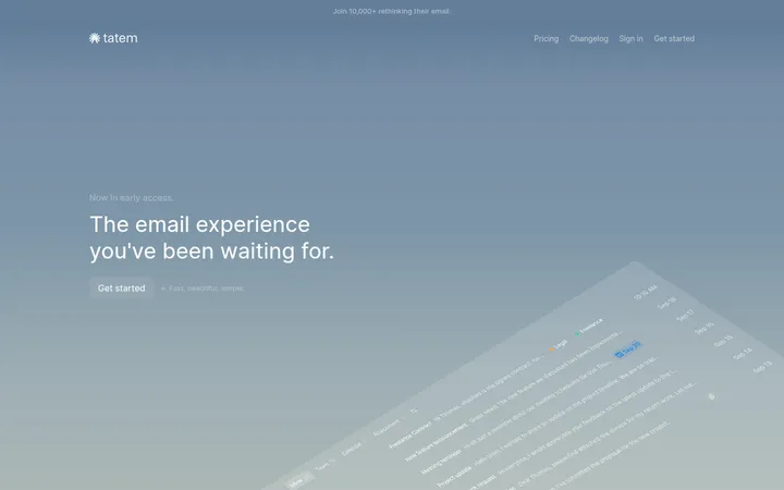
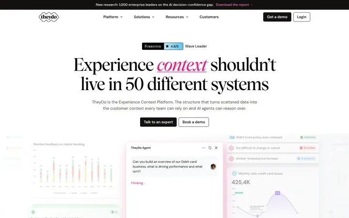
North star · Pair oversized, expressive gradient headlines with calm paper-toned space and clear product proof.
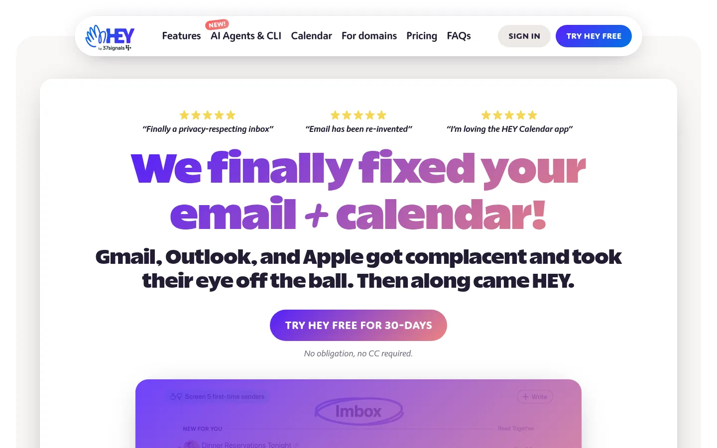
The page balances a warm, near-white paper canvas with crisp white panels and occasional stone-colored section bands. Ink-colored copy anchors the layout, while Blurple appears in links, prominent calls to action, and gradient headline treatments. Mint and sky blue act as bright accents; coral adds warmth to gradients and select promotional details. Heavy display type gives the hero and feature headings a loud, friendly voice, contrasted by Moniker’s readable, slightly tight body copy. The main content sits in centered, constrained blocks, with generous vertical breathing room between product explanations. Rounded navigation, buttons, testimonial cards, and a floating product preview soften the otherwise structured page. The product interface is shown as imagery rather than competing with the text. A saturated Blurple calendar band creates a clear late-page shift before the bright, link-rich footer.
配色
点色块复制色值。用途说明来自对页面的实测位置(背景、文字、描边、按钮)与截图判读。
品牌色
强调色
表层色
中性色
功能色
页面底色 · Warm Paper表层 · Clean White表层 2 · Soft Stone主文字 · Deep Ink强调 · Fresh Mint强调 2 · Electric Blurple强调 3 · Sky Blue
Body copy, navigation, links, buttons, and supporting text
Aa 设计
Really Sans Large
网络字体 · 字重 850 / 900 · 占比 7%
免费替代:Baloo 2
Display headlines and major section headings
角色
示例
字号
字重
行高
字距
特大标题
Oversized hero headline and standout promotional display copy.
HEY
83px
900
1.1
0
一级标题
Primary hero heading.
HEY
48px
850
1.1
0
二级标题
Major section and campaign headings.
HEY
40px
850
1.2
0
三级标题
Feature titles and prominent supporting headings.
The quick brown fox 敏捷的狐狸
27px
400
1.4
-0.012em
四级标题
Smaller secondary headings and content-card titles.
The quick brown fox 敏捷的狐狸
24px
400
1.45
-0.012em
正文
Feature descriptions, testimonial copy, and explanatory paragraphs.
The quick brown fox 敏捷的狐狸
17.5px
400
1.45
-0.012em
辅助文字
Small labels, notes, and supporting metadata.
The quick brown fox 敏捷的狐狸
14.5px
500
1
-0.012em
按钮
Primary and secondary CTA labels.
The quick brown fox 敏捷的狐狸
21px
500
1
-0.012em
导航
Top navigation labels and footer navigation links.
The quick brown fox 敏捷的狐狸
21px
500
1
-0.012em
链接
Inline editorial, product, and supporting calls to action.
The quick brown fox 敏捷的狐狸
17.5px
500
1.45
-0.012em
间距与布局
基准单位 1px · 密度:宽松
45px版块间距
45px元素间距
45px卡片内边距
768px内容最大宽度
1px
3px
4px
7px
10px
11px
12px
16px
19px
21px
32px
34px
40px
45px
64px
The page uses centered content blocks with a measured page max width of 768px, while major panels and promotional bands read as broader horizontal surfaces. Hero content is center aligned, combining three small testimonial cues, a large headline, supporting copy, CTA, and a product preview. The long feature sequence keeps a single-column editorial rhythm with generous measured section and element gaps. Testimonials form a multi-column card cluster; the footer is denser and more link-heavy. Alternating paper, white, and stone surfaces add pacing without heavy dividers.
圆角与层次
按钮 · 9999px
卡片 · 26px
图片 · 50%
导航 · 9999px
链接 · 9999px
xl · card
xl · button
xl · other, card
xl · nav
Layering is a defining detail: the floating pill navigation, hero panel, testimonial cards, and founder letter lift gently from the canvas with soft, deep ink-tinted shadows. Cards use generous rounded corners, while the founder letter is comparatively crisp. Borders are not a dominant organizing device; surface contrast and spacing separate most content.
组件
下面的预览按实测的按钮、输入框、徽标、卡片样式重建(字体用替代字体)。
Floating pill navigation
White rounded navigation bar with compact links, a muted sign-in pill, and a vivid trial CTA; it floats above the page with a soft shadow.
Hero headline and CTA
Center-aligned oversized heavy headline uses a Blurple-to-coral gradient above dark supporting copy and a pill-shaped trial action.
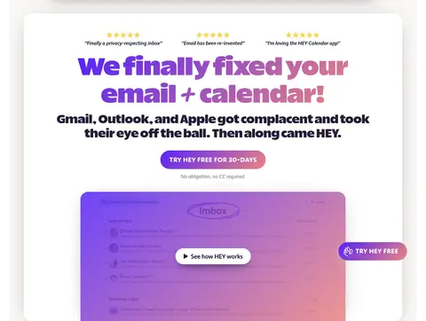
Product preview
Large email-interface visual sits beneath the hero CTA, framed as a rounded product panel with an overlaid play control.
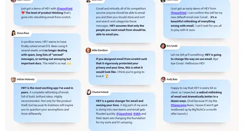
Testimonial cards
Multi-column cluster of short quotes on rounded pale blue cards, with small author portraits and dark, readable copy.
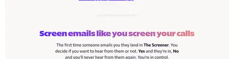
Centered feature copy
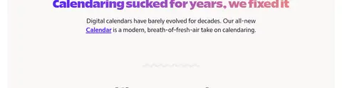
Single-column feature sections use large gradient headings, concise centered explanatory text, and substantial vertical separation.
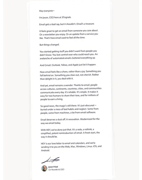
Founder letter
A white, document-like letter panel presents long-form copy, a signature, and founder identification with subtle lift from the paper canvas.
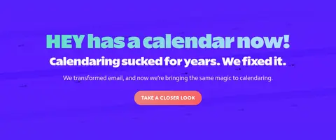
Calendar campaign band
Full-width Blurple section contrasts with the paper canvas, featuring mint-to-blue display text, white support copy, and a coral CTA.
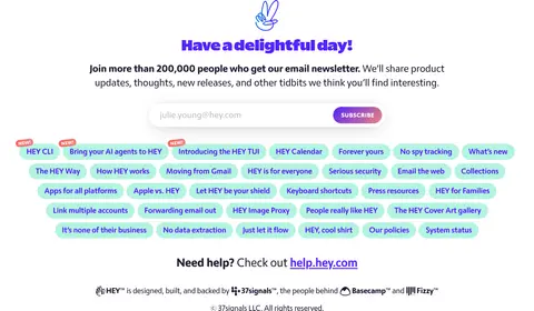
Link-rich footer
Bright white closing area combines a newsletter signup, many rounded pastel navigation chips, help link, and compact credits.
Imagery · The hero centers a large email-interface preview beneath the headline, with the interface softened by a vivid purple-to-coral overlay. User testimonials appear as compact, pale blue cards with small avatar portraits; these illustrations and product mockups provide color without changing the underlying palette. The founder letter uses a restrained document-like presentation with a signature and portrait. Imagery supports product proof and human credibility rather than filling every section.
Reserve Deep Ink for readable text and navigation.
Use Electric Blurple for links and high-priority actions.
Set major headlines in a heavy rounded display face.
Keep feature copy centered and short.
Separate content with generous vertical breathing room.
Use rounded cards and soft shadows for product proof.
✕ 不该做
Do not make every section a saturated color band.
Do not use gradients as a substitute for text hierarchy.
Do not crowd the hero with multiple competing actions.
Do not use pale accent colors for essential body text.
Do not flatten the floating navigation and cards into the canvas.
Do not turn feature explanations into dense multi-column prose.
给 AI 的提示词
想快速出一个同风格的新页面,把这段话连同 DESIGN.md 一起发给 AI。
Build a new HEY-style productivity page with a Warm Paper (#f9f7f5) canvas, Deep Ink (#231c33) copy, and Clean White (#ffffff) panels. Use Electric Blurple (#5522fa) for links and primary actions; reserve Fresh Mint (#b3f4e0), Sky Blue (#b6dbff), and Soft Coral (#ec8580) for selective accents and gradients. Make the hero centered, with a heavy rounded display headline, concise supporting text, one clear pill CTA, and a product preview. Use a readable humanist sans for body and navigation. Keep content blocks constrained and spacious, with centered feature sections, rounded testimonial cards, and subtle ink-tinted shadows. Include one vivid promotional band and a bright footer with compact pill-like links. Preserve generous whitespace and strong contrast.