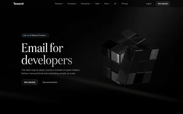
North star · Use near-black space and understated Inter typography as the foundation, reserving the cool gradient for the opening hero.
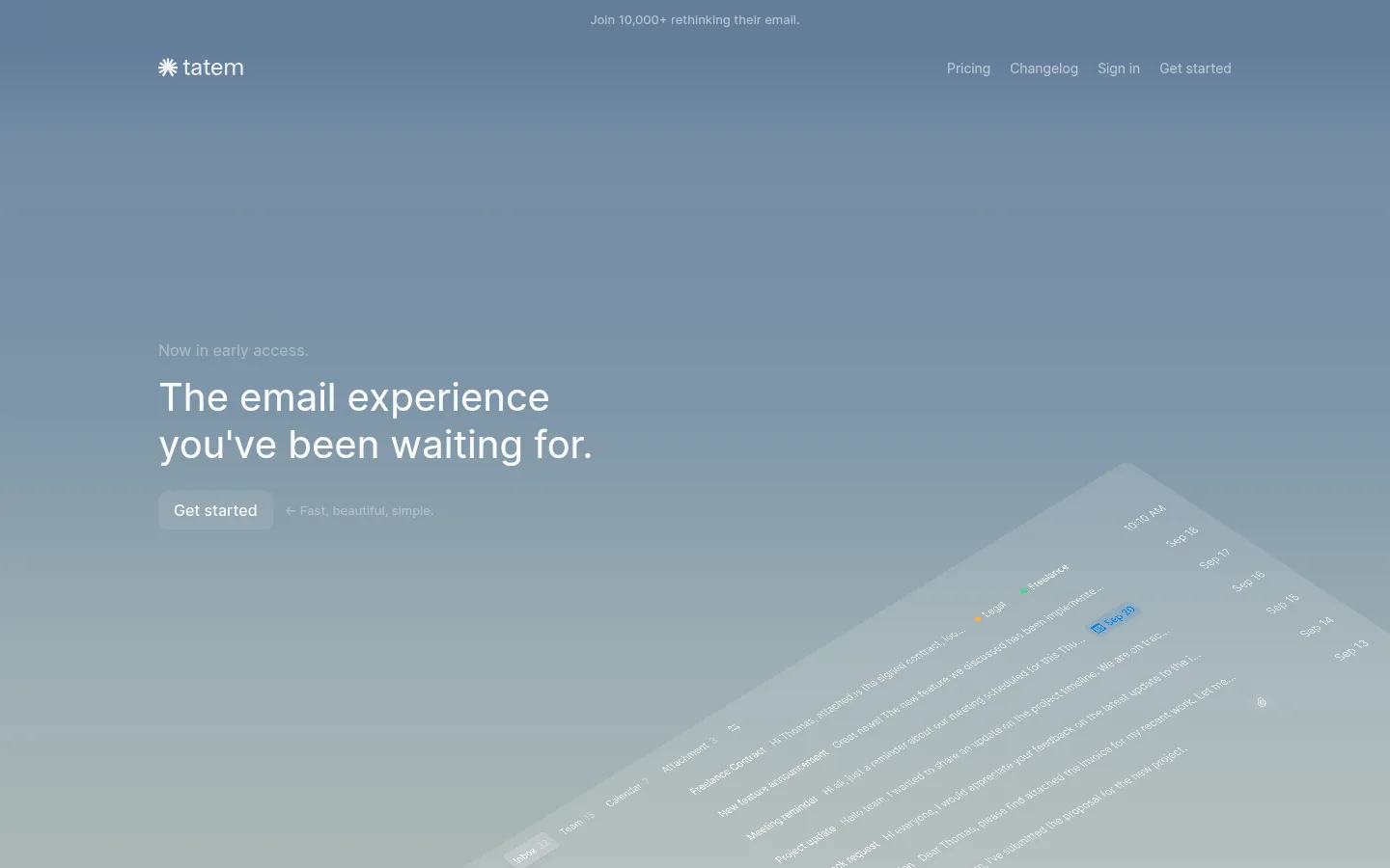
The page opens with a full-viewport, cool blue-gray gradient that fades from slate blue into pale, muted gray-green, framing white hero copy and a tilted email-interface preview. Below it, the site returns to a near-black canvas and uses large vertical gaps to make each product feature feel deliberate rather than crowded. Inter is used throughout in regular weights: headings are clean and sentence-case, while feature labels are small uppercase text. Primary copy is off-white; supporting text steps down into two restrained grays. Product previews sit in subtly lighter charcoal panels, with their interface details kept low-contrast so they support rather than compete with the message. Alignment is consistently left-led within a centered content area. The visual language is flat and quiet: no prominent shadows, thin borders, or decorative ornament. The gradient belongs chiefly to the hero; the rest of the page is defined by black space and product demonstrations.
All page typography: hero and feature headings, body copy, navigation, captions, and links.
角色
示例
字号
字重
行高
字距
一级标题
Main hero headline introducing the email experience.
Tatem
40px
400
normal
0
正文
Feature descriptions and prominent supporting copy.
The quick brown fox 敏捷的狐狸
20px
400
normal
0
辅助文字
Small labels, eyebrow text, and understated supporting details.
The quick brown fox 敏捷的狐狸
13px
400
normal
0
导航
Header navigation links.
The quick brown fox 敏捷的狐狸
14px
400
normal
-0.007em
链接
Get started calls to action and inline links.
The quick brown fox 敏捷的狐狸
16px
400
1.5
0
间距与布局
基准单位 8px · 密度:适中
48px版块间距
12px元素间距
—卡片内边距
1112px内容最大宽度
5px
6px
8px
10px
12px
16px
20px
24px
32px
48px
80px
A centered content area is capped at the measured 1112px maximum width, with left-aligned copy. The hero fills the opening viewport and places its text on the left, while a large tilted product preview enters from the lower right. Feature sections follow in a single-column narrative, using substantial vertical pauses and repeated product panels. The page feels intentionally sparse rather than grid-dense; content is comfortable in density, and measured spacing steps are built around an 8px base unit.
圆角与层次
链接 · 8px
没有测到阴影:页面是扁平的,层次靠底色和描边区分。
The interface is predominantly flat: no measured shadows and no prominent border treatment. Product demonstrations are separated from the near-black canvas with charcoal surfaces rather than strong outlines. The hero creates depth through its gradient, while the tilted email mockup supplies the main layered effect.
组件
下面的预览按实测的按钮、输入框、徽标、卡片样式重建(字体用替代字体)。
Header navigation
A compact logo and understated links sit across the top of the hero. Navigation text is white, regular-weight Inter, measured at 14px for individual links.
Hero message
Left-aligned eyebrow and sentence-case headline, followed by a rounded dark Get started link and a quieter inline supporting phrase.
Hero product preview
A large, diagonally angled email UI mockup enters from the lower right, over the blue-gray-to-pale gradient.
Feature introduction
Small uppercase feature label followed by a concise headline and muted explanatory copy, aligned to the left.
Product demonstration panel
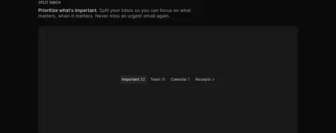
Wide, restrained charcoal surface displaying a single product interaction, such as inbox categories or editor controls.
Get started link
A 16px regular Inter link with a #1d1d1d background, white text, and 8px corner radius.
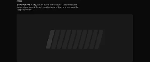
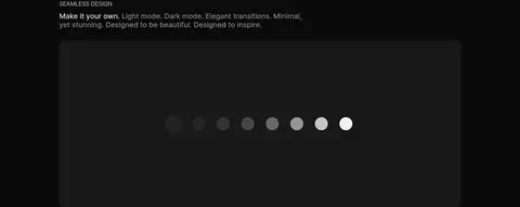
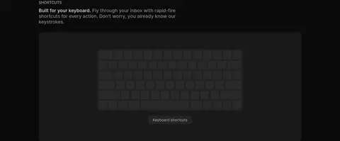
Imagery · The hero uses a large, angled email-interface mockup that appears to emerge from the lower-right edge over the gradient. Later sections use dark product-preview panels: inbox categories, a text editor, speed graphics, theme samples, and keyboard shortcuts. There is no prominent lifestyle photography; visuals are interface-led, low-contrast, and framed within the page’s dark surfaces.
Use Inter with regular weights and restrained hierarchy.
Reserve the blue-gray gradient for the opening hero.
Align feature copy to the left and let it breathe.
Show product functionality in quiet charcoal panels.
Use off-white for primary text and grays for secondary copy.
✕ 不该做
Do not carry the hero gradient across every section.
Do not add colorful CTA treatments or unmeasured accent colors.
Do not crowd the feature sections into a dense card grid.
Do not add heavy shadows, outlines, or ornamental borders.
Do not make supporting copy as bright as the main headline.
Do not use decorative display fonts or bold-heavy typography.
给 AI 的提示词
想快速出一个同风格的新页面,把这段话连同 DESIGN.md 一起发给 AI。
Build a new Tatem-style page with a near-black #0a0a0a canvas and regular-weight Inter throughout. Keep the opening hero visually distinct with a restrained gradient from Slate Blue #5a7694 through Misty Blue #758da5 and Horizon Blue #7e96a8 to pale Blue Gray #9cadb3 and Pale Sage #abb7b5. Place concise, left-aligned white copy beside or above a quiet product-interface preview. Below, return to the dark canvas and organize content as spacious, left-led feature sections with charcoal #181818 product panels and restrained secondary surfaces such as #262626. Use Soft White #f3f3f3 for primary text and Quiet Gray #919191 or Silver Gray #b6b6b6 for supporting text. Keep hierarchy understated, surfaces flat, and demonstrations product-focused. Avoid heavy shadows, dense grids, and invented bright accents.