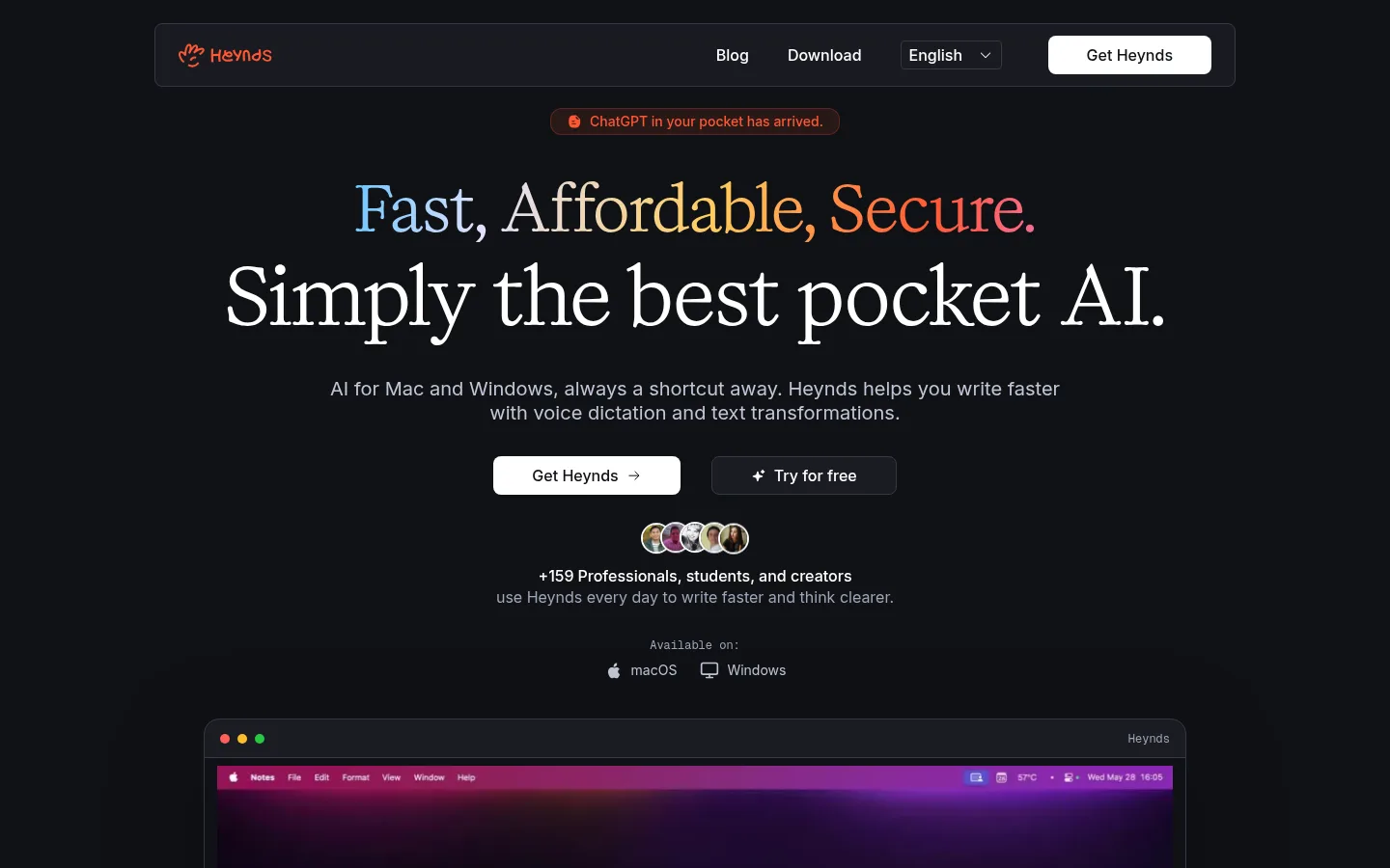
Heynds 以深色编辑式页面展示 AI 写作与语音输入产品,突出衬线大标题和克制的界面装饰。产品截图、紧凑功能卡片与暖色渐变强调,串联起产品介绍、功能证明和价格信息。
North star · Keep the dark page quiet and let editorial serif headlines, focused product evidence, and selective warm gradient accents carry the story.
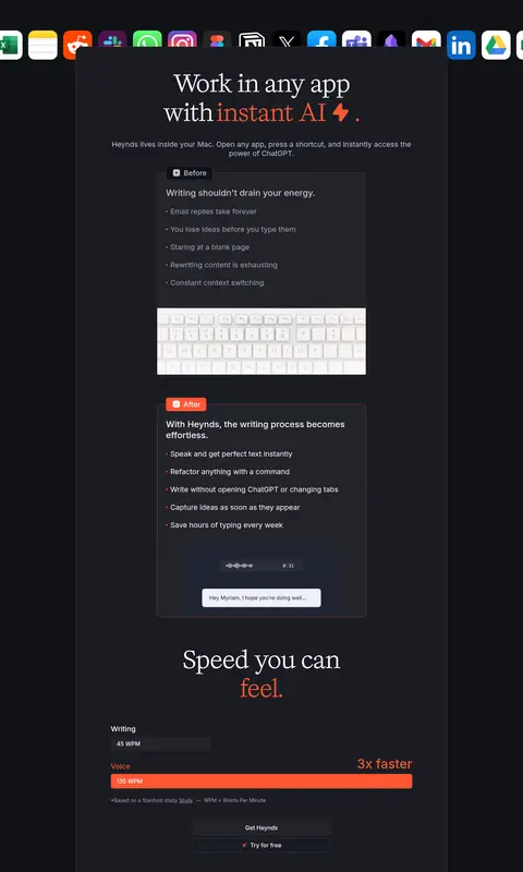
The visual strategy centers on a near-black canvas (#101216) and slightly lighter charcoal panels, creating contrast without the glare of pure black and white. Large, centered Kalice Trial serif headlines give the page an editorial character; Inter Variable handles navigation, body copy, cards, and controls with compact, legible clarity. Accent words and selected icons use a multicolor gradient, while the coral (#ff5733) is the recurring emphasis for phrases about instant AI, speed, and workflow. White primary buttons stand out against the dark field; secondary actions remain dark with fine borders. The long page is organized as a centered product narrative: hero and video, feature and privacy cards, paired use cases, workflow examples, pricing, FAQ, social proof, then footer. Interface imagery stays inside rounded, bordered frames, with generous dark breathing room around each section.
配色
点色块复制色值。用途说明来自对页面的实测位置(背景、文字、描边、按钮)与截图判读。
品牌色
强调色
表层色
中性色
页面底色 · Midnight Canvas表层 · Charcoal Panel表层 2 · Graphite Control主文字 · Paper White次要文字 · Quiet Lavender弱文字 · Pale Periwinkle描边 · Slate Hairline强调 · Signal Coral强调 2 · Electric Blue强调 3 · Golden Glow
Navigation, body copy, cards, buttons, labels, and compact supporting headings.
Aa 设计
Kalice Trial
网络字体 · 字重 400 · 占比 3%
免费替代:Cormorant Garamond
Display and hero headlines, plus editorial section titles.
角色
示例
字号
字重
行高
字距
特大标题
Oversized editorial hero or headline moments.
Heynds
80px
400
1.1
0
一级标题
Primary hero title and major page statement.
Heynds
64px
400
1.12
0
二级标题
Centered section titles throughout the product narrative.
Heynds
48px
400
1
0
三级标题
Feature and content group headings.
Heynds
40px
500
1.15
0
四级标题
Card headings and smaller subsection titles.
Heynds
36px
500
1.11
0
正文
Feature explanations, testimonials, and supporting prose.
The quick brown fox 敏捷的狐狸
16px
400
1.25
0
辅助文字
Small clarifiers, metadata, and supporting labels.
The quick brown fox 敏捷的狐狸
14px
400
1.25
0
按钮
Primary and secondary call-to-action labels.
The quick brown fox 敏捷的狐狸
16px
400
1.25
0
导航
Top navigation and interactive audience tabs.
The quick brown fox 敏捷的狐狸
16px
500
1.25
0
链接
Footer and inline secondary links.
The quick brown fox 敏捷的狐狸
14px
400
1.25
0
代码
Compact technical or code-like utility labels.
const style = 1;
12px
400
1.33
0
间距与布局
基准单位 8px · 密度:适中
48px版块间距
8px元素间距
10px卡片内边距
830px内容最大宽度
4px
8px
12px
16px
20px
24px
40px
The page uses a centered content column, with measured page max width of 830px and generous negative space around it. The hero is tightly stacked and center-aligned, followed by framed product media and alternating centered grids or paired cards. Feature and FAQ content stays compact against the broad dark canvas. Sections repeat with a measured 48px section gap and an 8px element rhythm, while the footer switches to a three-column link arrangement. Preserve the long, orderly scroll and avoid filling every available area.
圆角与层次
按钮 · 8px
卡片 · 16px
图片 · 50%
导航 · 8px
hairline · other
xl · card
The interface is mostly flat: dark surface changes and fine slate borders define cards more than shadows. Cards use measured rounded treatments, while the large media and interface examples sit as distinct framed layers. Reserve stronger depth for featured media or overlays; avoid bright glows and heavy drop shadows across the page.
组件
下面的预览按实测的按钮、输入框、徽标、卡片样式重建(字体用替代字体)。
Top navigation
A centered dark bar with a fine border, brand mark, text links, language selector, and white Get Heynds CTA.
Hero CTA pair
White filled primary action with dark text beside a charcoal Try for free button outlined in slate.
Product media frame
Large rounded dark window holding a screen recording or app interface, visually separated from the canvas.
Feature cards
Compact charcoal cards with fine borders, small coral icon accents, short headings, and muted explanatory copy.
Paired workflow panels
Two framed product-use examples with screenshots, concise descriptions, and restrained in-card actions.
FAQ accordion
Stacked dark question rows with fine outlines, white question text, and a small trailing disclosure chevron.
Testimonial and metric cards
Dark outlined cards combine coral percentage highlights or short quotes with compact user attribution.
Footer link groups
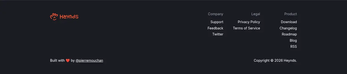
A charcoal footer with brand mark, three compact link columns, and a low-emphasis copyright row.
Imagery · Product UI is the primary visual evidence: screen recordings, app mockups, and workflow examples appear inside dark, rounded frames. The hero includes a large video-style product window; later use-case panels pair interface screenshots with concise text. Small portraits and app icons provide social proof and compatibility context. Keep screenshots legible and framed, while treating saturated colors inside app mockups as content imagery rather than as the site palette.
Reserve the full spectrum gradient for selected headline words.
Frame screenshots with dark panels and fine borders.
Make primary actions white and secondary actions outlined.
Leave visible dark breathing room between content groups.
✕ 不该做
Do not turn the page into a bright or white interface.
Do not apply the gradient to every card or button.
Do not use product mockup colors as the site-wide palette.
Do not replace editorial headlines with generic heavy sans-serif.
Do not add thick borders or conspicuous shadows to every panel.
Do not crowd the centered sections with extra columns.
Do not make supporting copy compete with the main headline.
给 AI 的提示词
想快速出一个同风格的新页面,把这段话连同 DESIGN.md 一起发给 AI。
Build a new page in the Heynds visual style: use Midnight Canvas (#101216) as the broad background, with Charcoal Panel (#1a1c23) and Graphite Control (#23242a) for framed content. Use Paper White (#ffffff) for key text and primary CTA fills; keep secondary text in Quiet Lavender (#9fa5ba) or Pale Periwinkle (#c2c6d7). Set display headlines in an elegant editorial serif and use Inter-style sans serif for navigation, prose, and controls. Highlight only selected headline words with Signal Coral (#ff5733) or the measured blue-to-orchid gradient. Center content in a restrained column, build sections from compact bordered cards, and use product screenshots as evidence inside rounded dark frames. Keep the overall page quiet, spacious, and readable; avoid decorative gradients, heavy shadows, and dense layouts.